CINEMATOGRAPHY
INSPIRATION
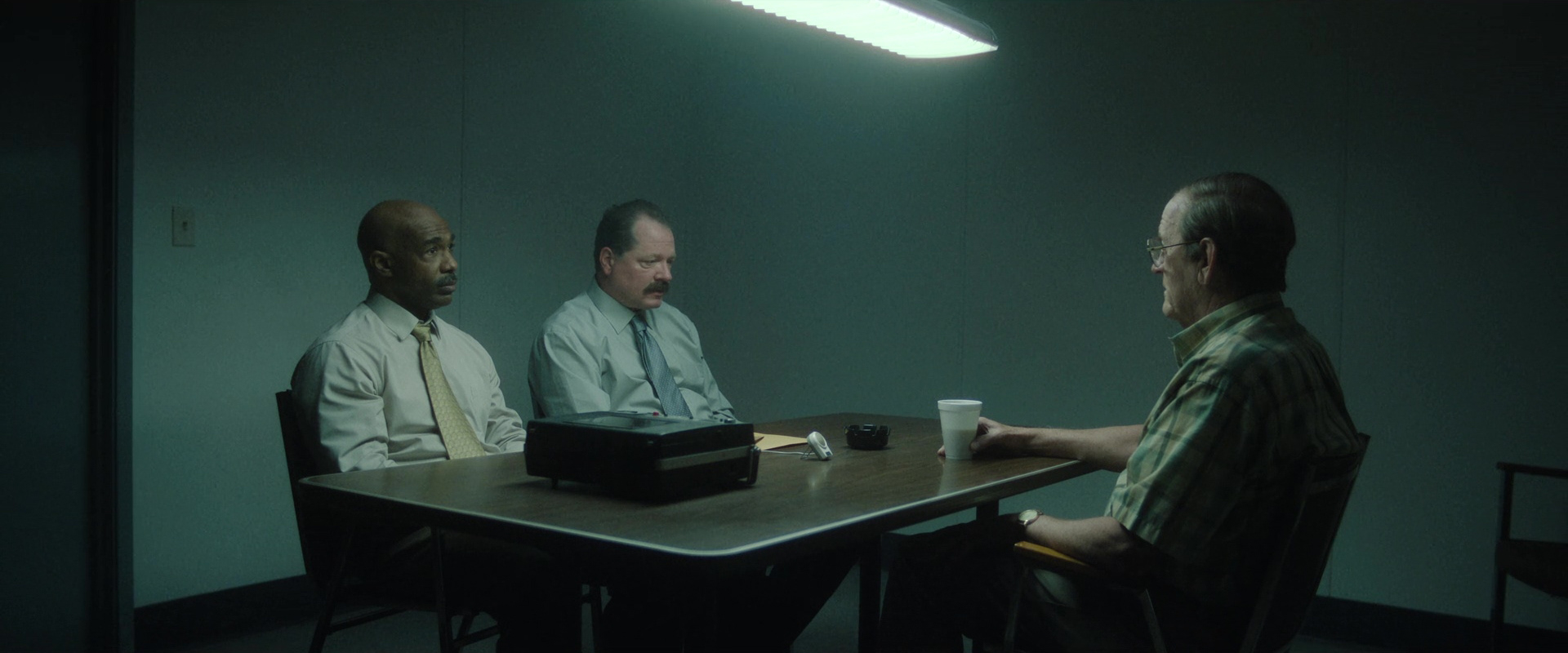
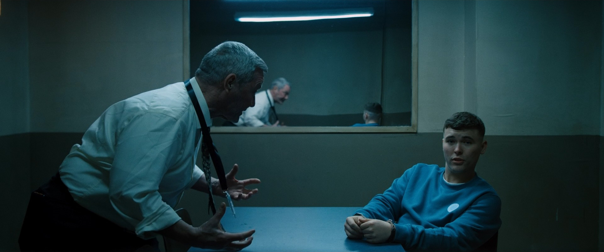
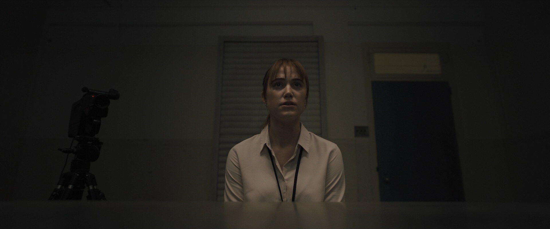
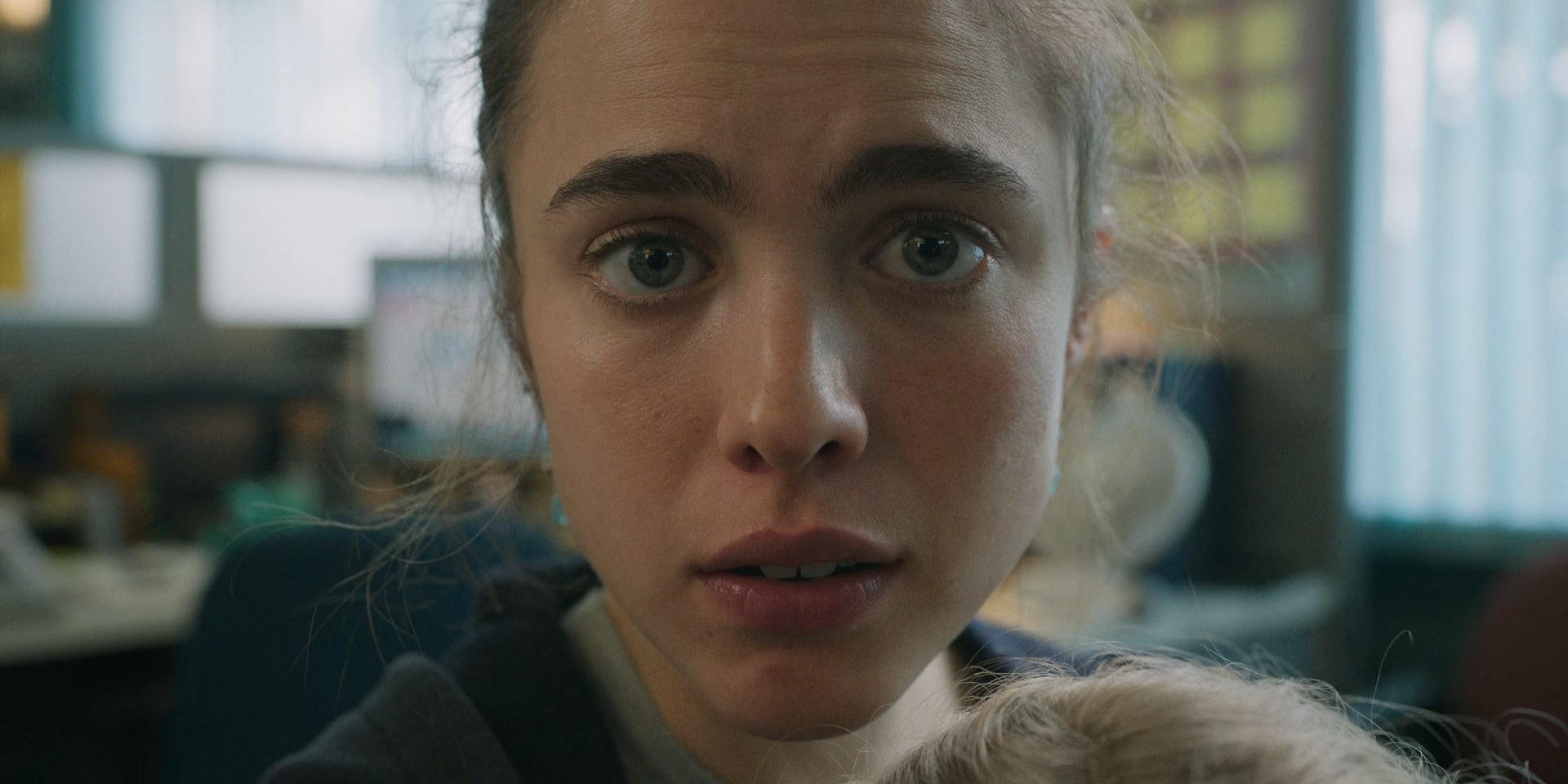
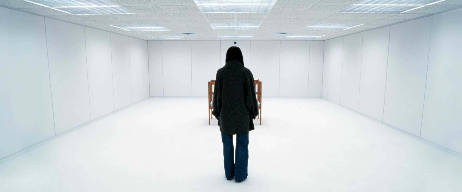
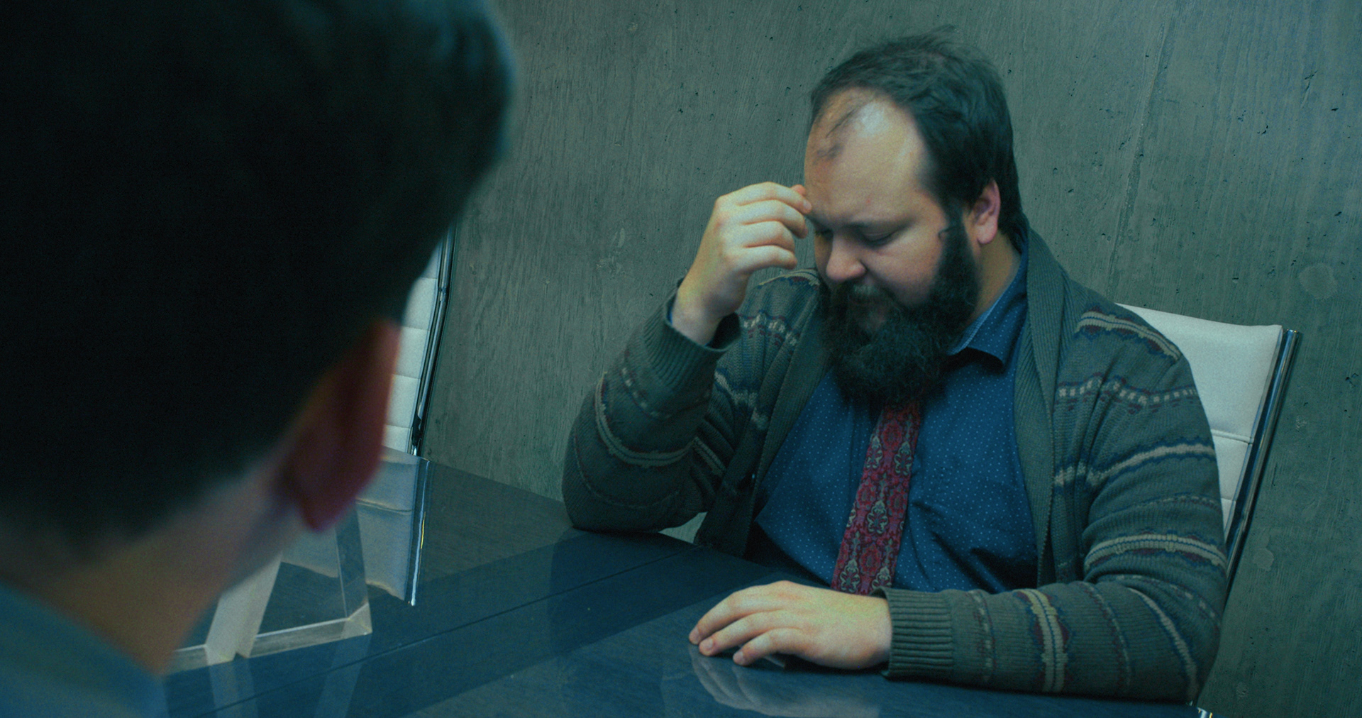
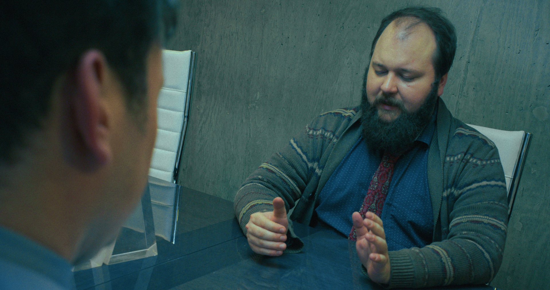
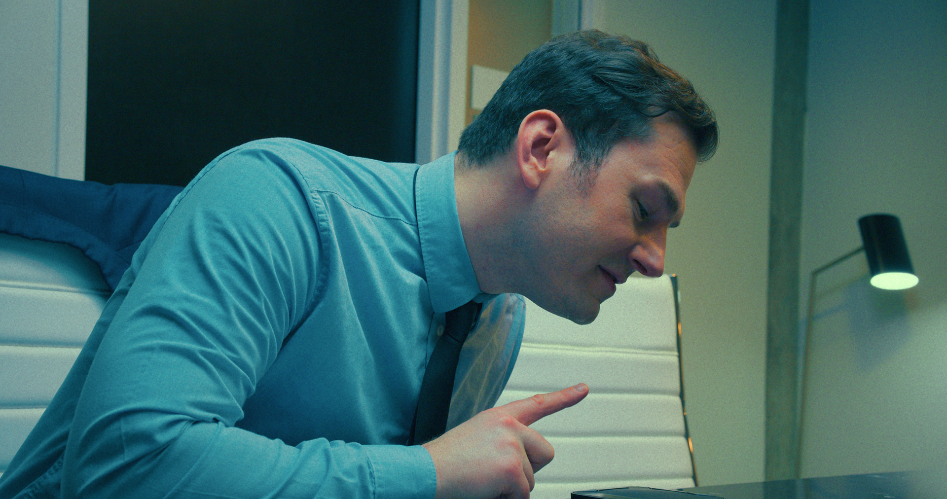
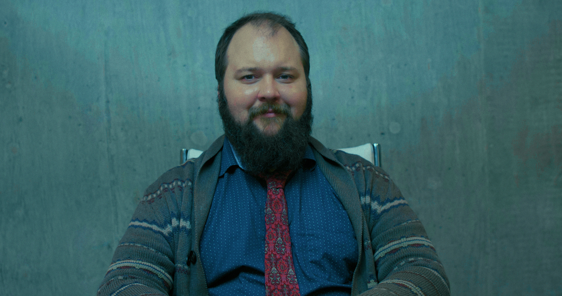
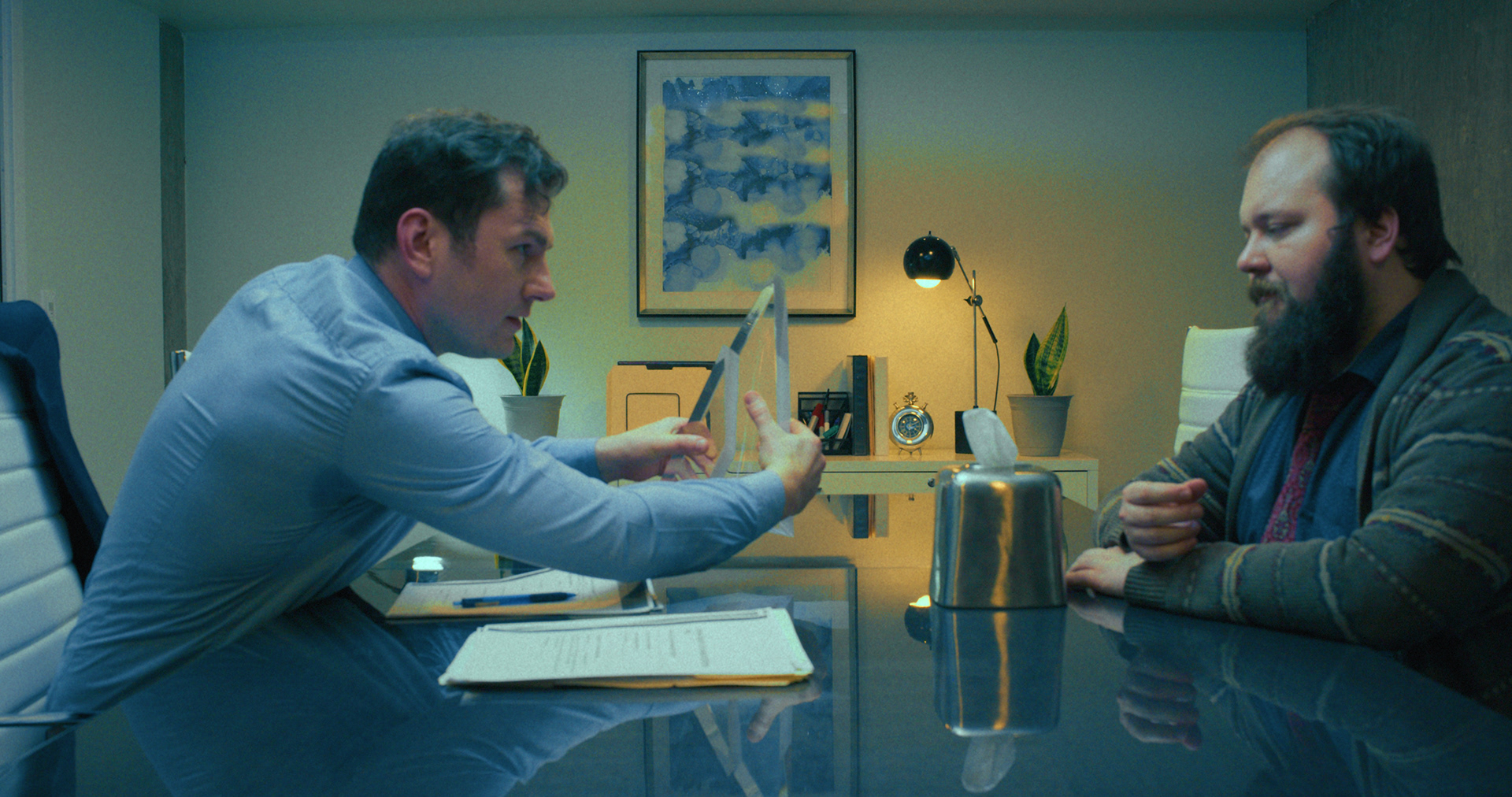
When I designed the look of the film, I was inspired by off-putting often bright fluorescent office lighting and how strange and alien it can feel. It was important to me that the film felt harsh. In these references the greens and cyans stuck out to me as well as the harsh top lighting.
RESULTS
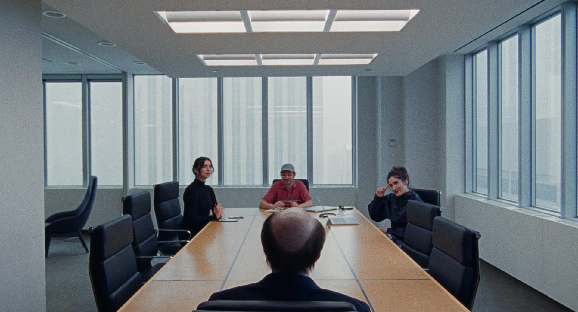
I began with a base idea of a tedtradic blue - yellow - red relationship, and I shifted the blue to the uncomfortable sickly cyan.


PRODUCTION DESIGN
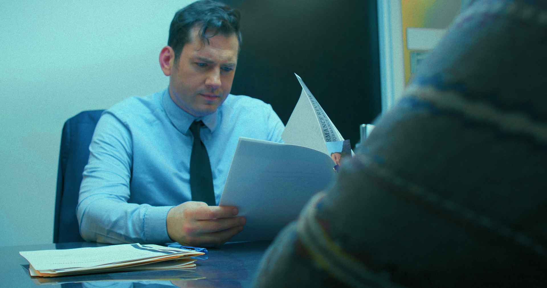
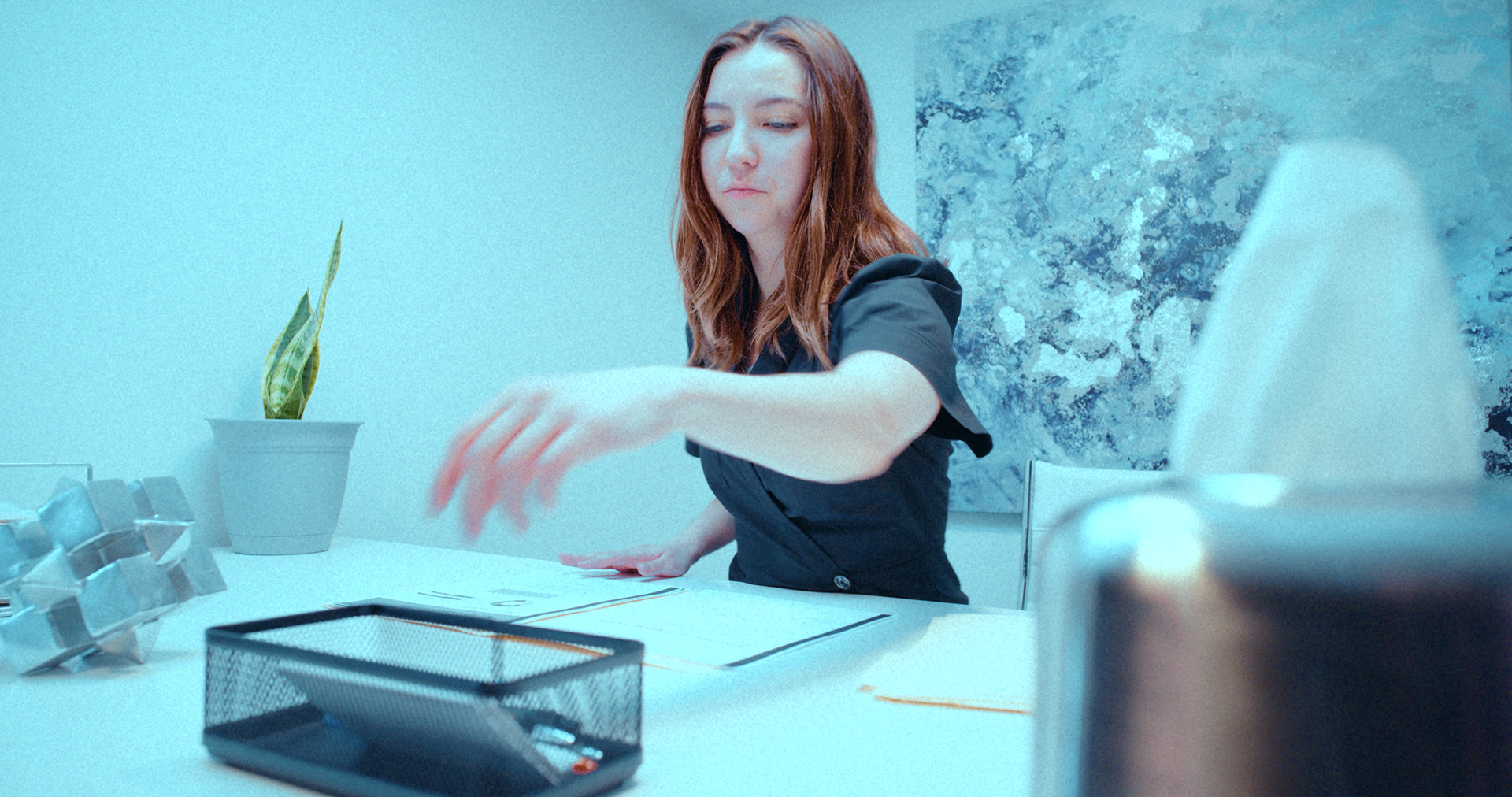
THE PAPERWORK
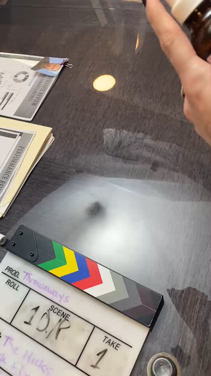
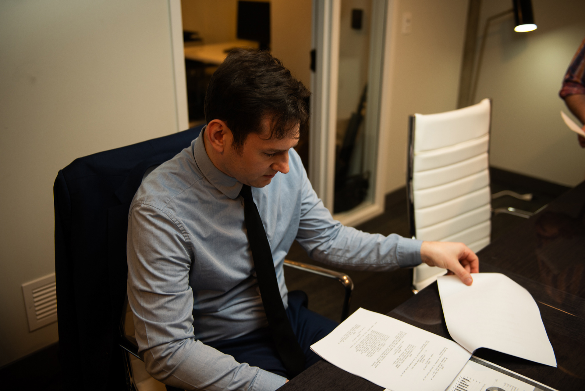
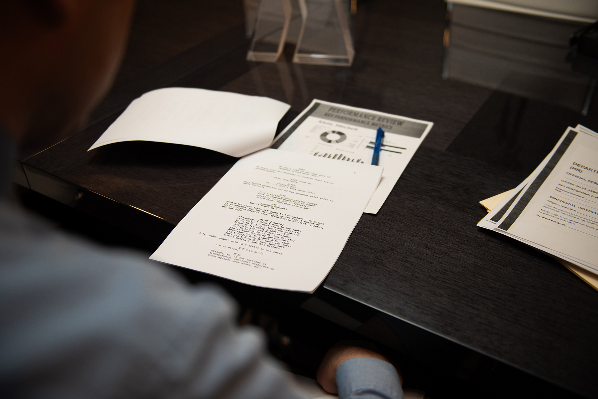
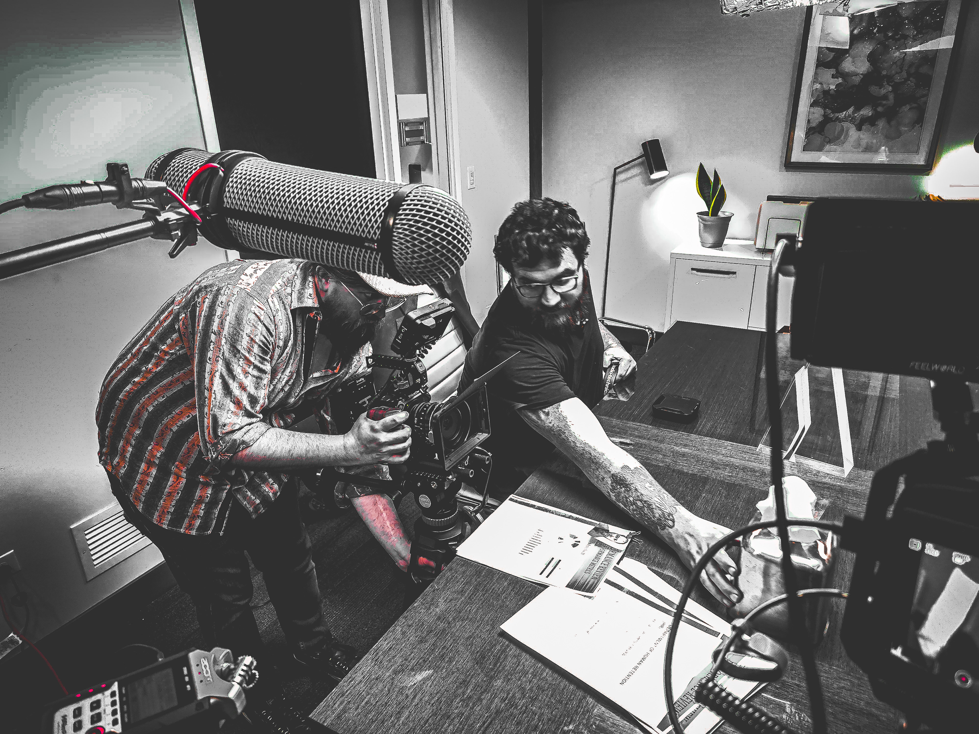
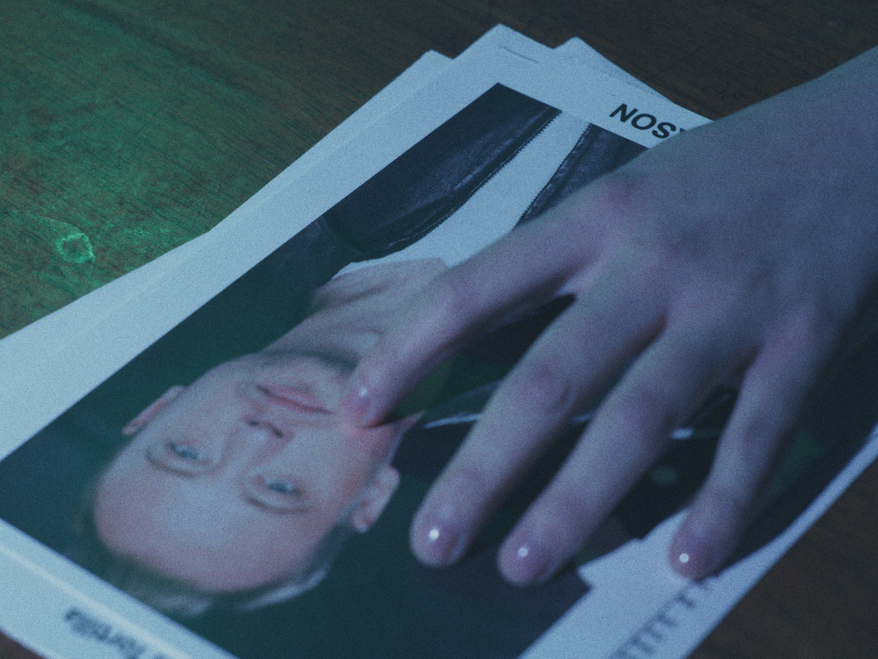
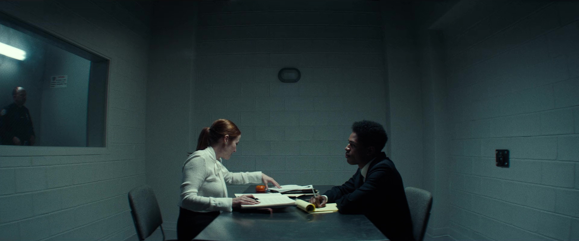
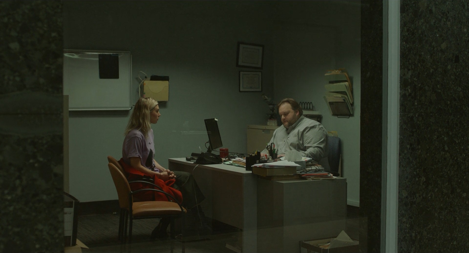
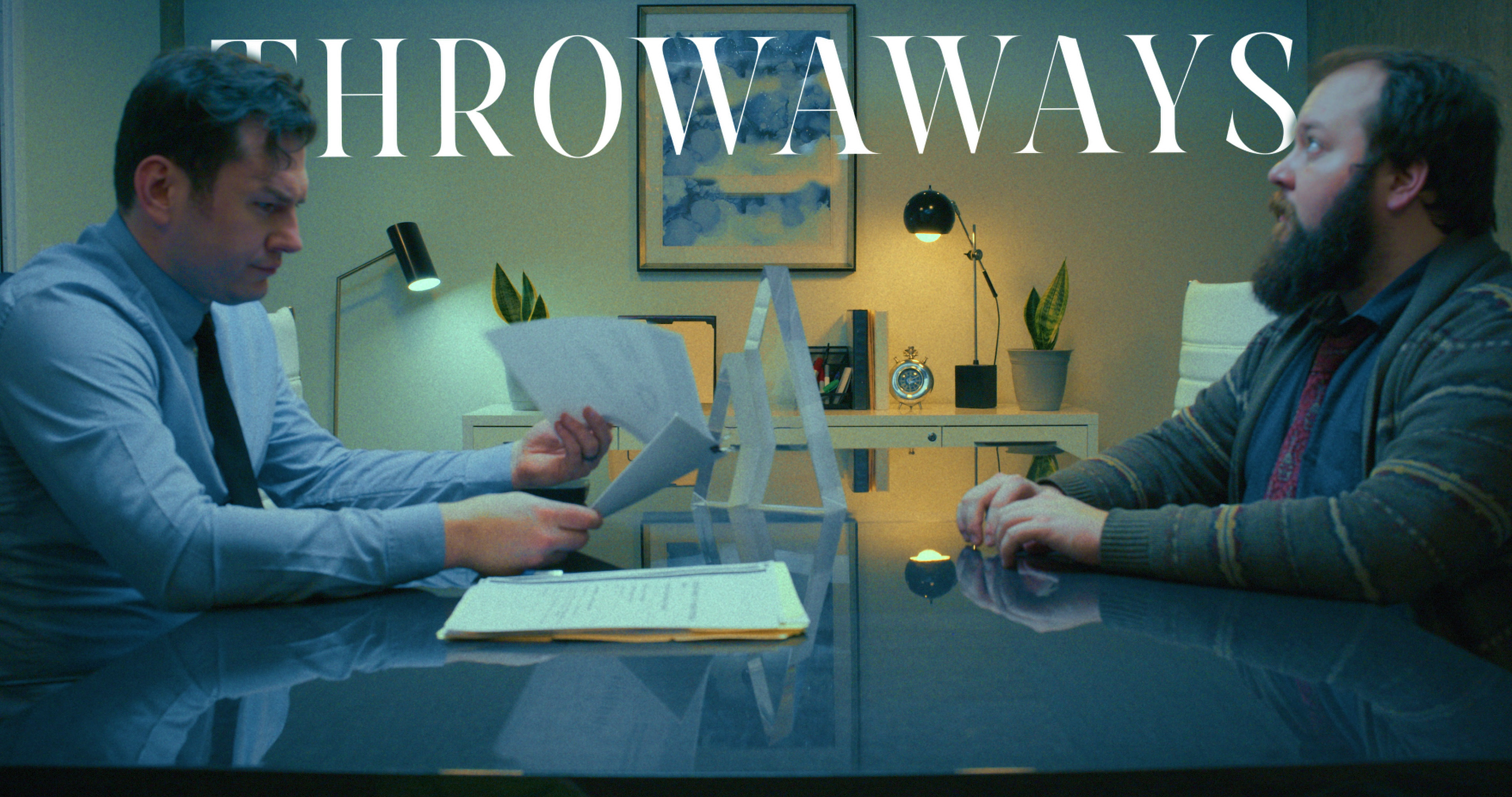
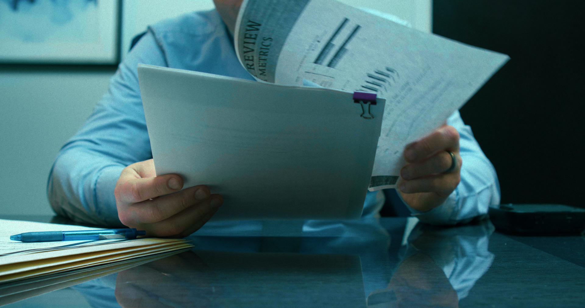
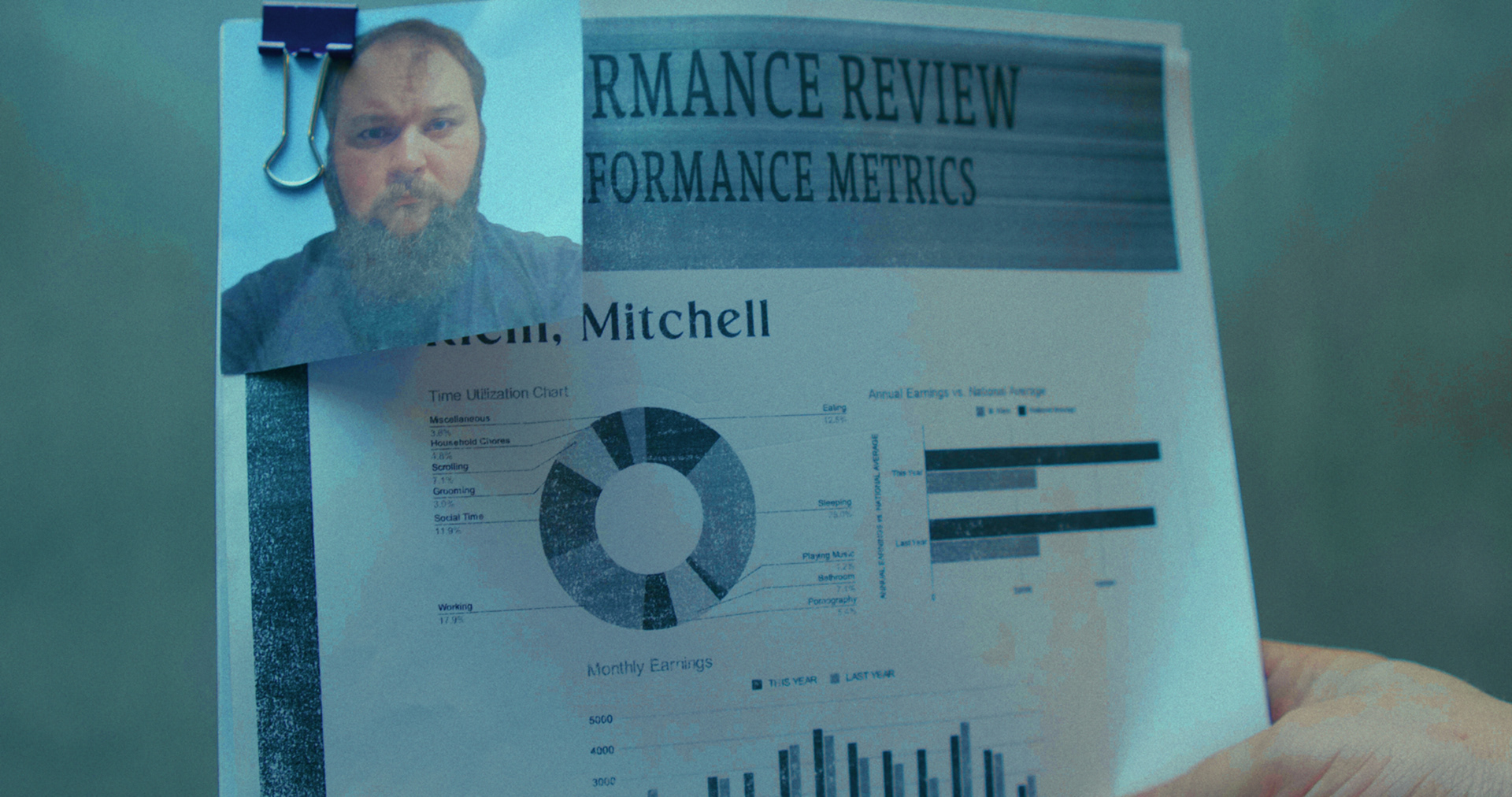
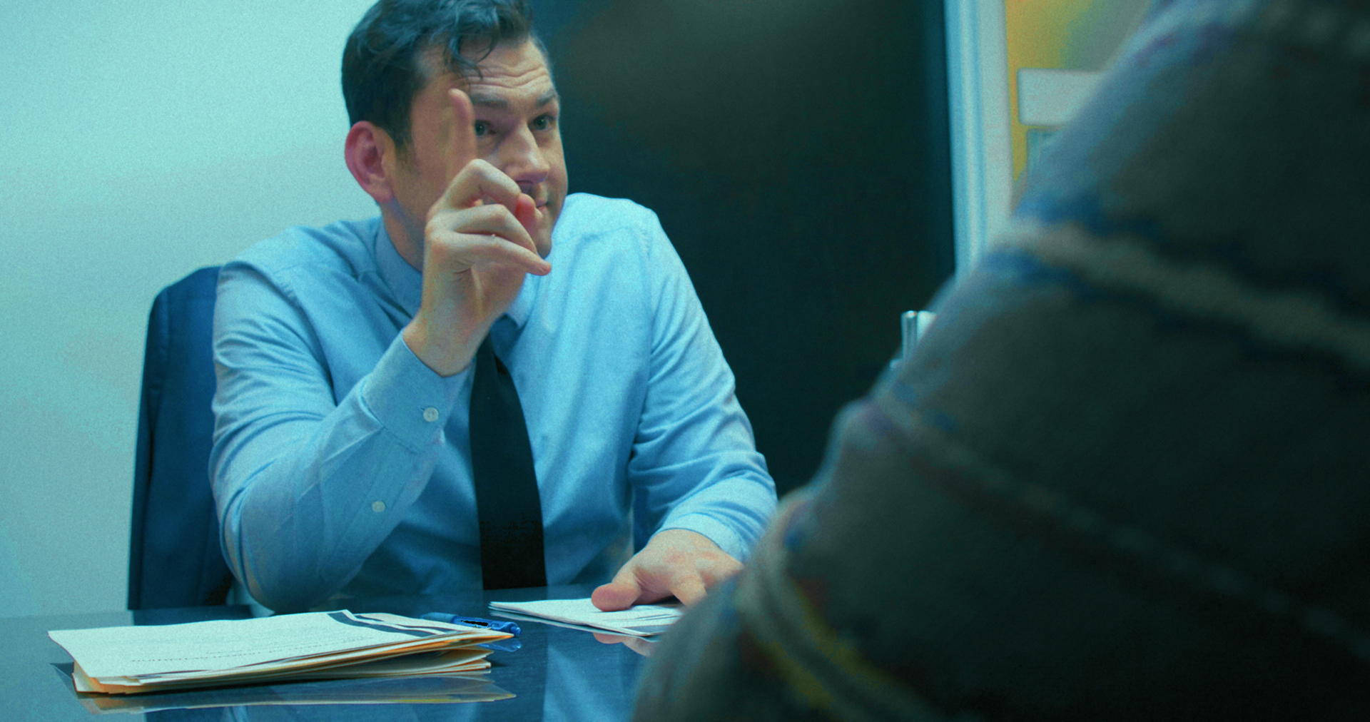
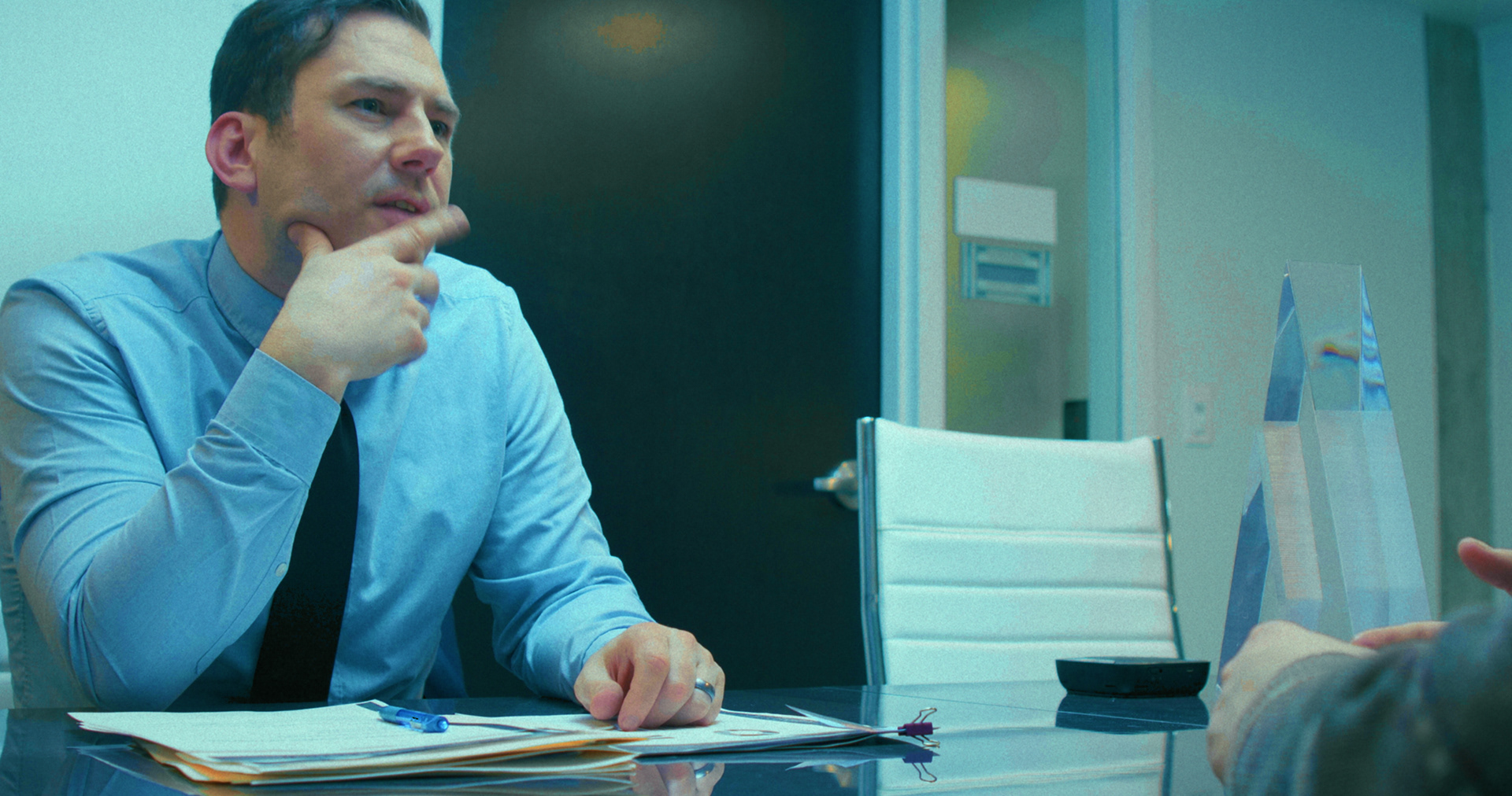
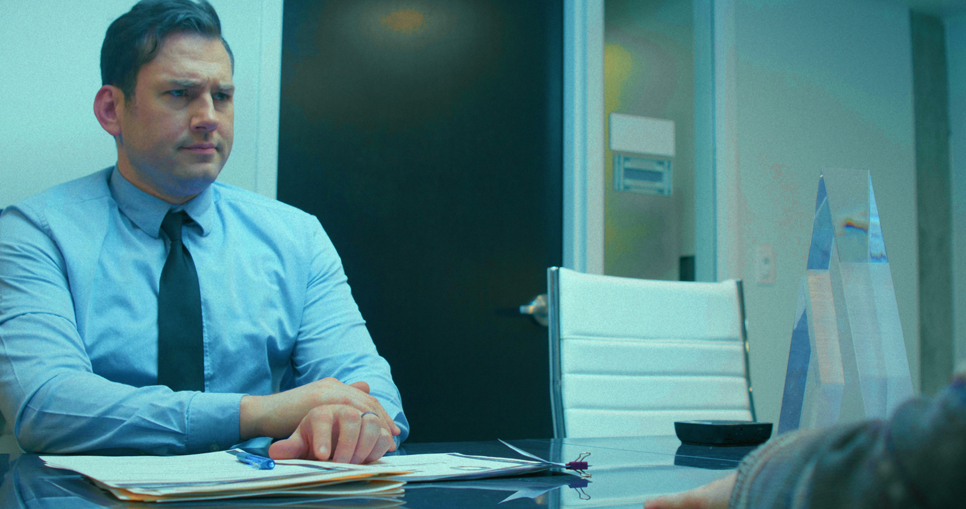
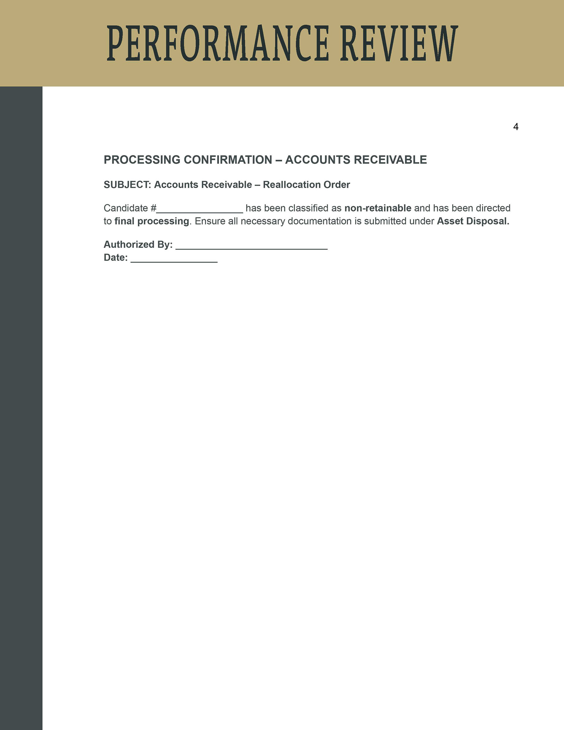
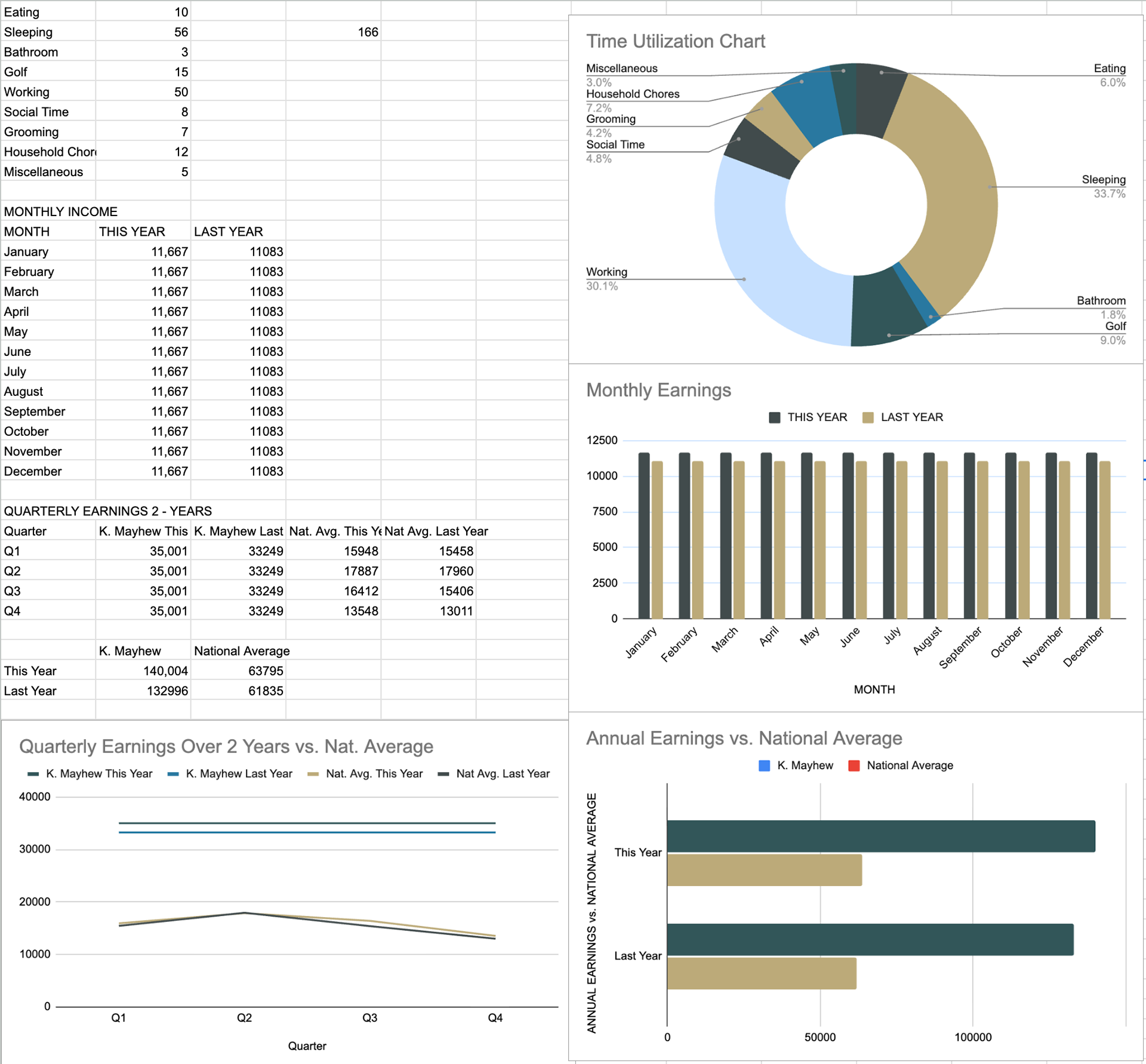
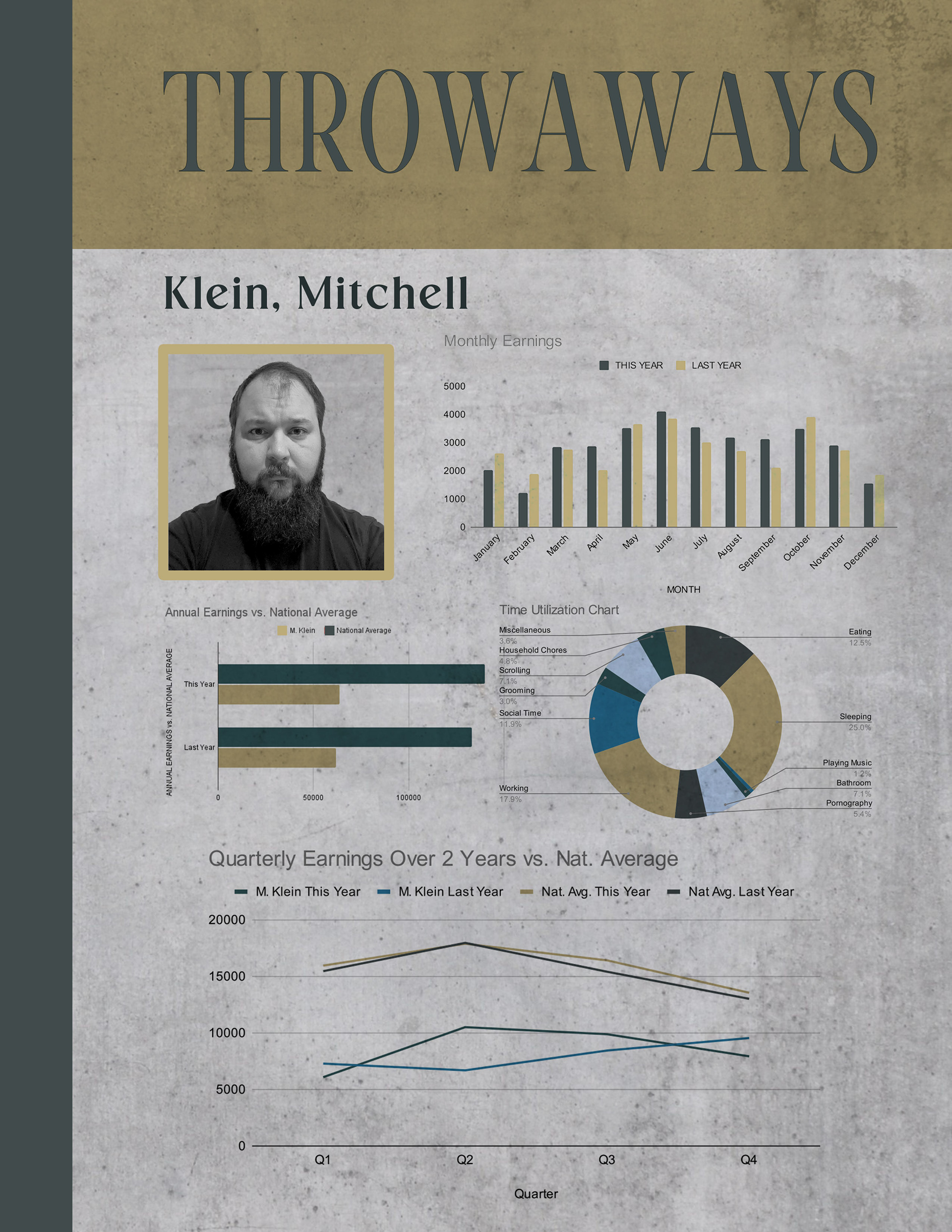
I wanted the paperwork to be interactive for the actors. There was actual information to gather and literal lines to be filled out, which made the performances feel more organic. In the process, I added to the world-building by giving the bureaucratic organization a title, which I called the Department of Human Retention (HR). This name evoked the office-like performance review setting while calling out the actual function of this interview.
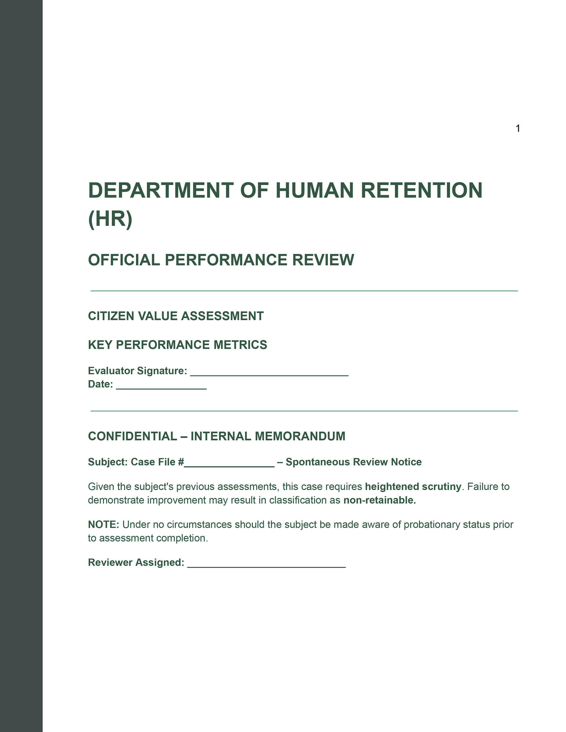
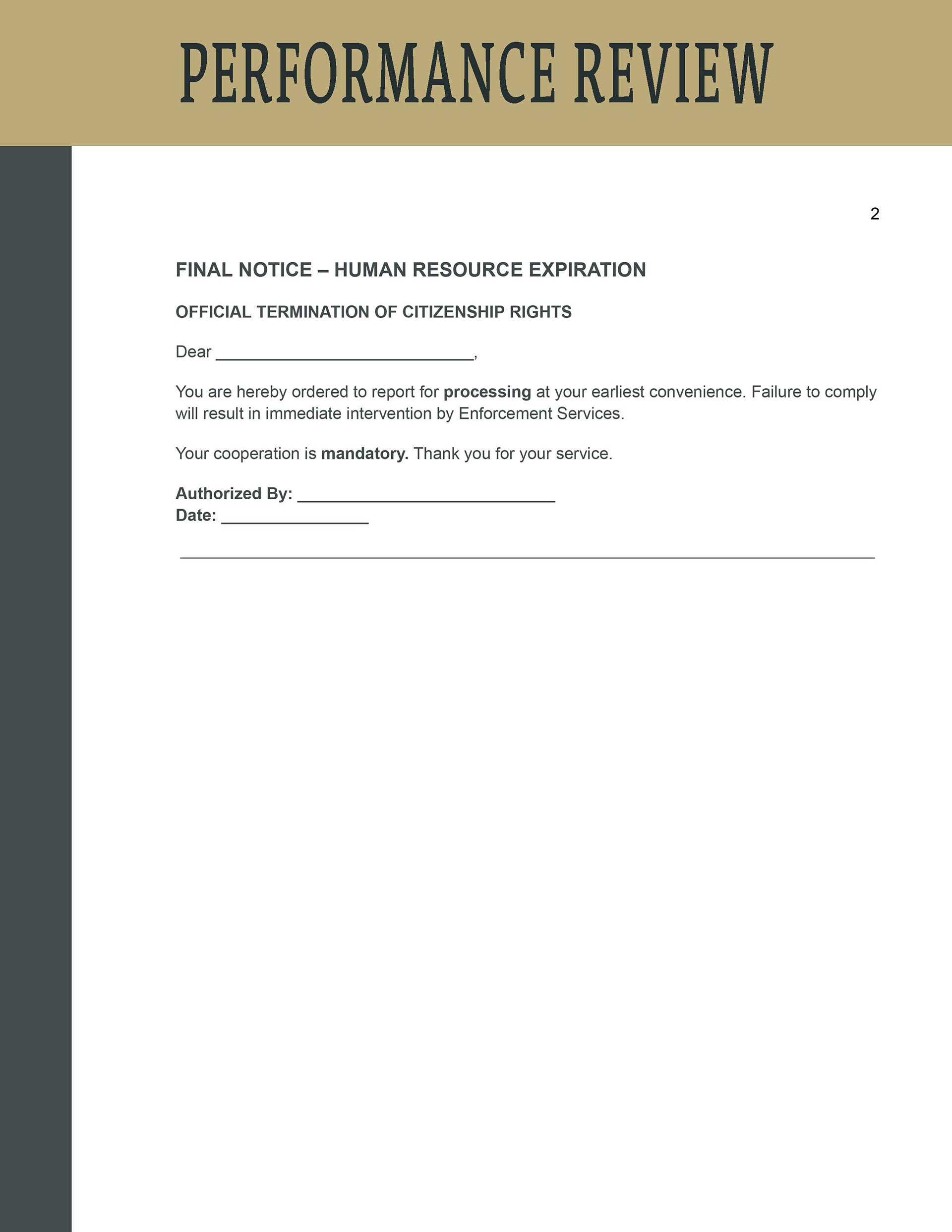
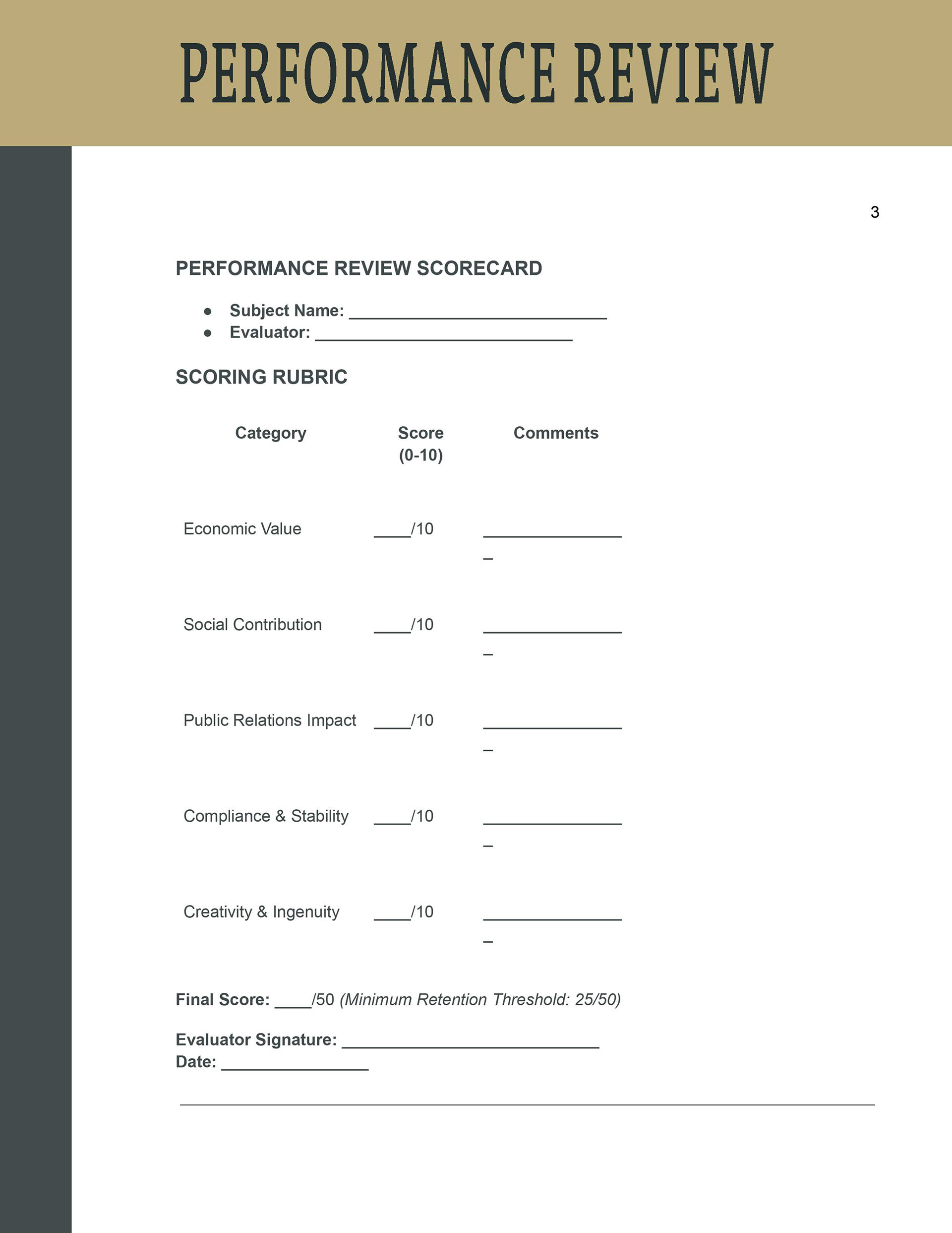
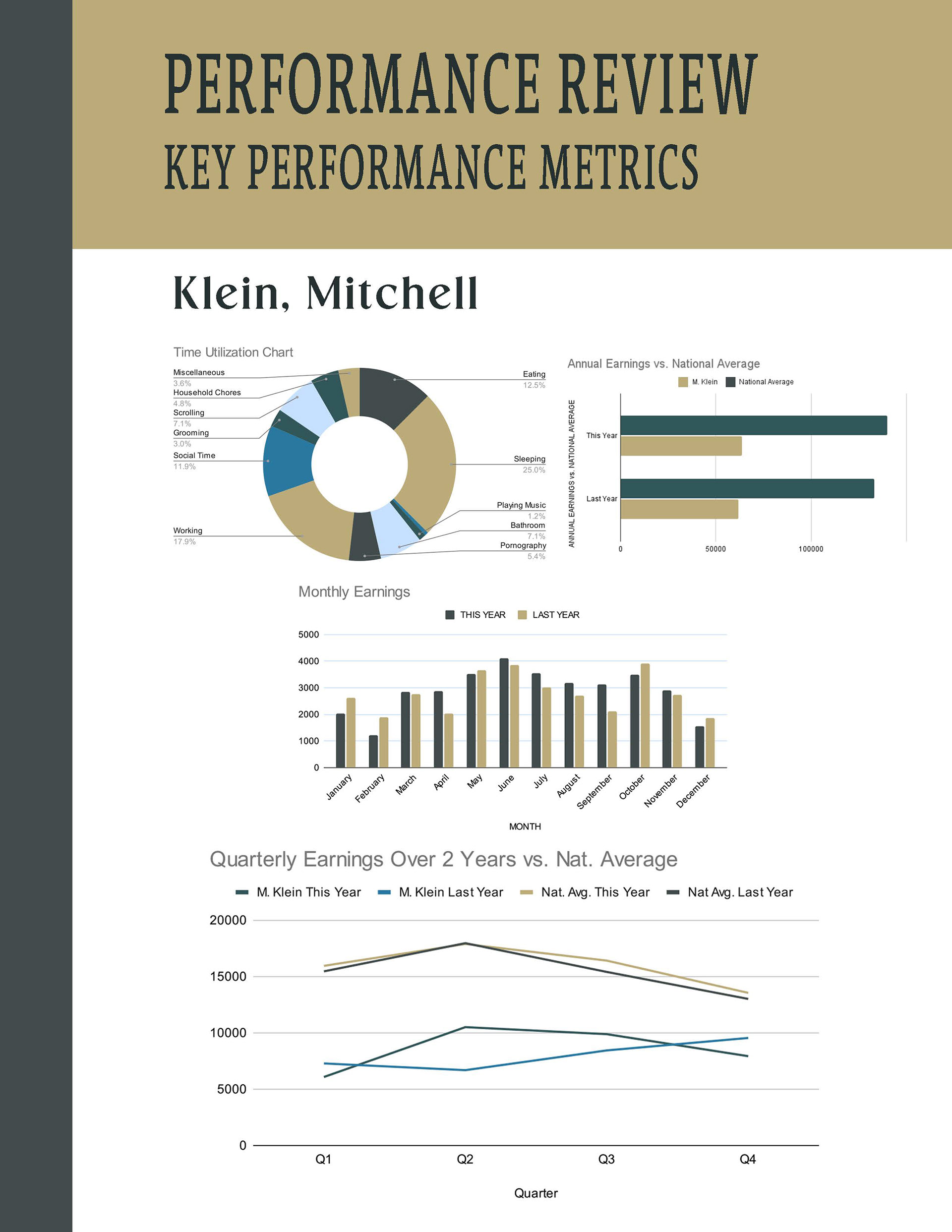
To generate the paperwork, I created a Google Sheet to rank actual statistics that I plugged in to give the graphs some genuine meaning.
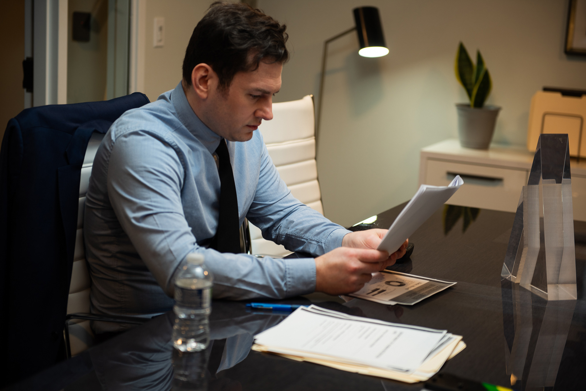
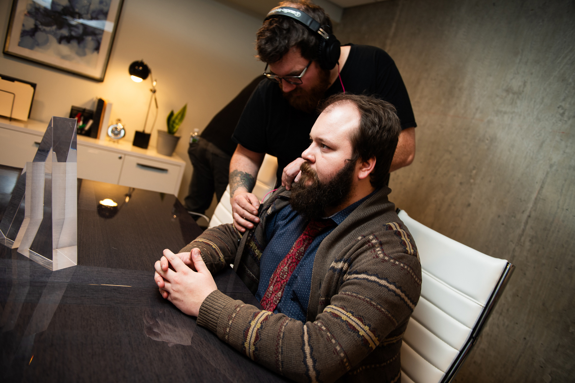
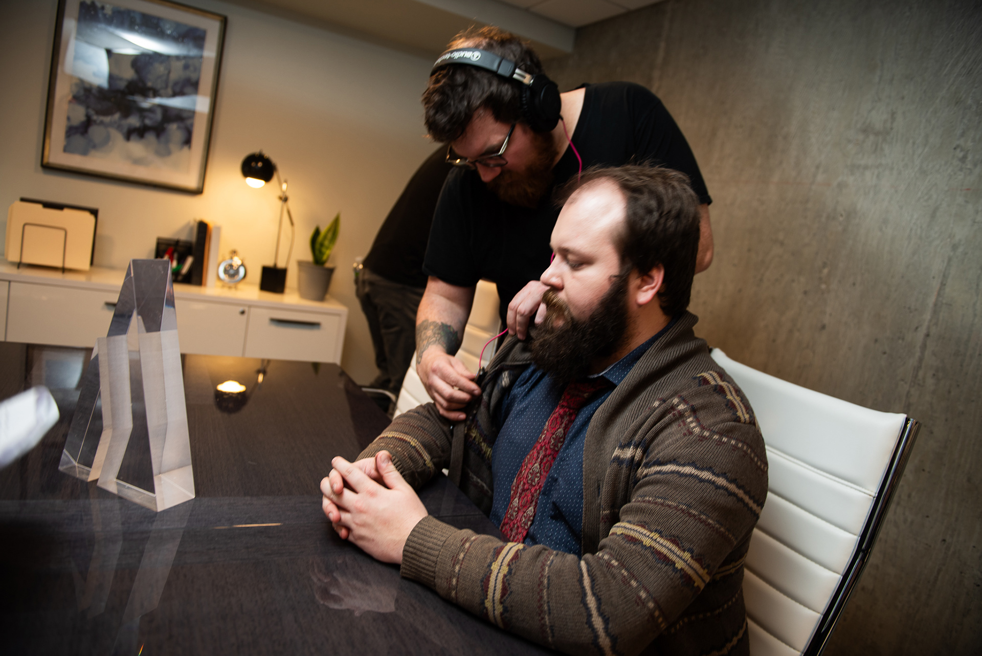
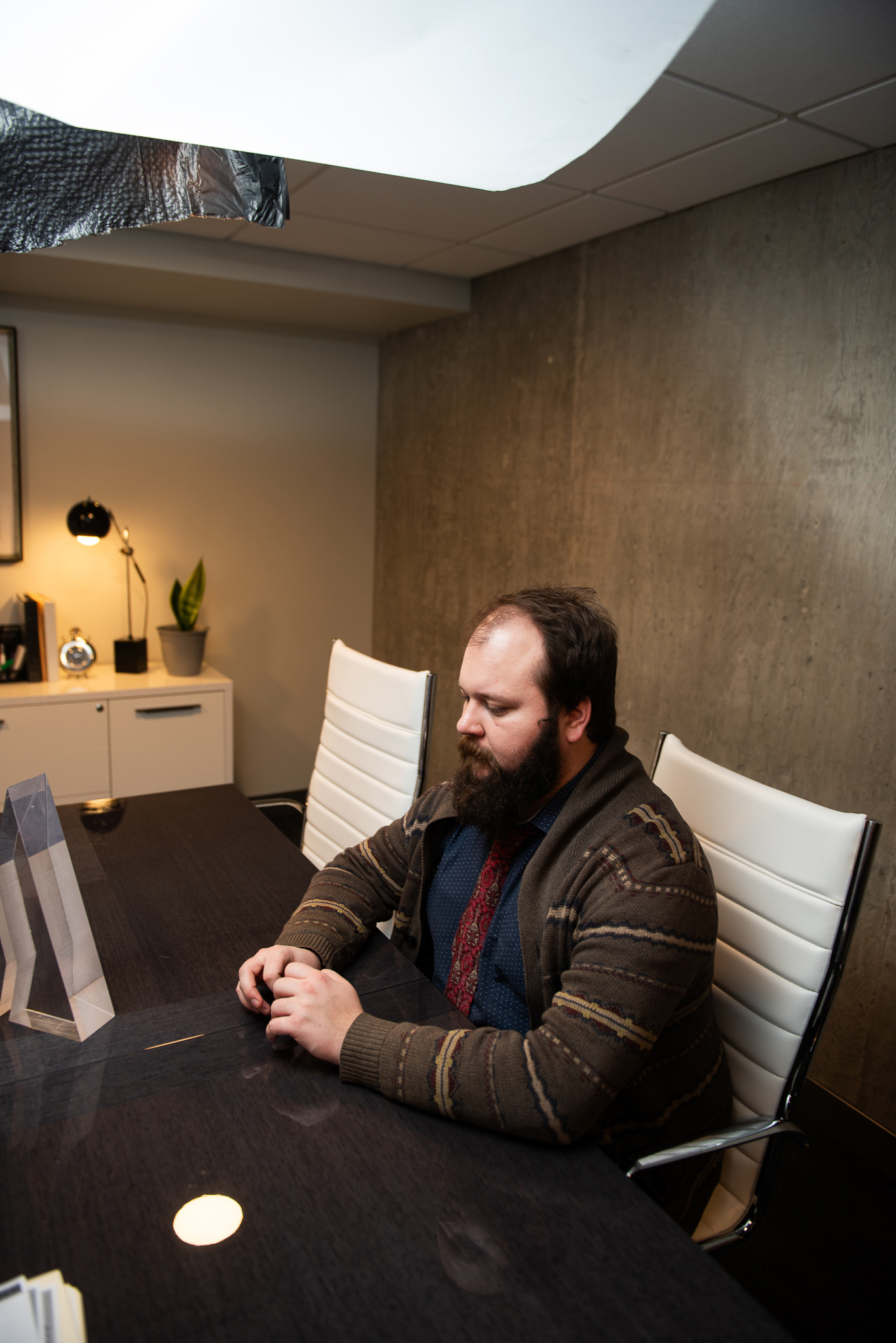
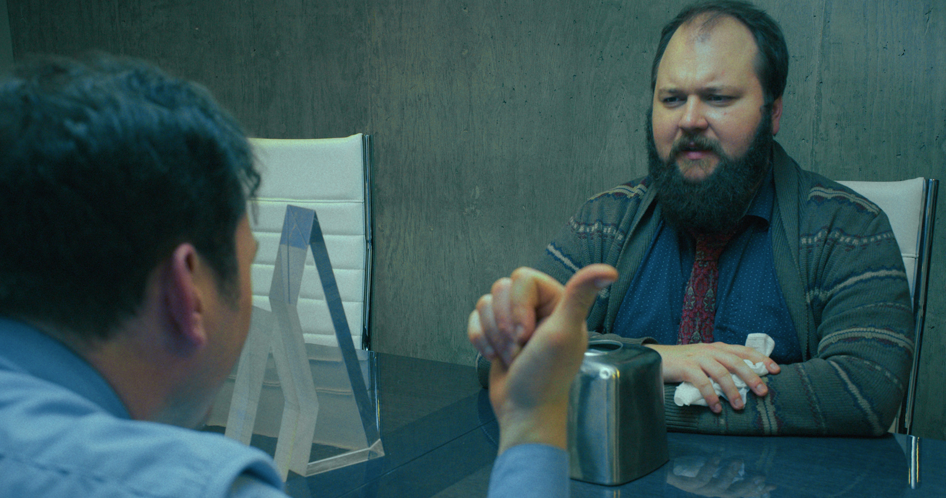
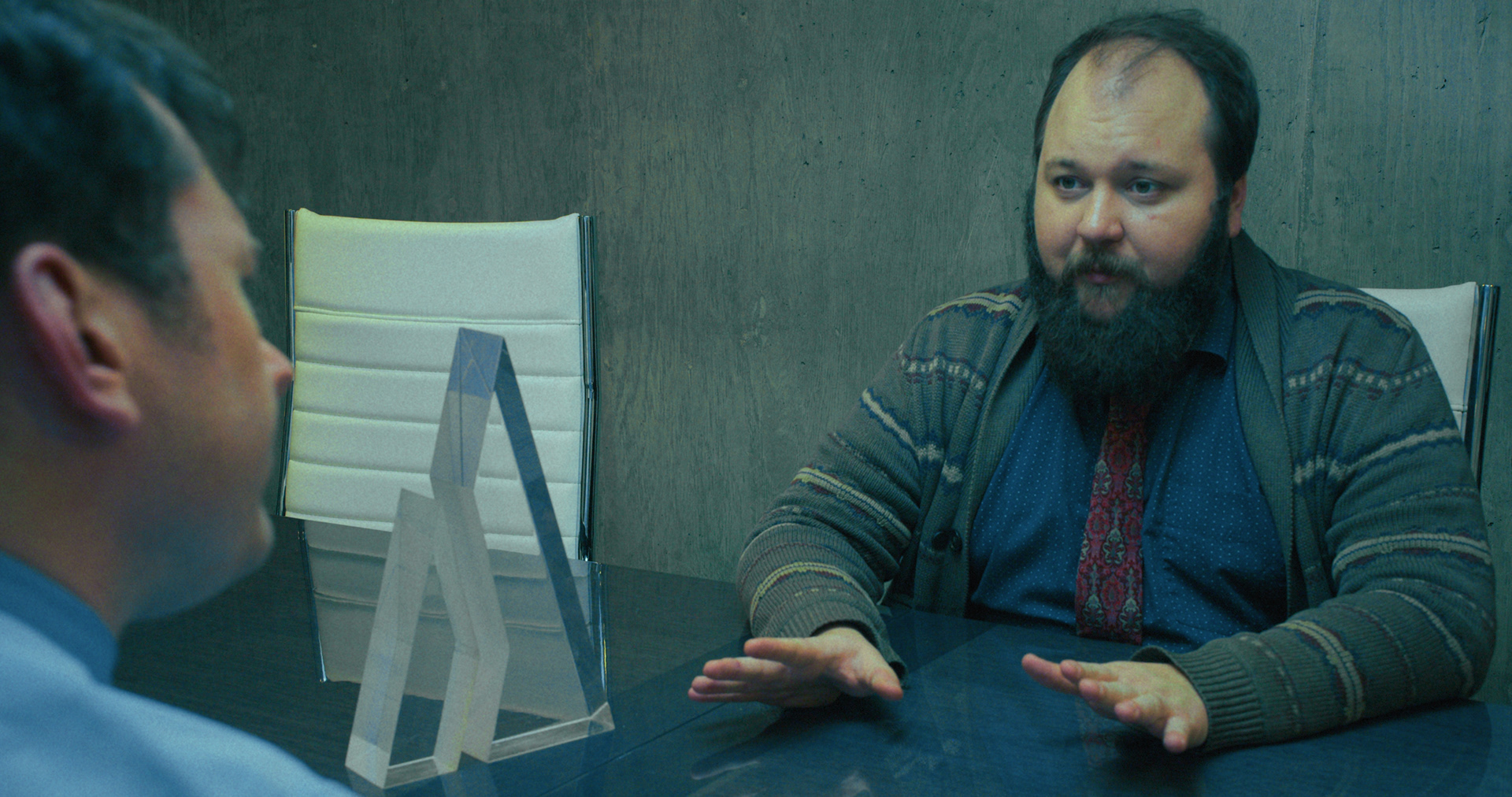
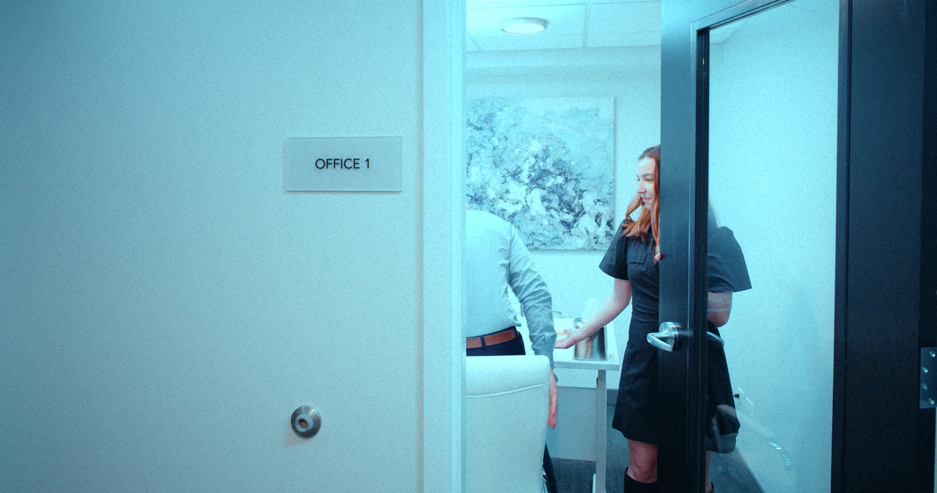
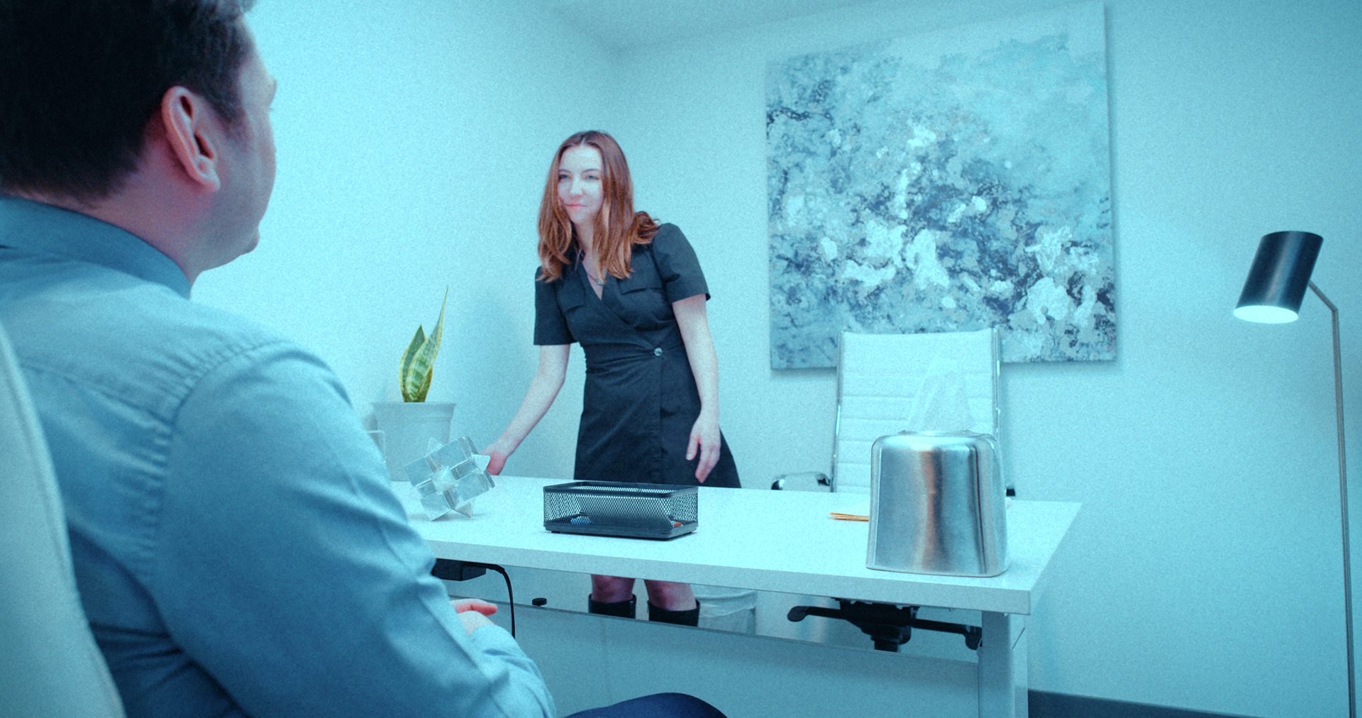
THE SETTING
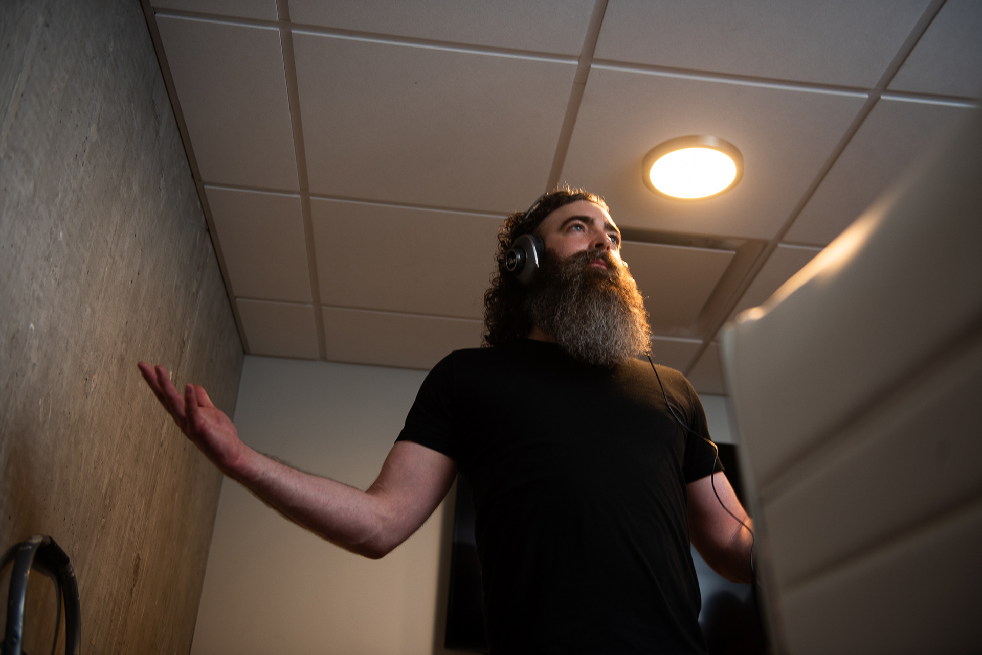
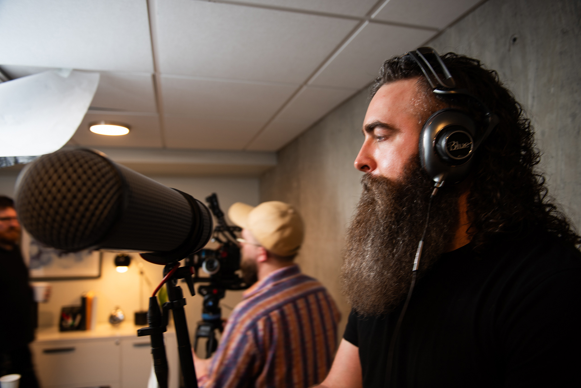
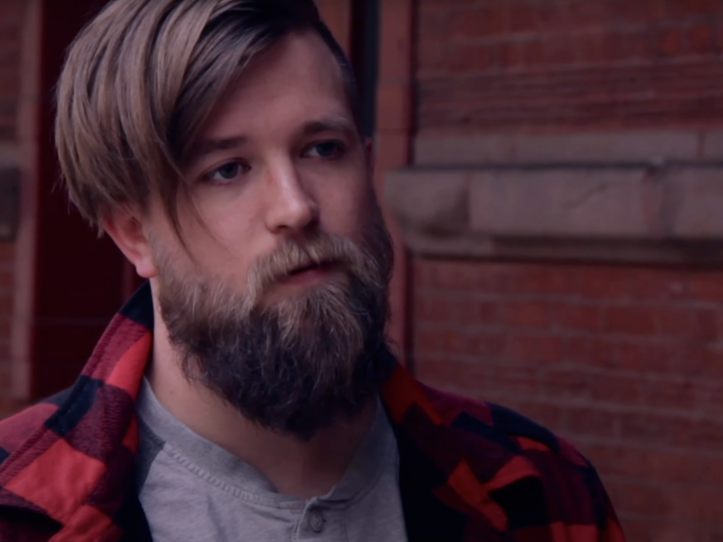
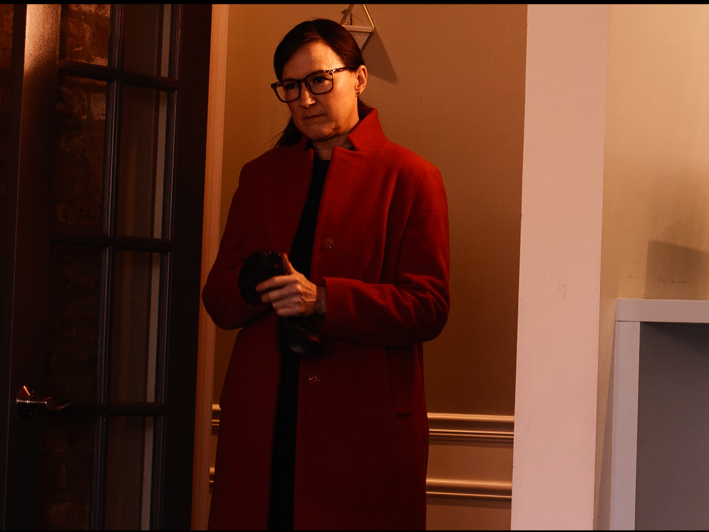
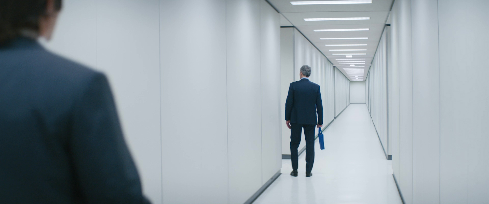
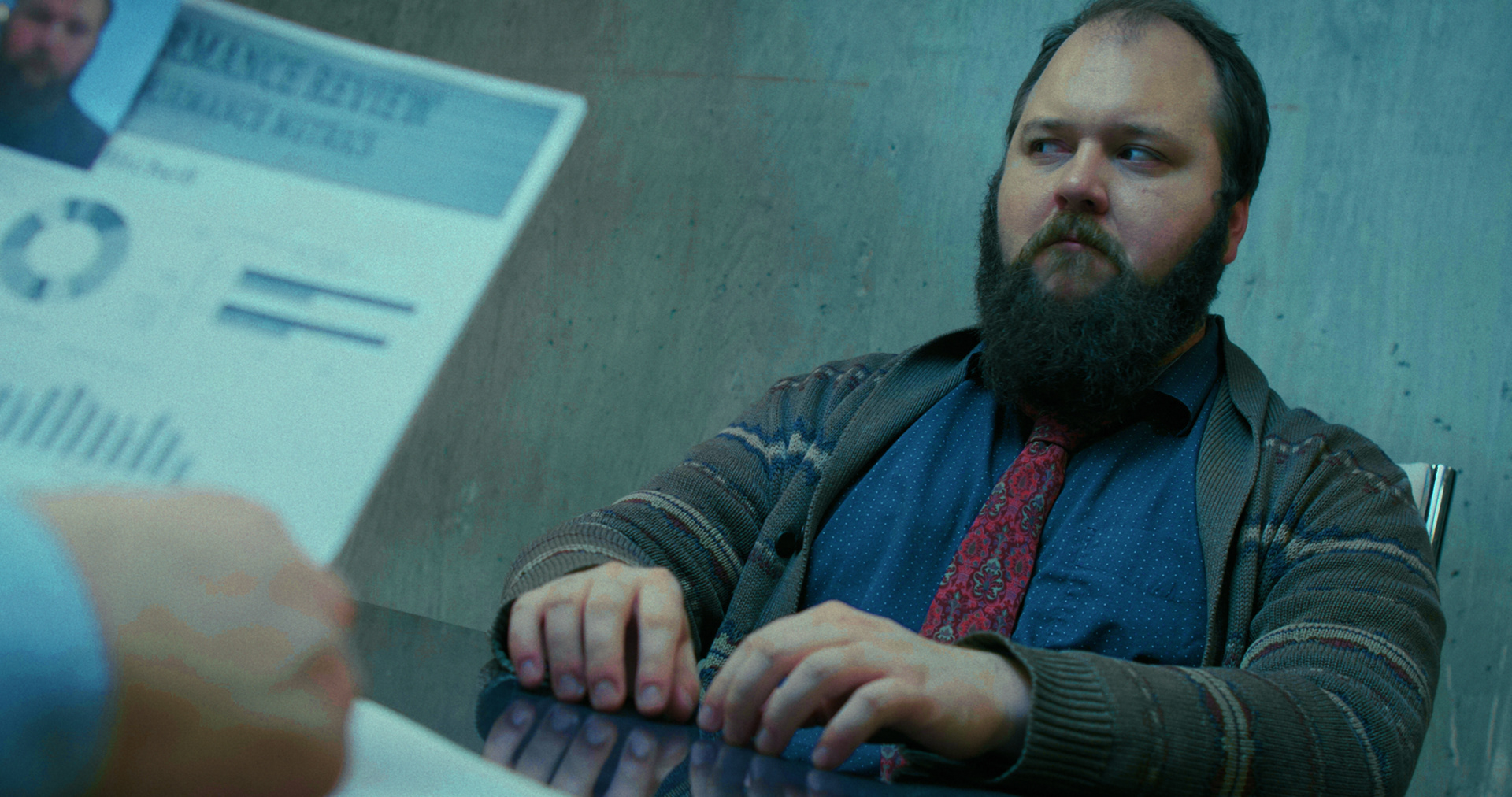
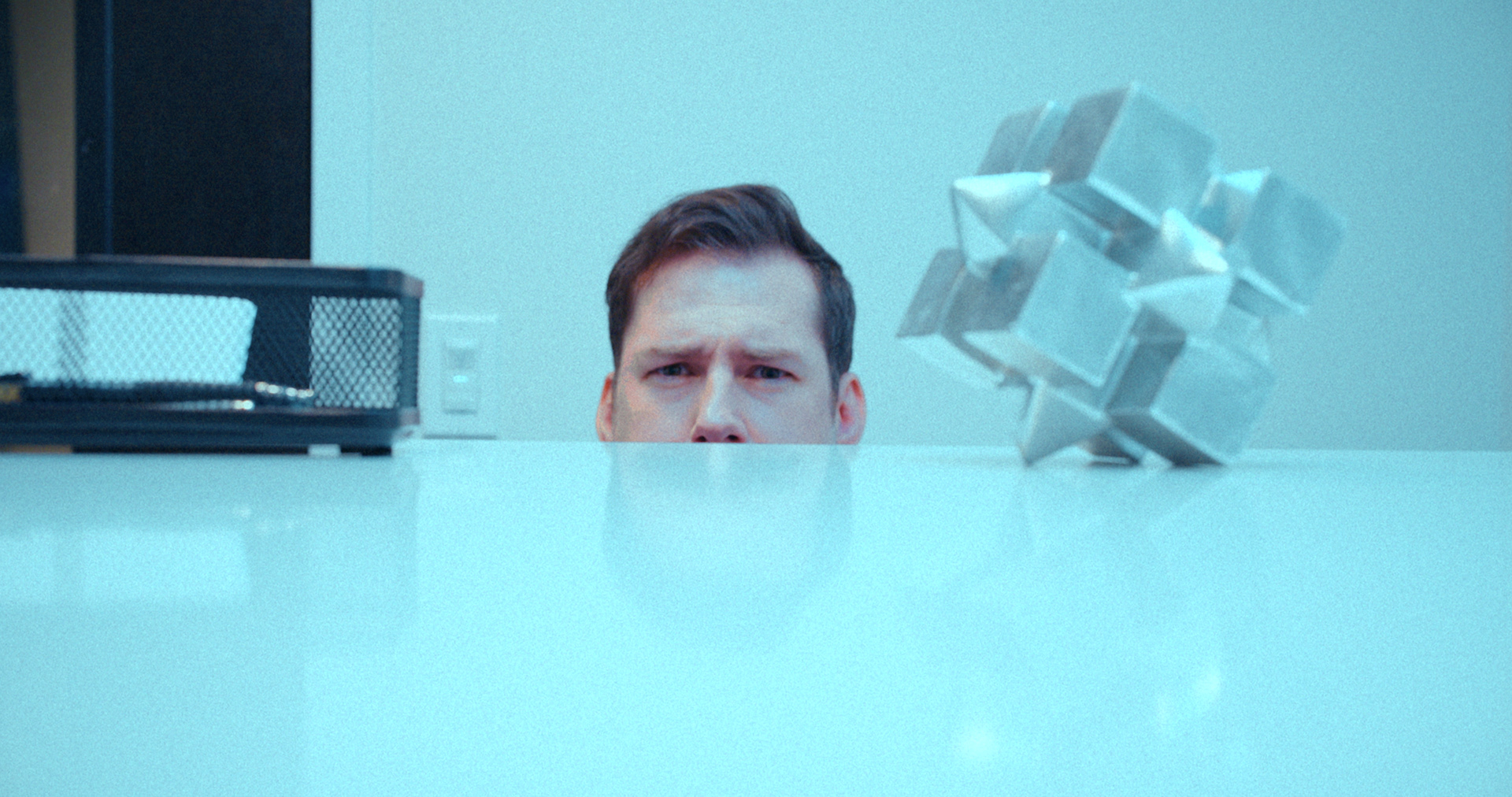
I loved this location for the contrast of the bright office drywall and the hard cement veneer that feels like a prison cell. Putting Mitch up against that texture made him feel flat and pressed. We added some pieces of geometric decor that felt brutalist, and harsh. Jagged edges and dense materials added to the pressure of the environment.


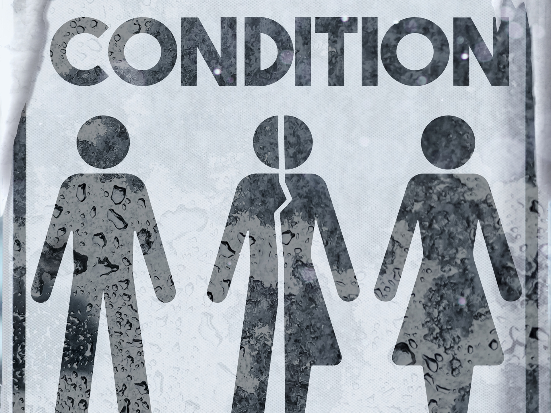
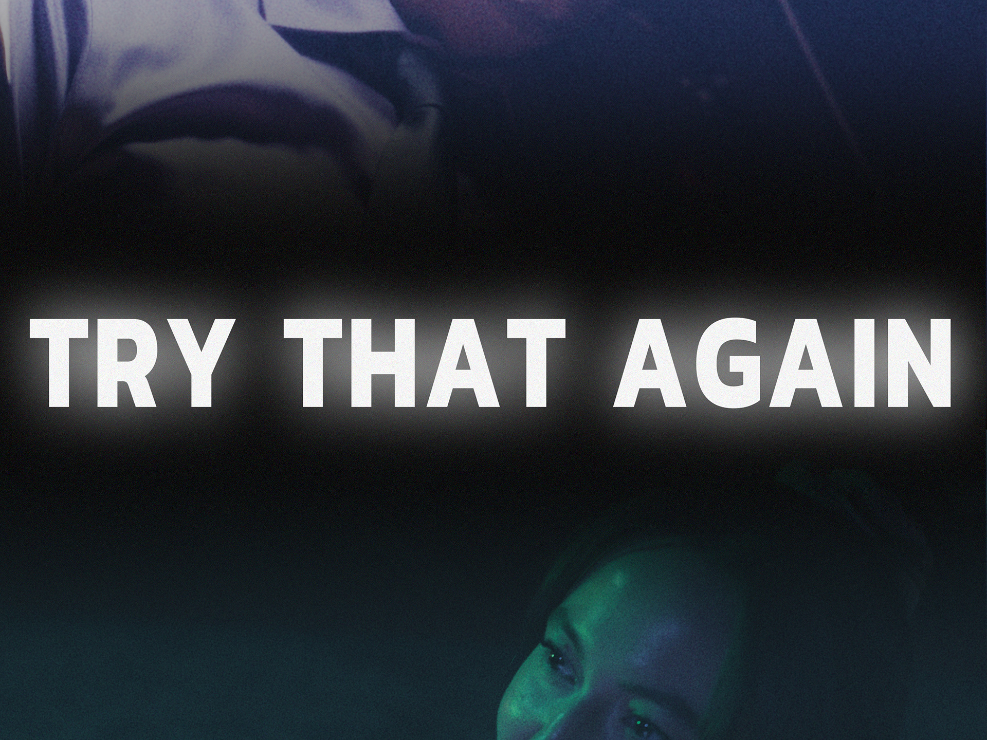
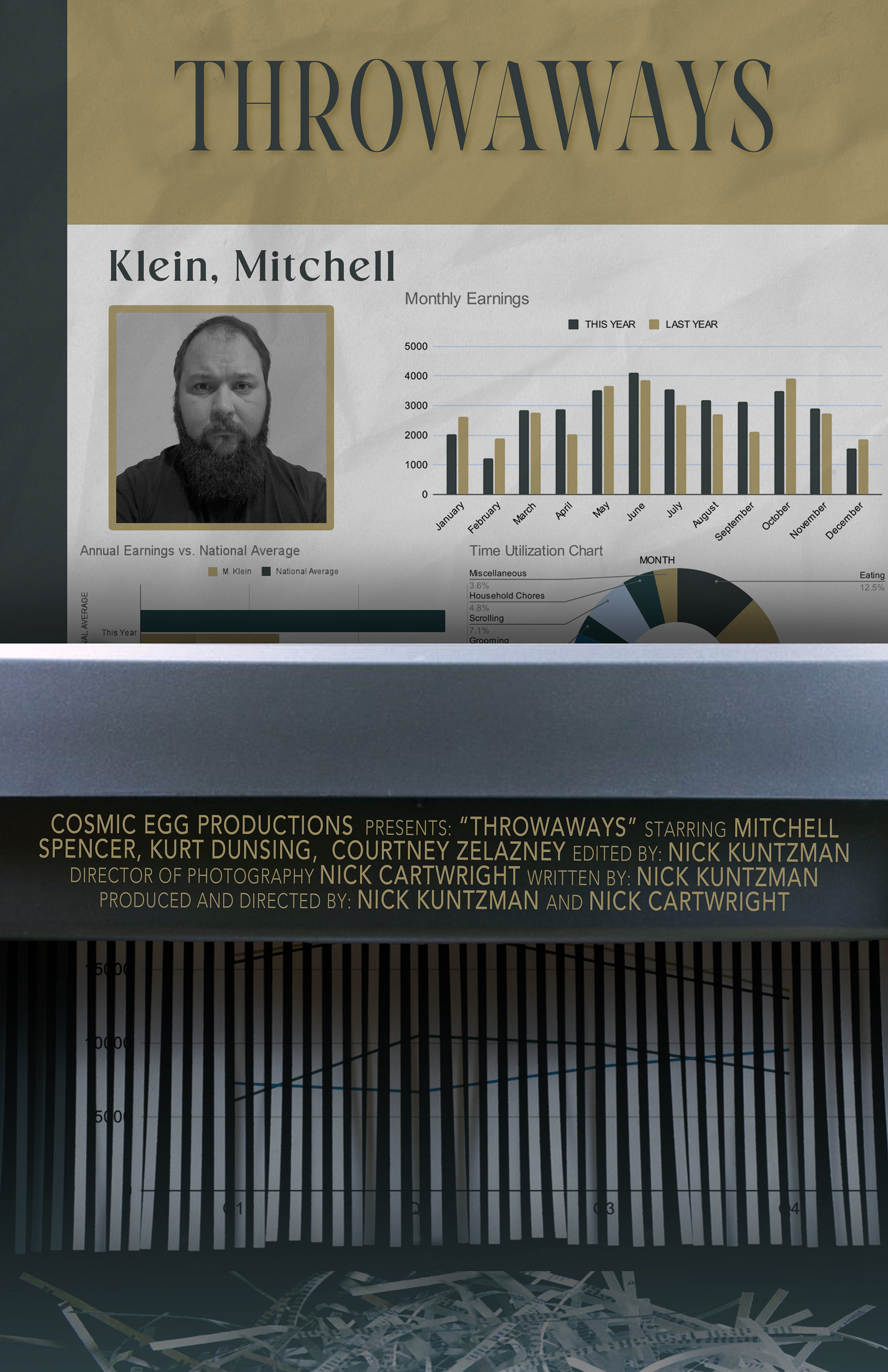
THE POSTER DESIGN
For the poster design, I started with my design for the corporate paperwork. At first, I tried incorporating the cement wall texture behind Mitch throughout the film, but the design felt flat, so then I made the design look like an actual sheet of paper and showed it being put through a shredder - which I felt strongly captured the themes of the film.
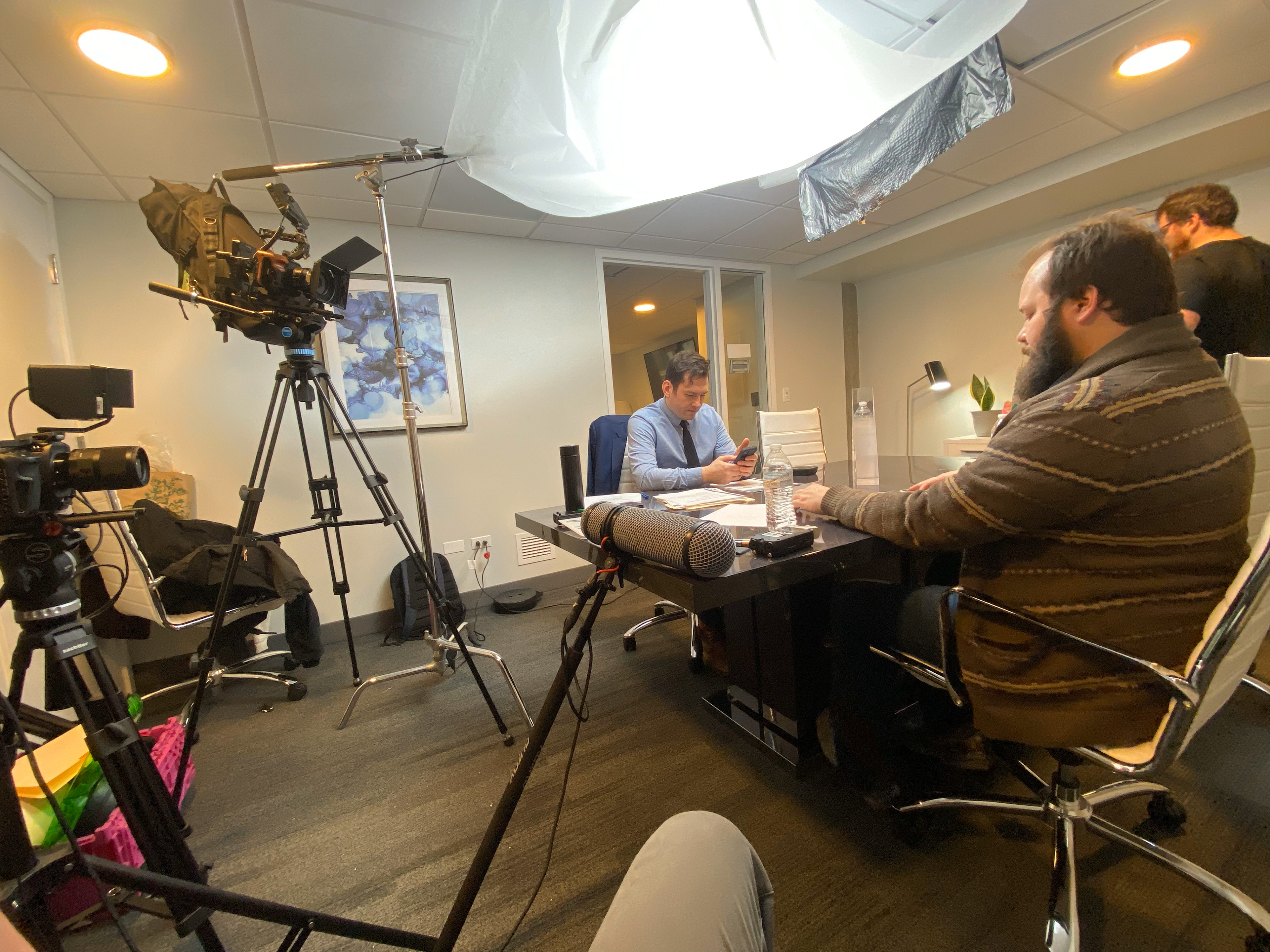
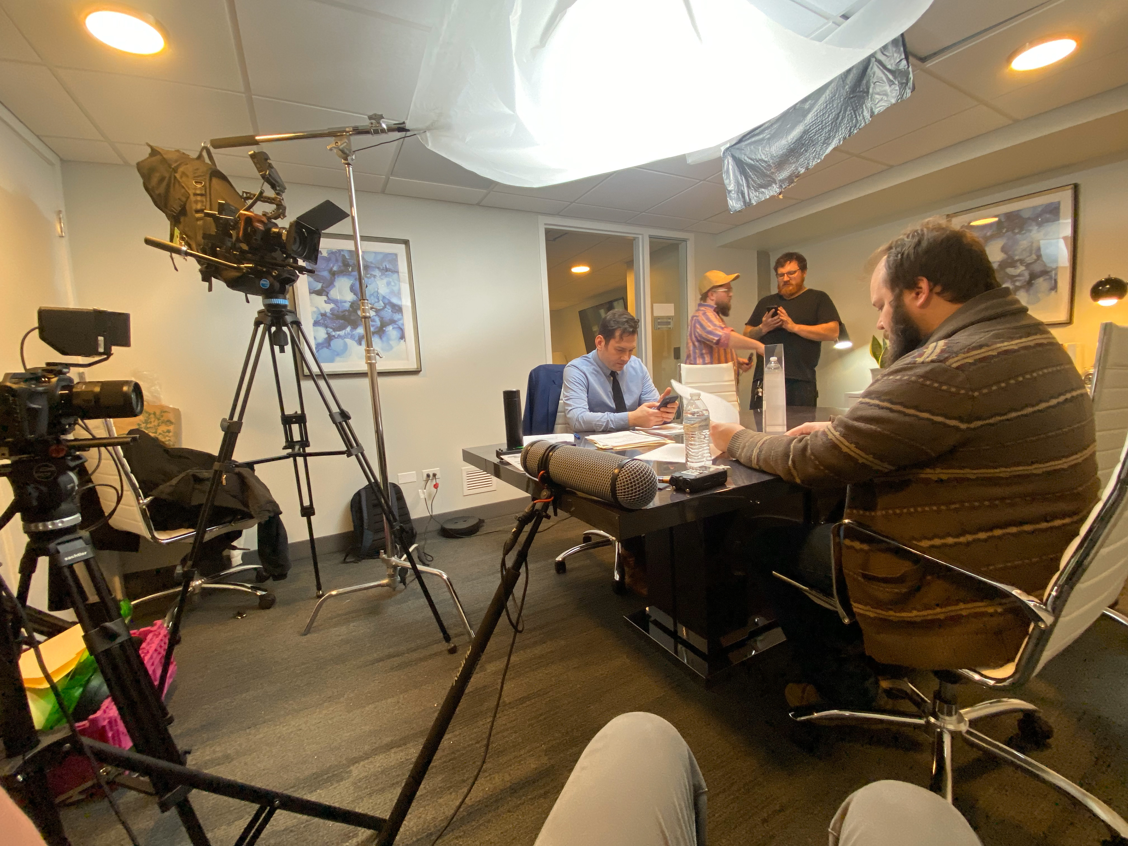
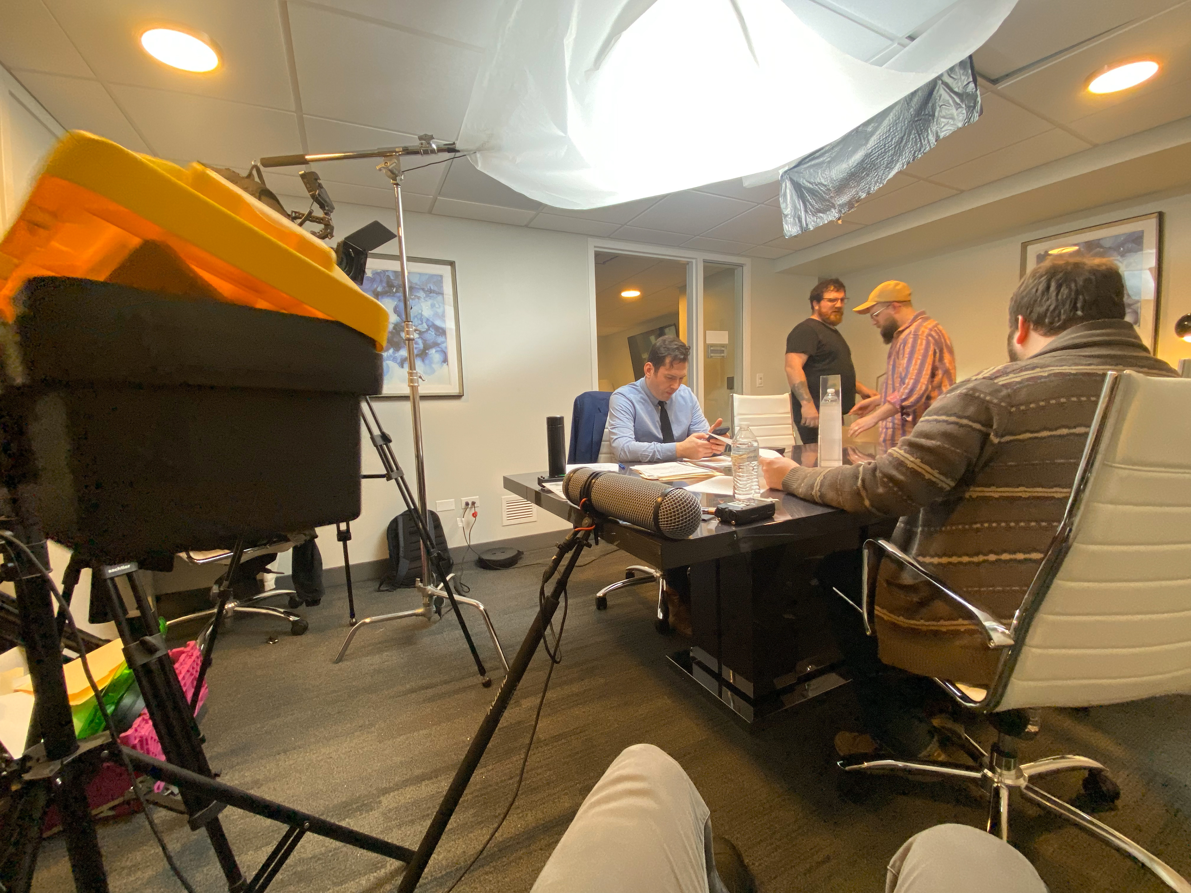
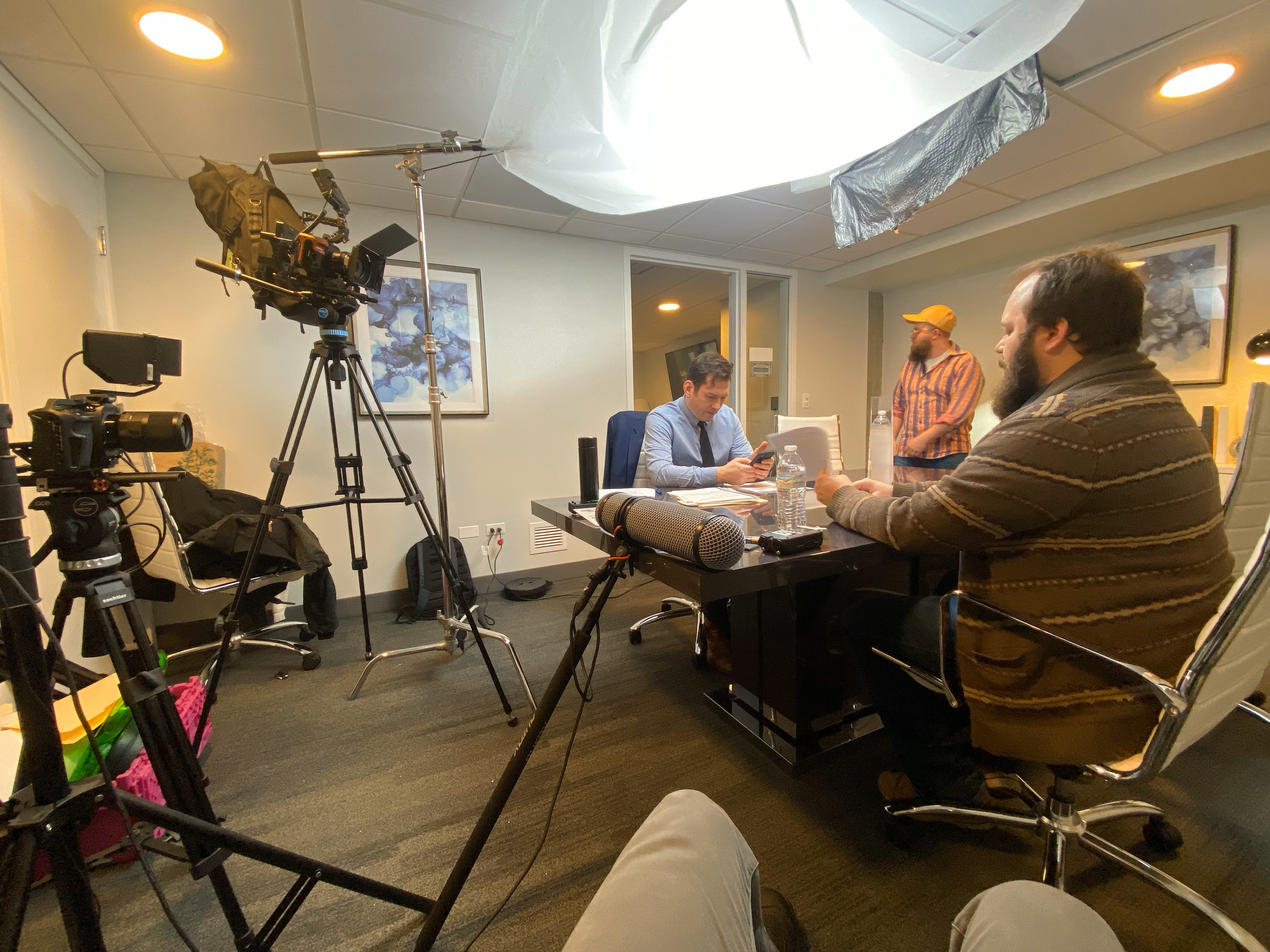
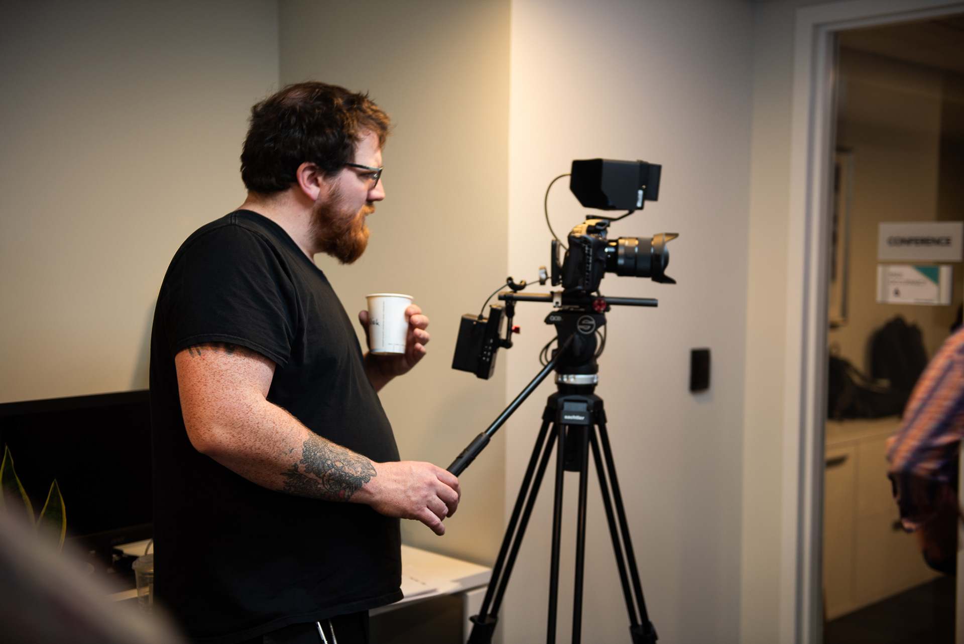
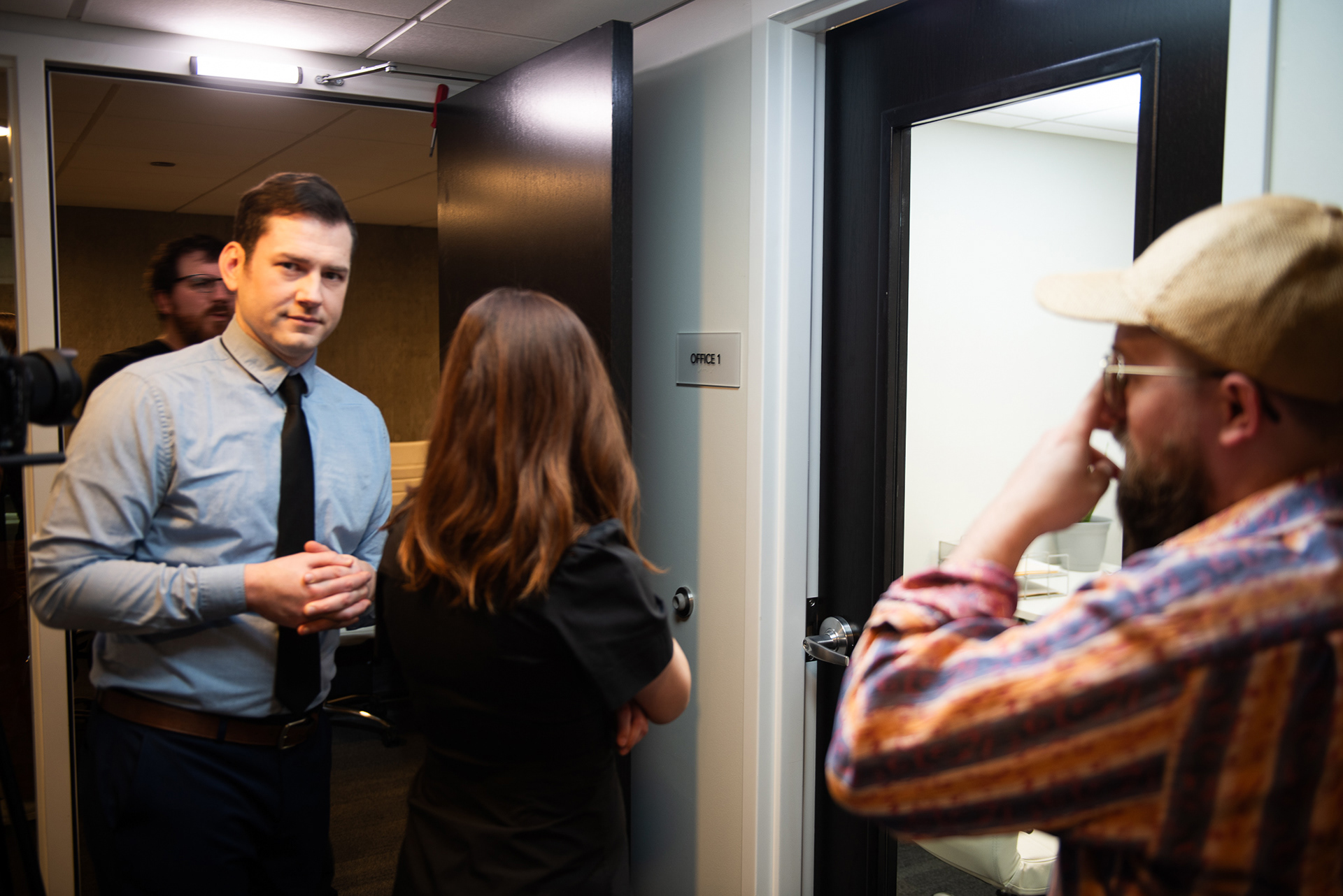
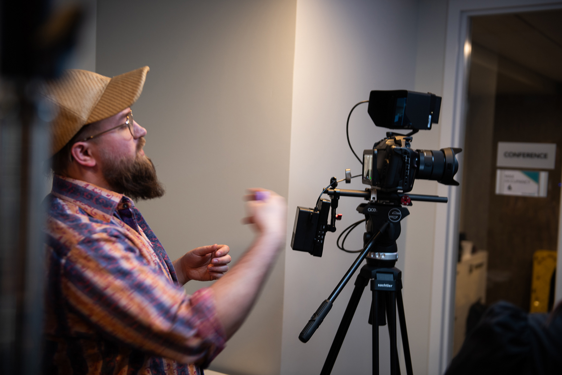
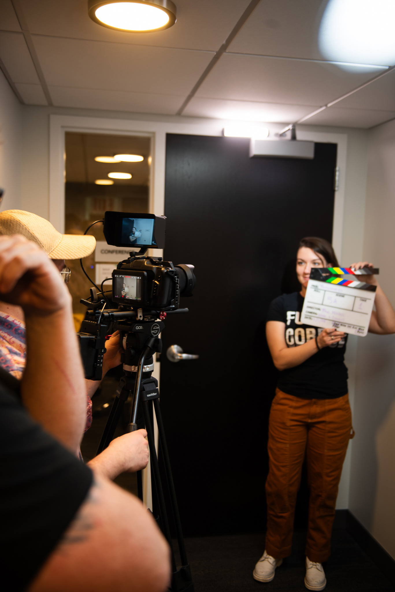
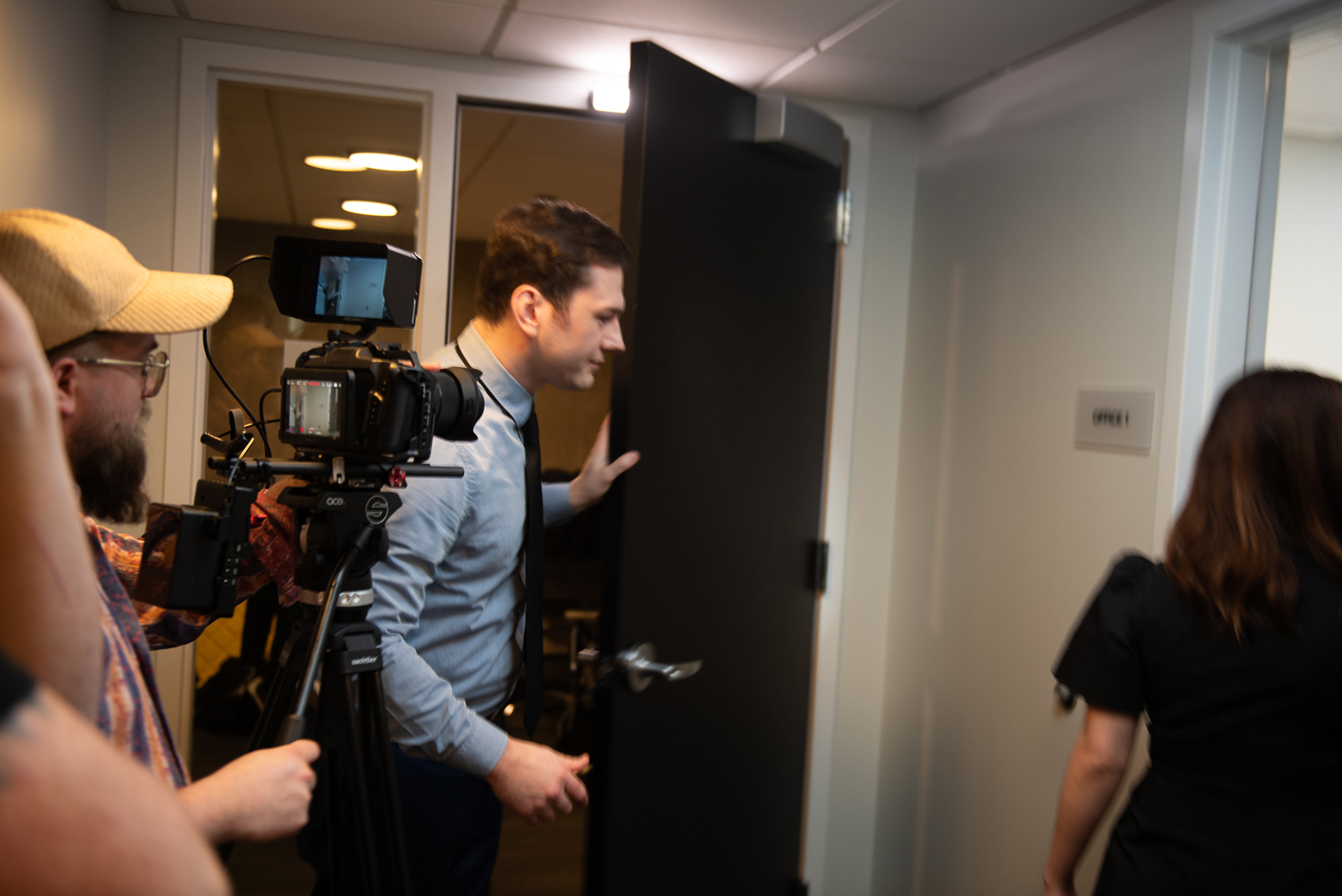
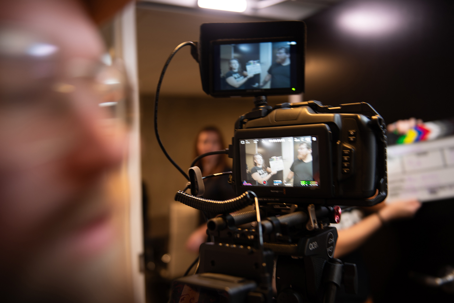
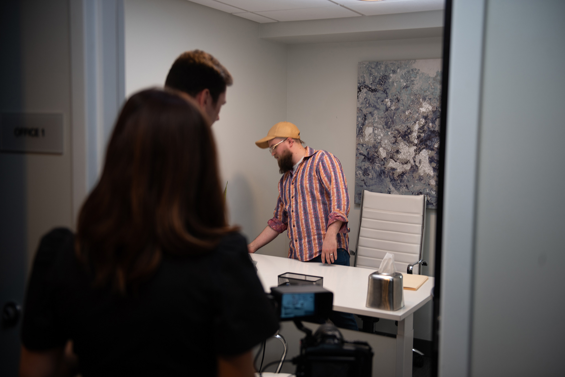
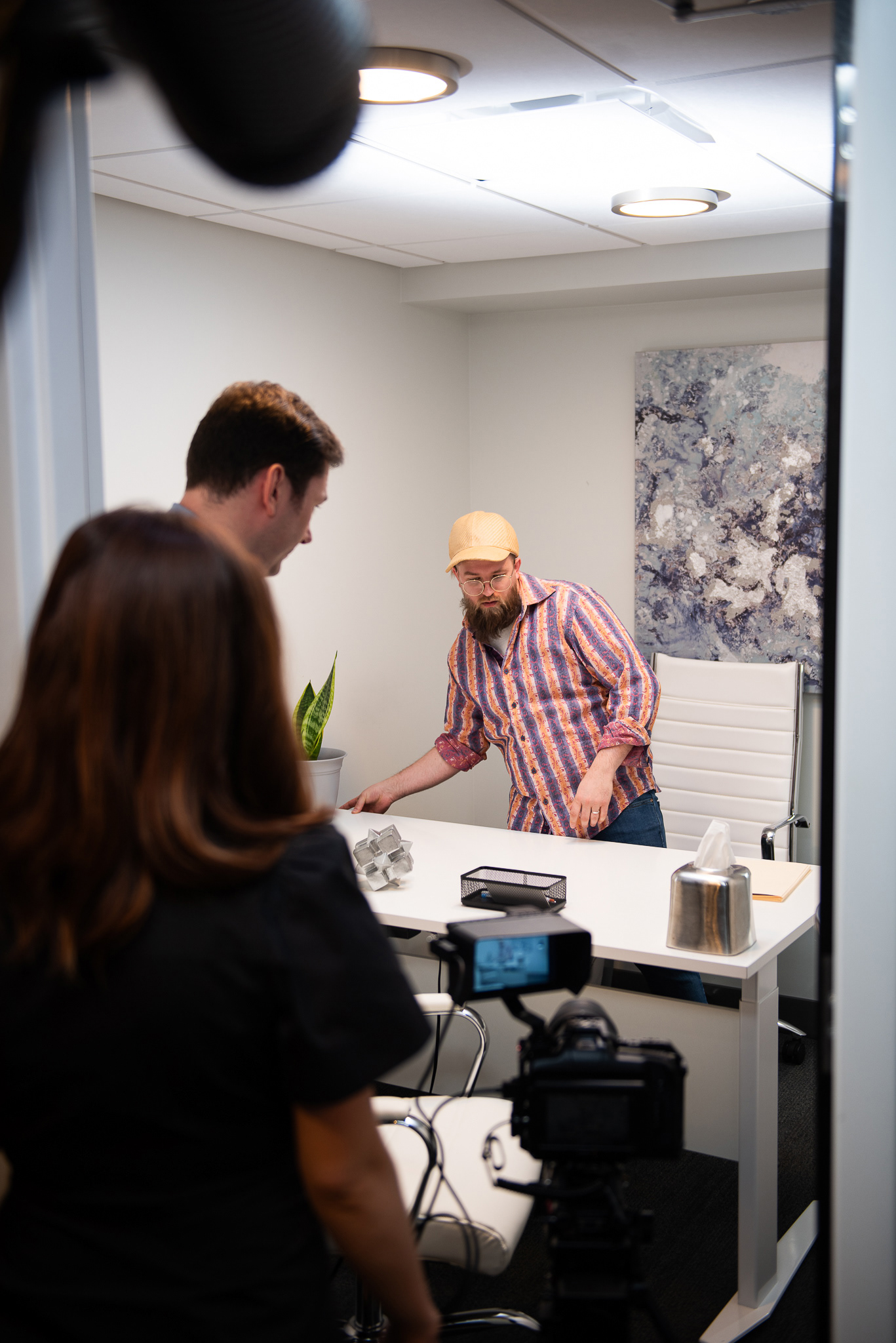
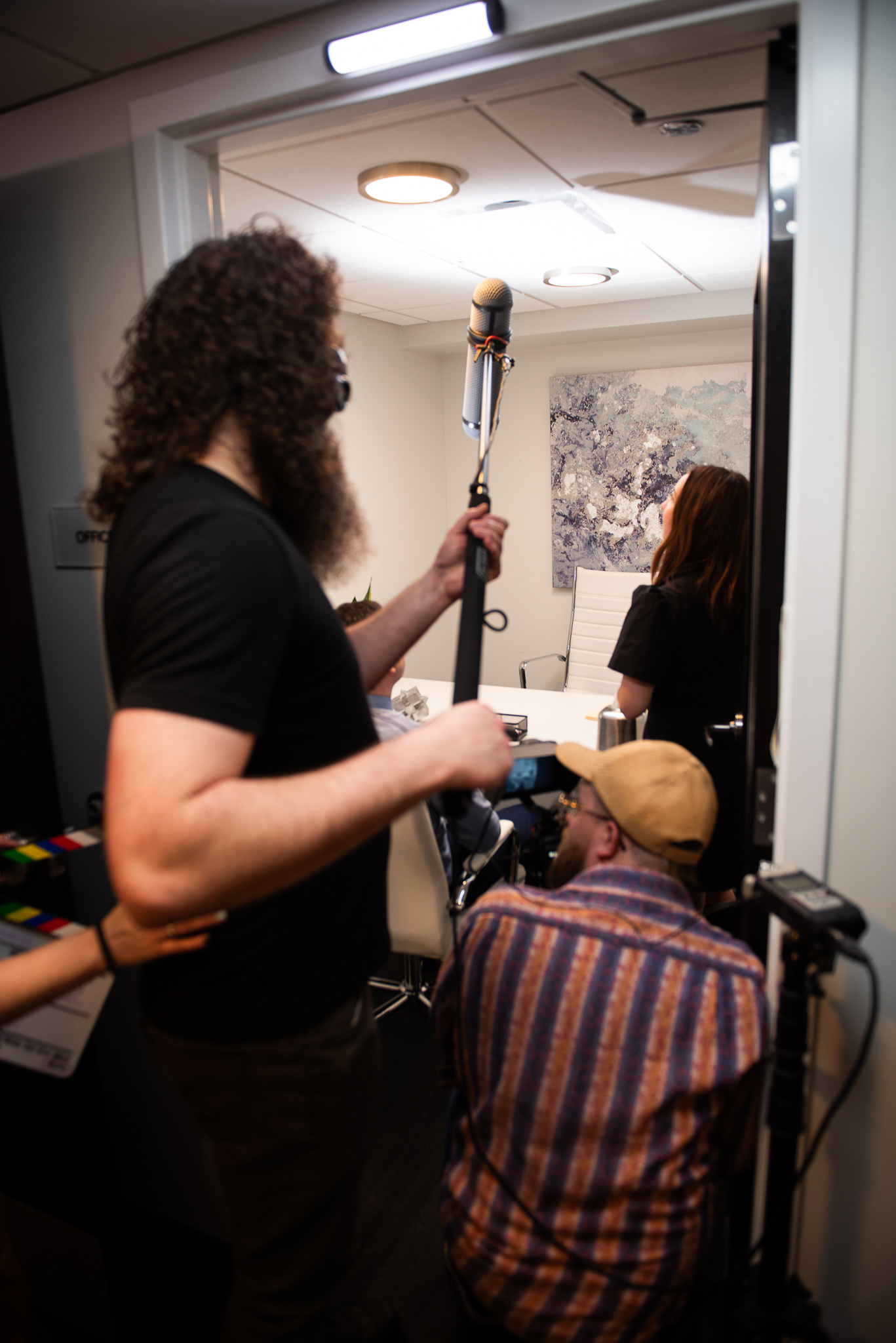
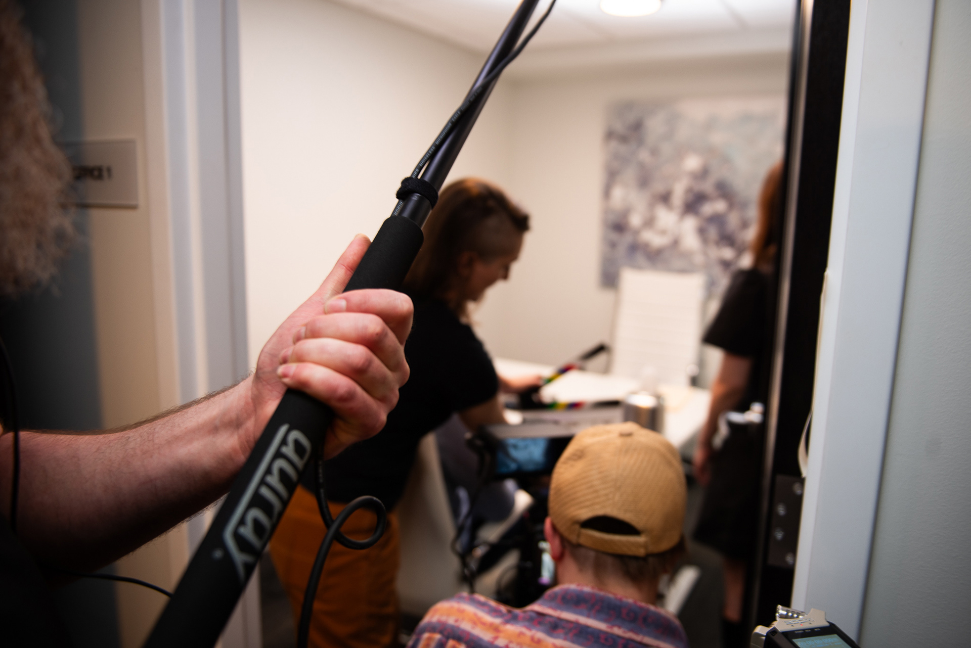
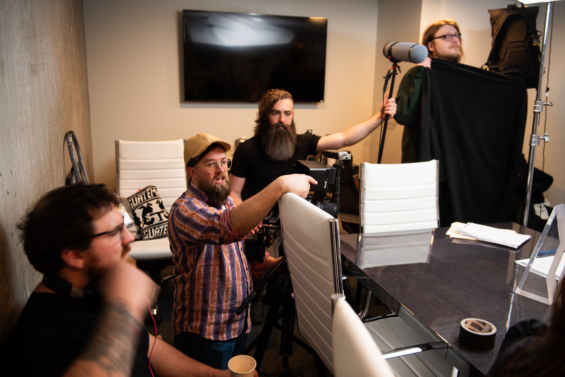
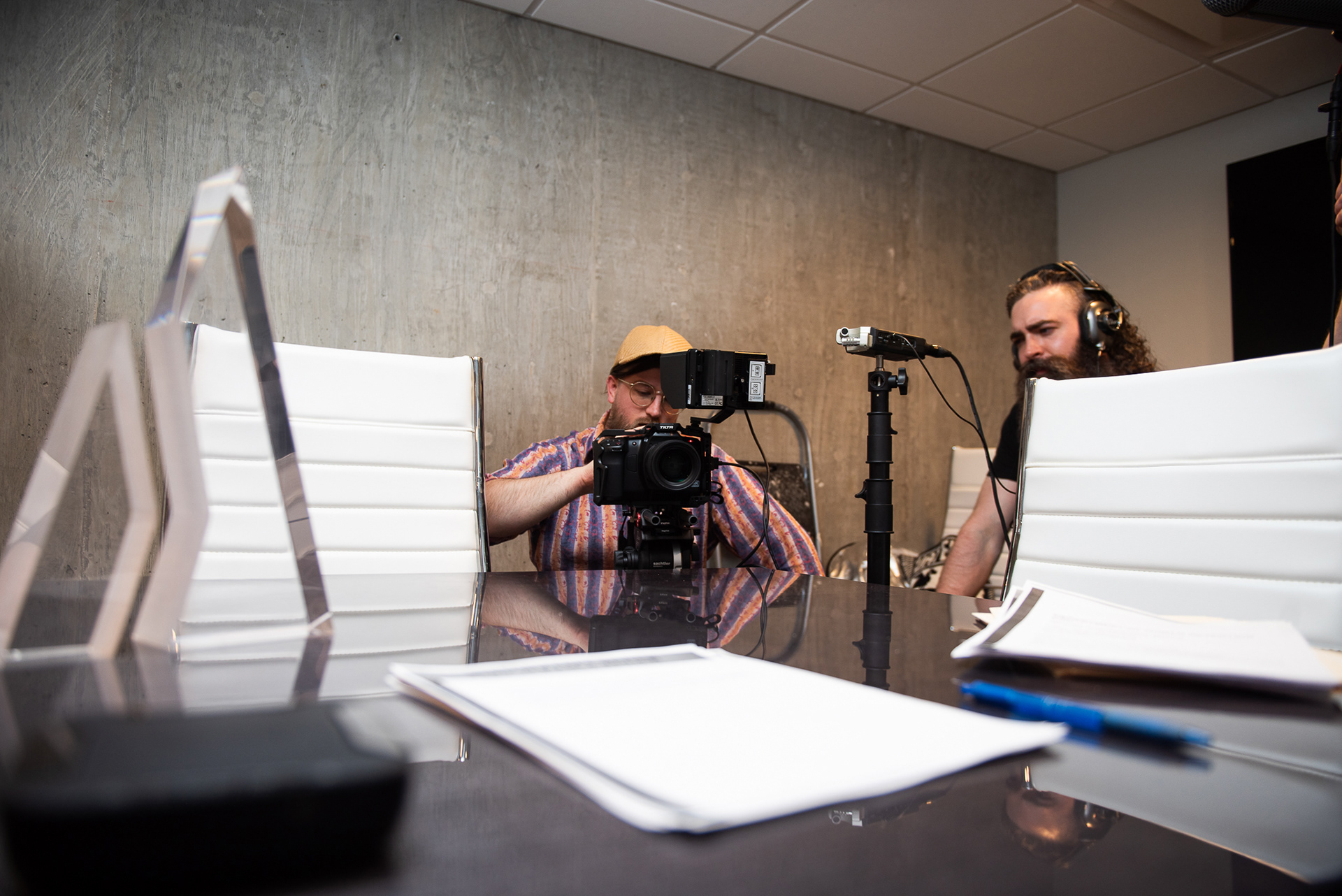
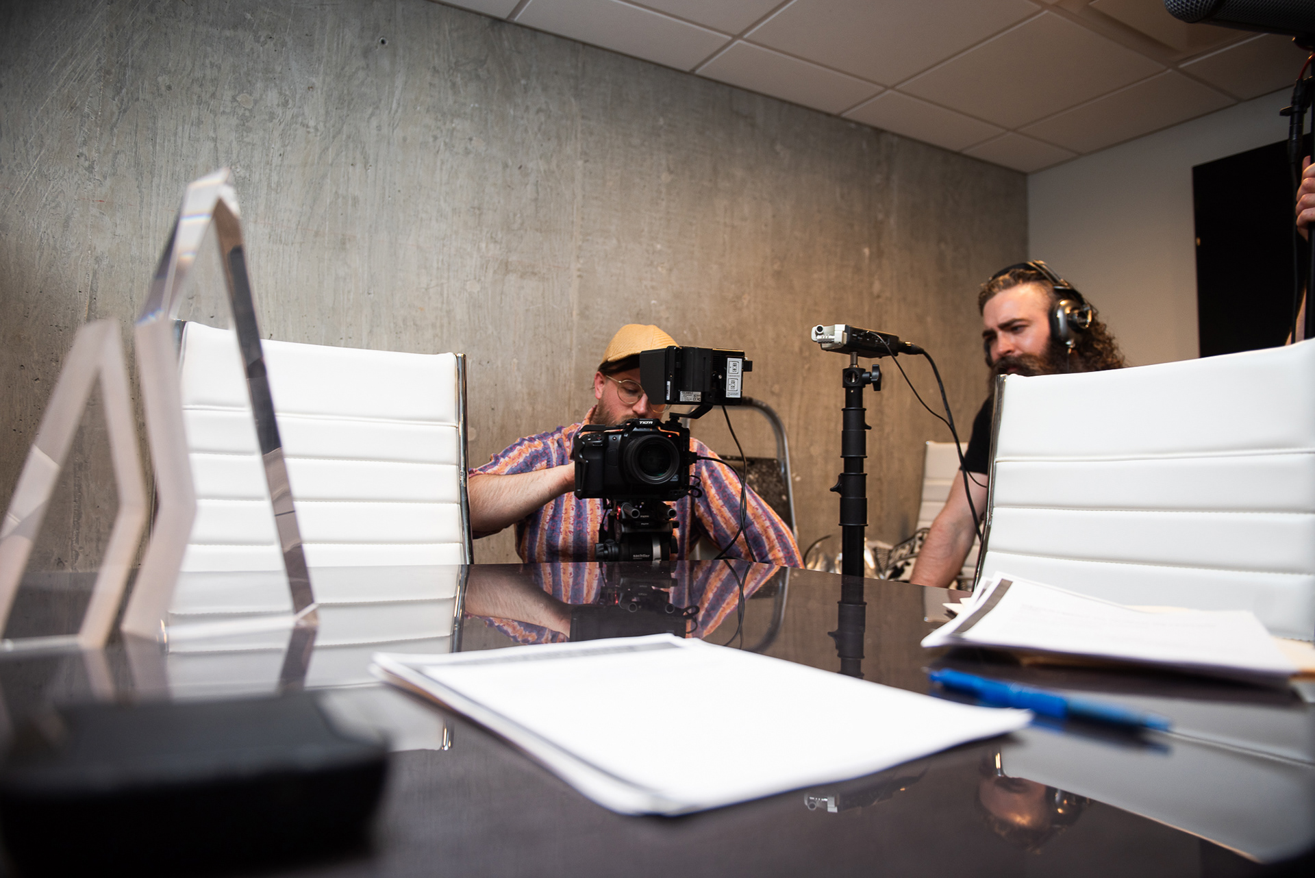
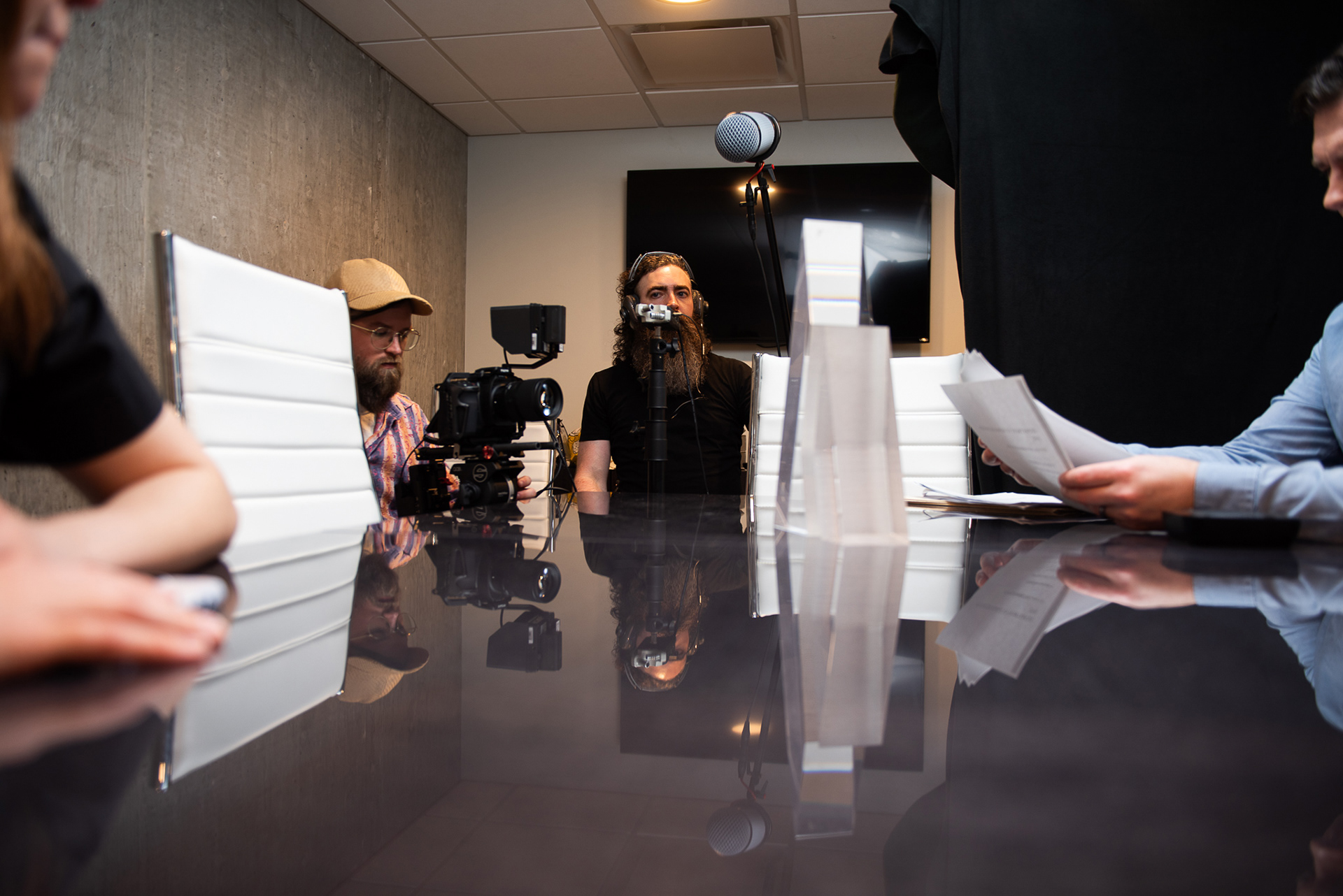
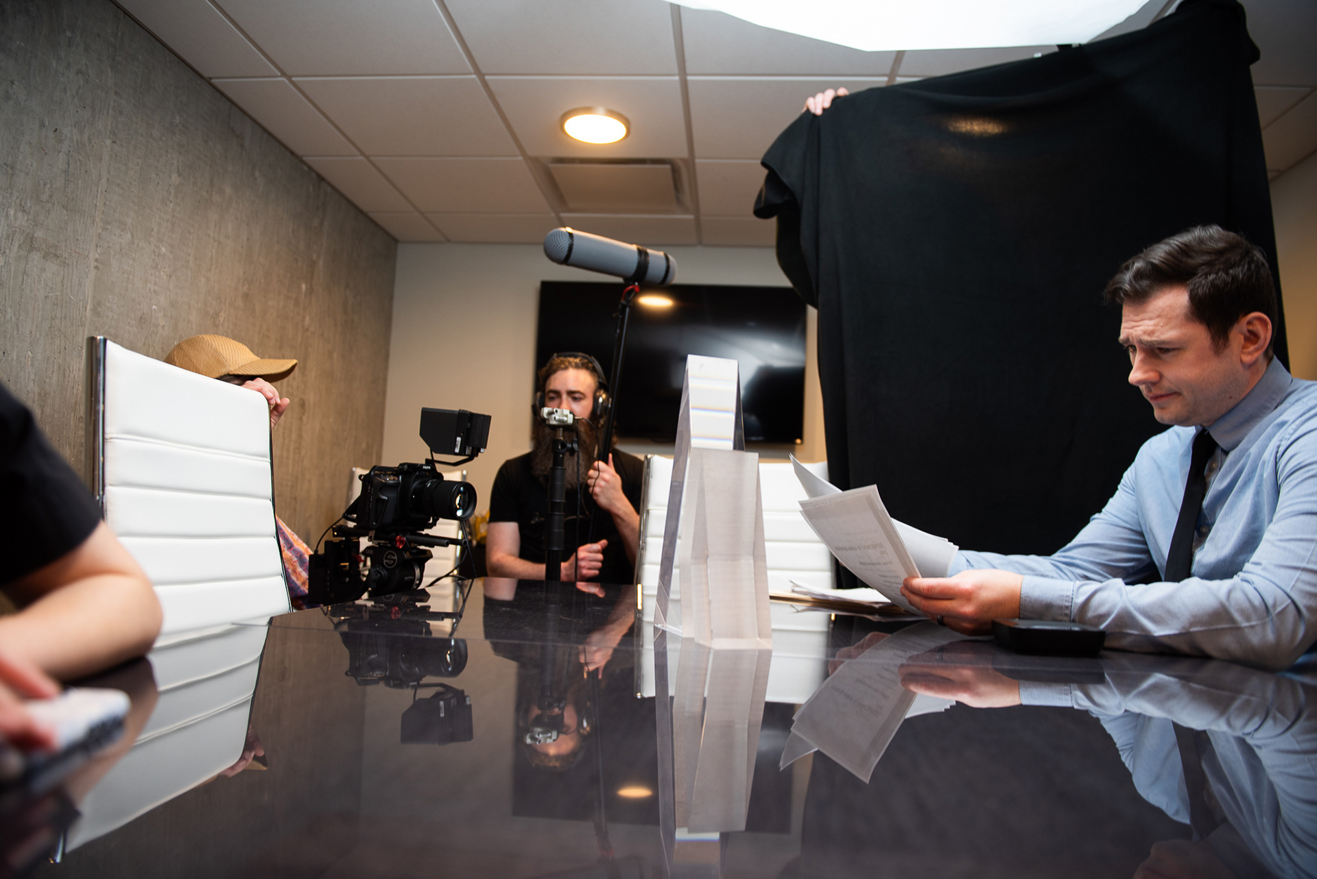
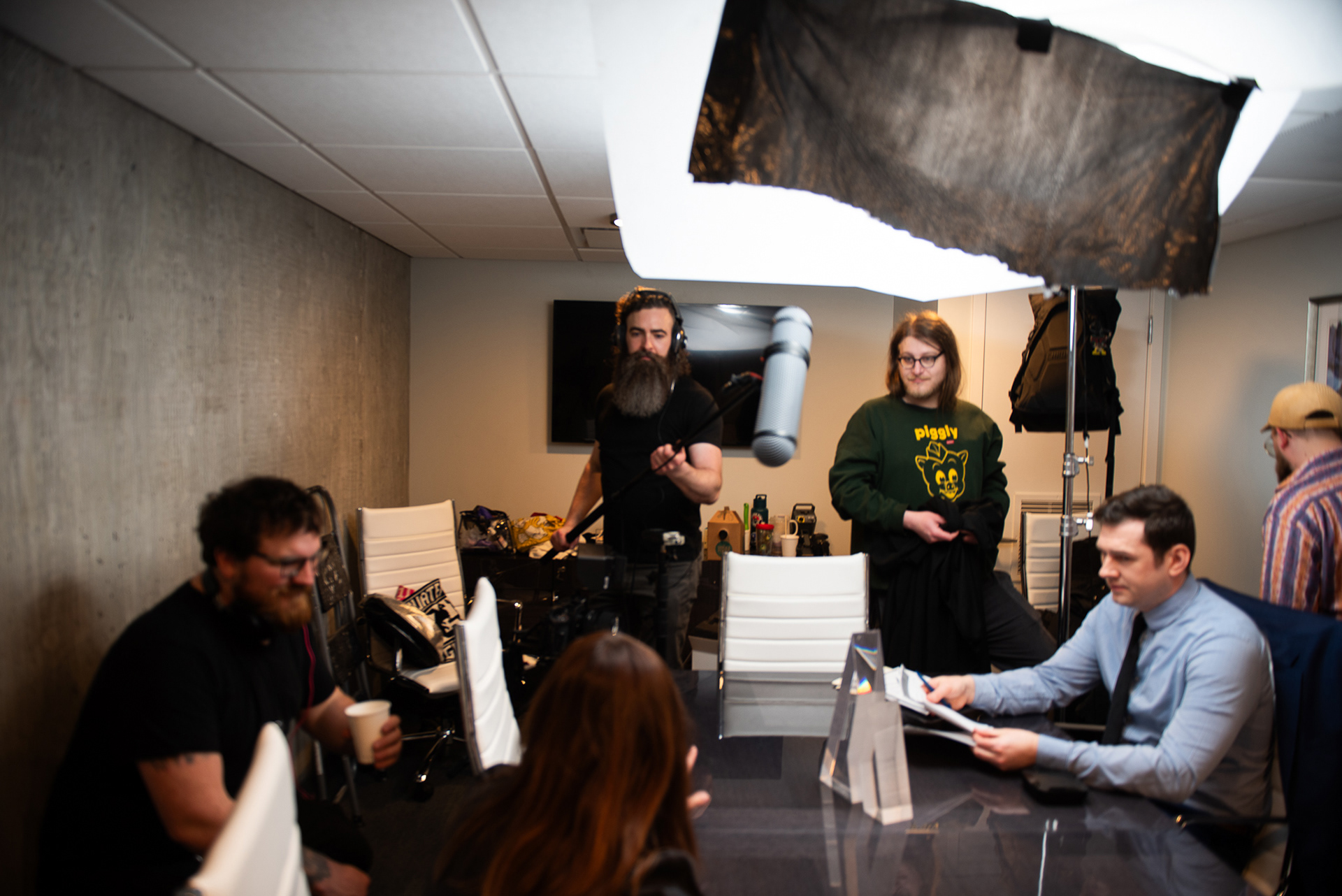
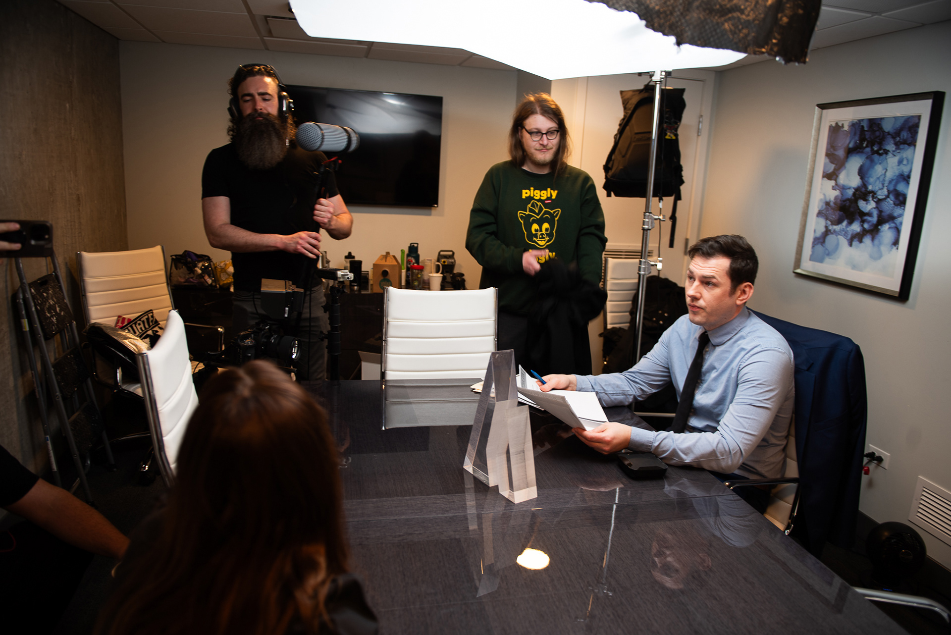
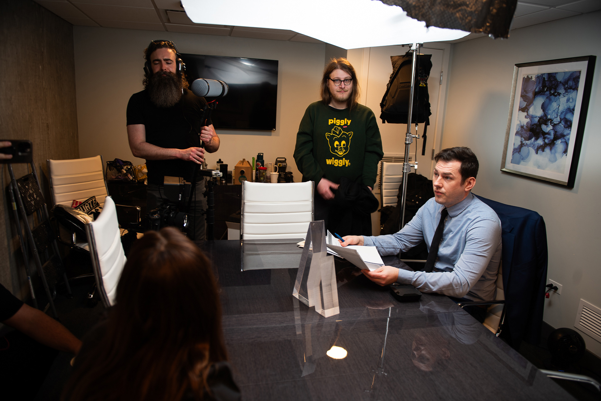
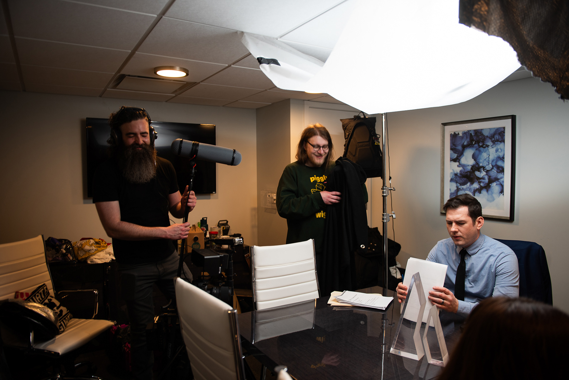
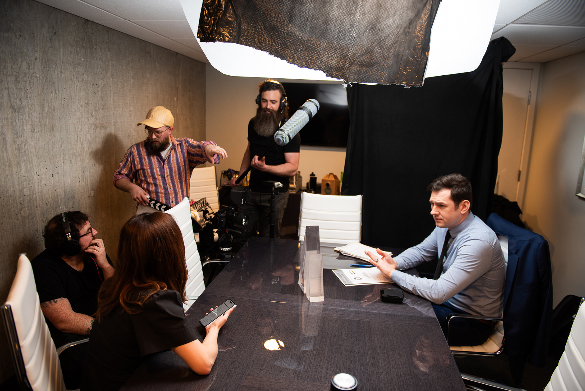
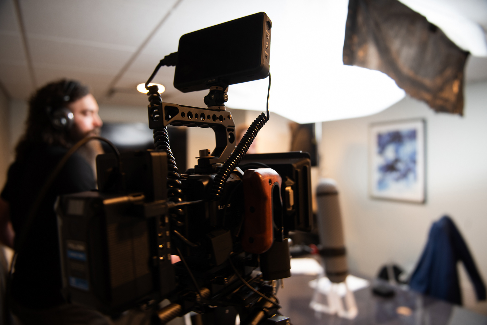
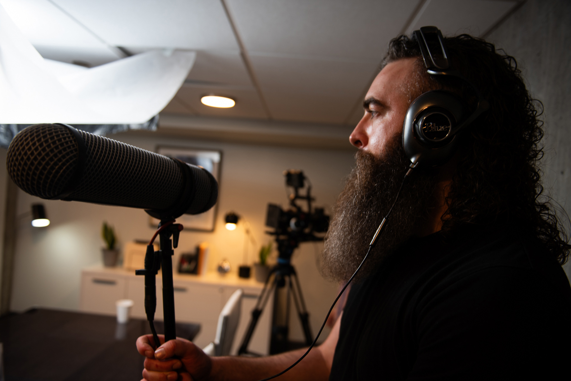
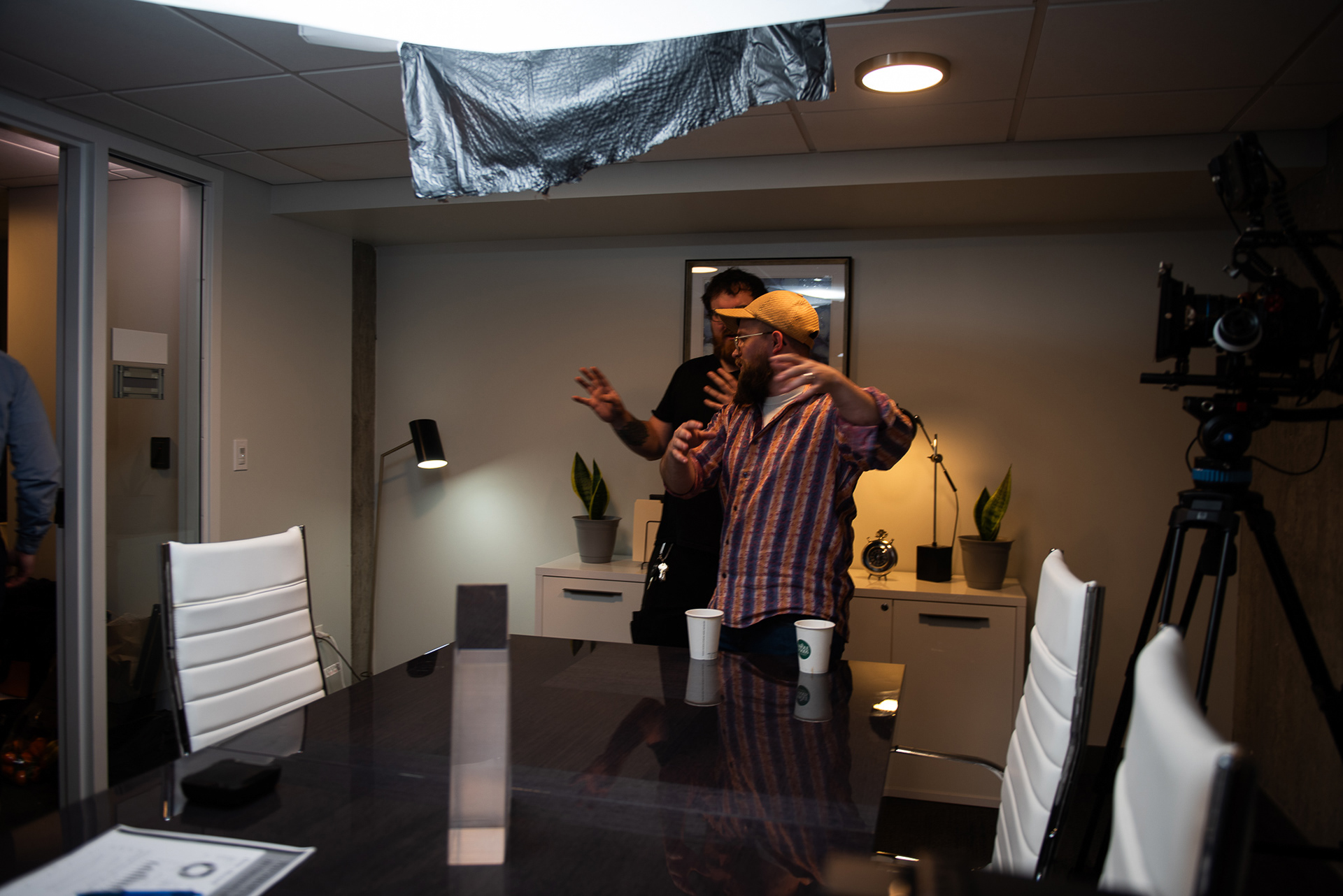
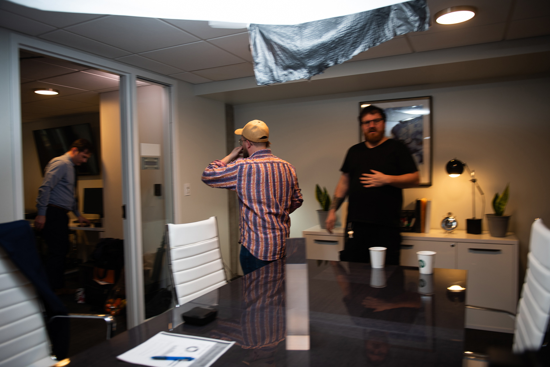
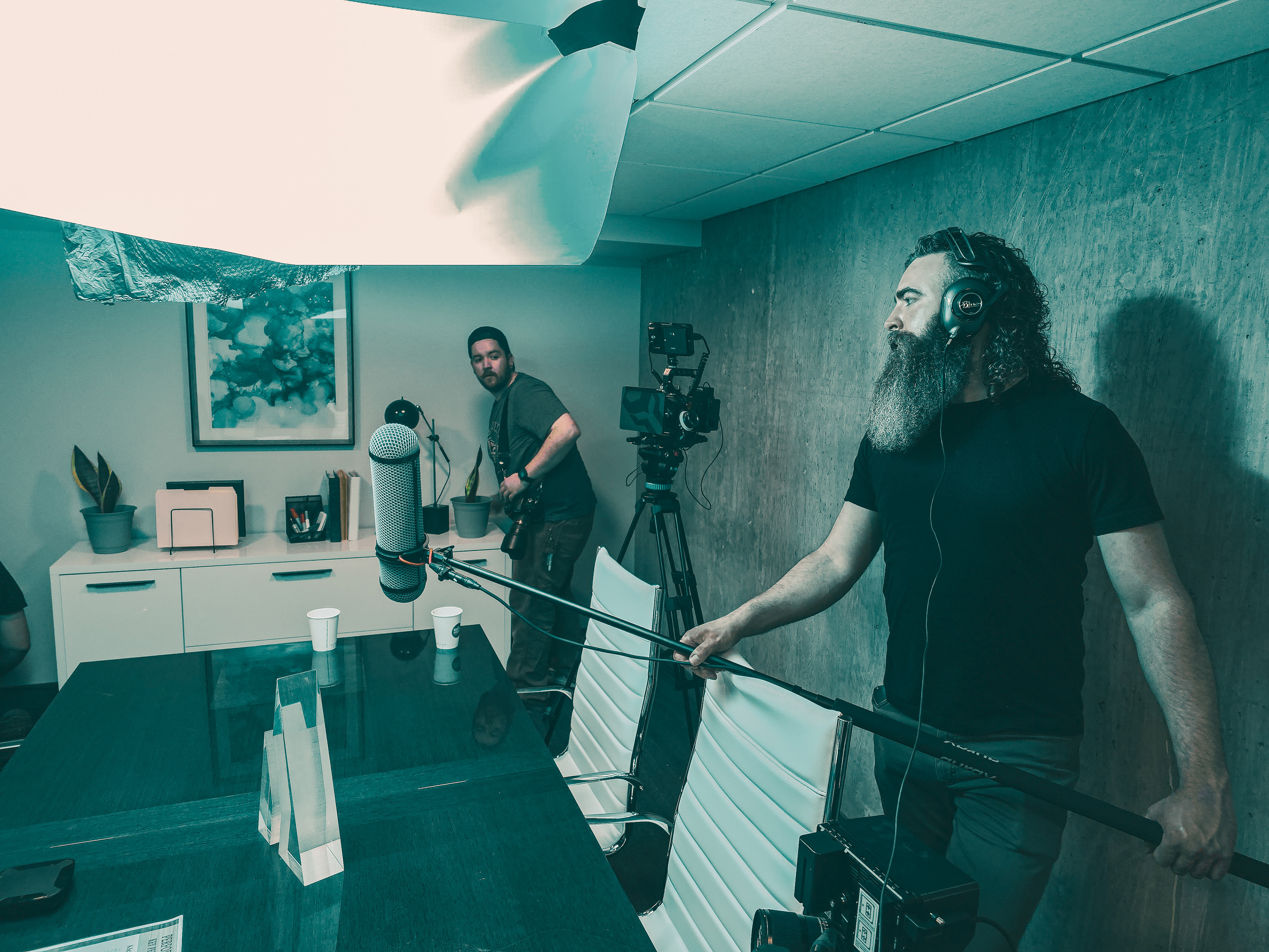
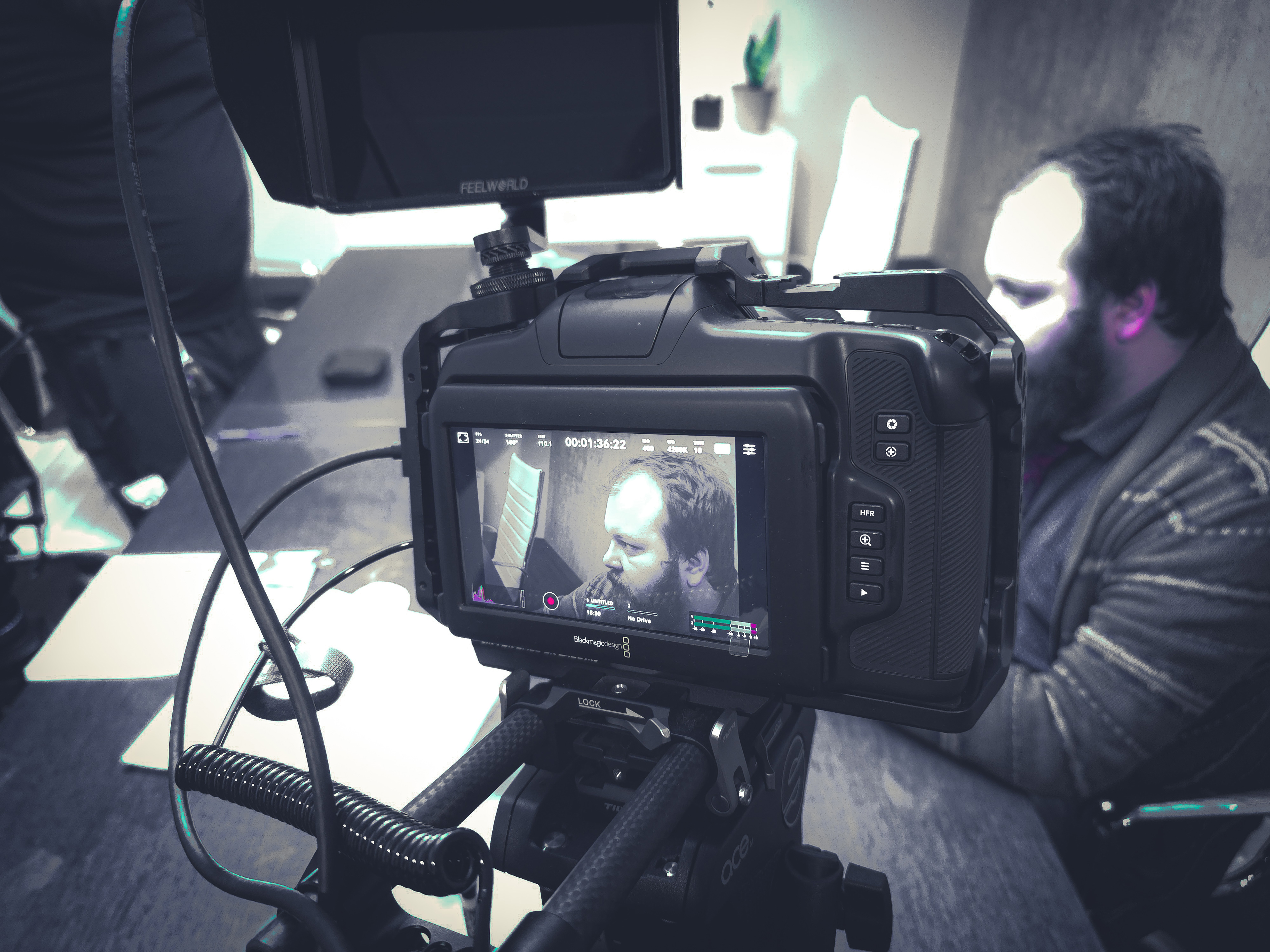
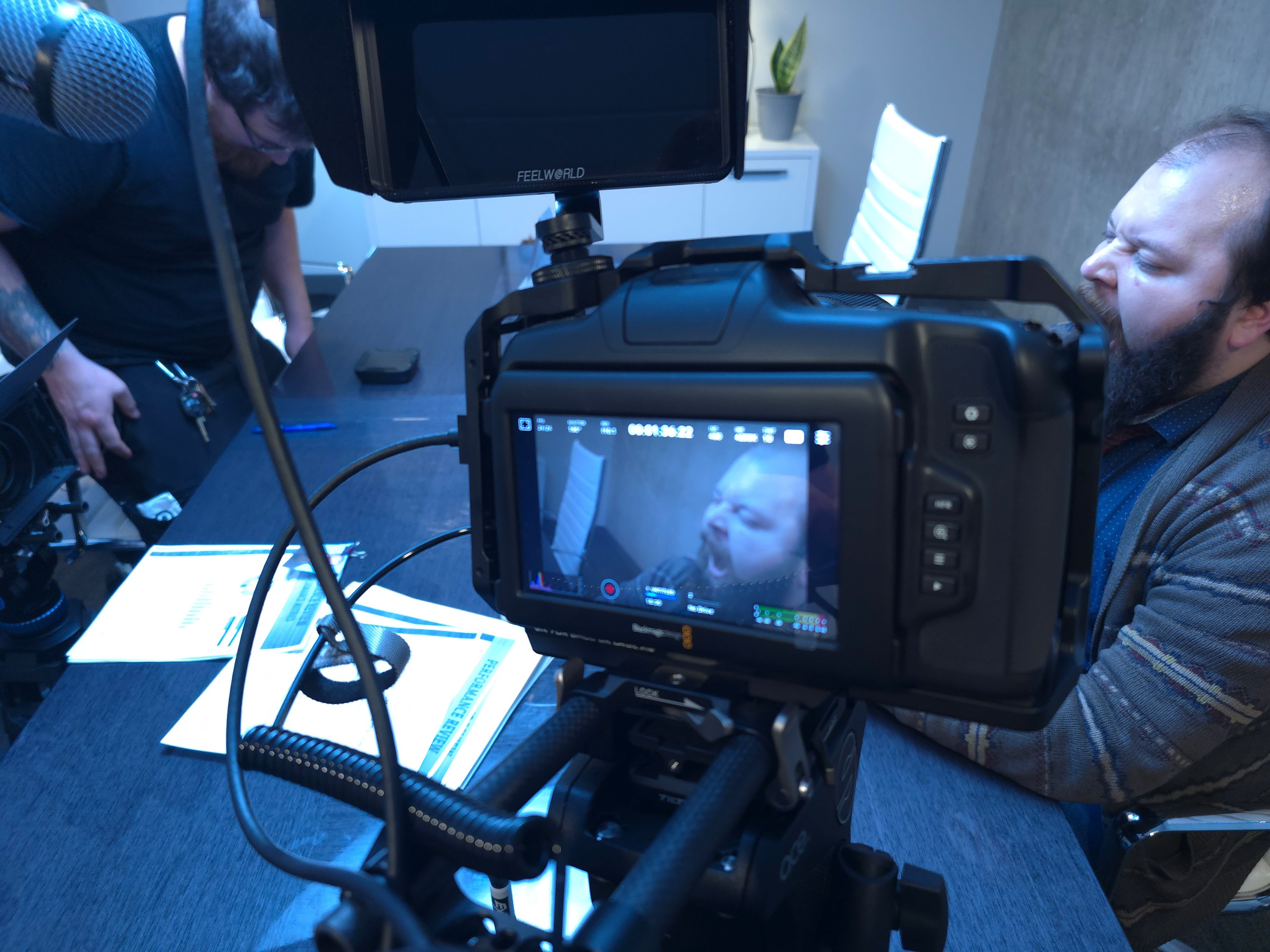
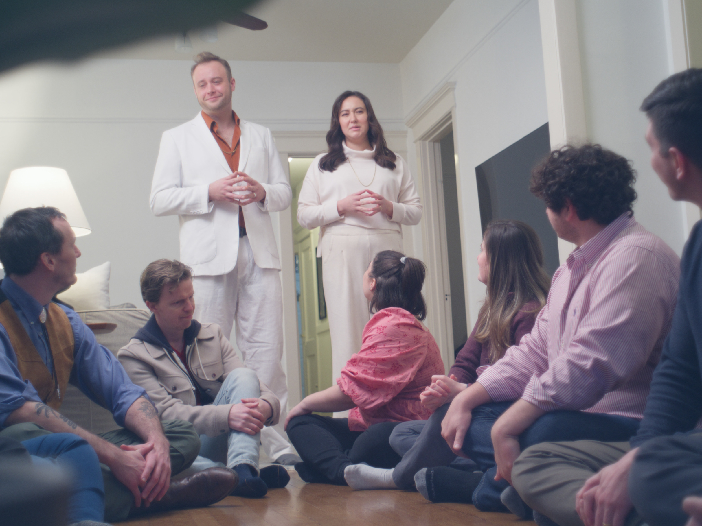
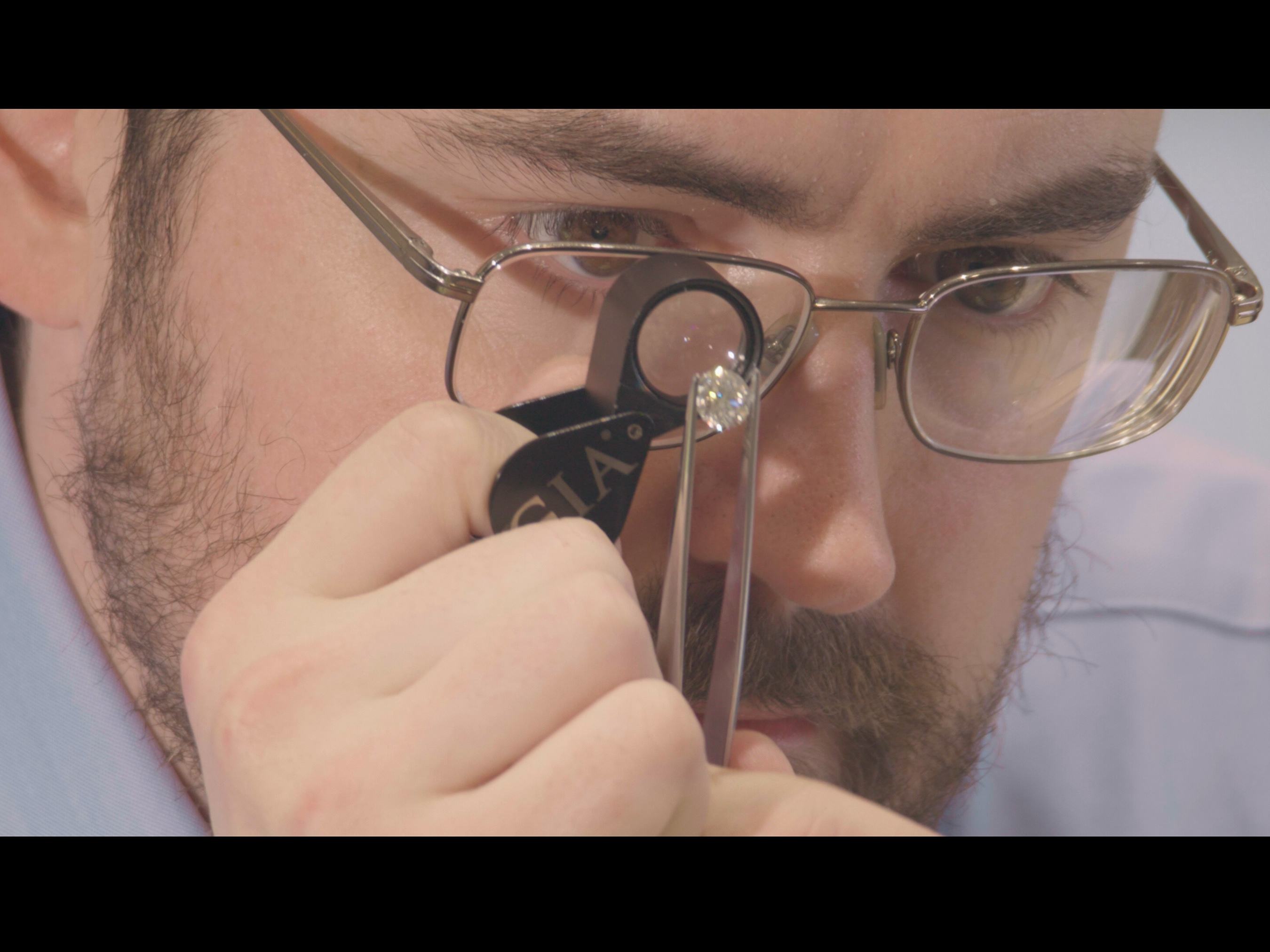
BEHIND THE SCENES