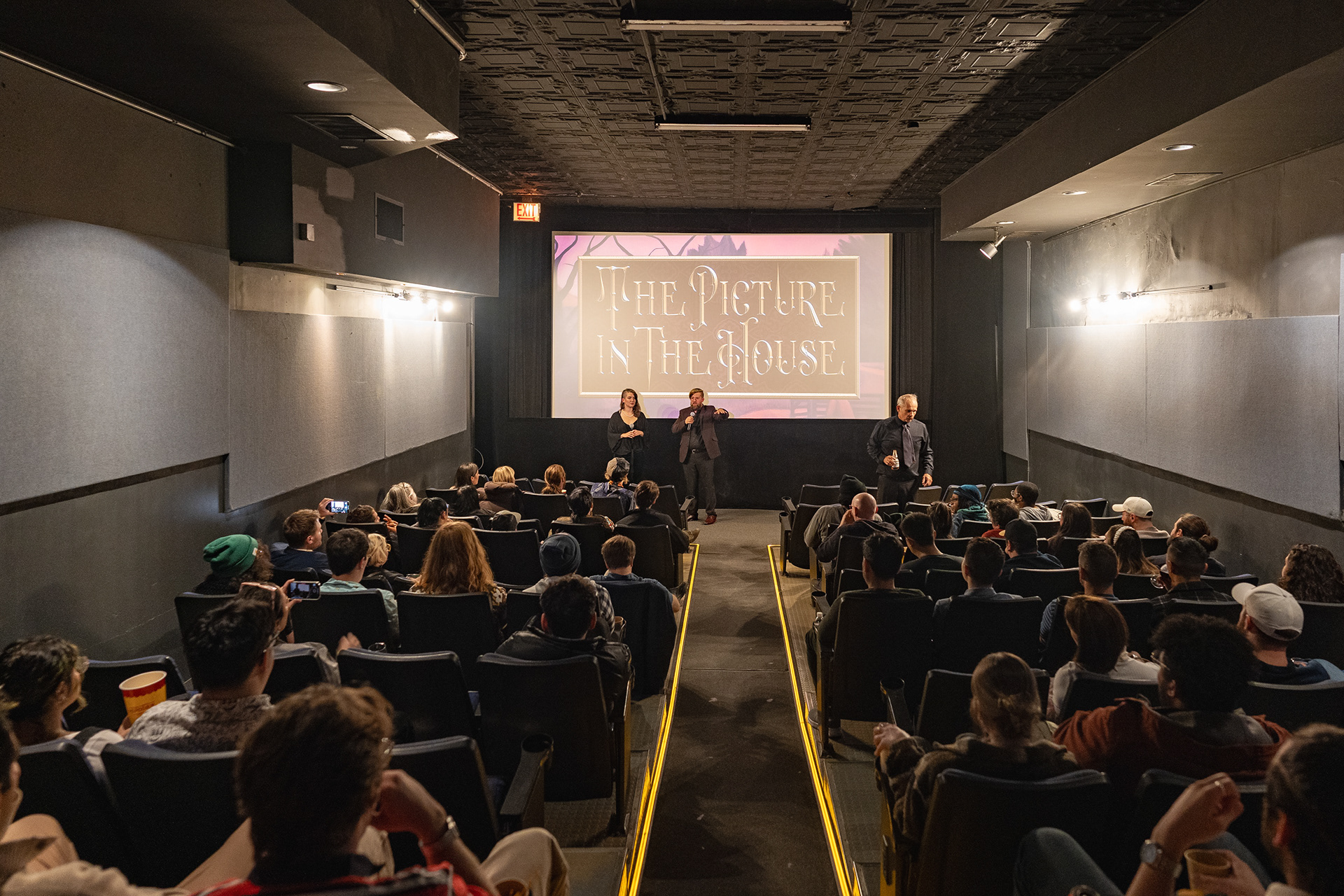
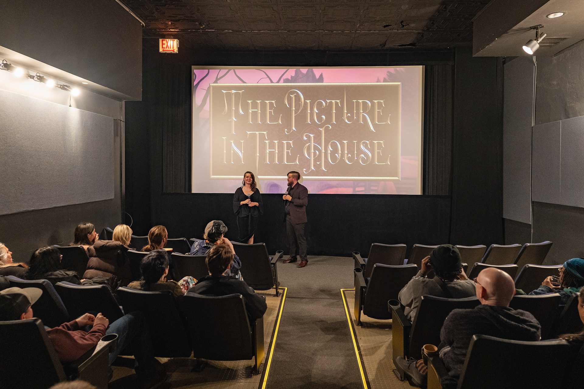
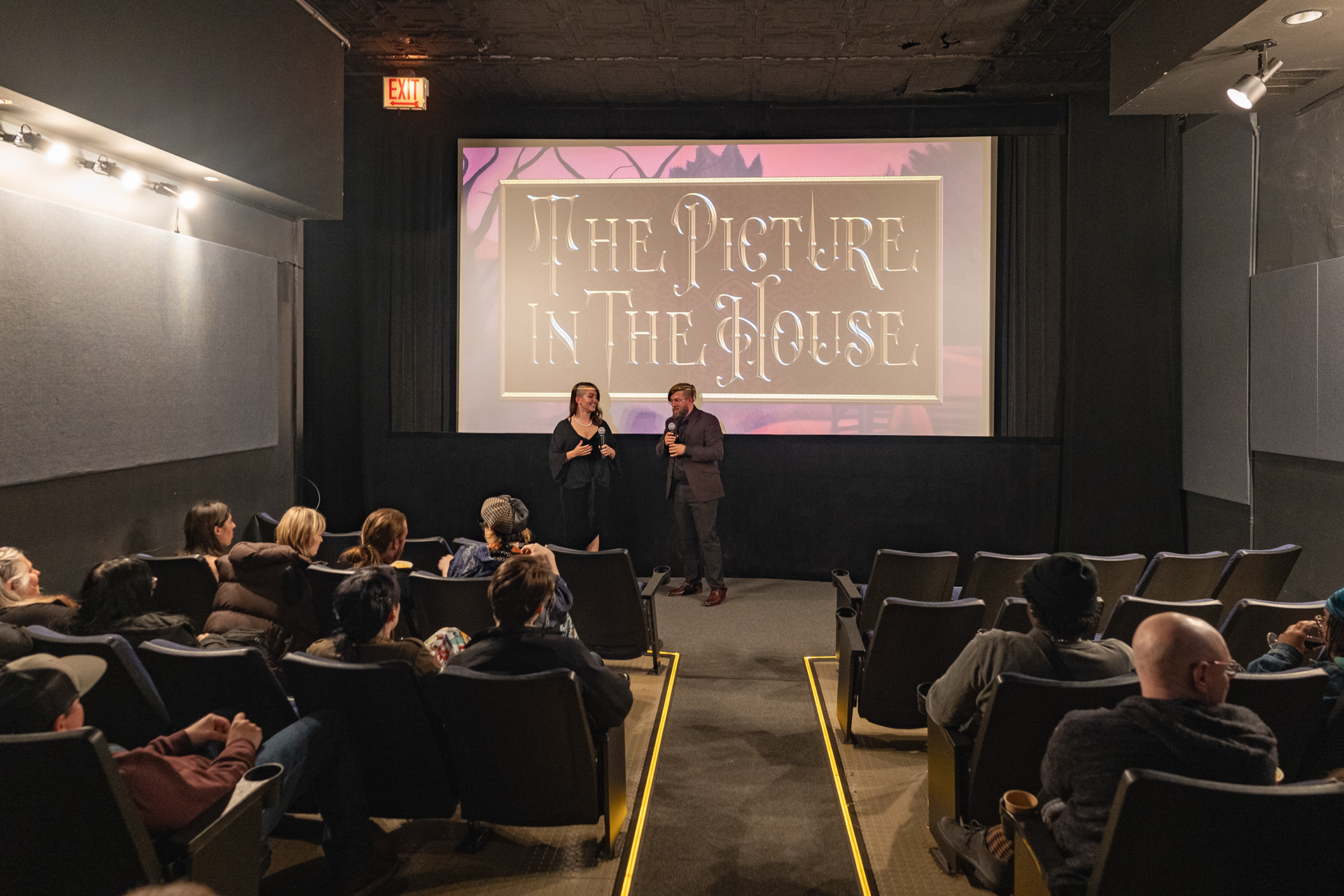
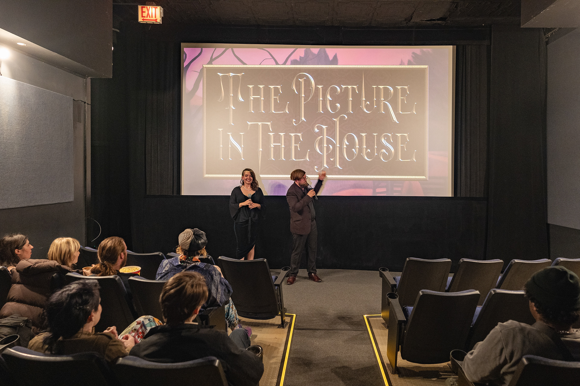
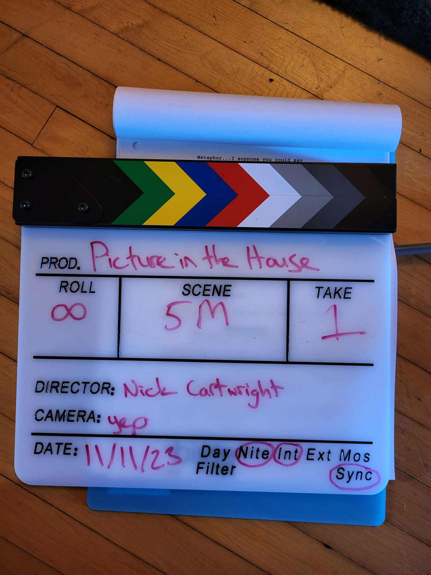
The Picture in the House is an original short film adaptation of the horror short story, "The Picture in the House" written by H.P. Lovecraft.
In this film, I acted as the director, producer, co-writer, cinematographer, production designer, editor, sound editor, sound designer, visual effects artist, and colorist.
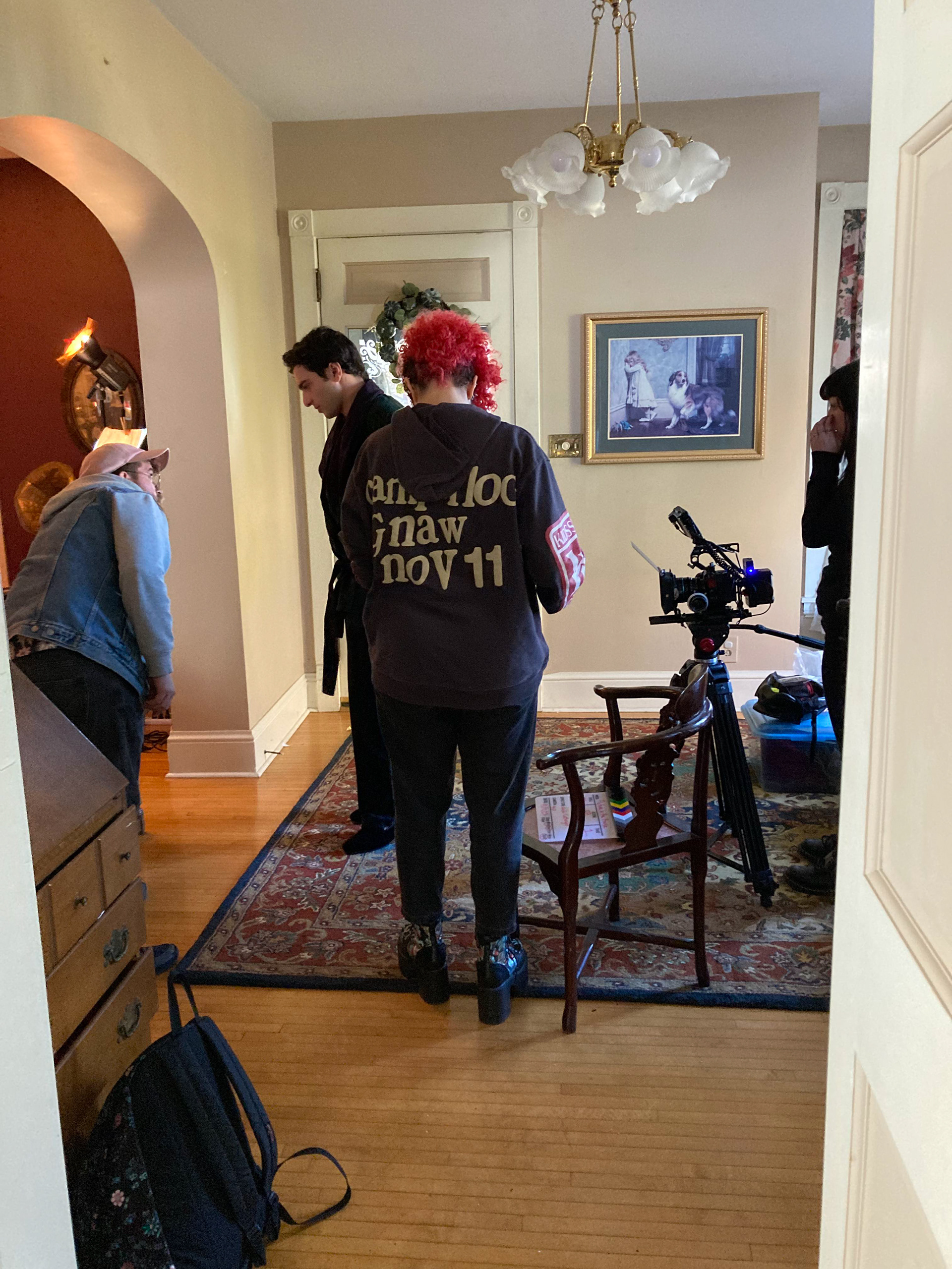
The film was made with a budget of approximately $5000 and the majority of the film was shot in a single weekend with a crew of 16 people. There were 3 other small days of production for specific location shots, and practical effects shots.
THE STORY
SUBJECTIVITY vs. OBJECTIVITY
HUNGER vs. DESIRE
In the original story by H.P. Lovecraft, a man enters a home he believes is abandoned to escape a heavy storm. He is surprised to meet the homeowner who graciously welcomes him in. The two share a conversation over a disturbing illustration of cannibalism inside the house, and slowly throughout the conversation it dawns on the protagonist that the homeowner is a cannibal himself and that he's been led right into a trap.
In creating this film, I aimed to pay homage to the original story by H.P. Lovecraft while exploring the thin line between hunger and desire. I decided a unique way to showcase that relationship was to have our protagonist instantly infatuated with the homeowner. My goal was to mislead the audience into believing there was romantic tension by telling much of the story through each character's highly subjective and expressionistic POV.
CINEMATOGRAPHY
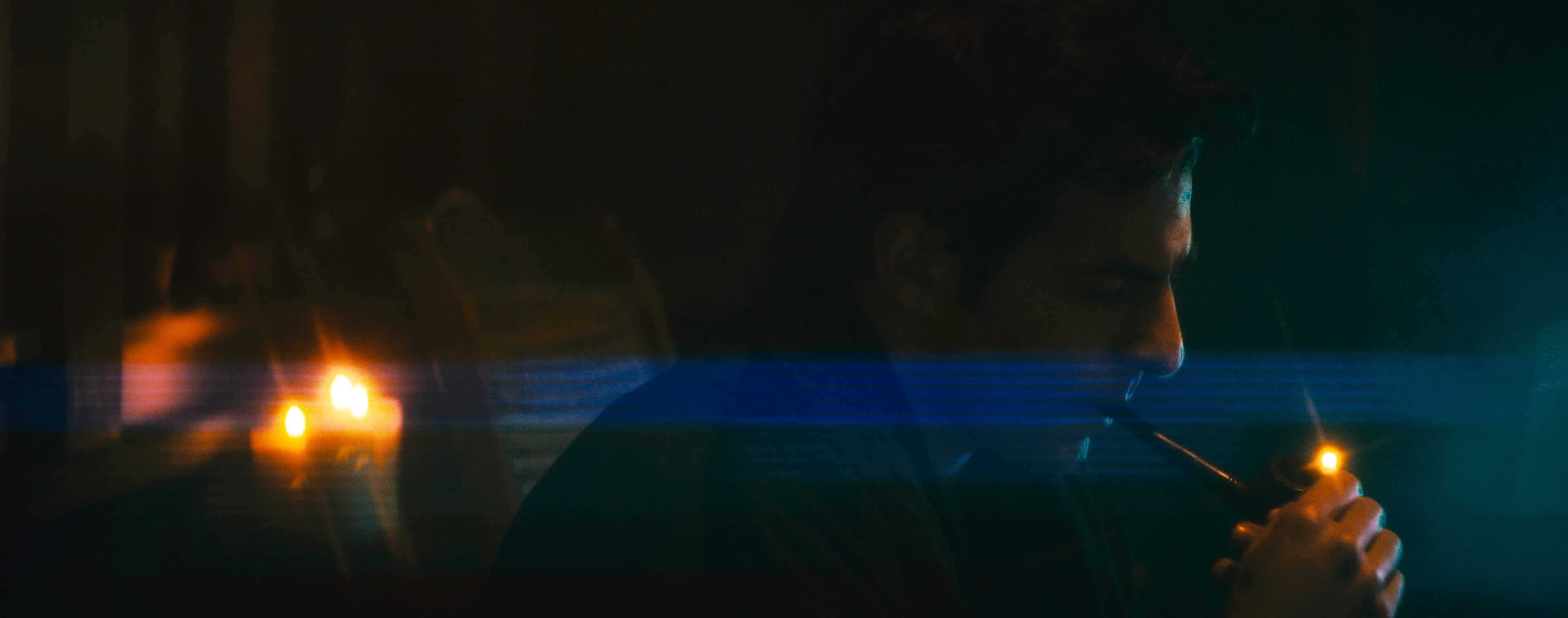
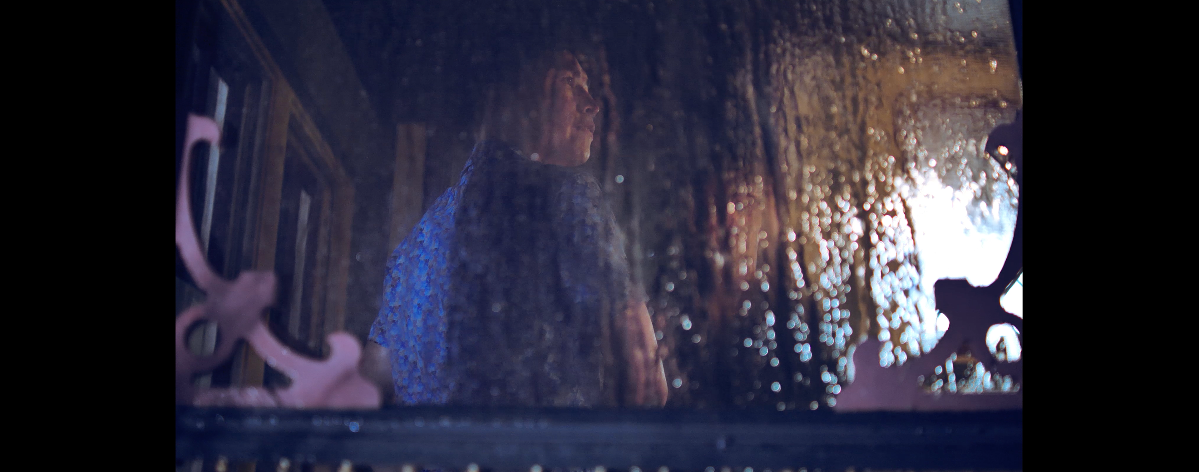
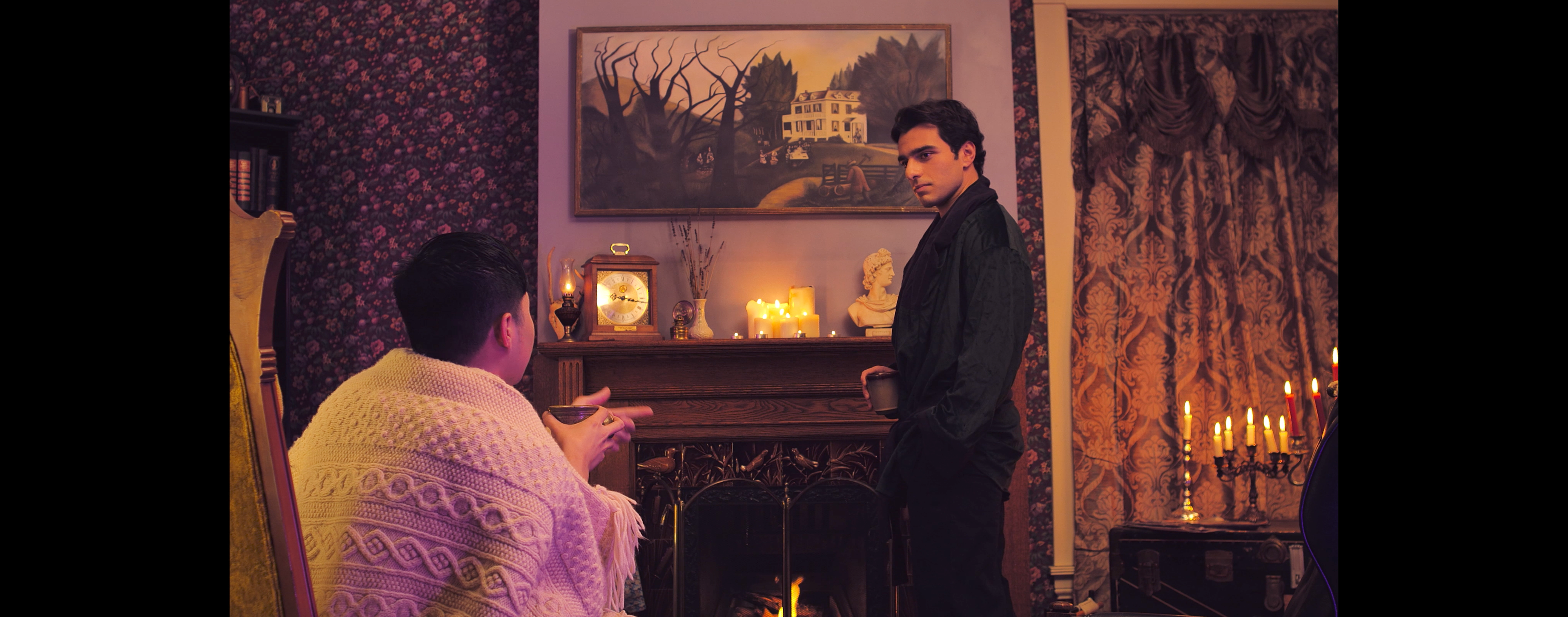
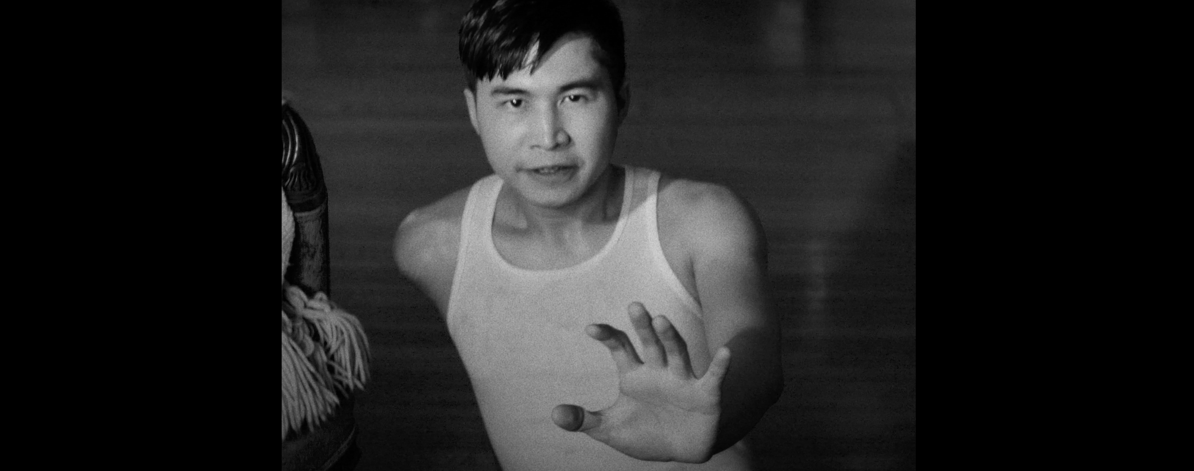
Much of the visual styling of this film hinged on subjective POV shots that take you into the minds and hearts of each character. My goal was for each character's POV to feel jarring and distinct. Simultaneously, every time we step outside of the subjective world of the POVs, I want the objective reality to stand out as well.
REFERENCE
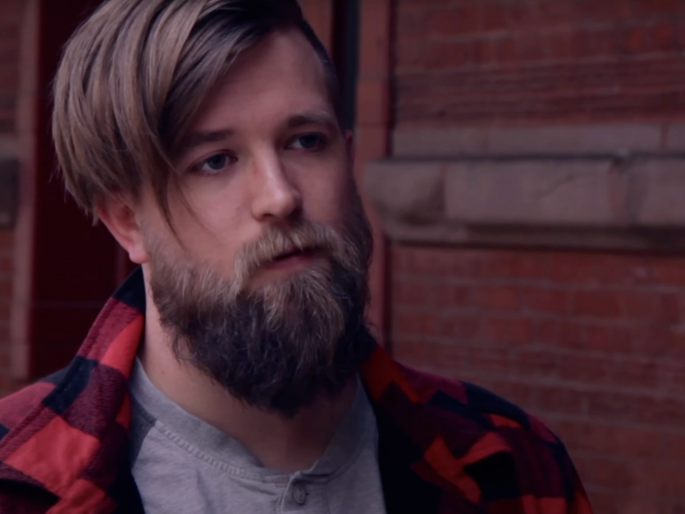
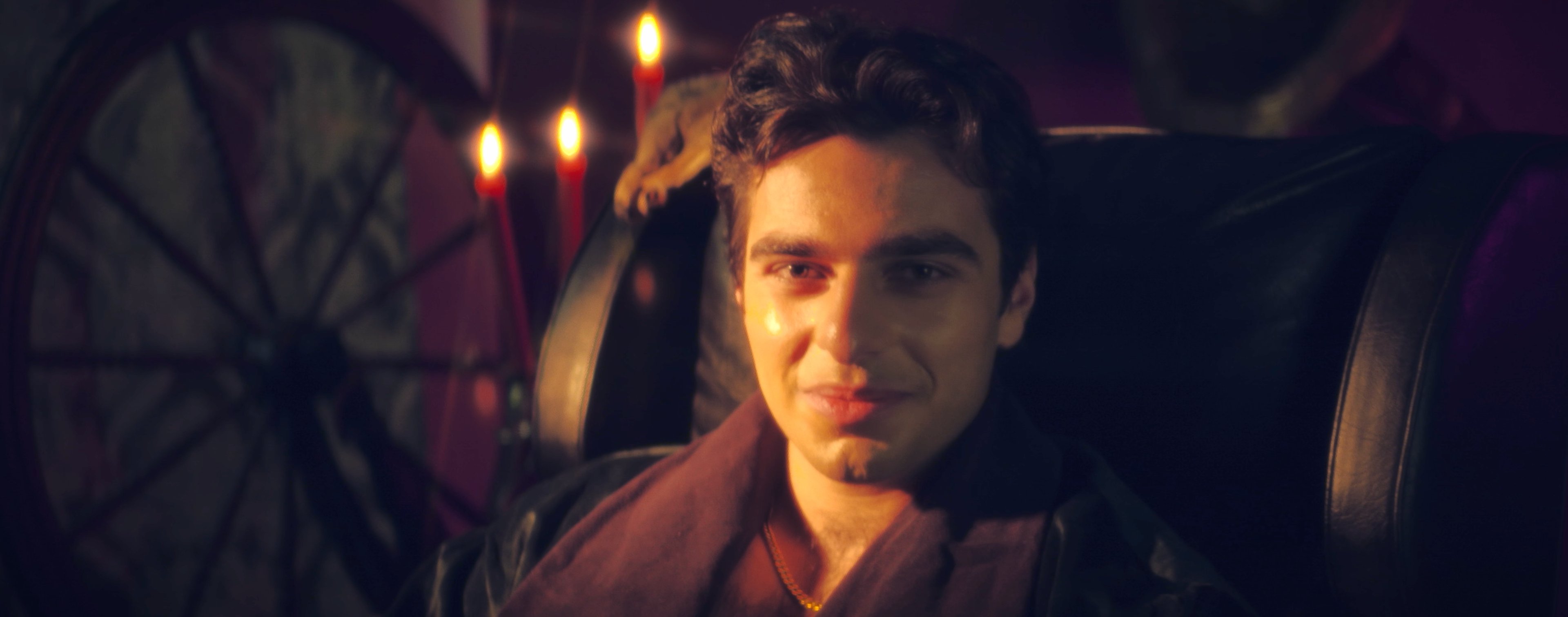
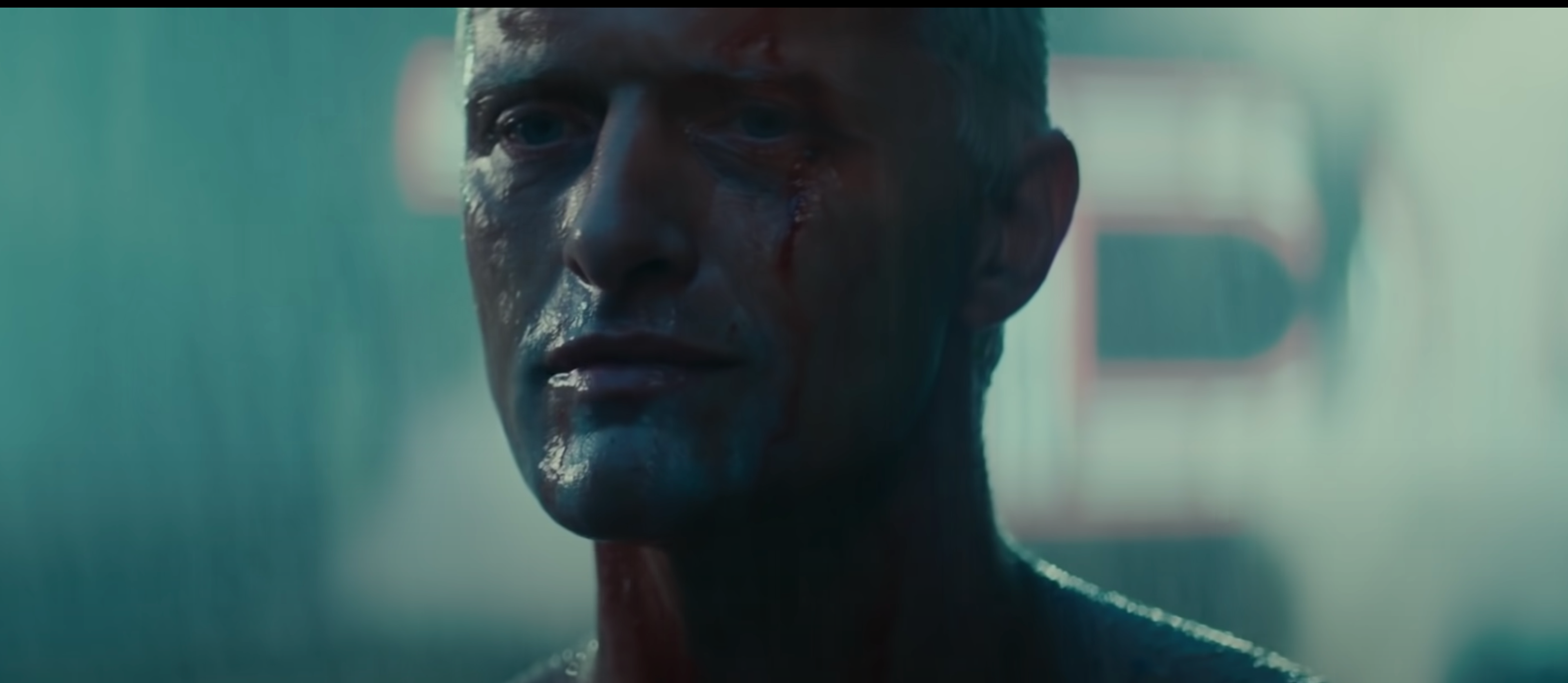
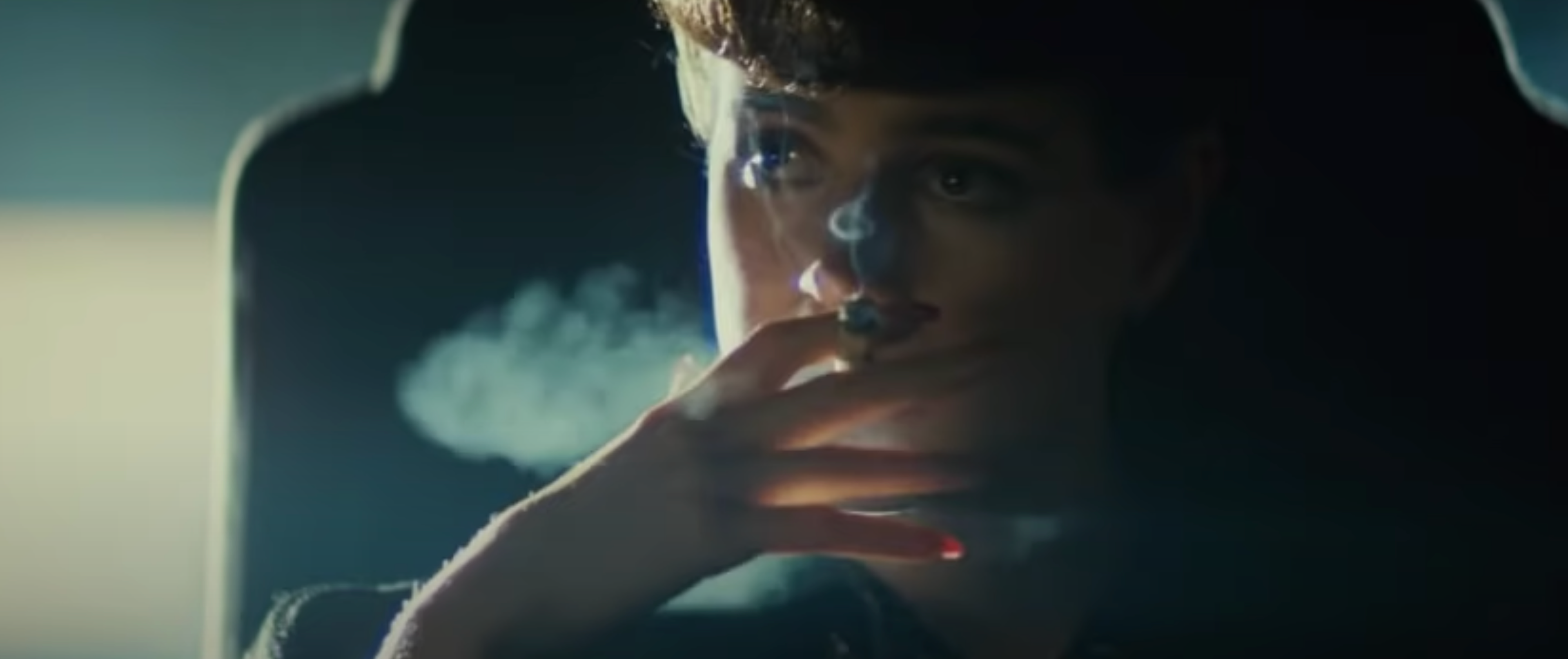
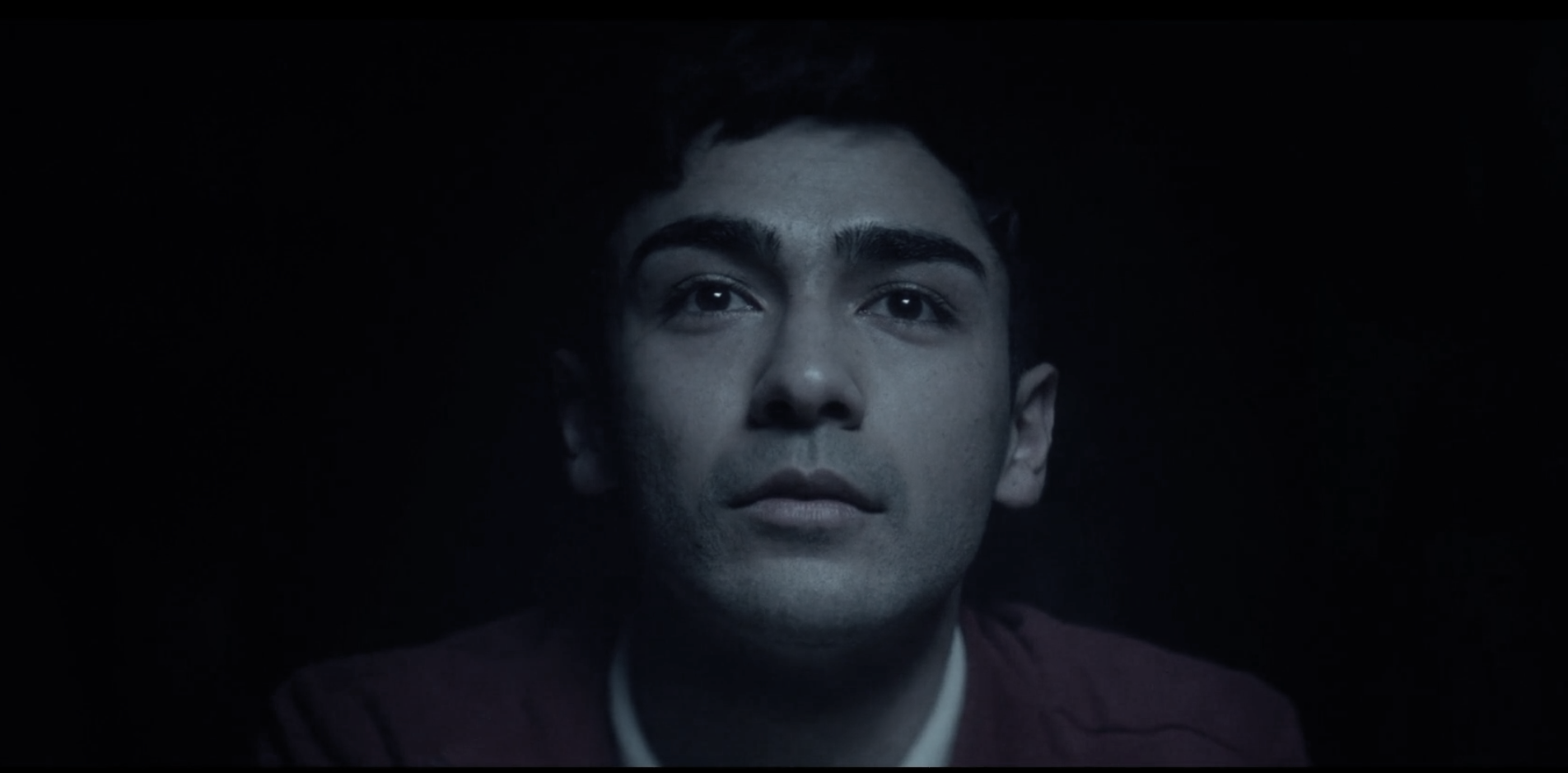
Mike's POV of Gordon
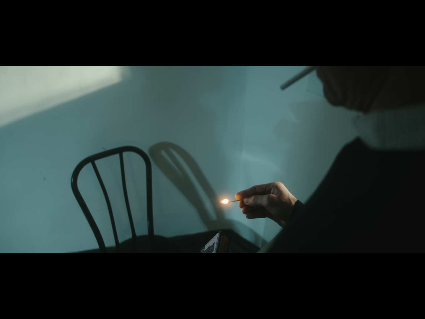
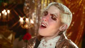
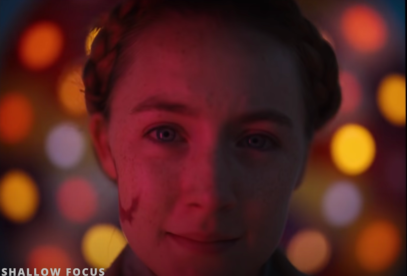
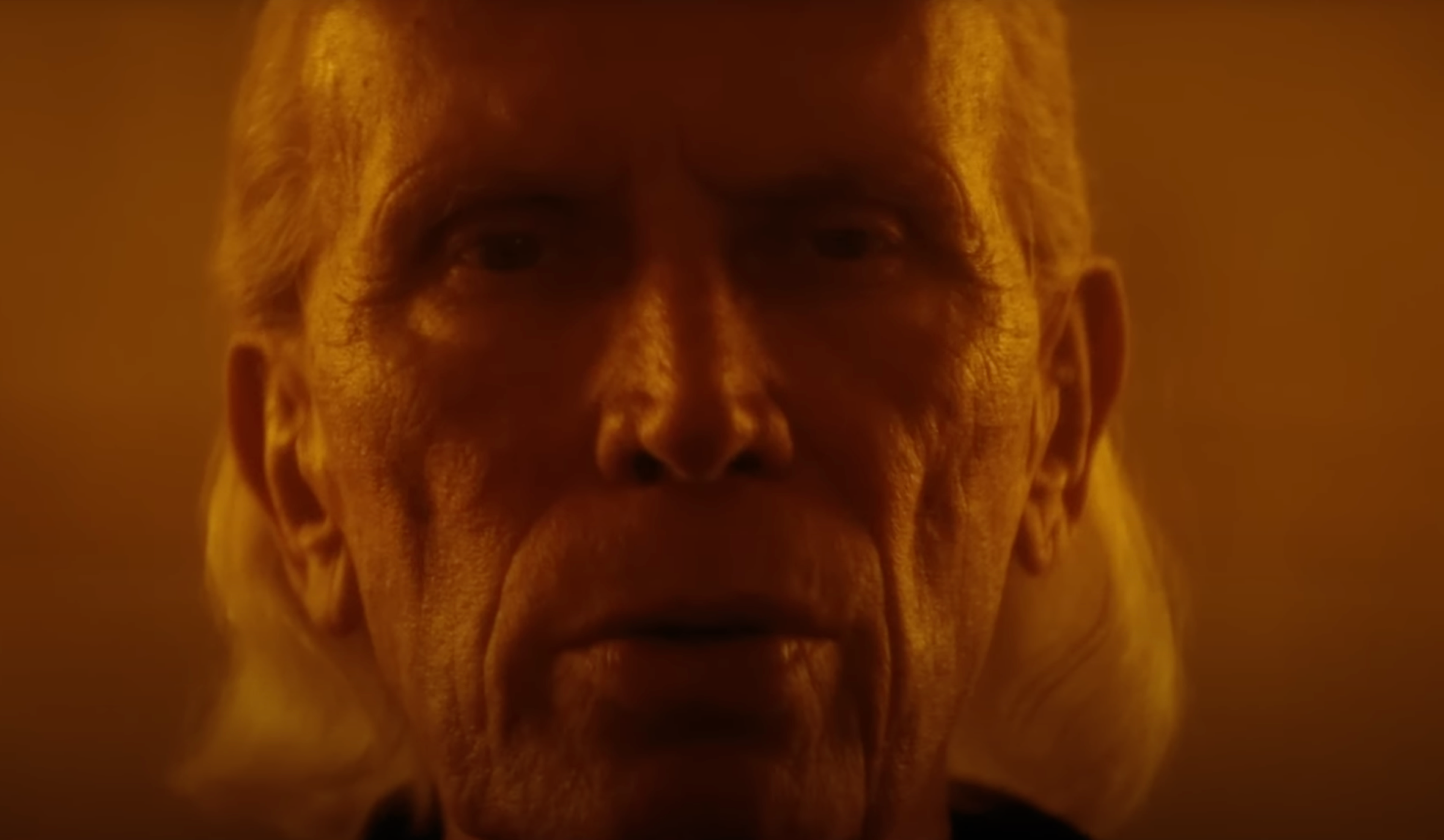
Our protagonist Mike, is instantly infatuated with Gordon. His perspective is dreamlike, and romantic, and is focused on only Gordon. This perspective shifts into a 16:9 wide anamorphic aspect ratio conveying a sense of grandeur. I also emulated the shallow depth of field, expressionistic color pallets, and star-burst filters from works of Wes Anderson, Ridley Scott, Panos Cosmatos and music videos by Dorian Electra.
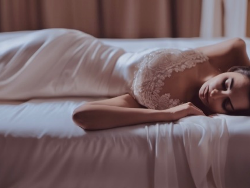
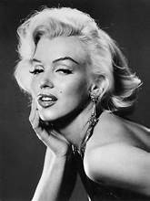
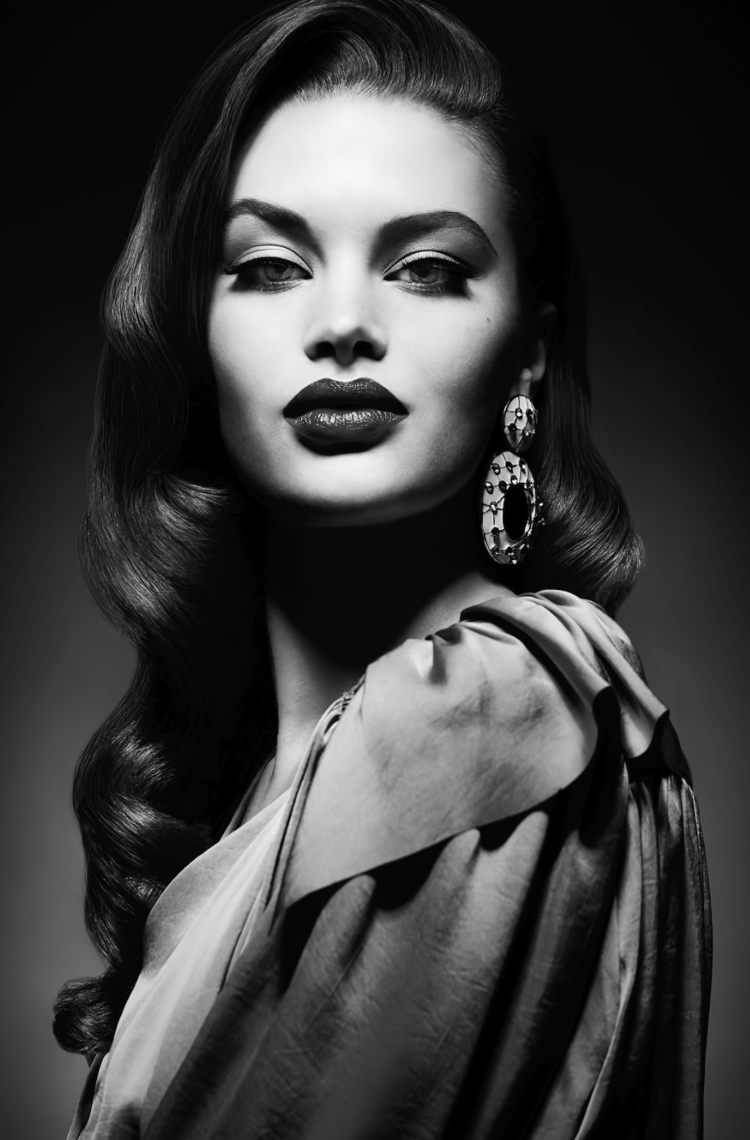
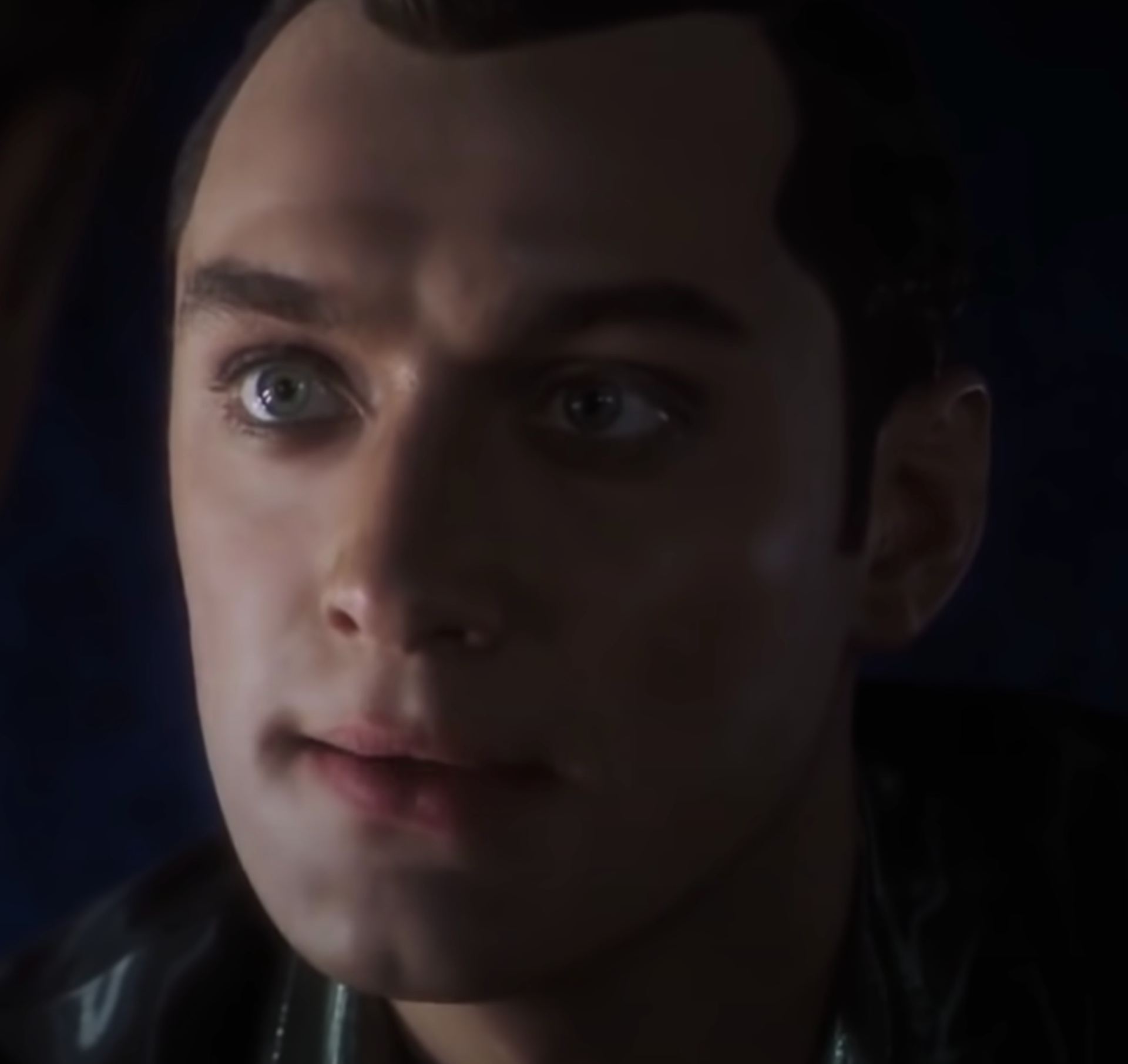
Gordon's POV of Mike
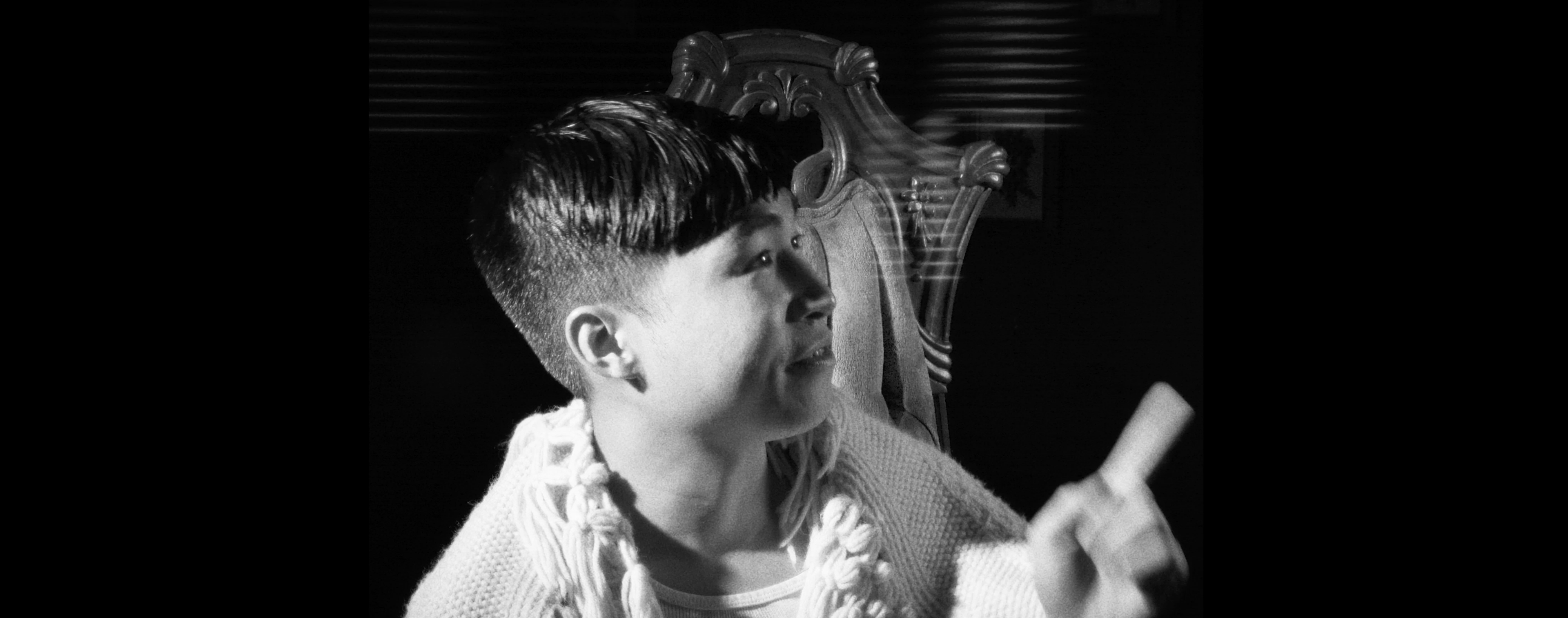
Gordon's view of Mike is also dazzling, but in the way Hollywood starlets of the 1930's-50's were captured. The character of Gordon sees the world in a black and white and we chose to illustrate this literally to convey it metaphorically as well. To him, everything is either "strong, or weak, hunt or be hunted", etc. Additionally Gordon is meant to seem like he's strangely from another time - based on the age we set his character, the years he would've strongly cultivated his tastes would've been the 1930's-50's. In our mind this view succeeds in illustrating a hunger. We felt this was the era where objectification in media took a large step forwards towards what we see today and Gordon views Mike as a piece of meat for his consumption. These frames also switch to a 1:1 aspect ratio reminiscent of older square formats.
PERFORMANCES
I met both actors attending the Meisner Acting Program at Green Shirt Studios in Chicago. We utilized the Meisner method find a deeper meaning in the performances, to create an intense emotional connection, and to build characters through careful crafting of imaginary, yet deeply personal circumstances. In the objective view, the characters delivered naturalistic and honest performances. In Mike's POV, Sam (playing Gordon) was directed to be perceived as "The Perfect Lover" while in Gordon's POV, Zachary (playing Mike) was directed to play Gordon's view of the "Perfect Prey".
Neither actor had previously done film acting so we did a rehearsal process before the week we filmed. Additionally, during the rehearsal process, I brought/set up my camera and also recorded on my phone to simulate the experience of performing in front of the camera and build camera comfort.
PRODUCTION DESIGN
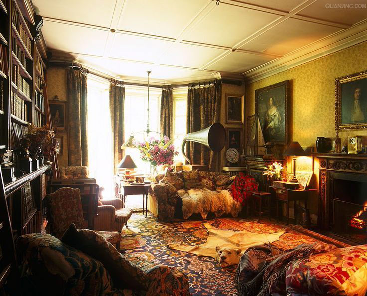
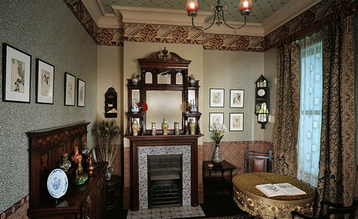
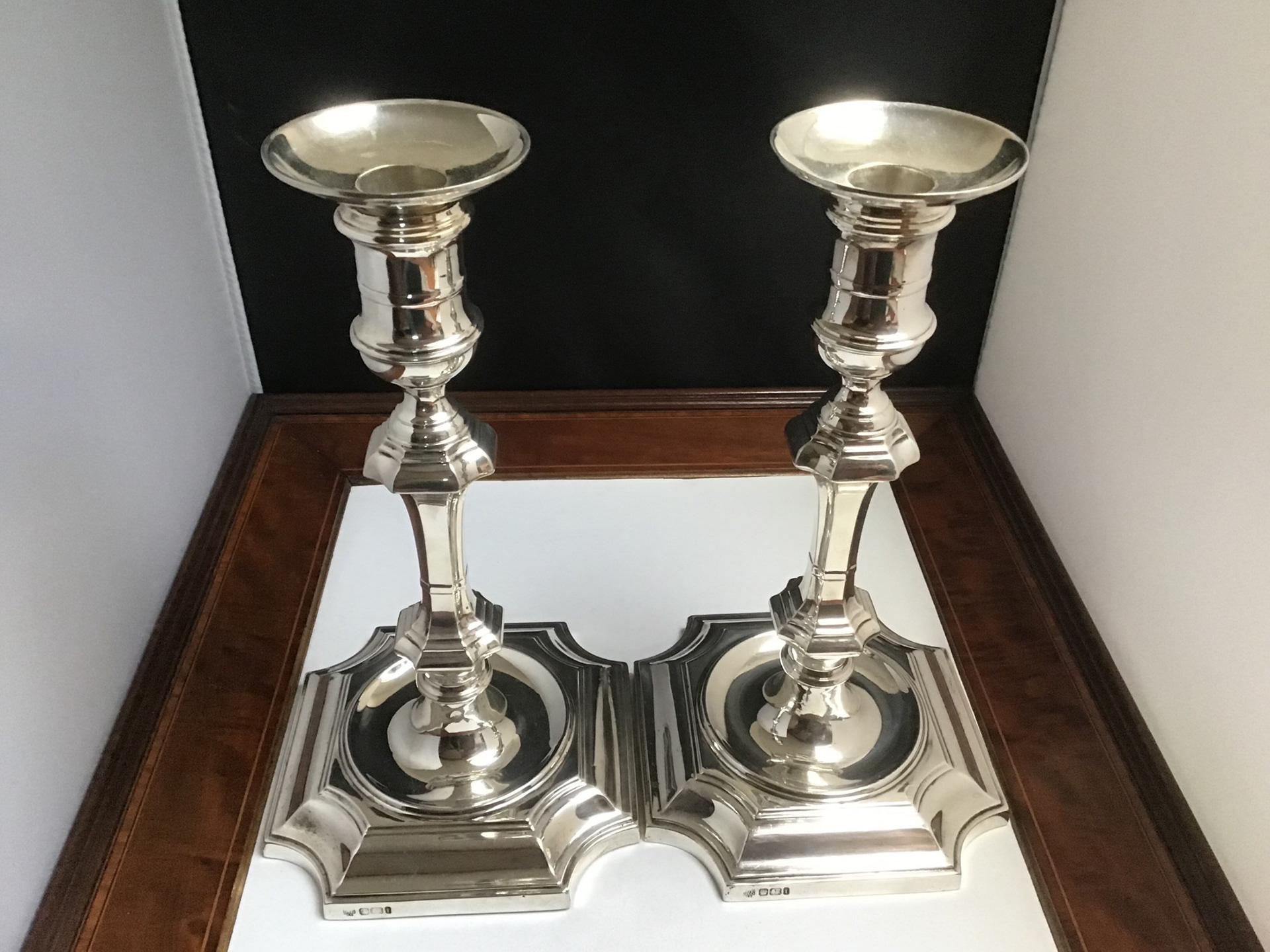
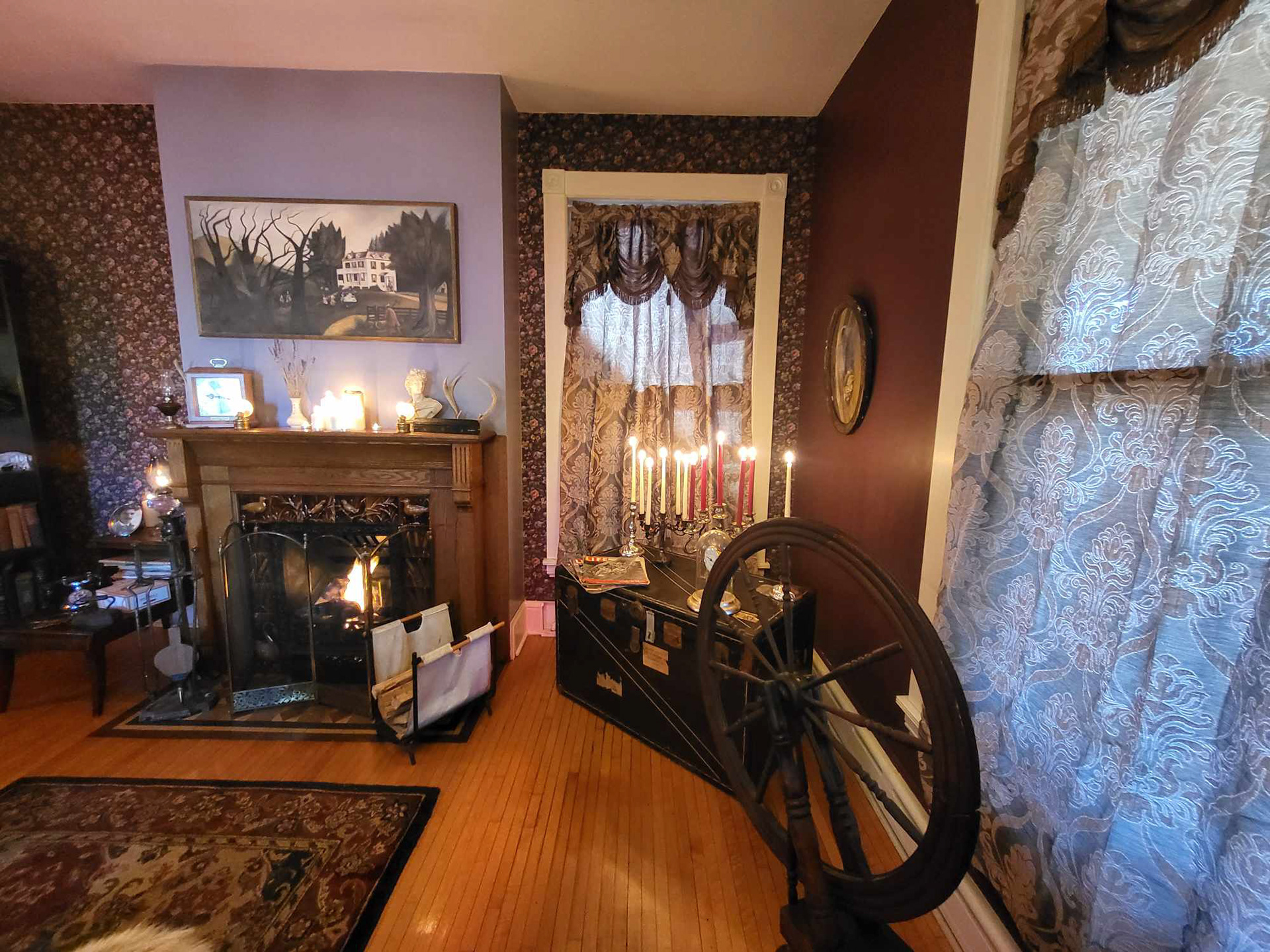
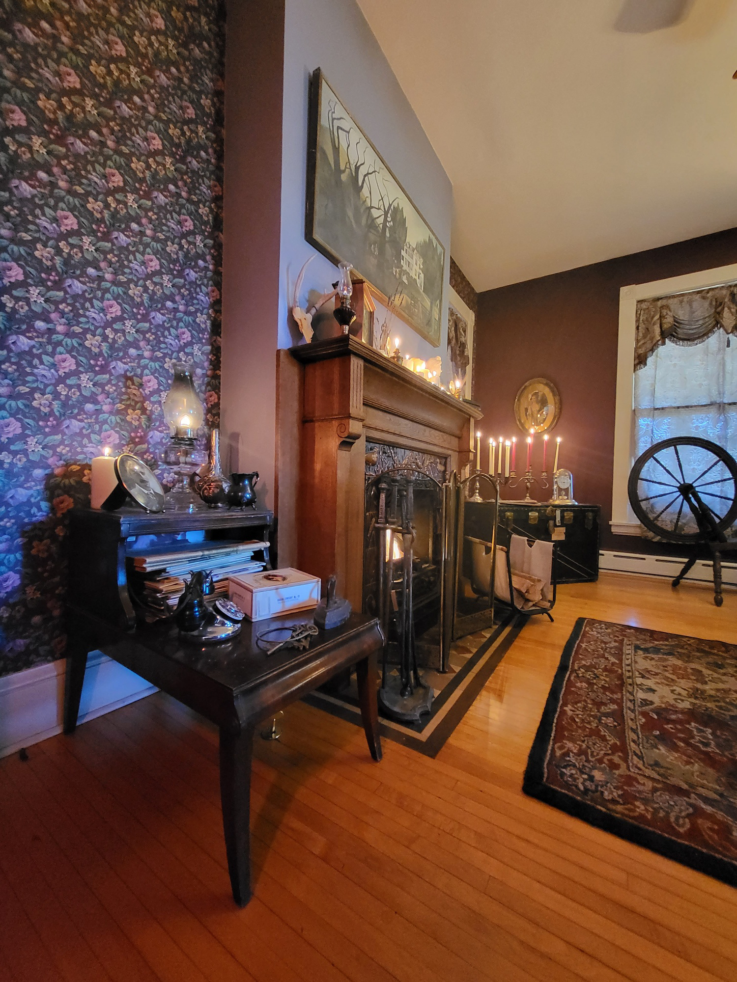
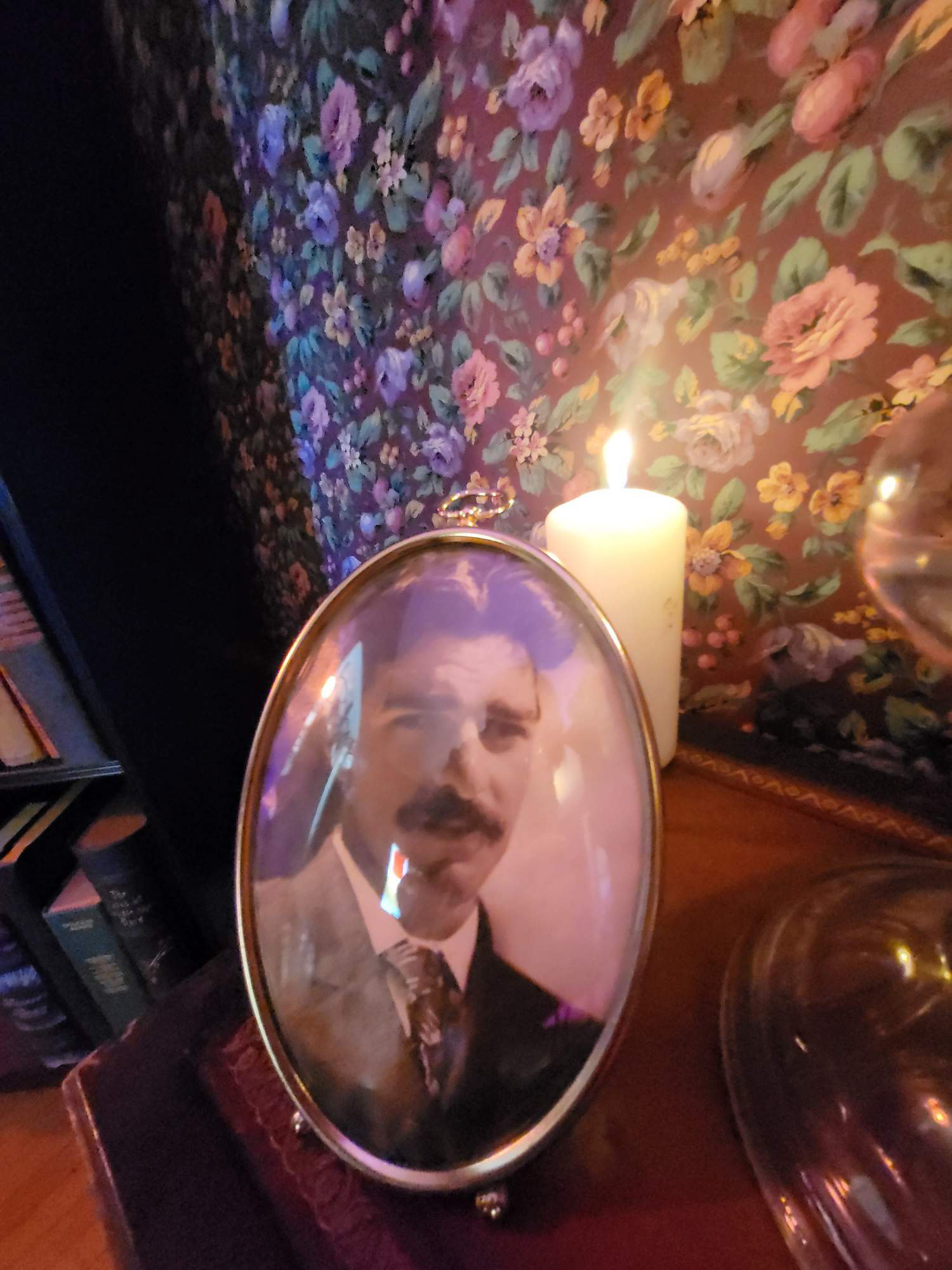
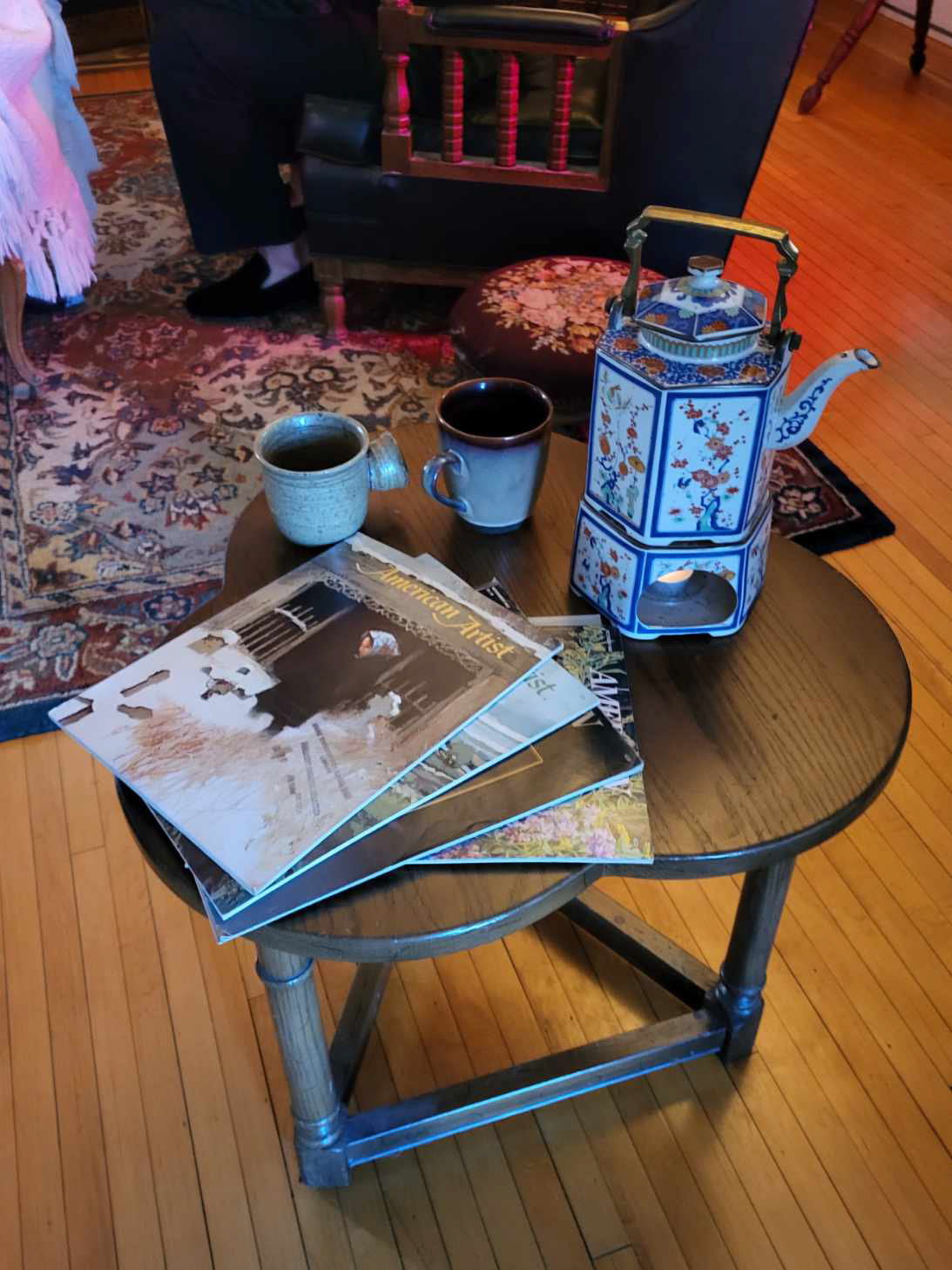
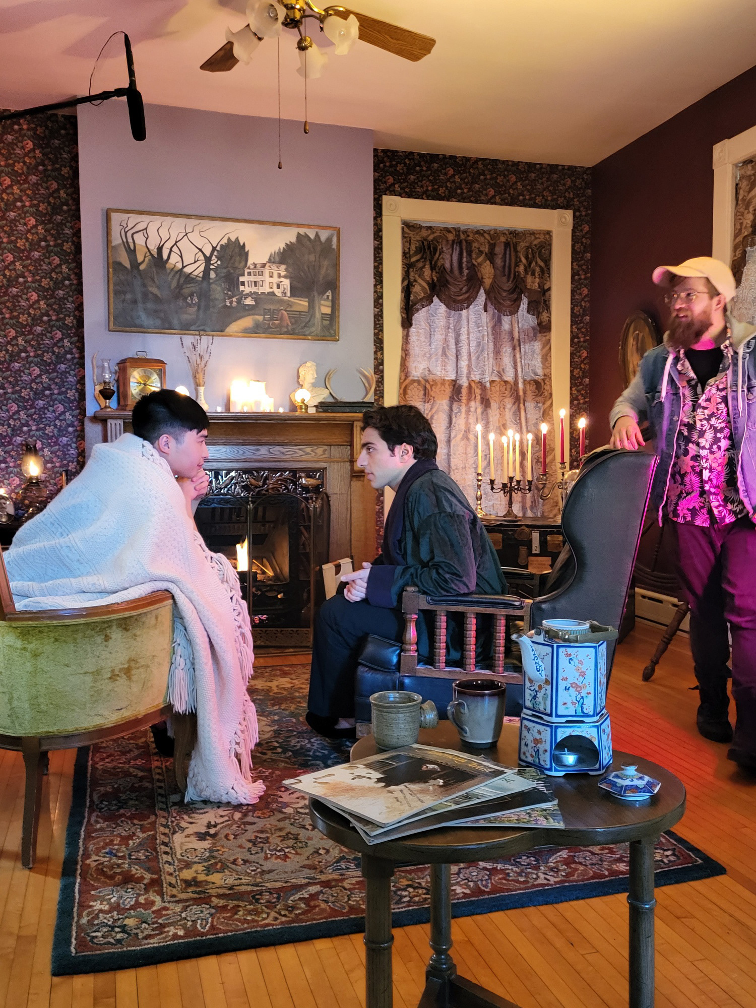
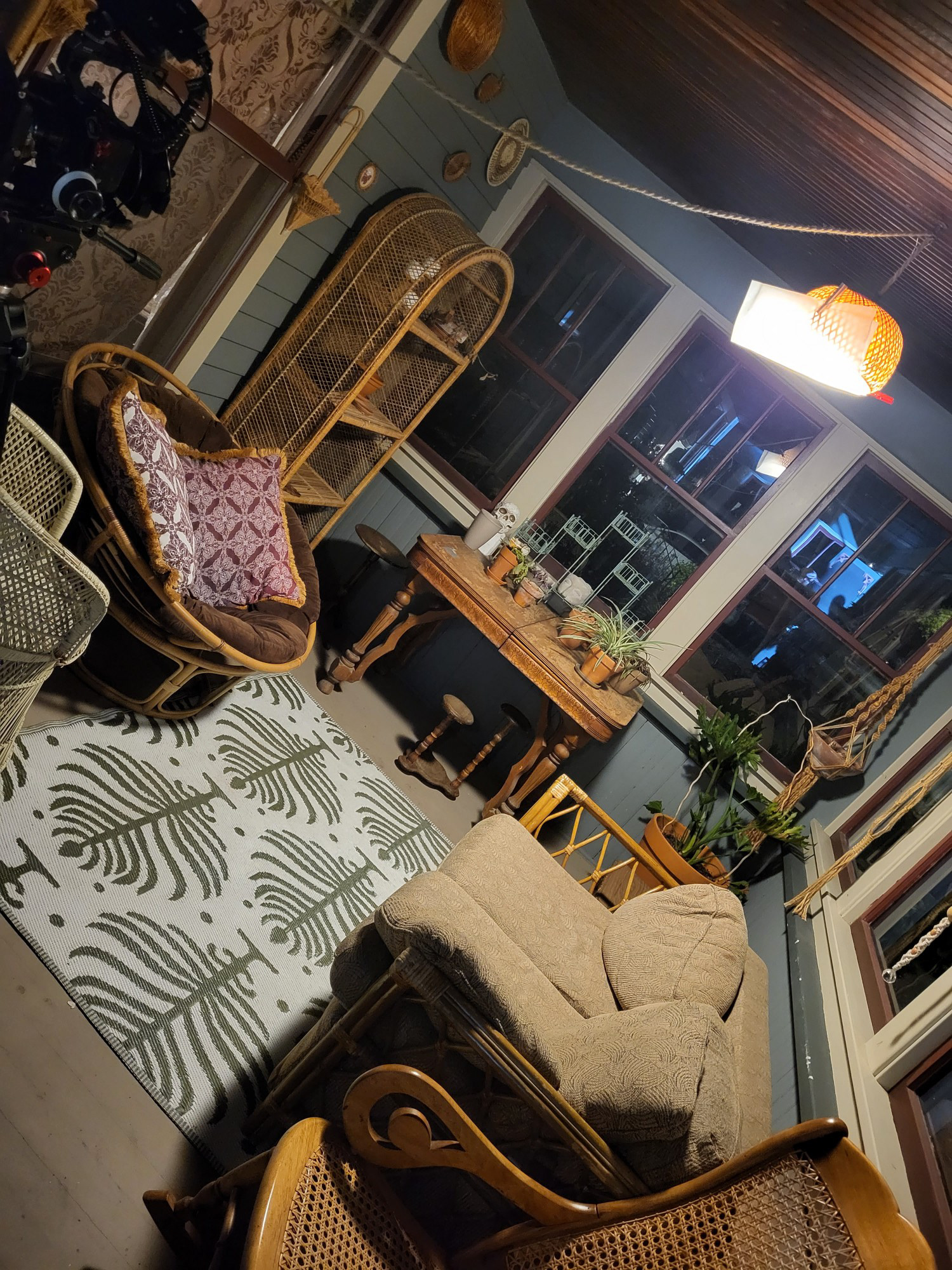
For the film's production design, we focused on highlighting styles and textures of the Edwardian Era in the early 1900's. This was the time Lovecraft was alive and writing, and we wanted Gordon, the antagonist of the story to have a home that reflects the warmth and charm of the era. We focused on a color palette of Burgundy, gold, orange, and green throughout the film. Greener environments are meant to reflect safer, more neutral spaces, while burgundy and orange were meant to represent heightened danger in the film.
THE "HOUSE"
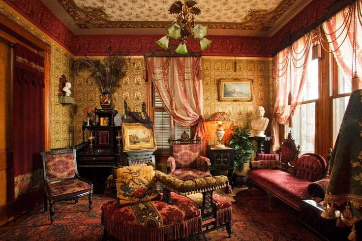
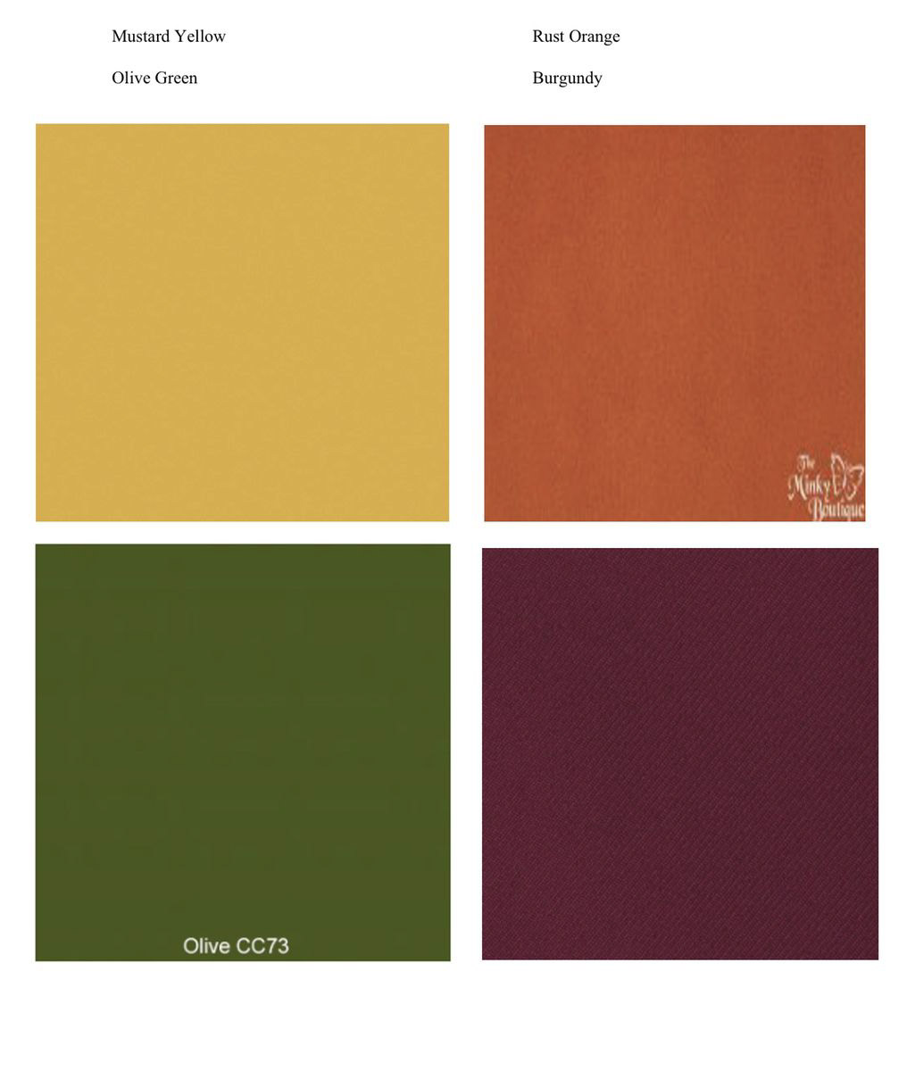
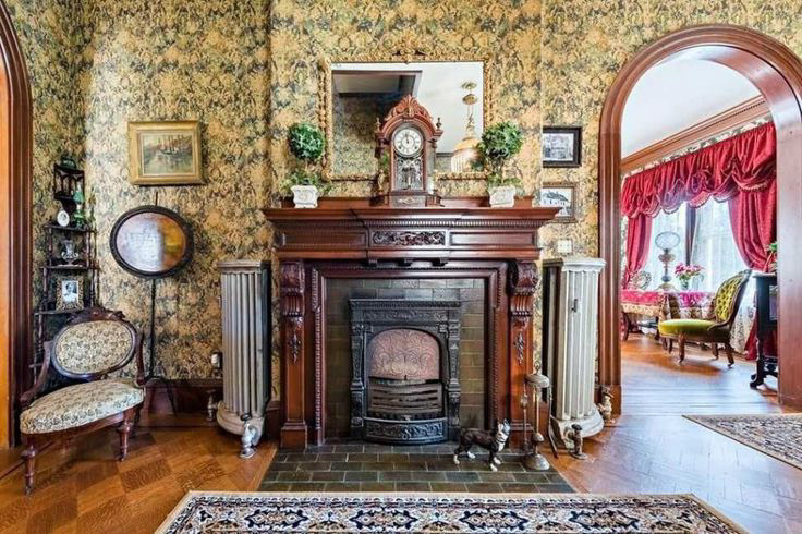
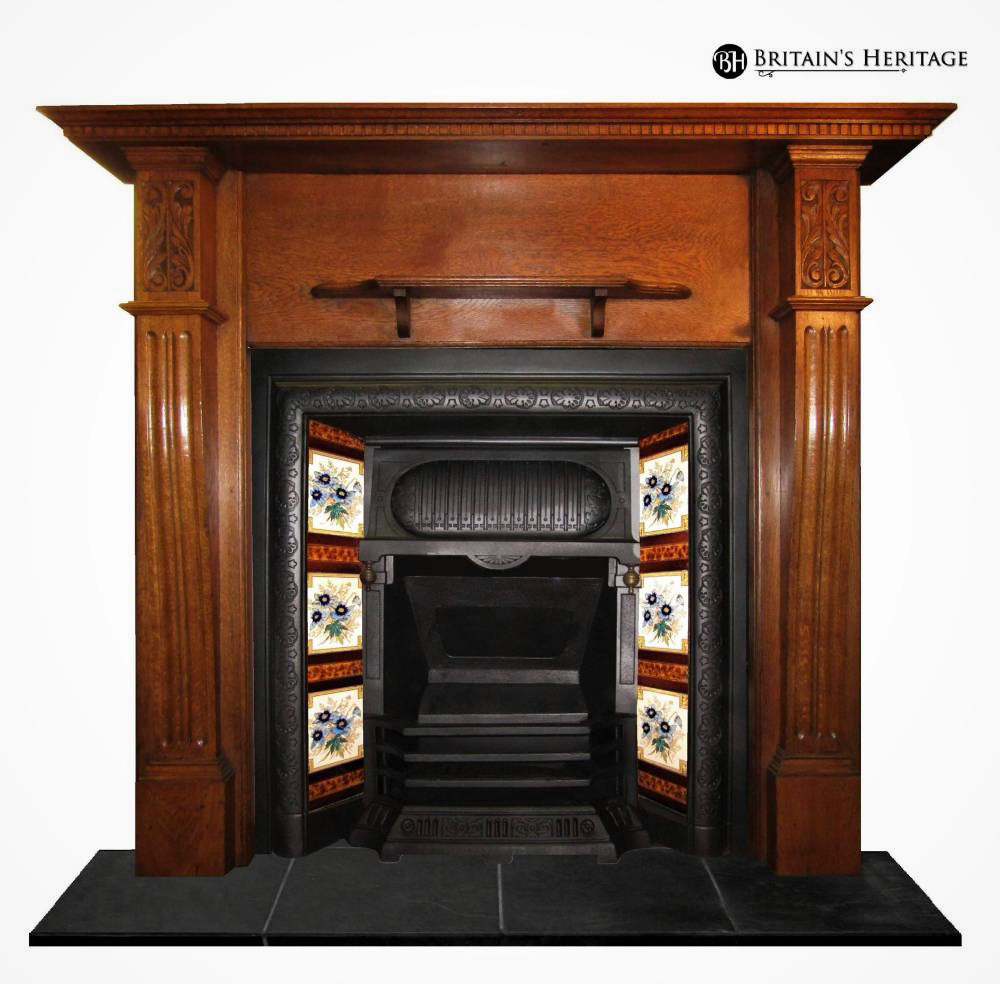
RESULT
THE "PICTURE"
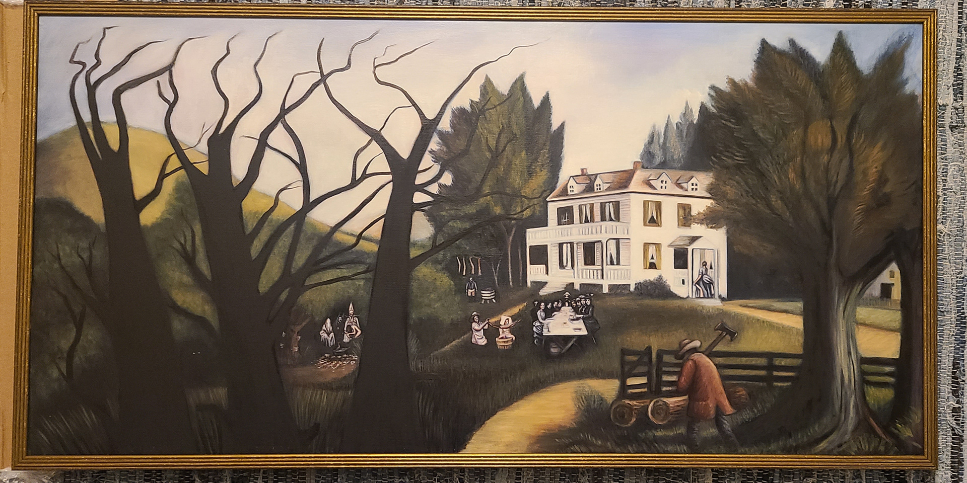
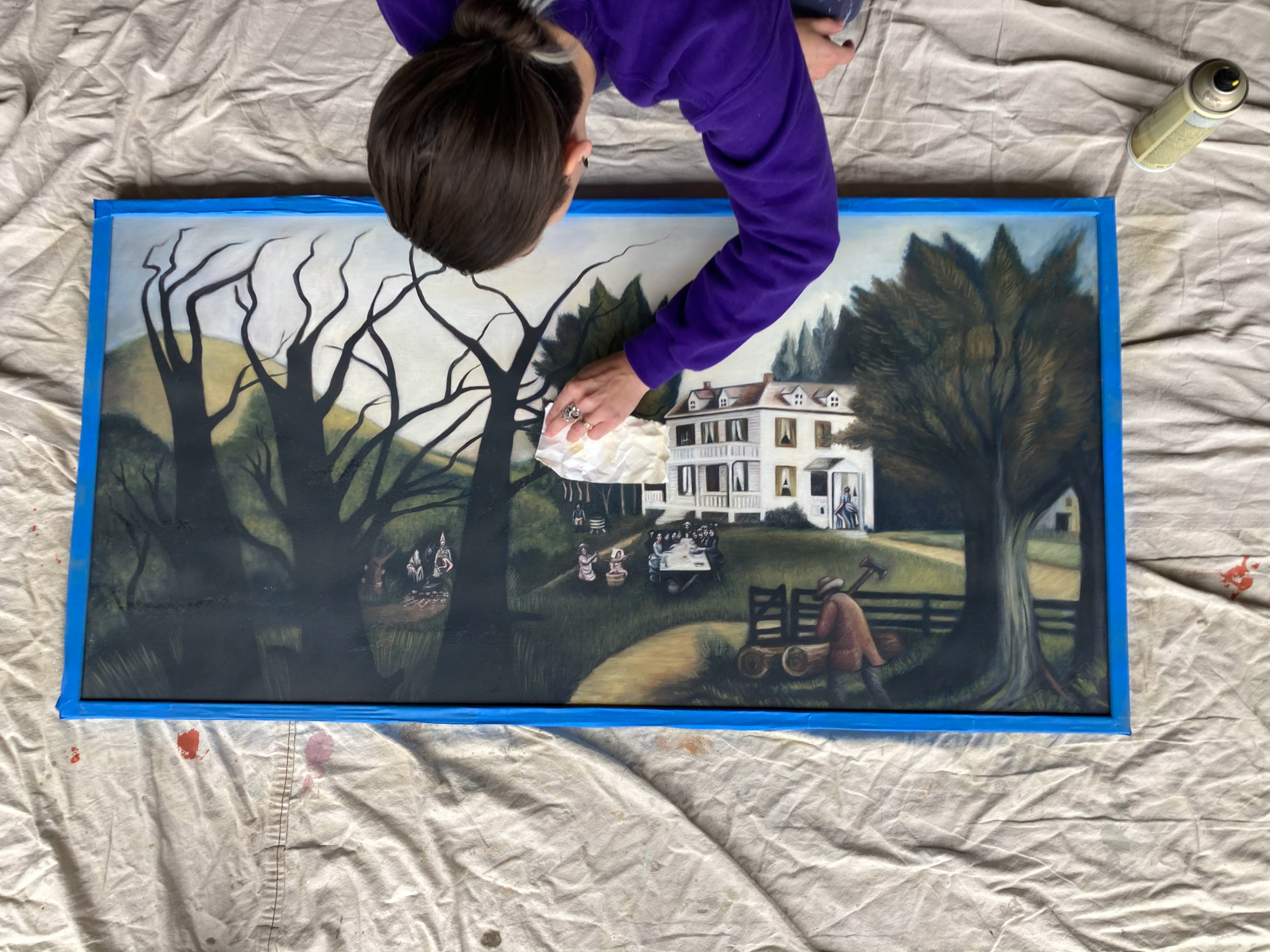
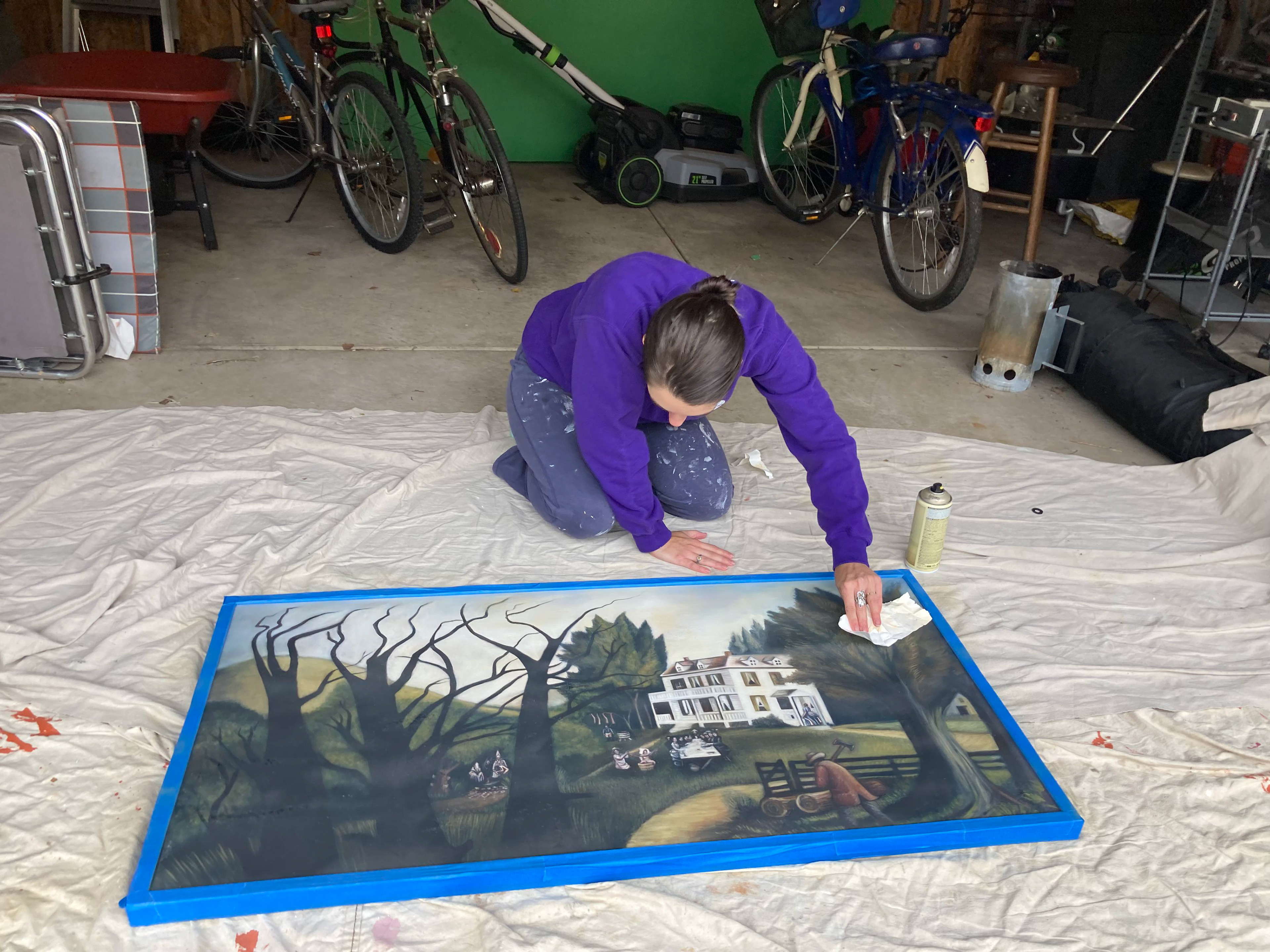
In the original H.P. Lovecraft story, the "Picture" in the house was found in the pages of an antique book. In this iteration, I thought it would be far more cinematic for it to be an aged oil painting. It would allow me to have the painting be ever-present even before our protagonist fully understands the danger he's in. I love the idea that keen-eyed viewers could perhaps notice threatening clues far before our protagonist does.
I worked with the incredible Mexican artist Laura Conde and together we developed the original painting.
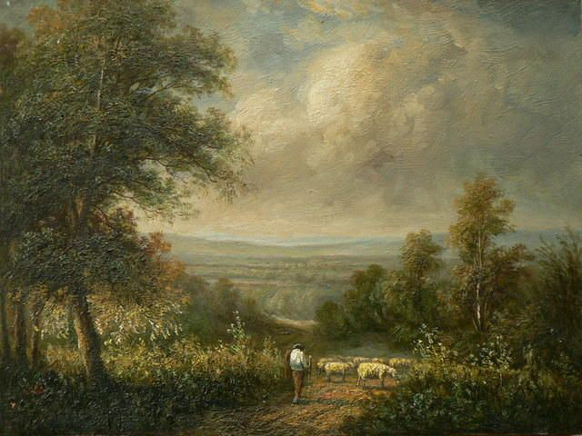
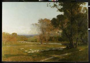
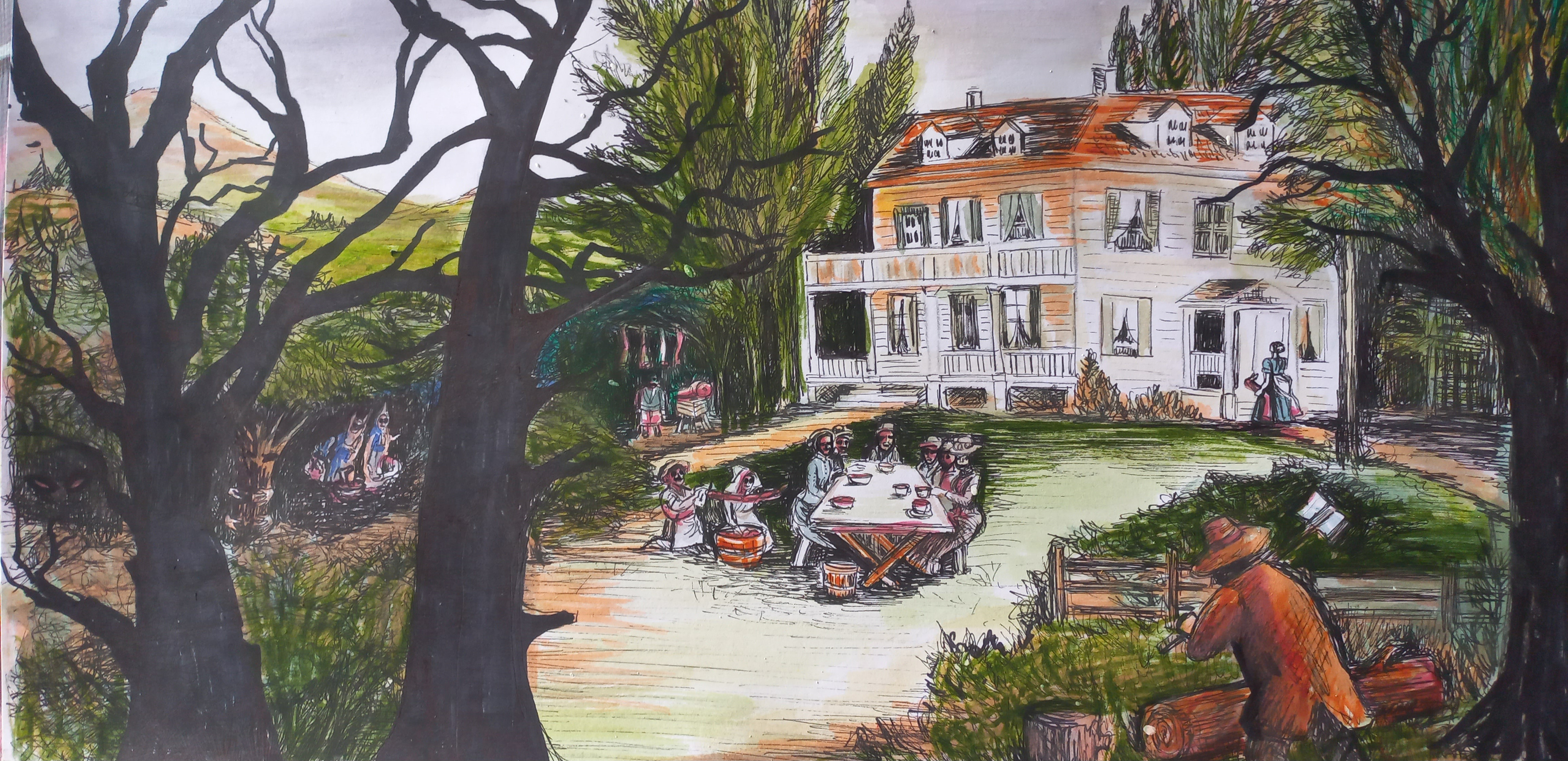
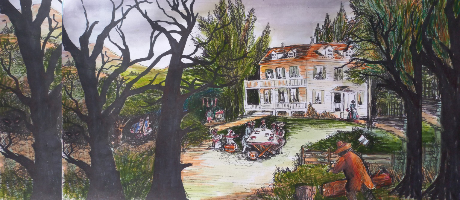
We wanted the painting to feel like a quaint and mundane pastoral landscape from afar, so that it can be seen and alluded to in wider shots without spoiling the reveal of the more haunting elements until our protagonist can see the details closely for himself. For the general composition of the painting, we found plenty of early American landscape oil paintings to reference.
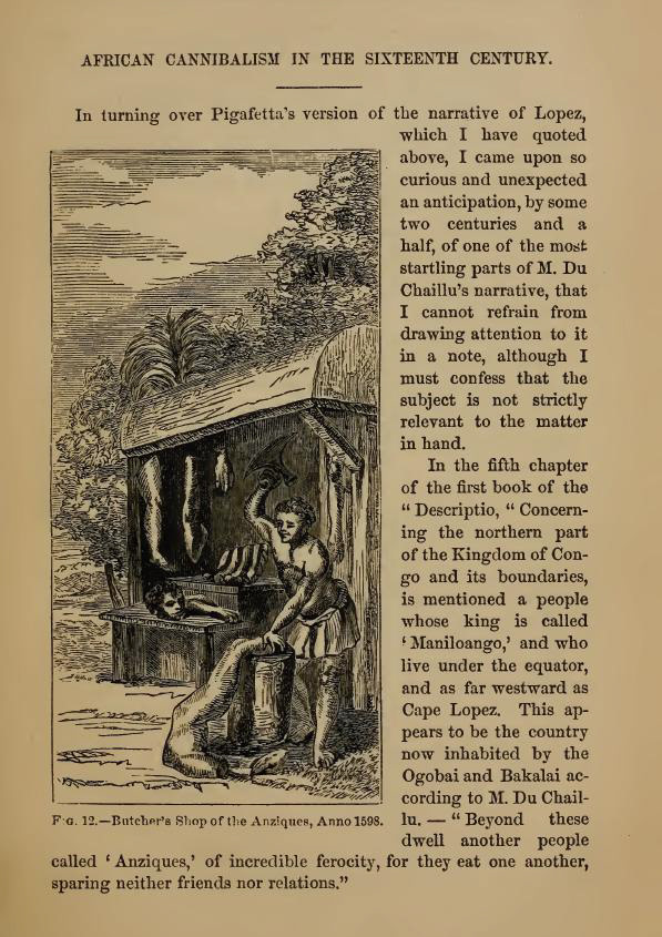
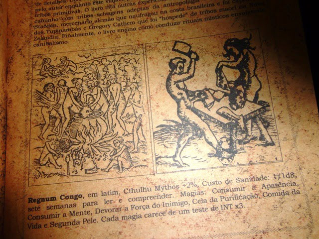
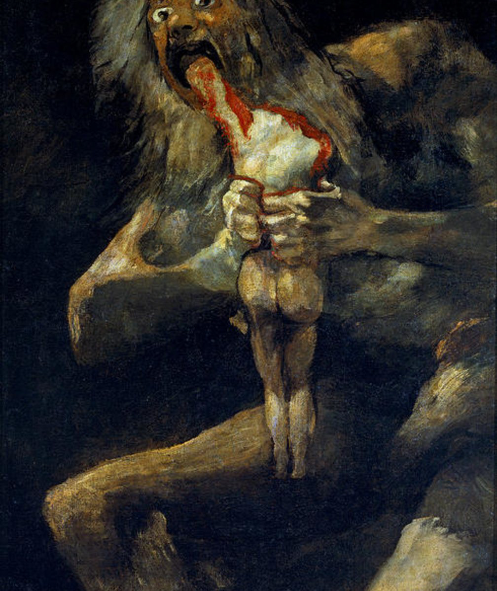
For the more intense closeups, we wanted to depict a cannibalistic cult, and referenced the illustrations from the book in the original story, "Regnum Congo", as well as the macabre gruesome quality of the works of Francisco Goya.
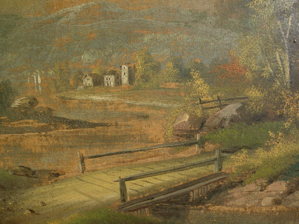
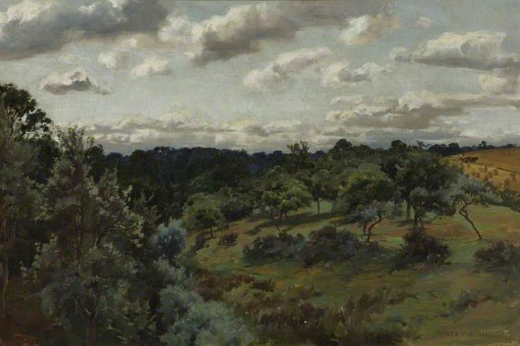
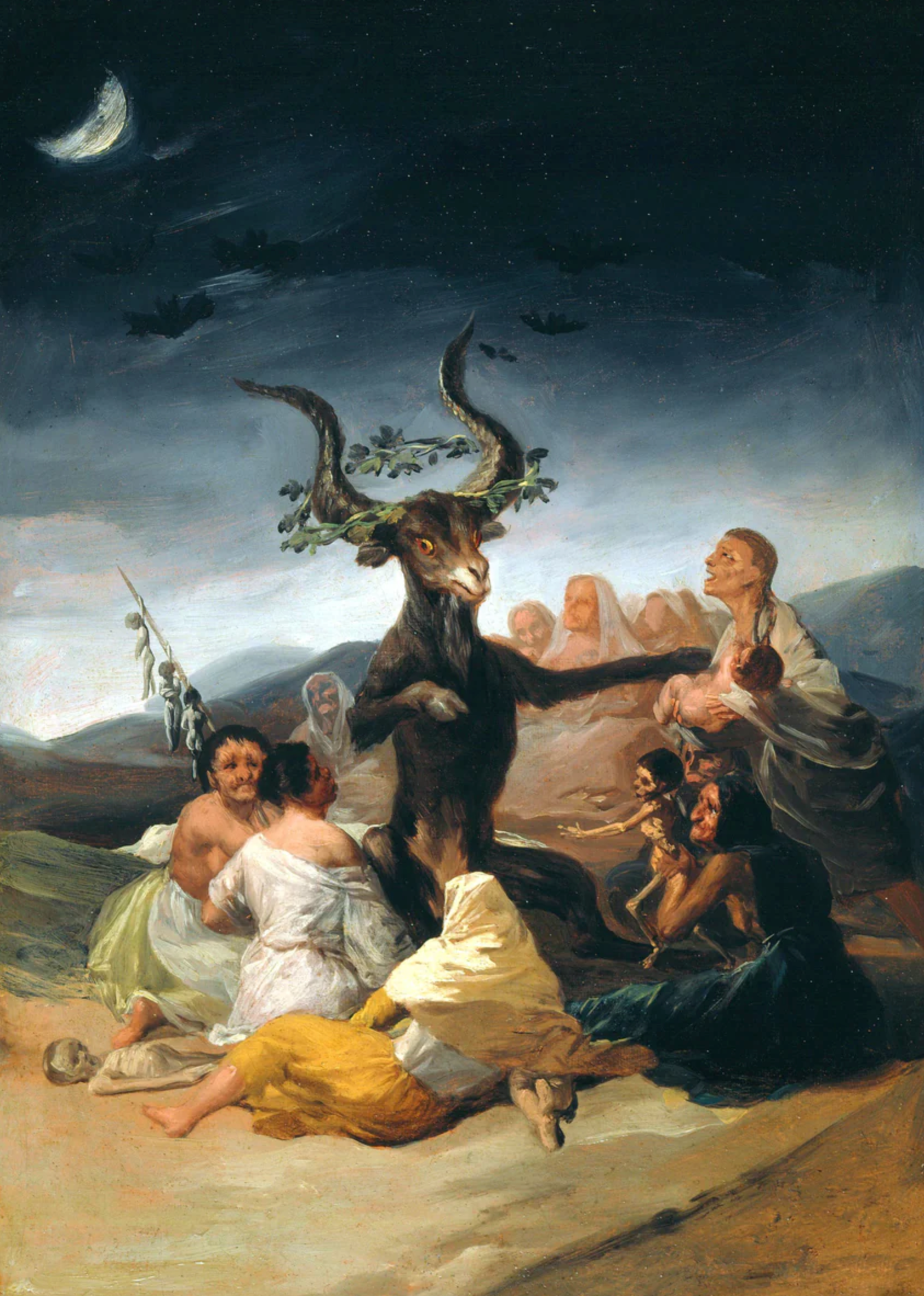
This was Laura's first pass at the design for the painting. I loved each of the creepy vignettes, but I wanted there to be more mystery. We moved them further back into the landscape and made them smaller.
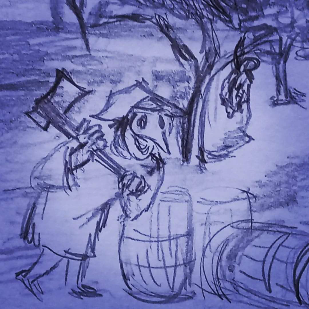
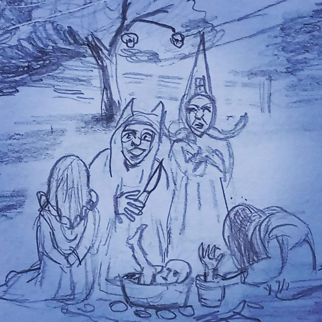
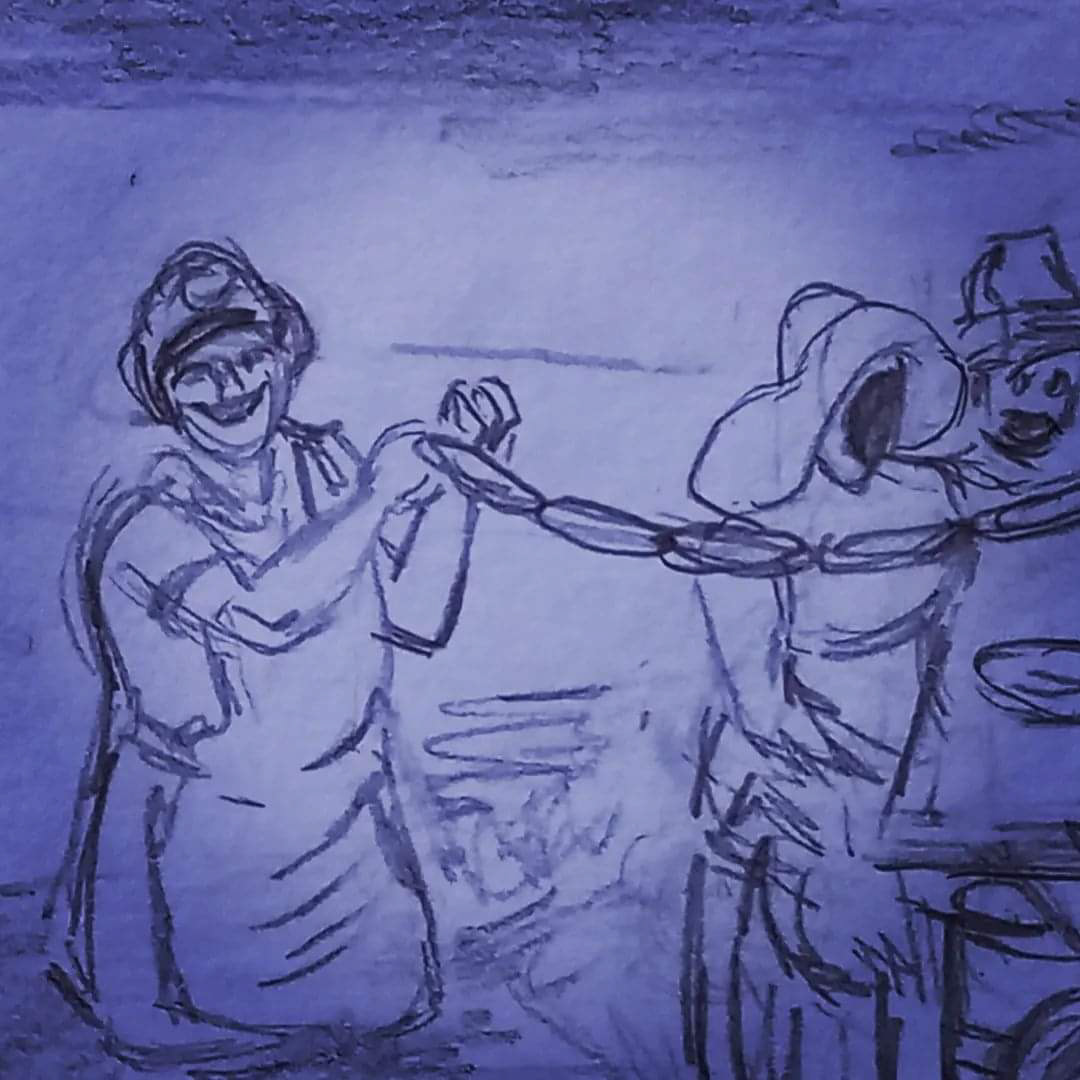
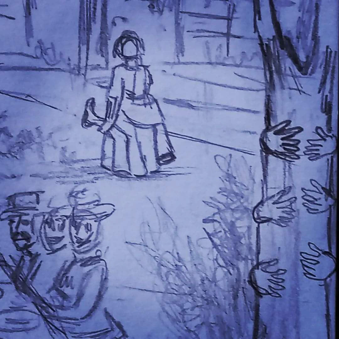
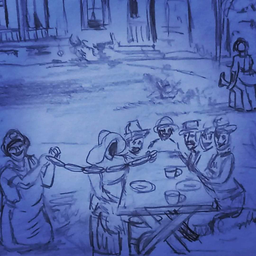
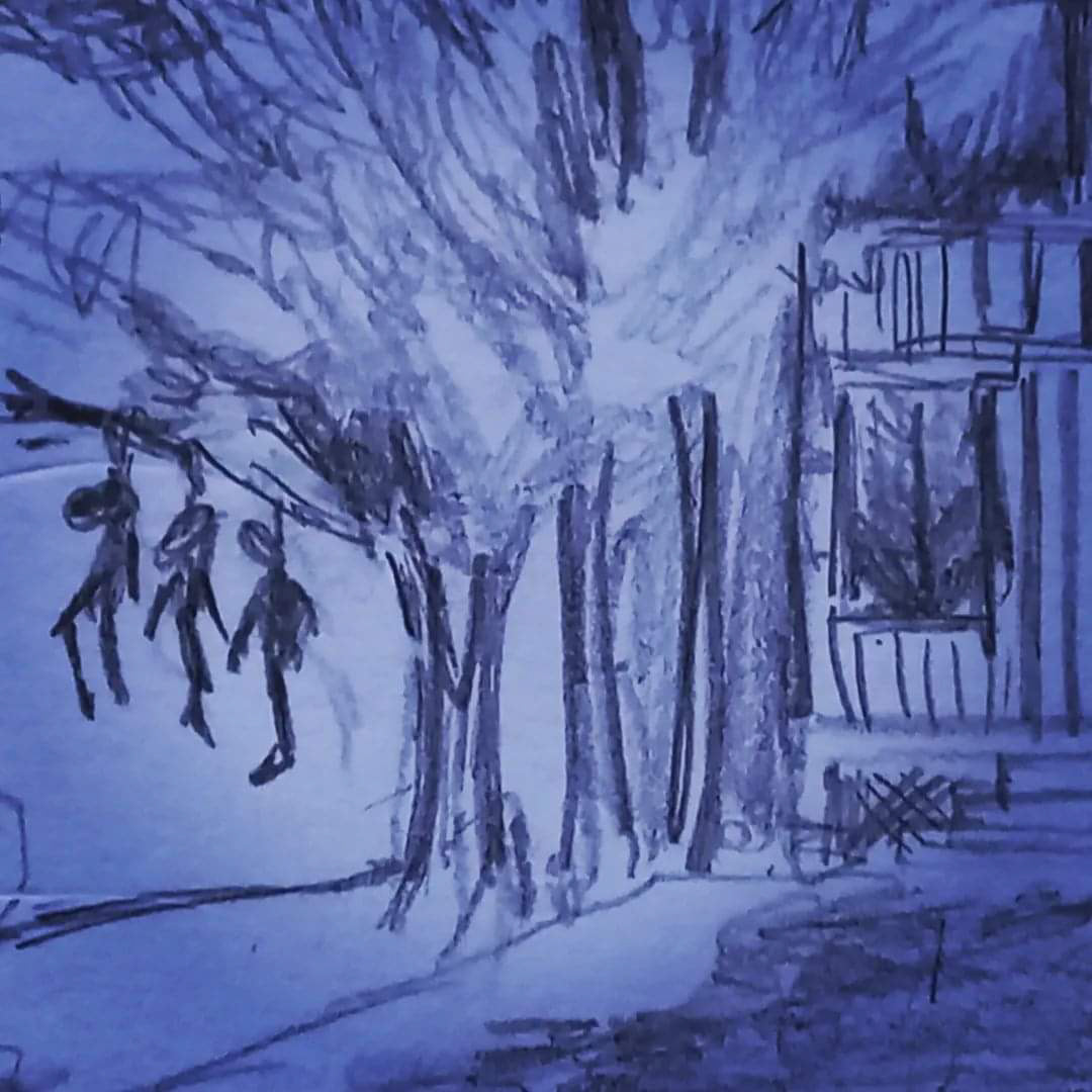
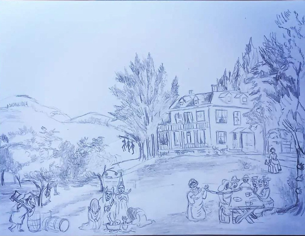
The second pass at the painting. Laura added the notes of the scale and the mystery and also incorporated the color palette that I had helped select.
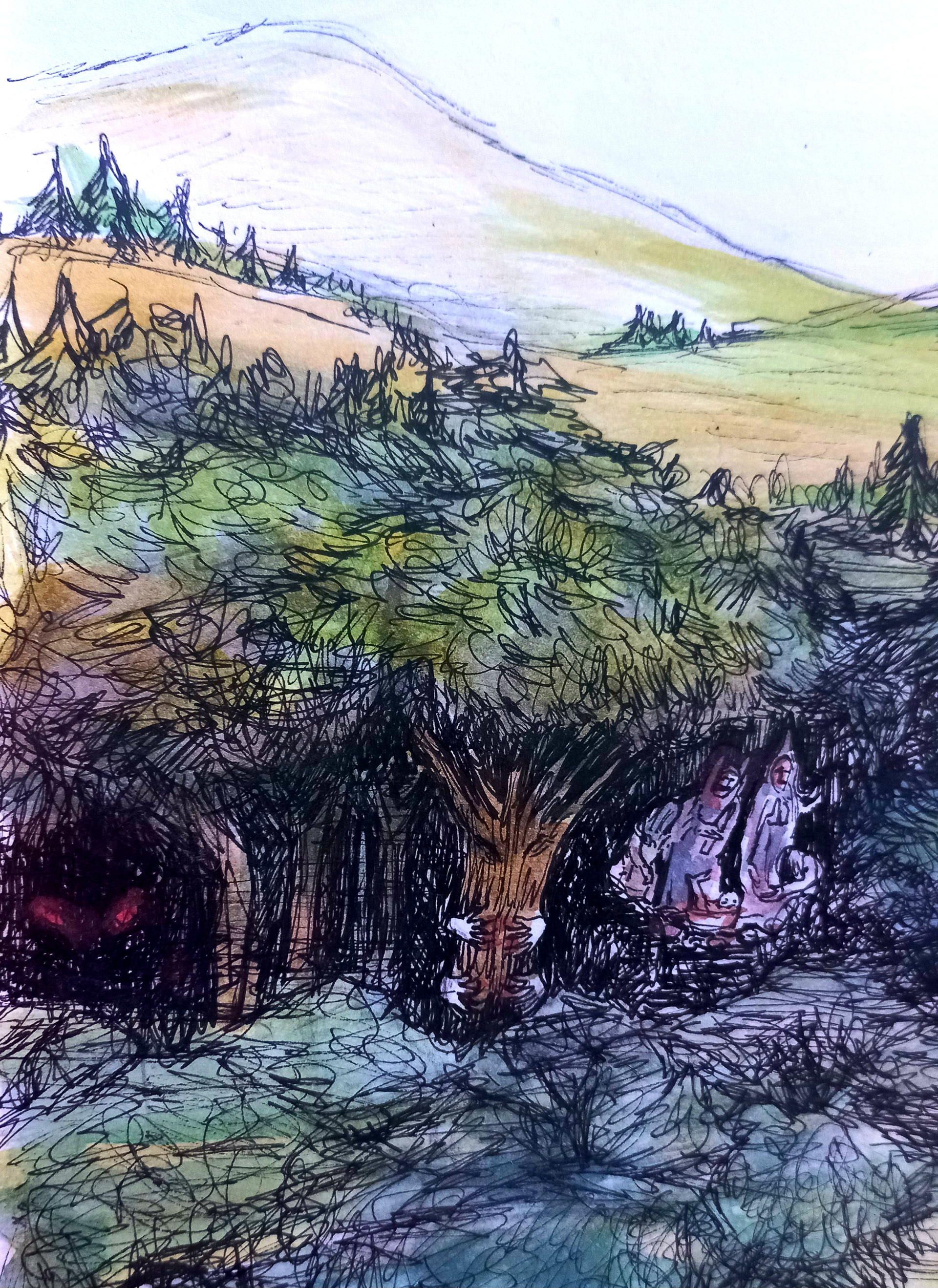
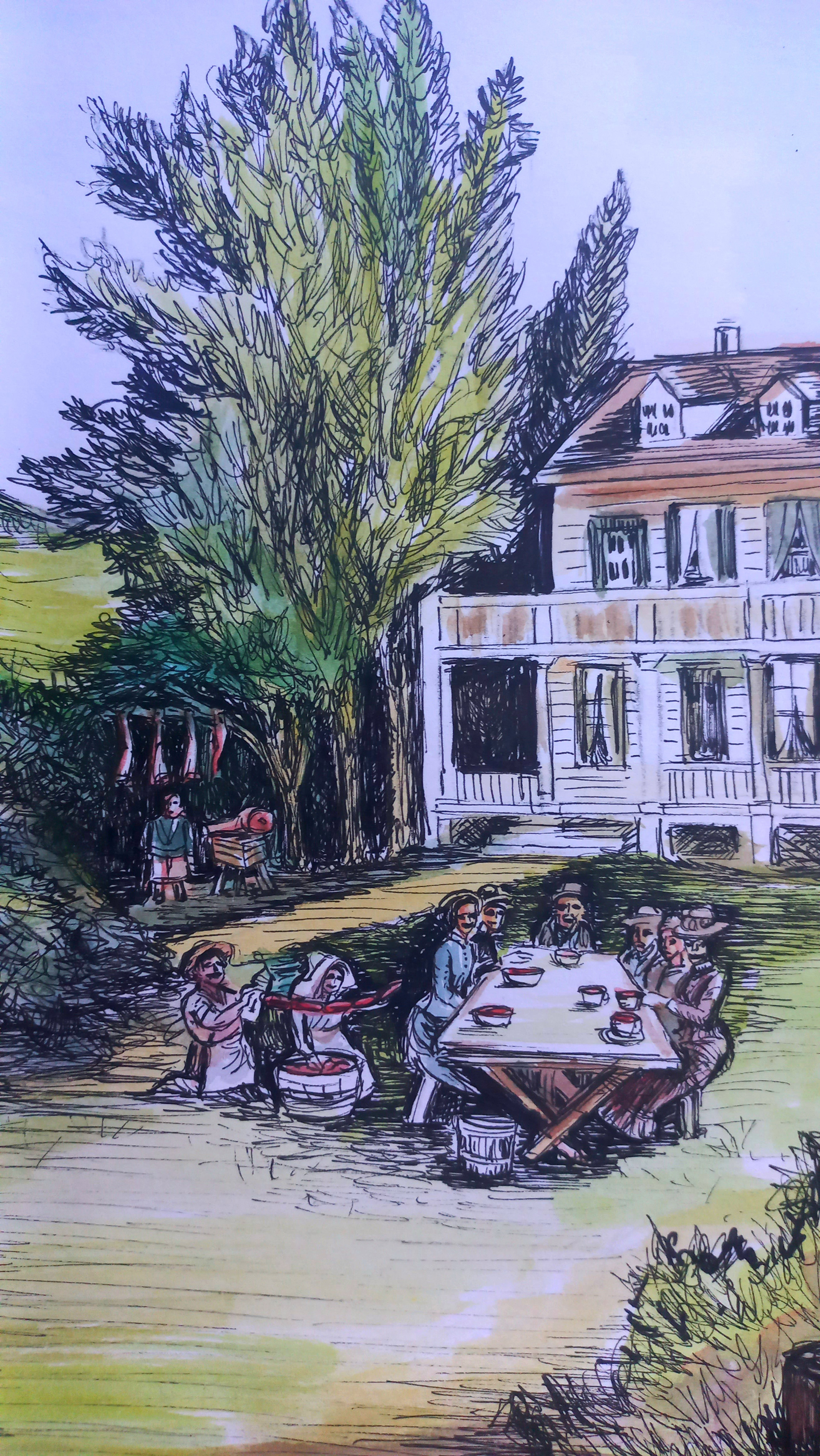
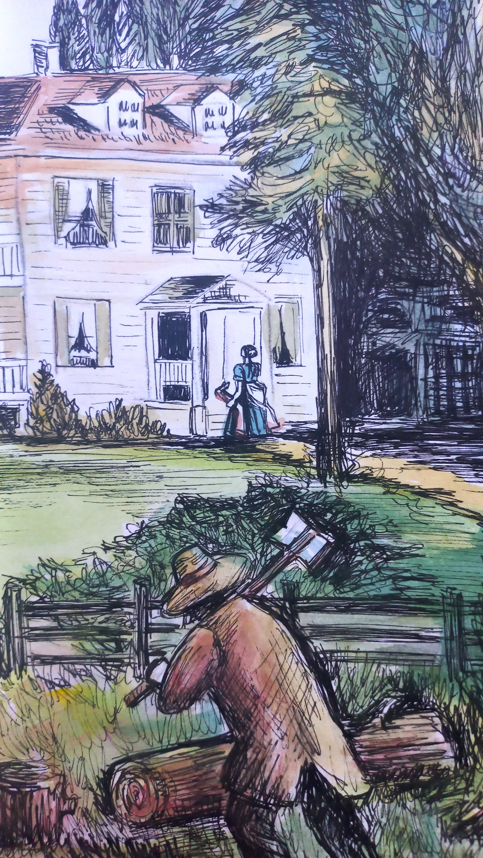
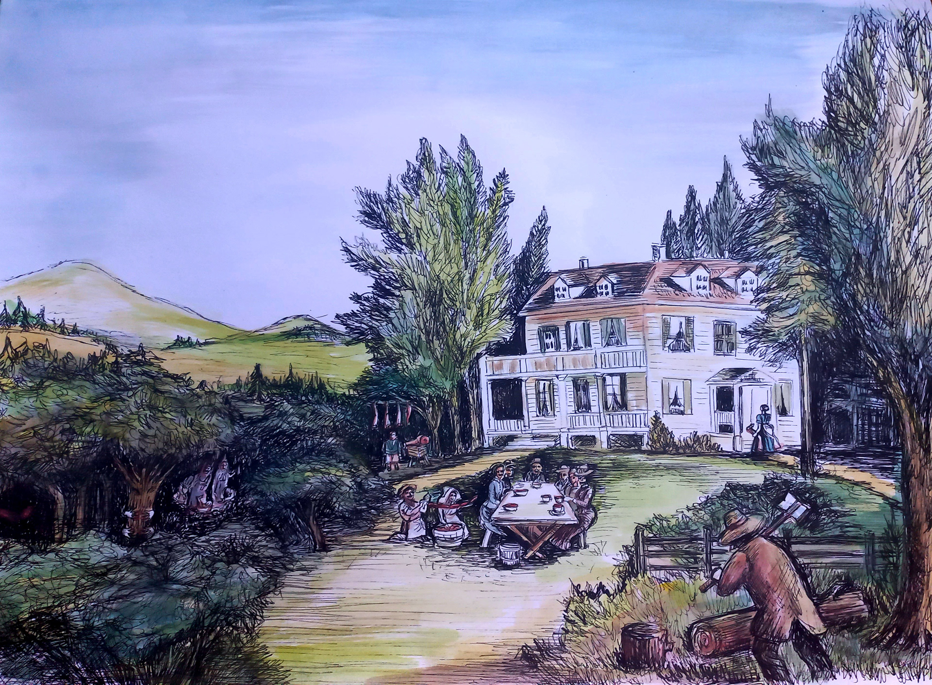
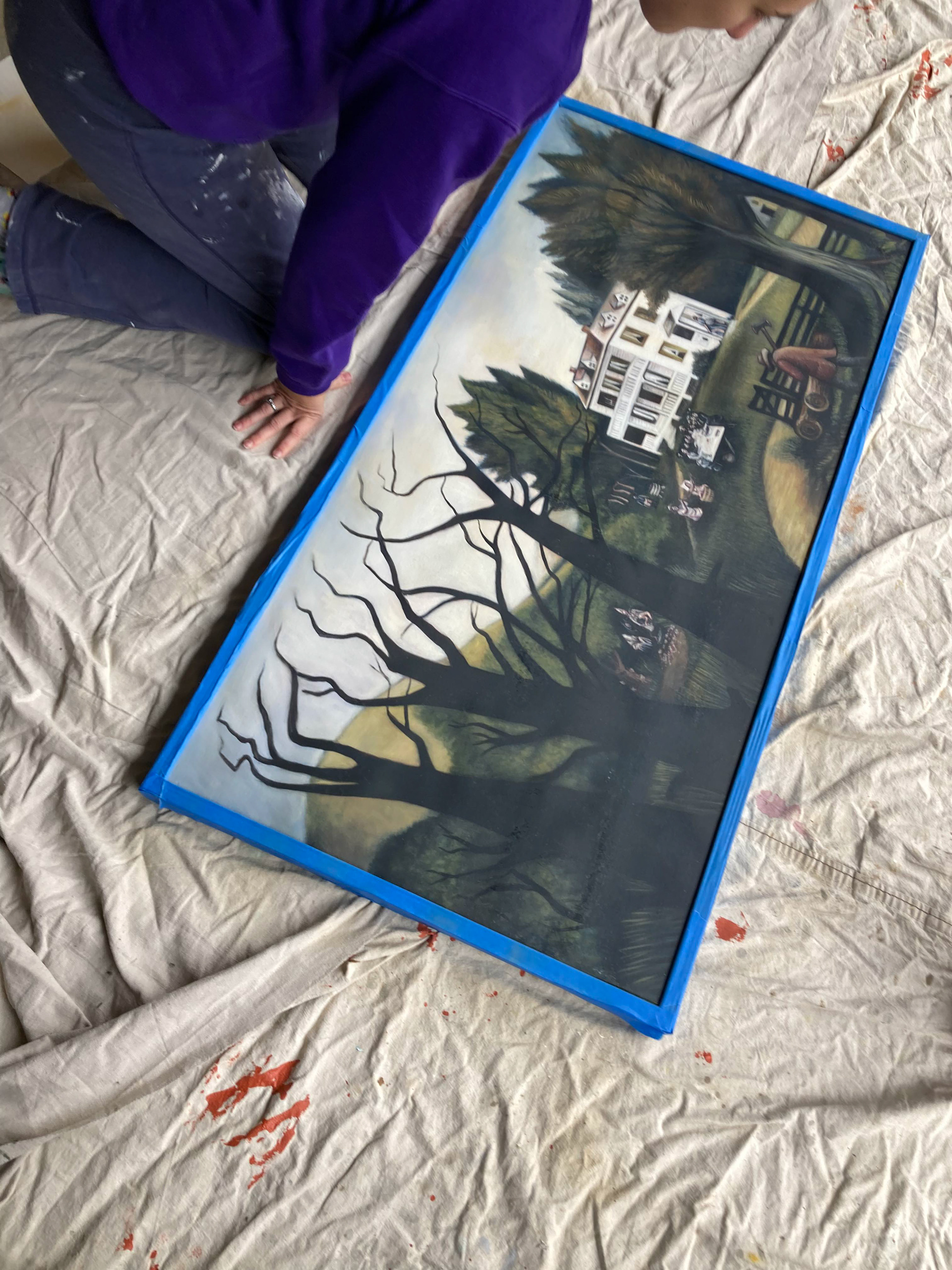
In the final mockups, we added trees to the foreground to create a more voyeuristic and obfuscated feel to the painting. Then, we expanded the aspect ratio to 4x2 to make the painting large and imposing and visible in each shot.
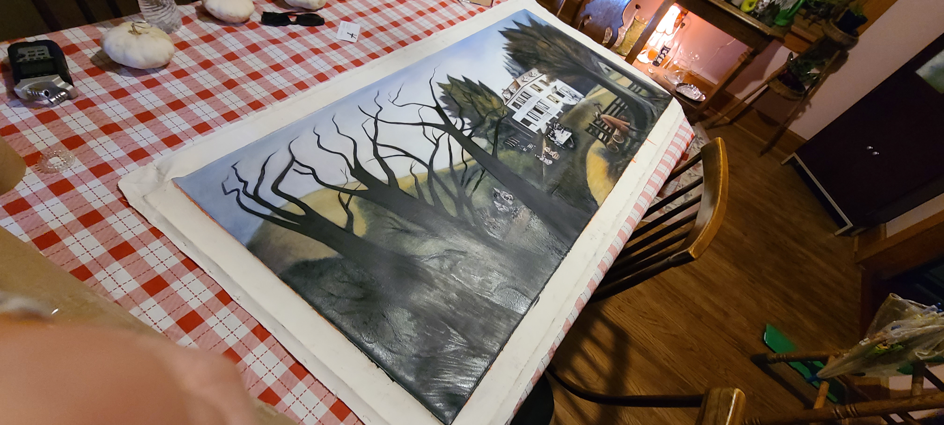
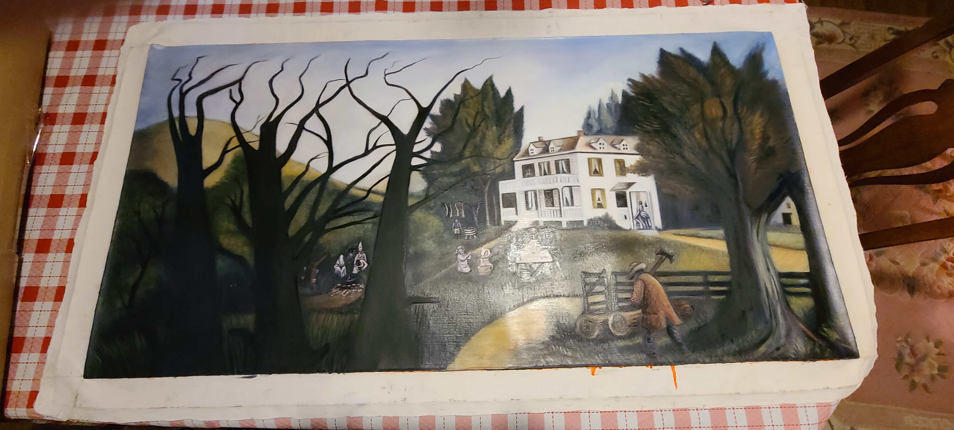
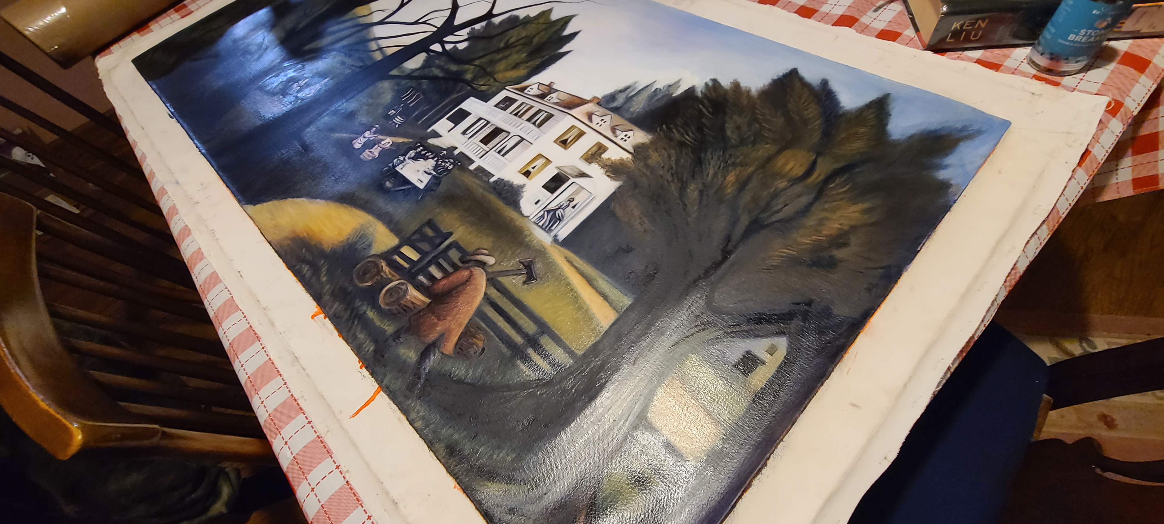
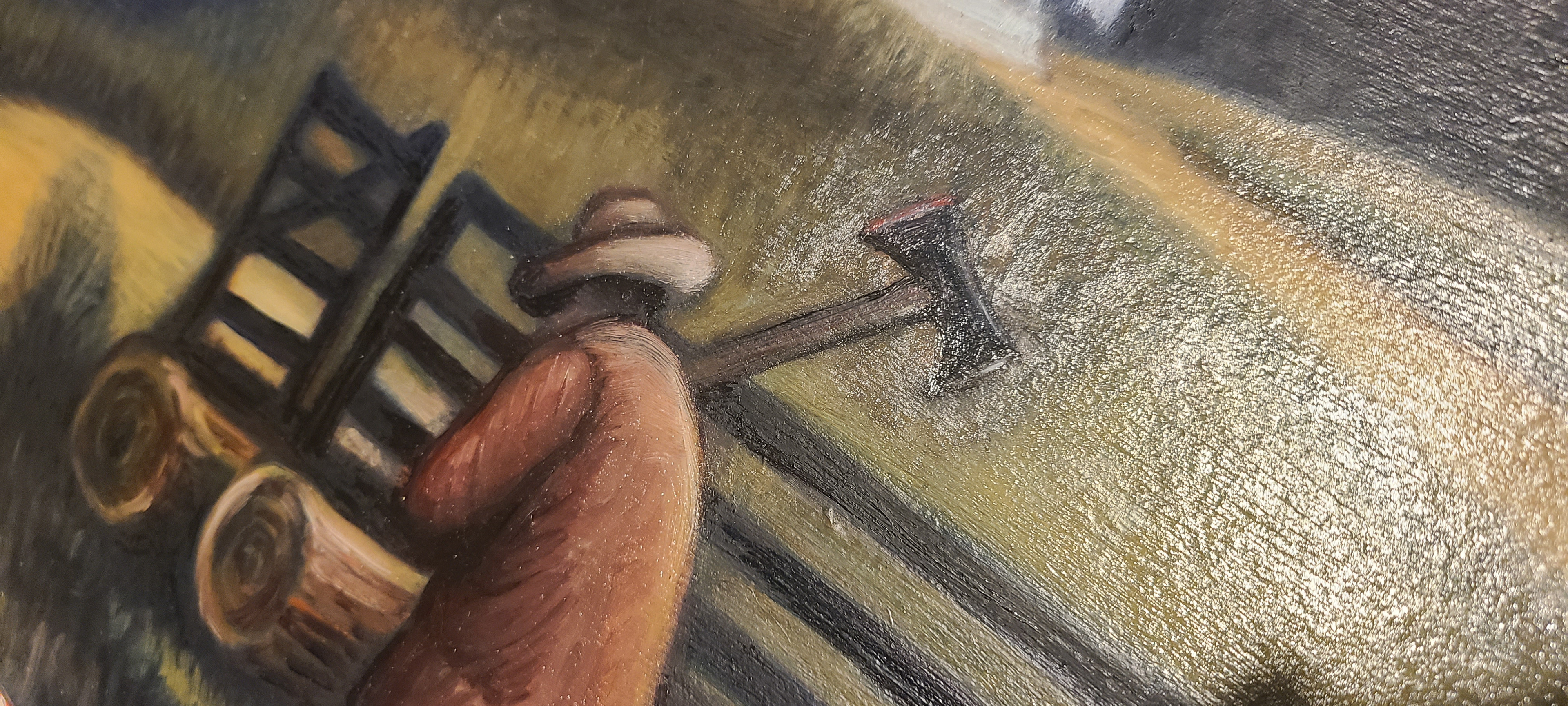
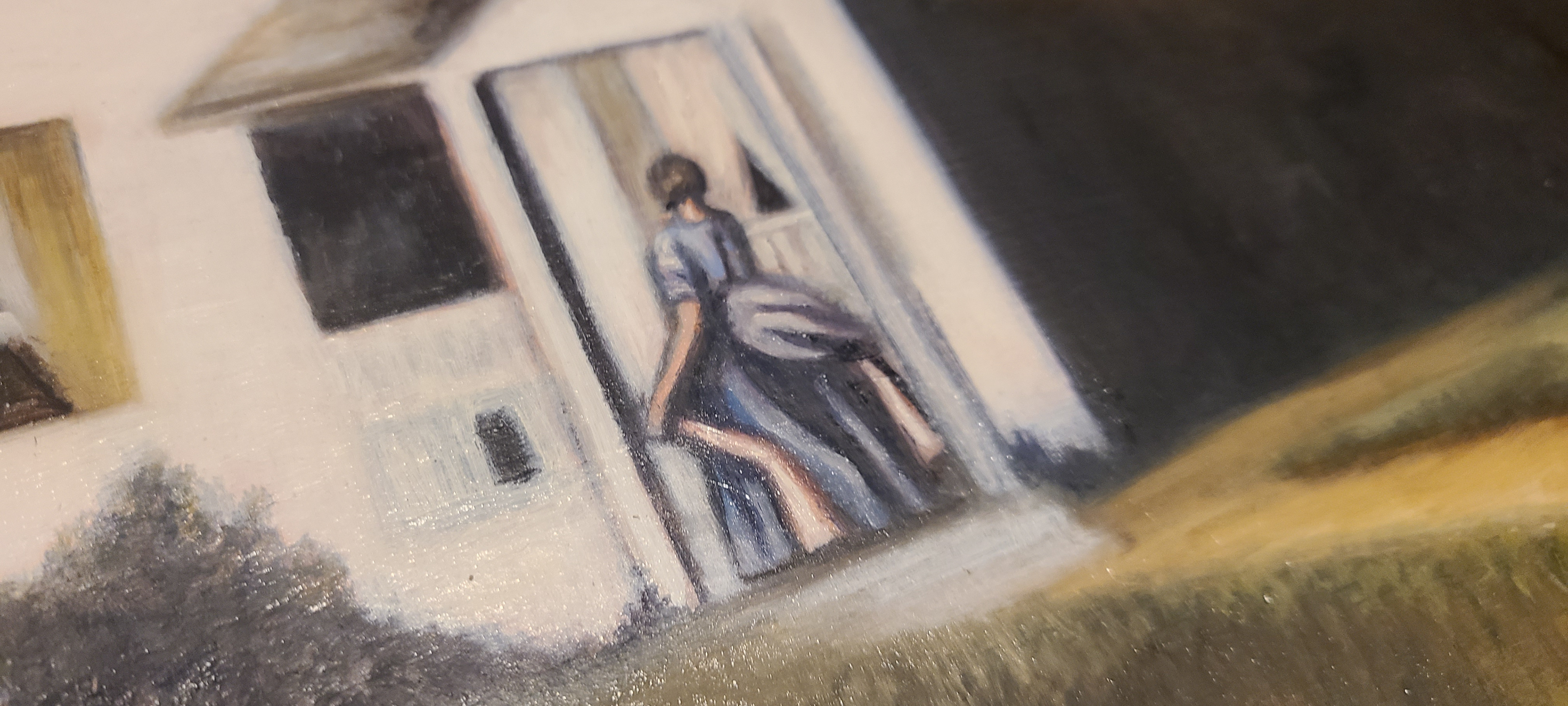
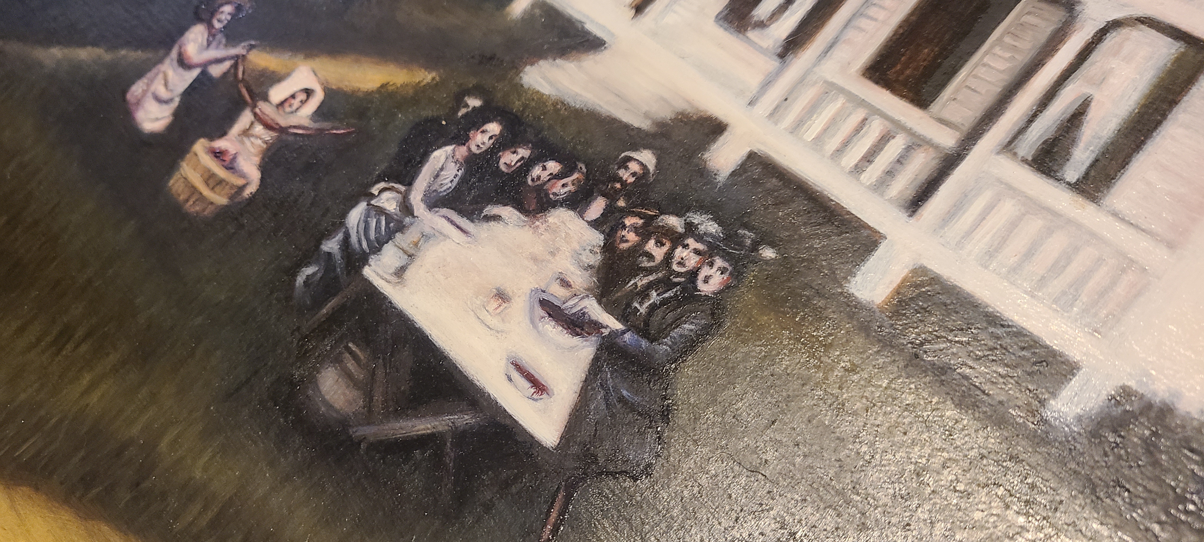
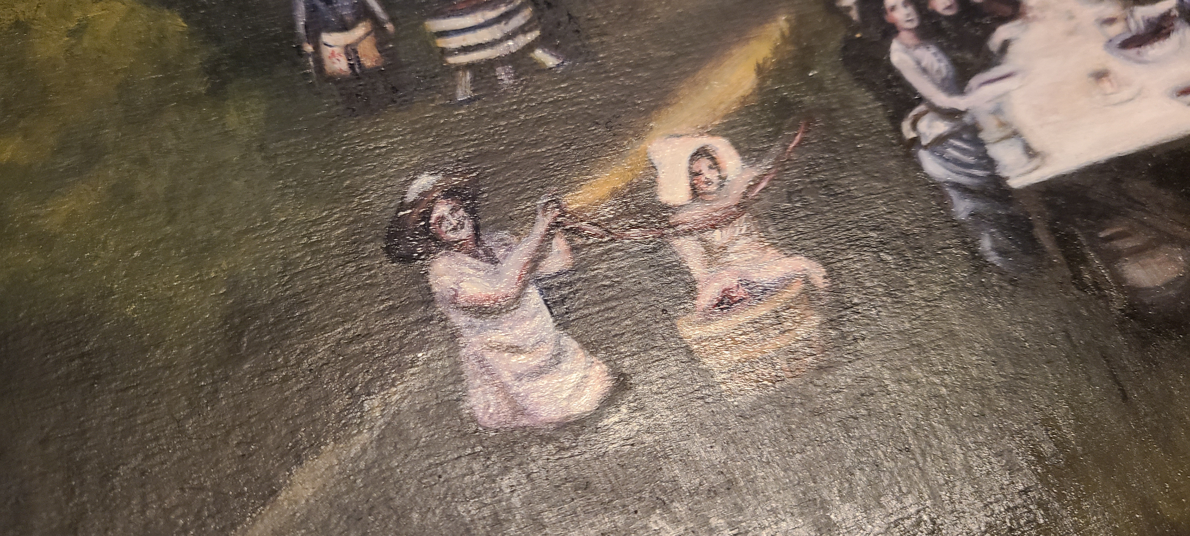
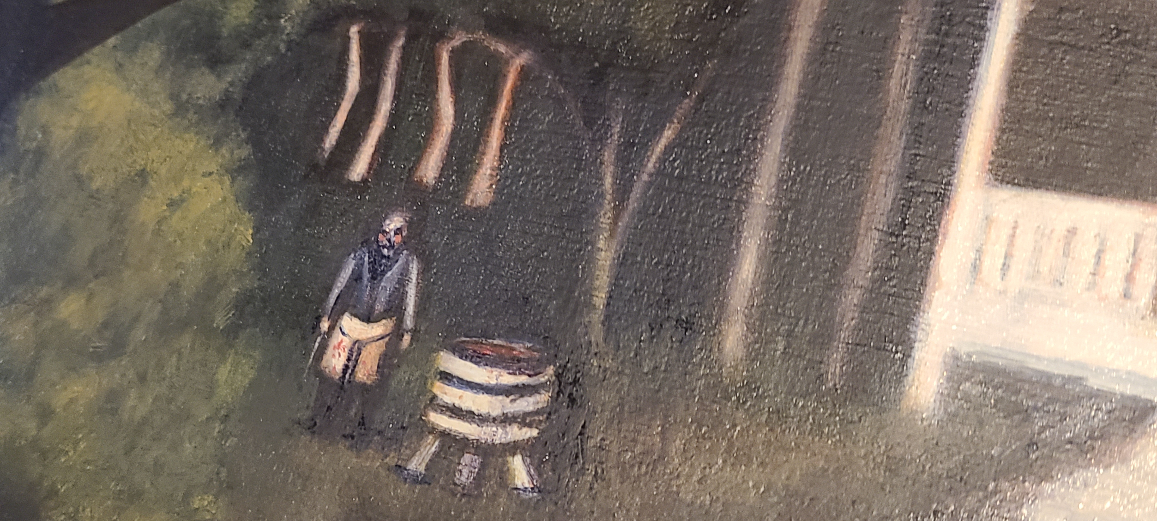
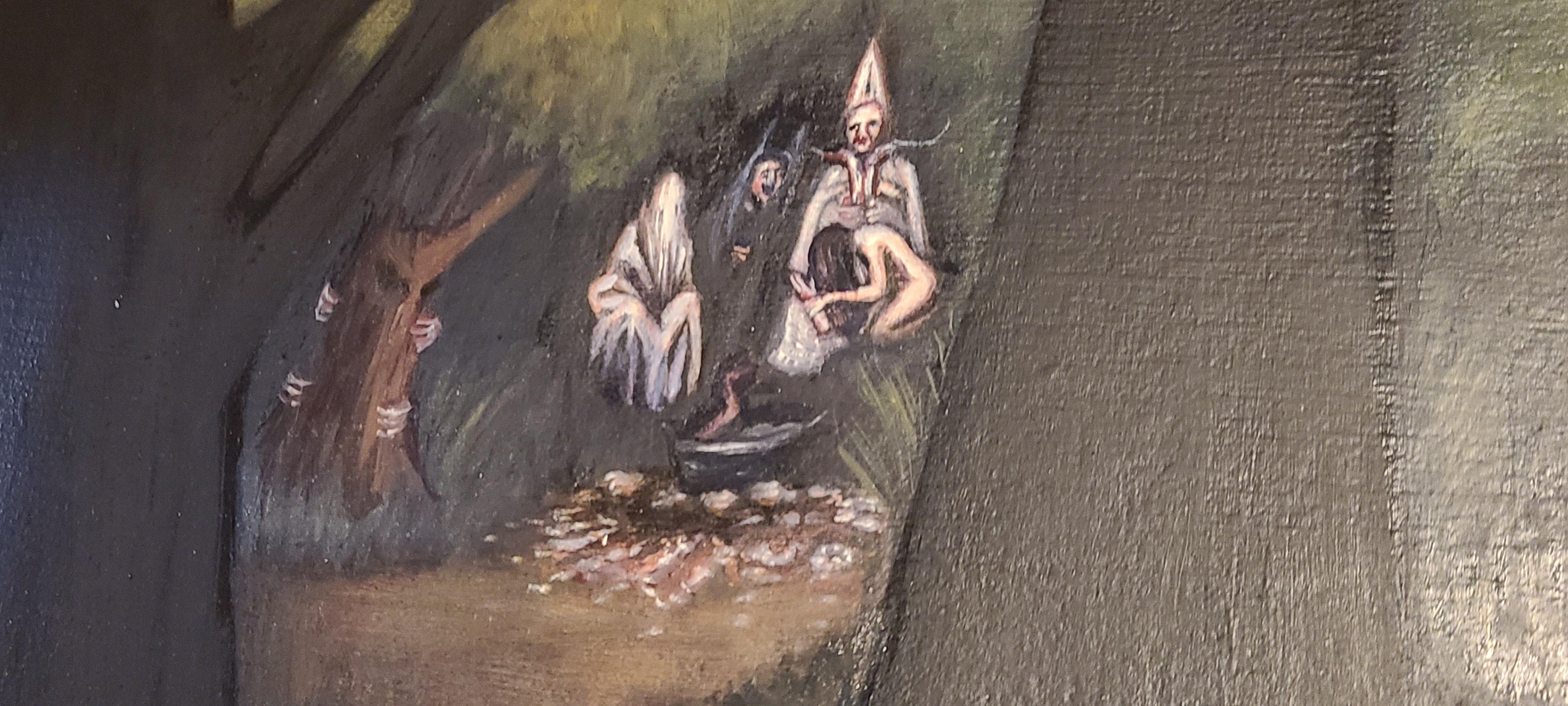
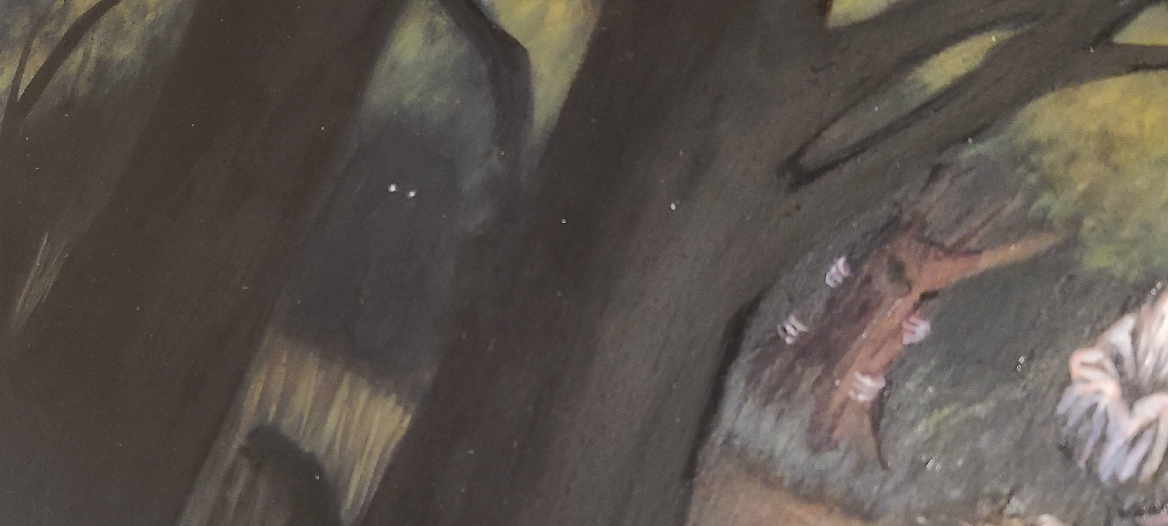
For the framing, I wanted something with antique gold coloration, that felt modest, and possibly even homemade by our homeowner/cannibal character. I opted for this one that had a wonderful antique olive-gold finish.
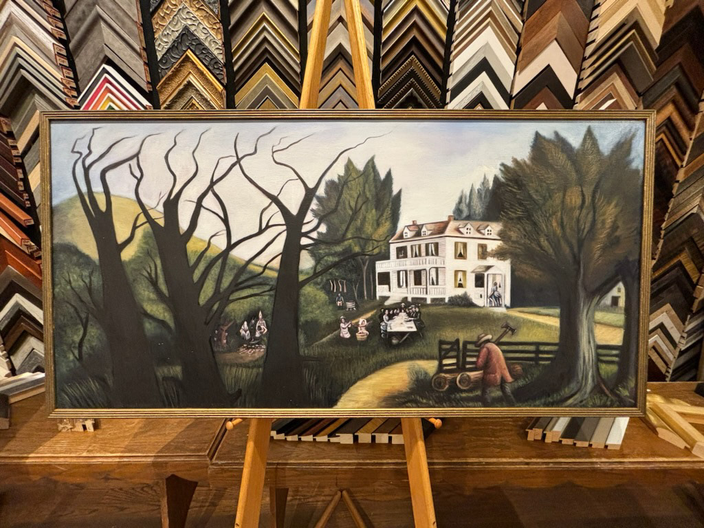
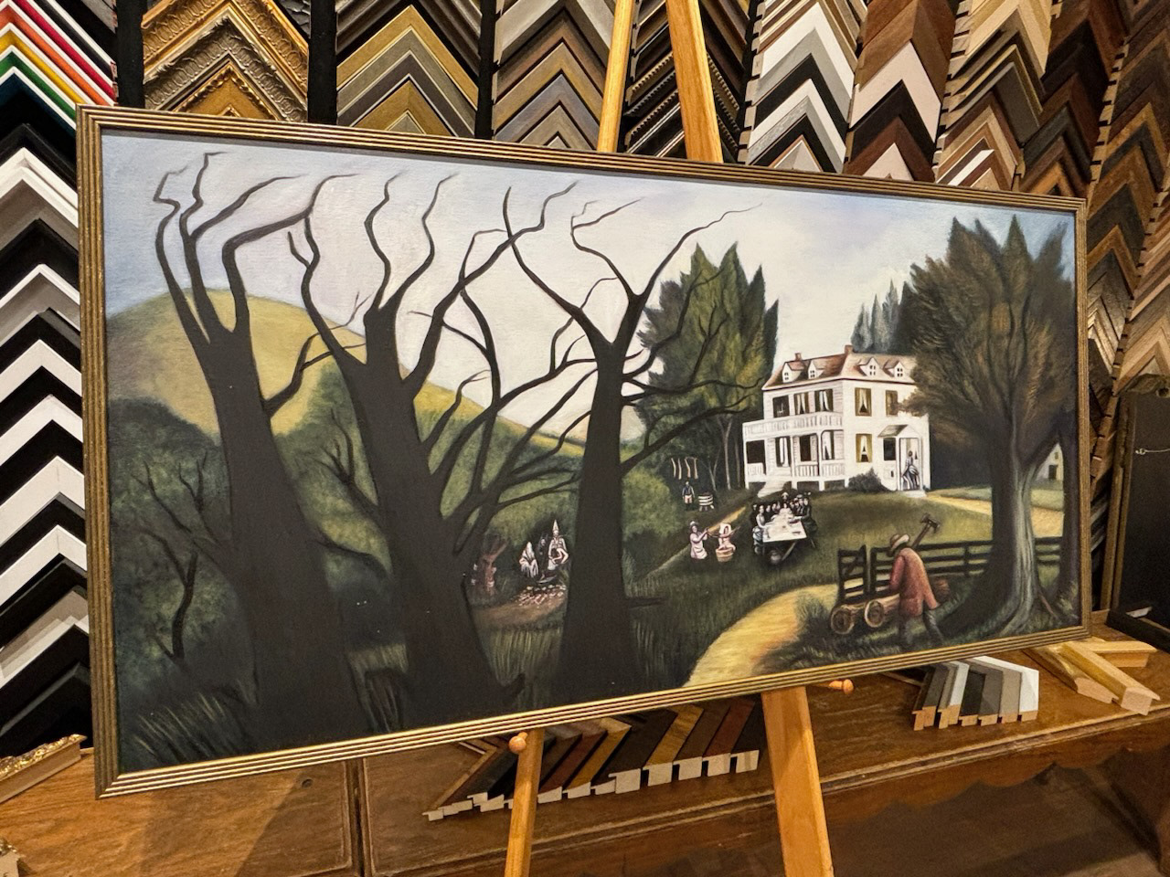
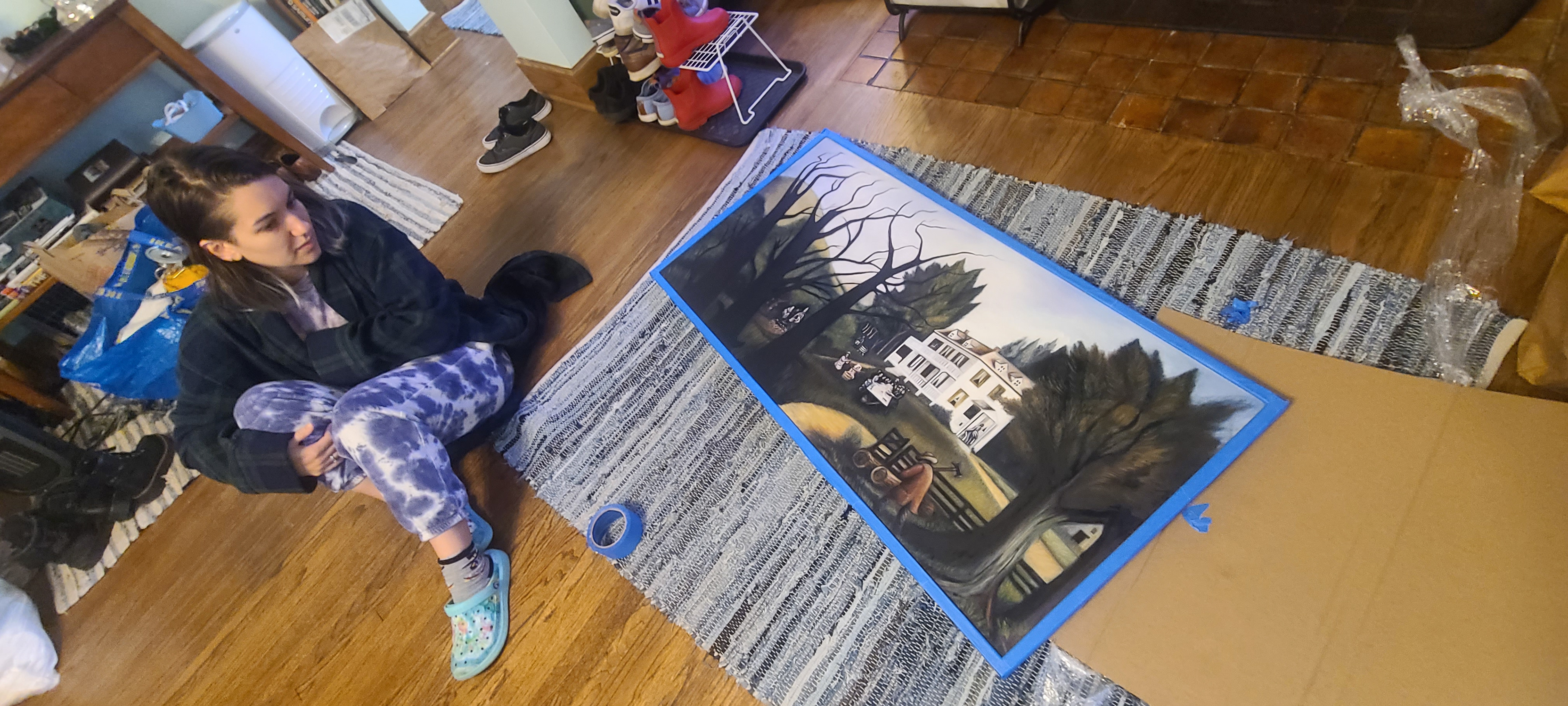
To finish the painting, I needed it to appear old and aged. So I used a mixture of antique varnish and fuller's earth to create a yellow-ed and dusty feel.
COSTUMING
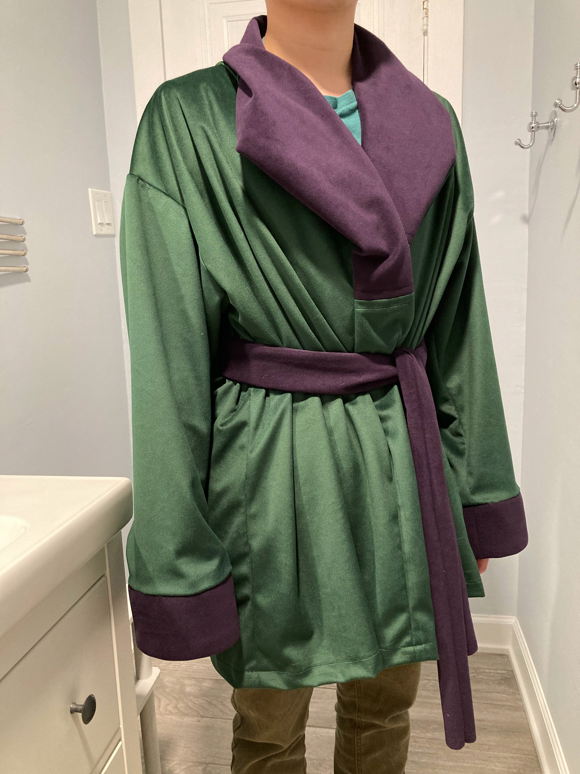
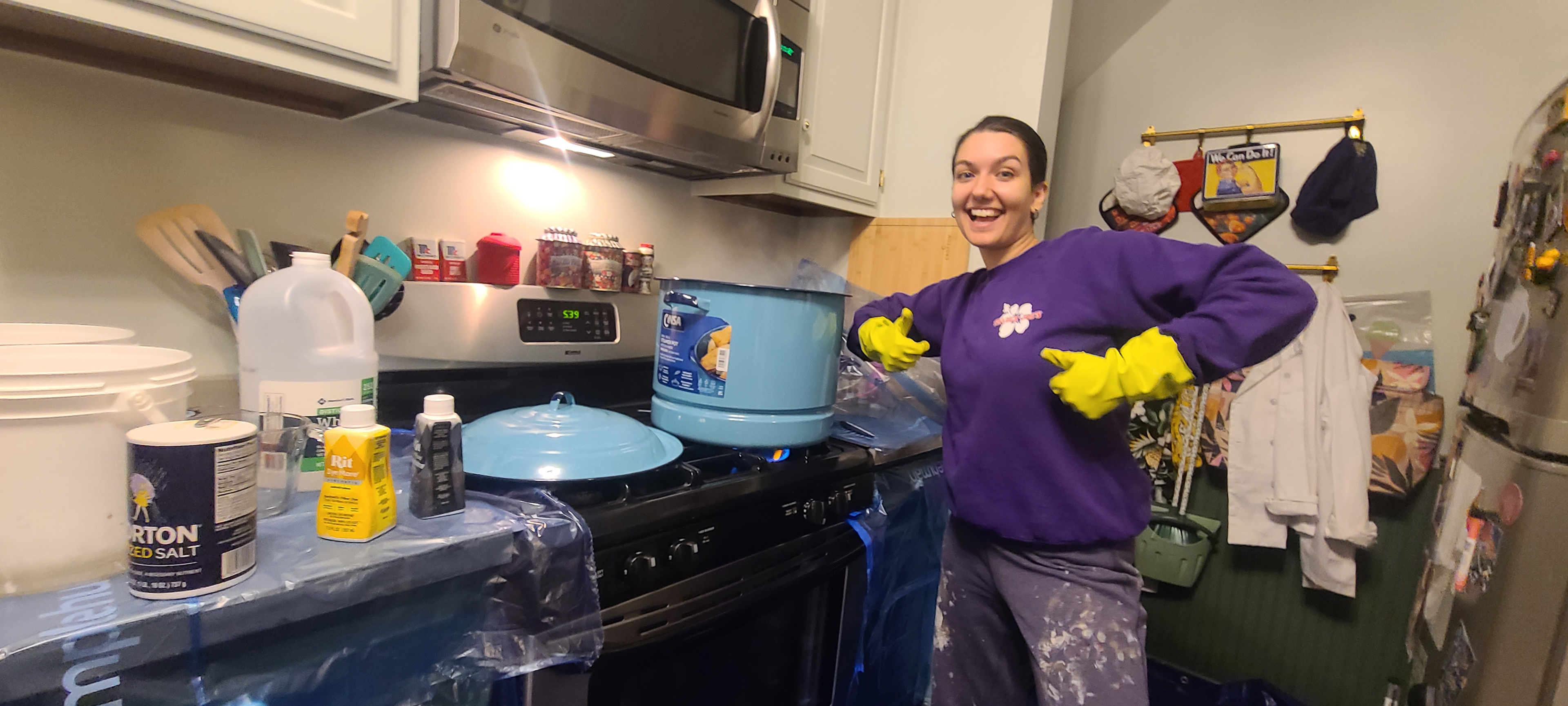
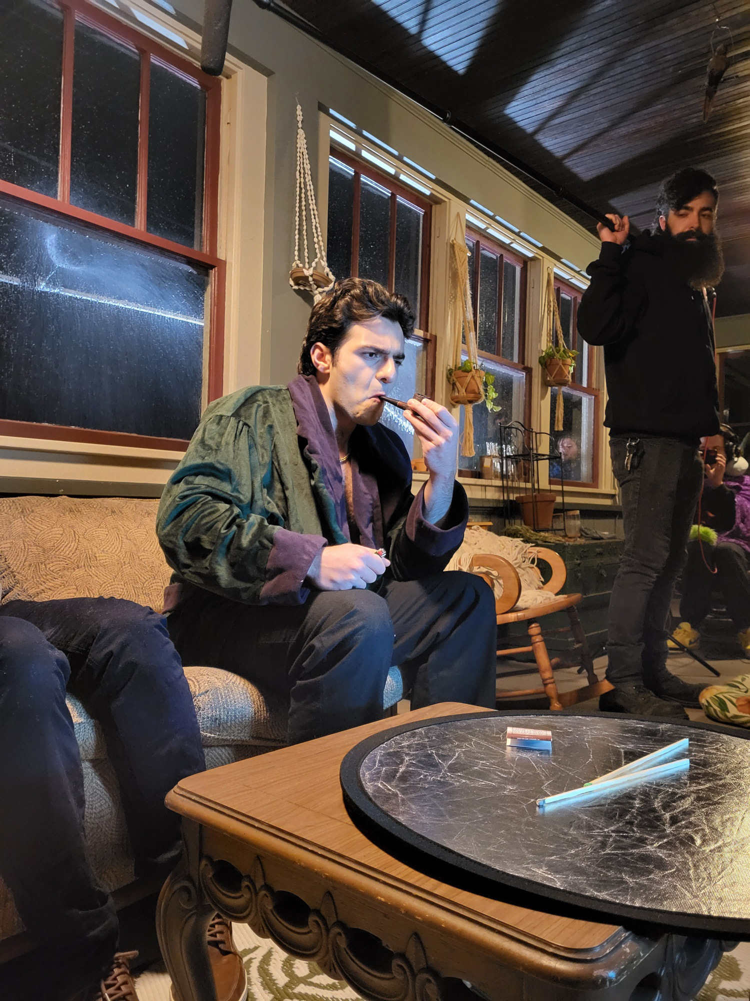
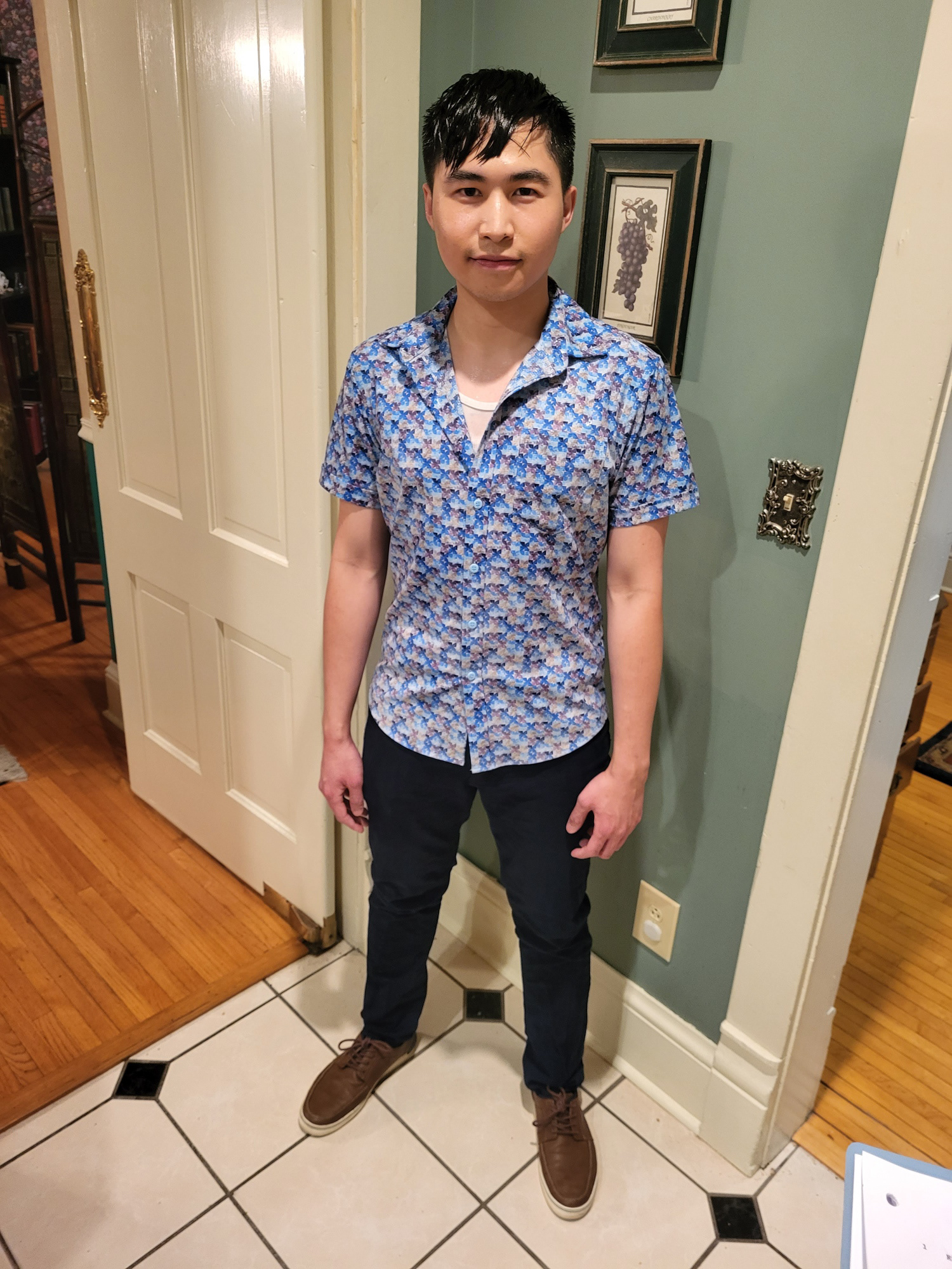
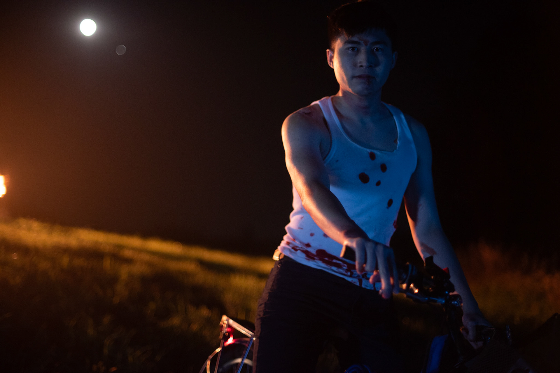
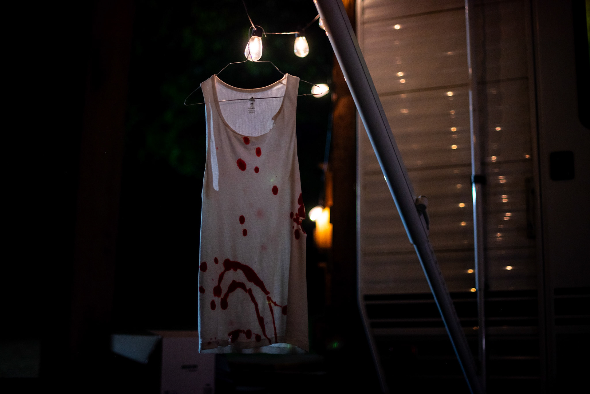
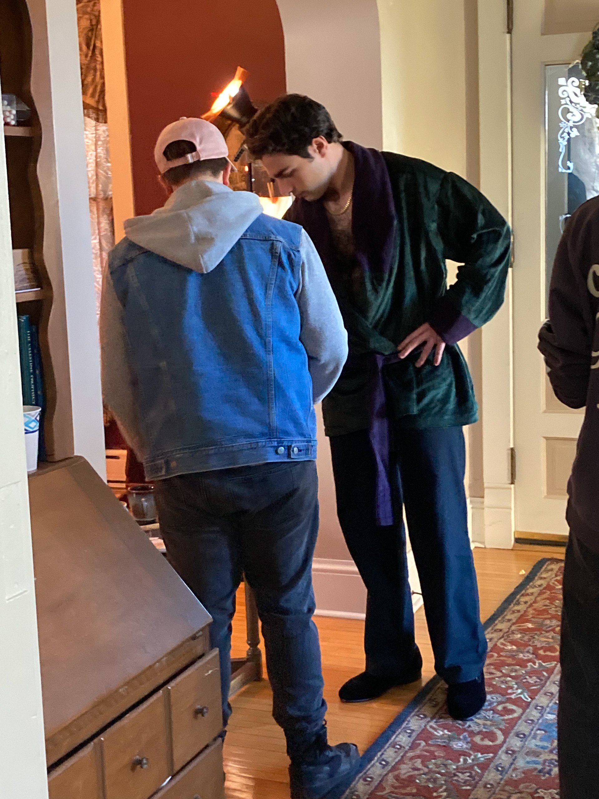
For the costuming, we wanted Mike to feel very realistic and relatable. We shopped his wardrobe from Kohl's and found a vibrant pattern that stands out with his color language (blues) and also softly nods to his somewhat closeted queerness. We also thought it was important to have a removable layer of clothing for the sake of his intimacy and vulnerability, and chose a white dago tee to show the blood and tears and burns at the end of thim. For Gordon's wardrobe, we wanted him to feel like he was incredibly comfortable, almost like he was a part of the space. We chose to commission an original smoking jacket. The dark green spoke to the color language of safety while the soles of his slippers were a dangerous hidden bright red. (Throughout the film, Gordon is a Wolf in sheep's clothing and green is used throughout to convey the illusion of safety) the smoking jacket arrived looking too brand-new, so we manually distressed it in a tea bath, put it in the dryer on tumble-dry, and dipped the sleeves in ash to simulate a well-worn and loved garment.
HAIR AND MAKEUP
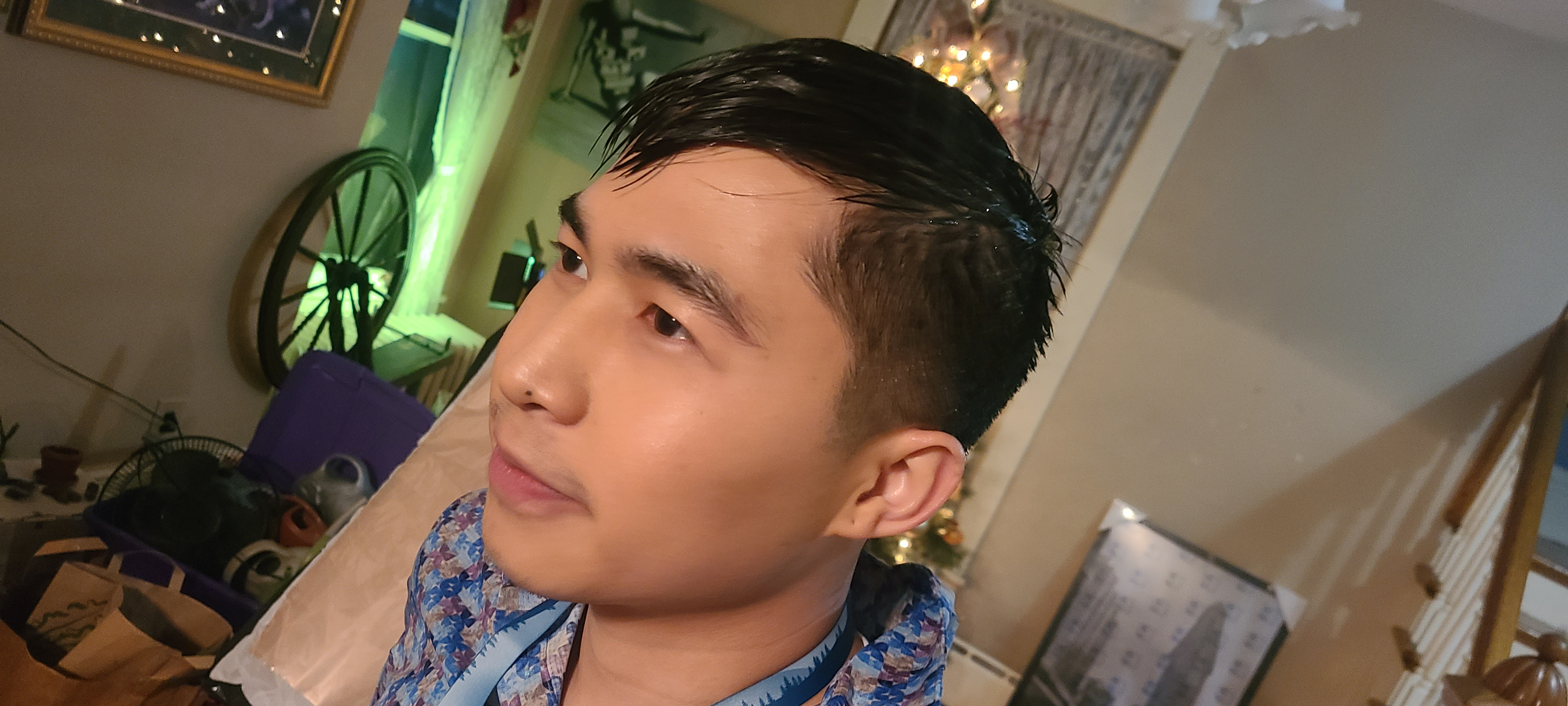
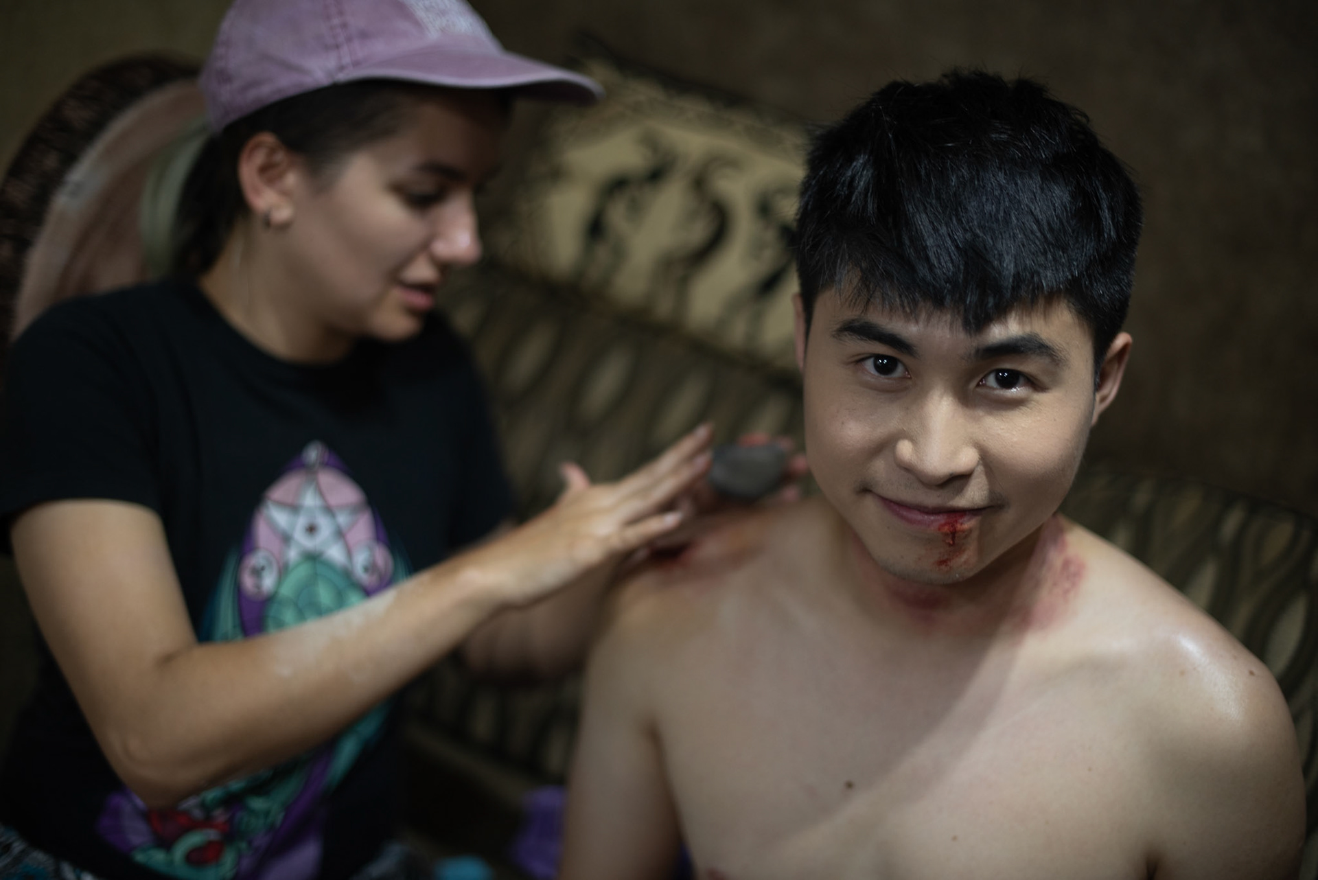
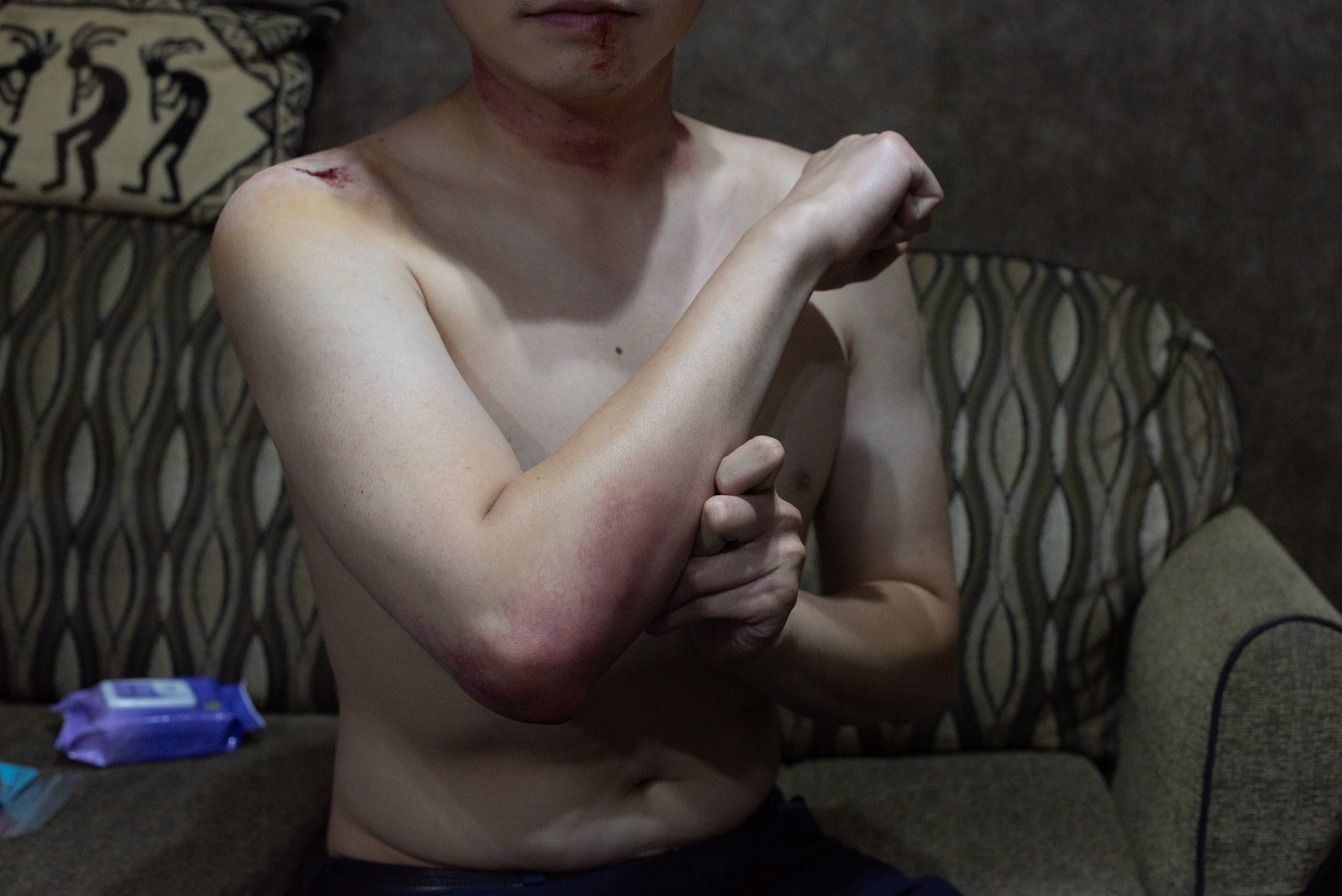
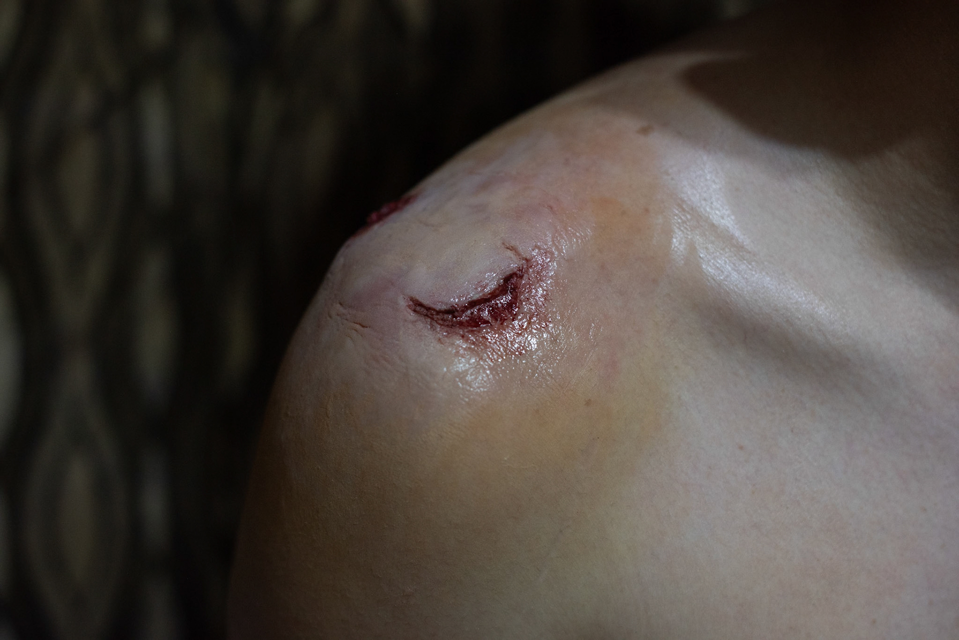
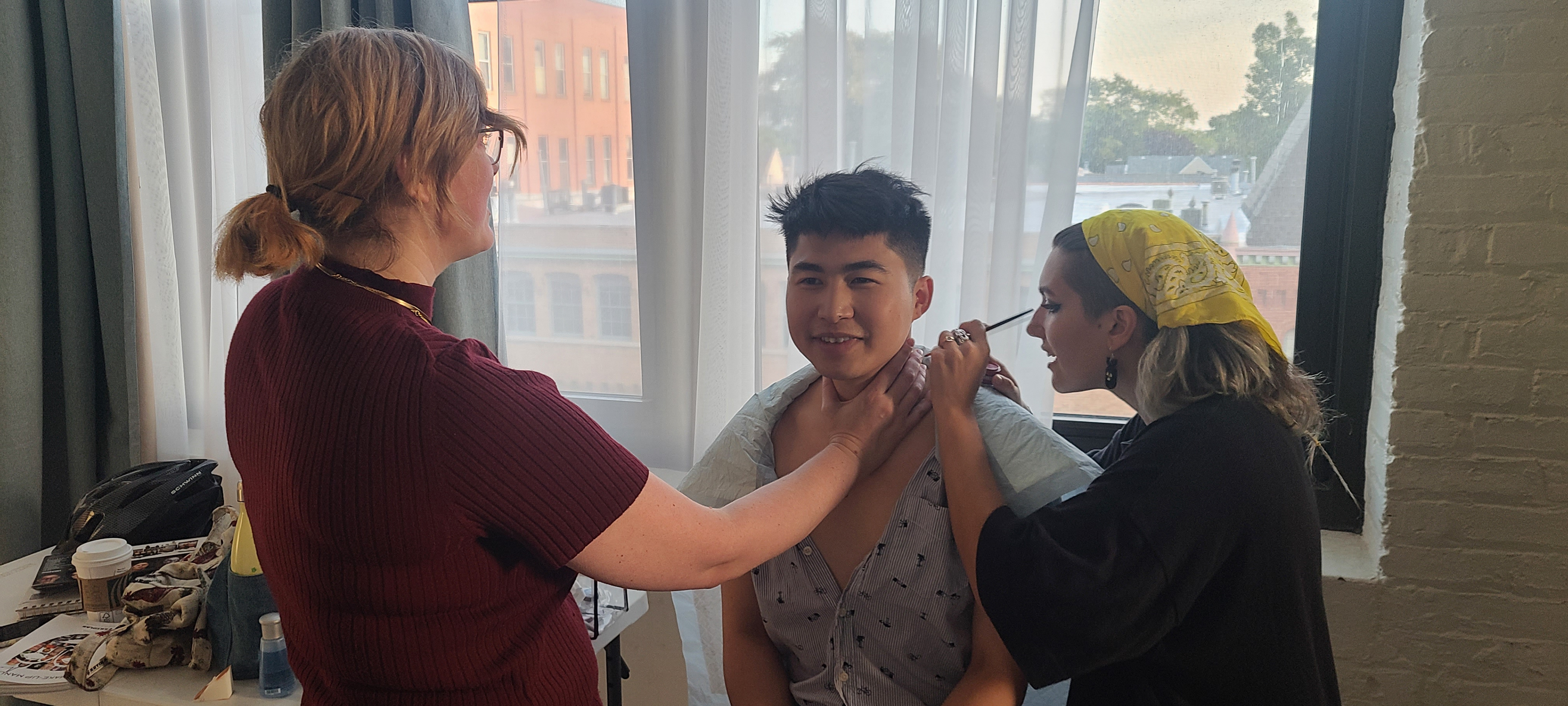
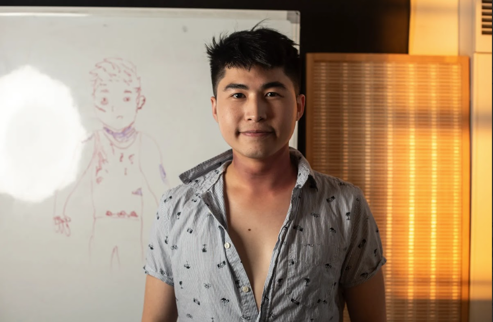
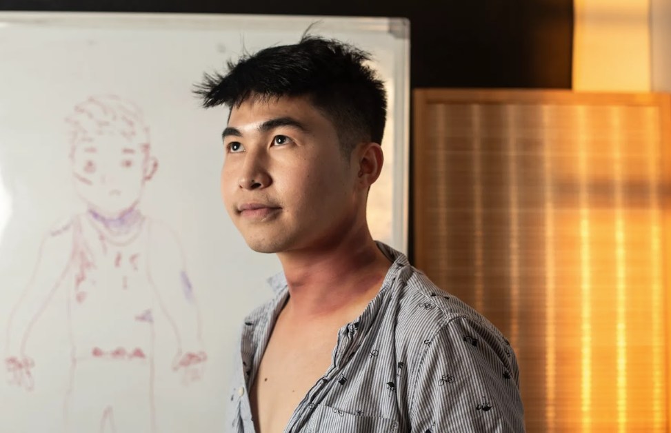
Mike's makeup required a "wet-look" for most of the production and towards the end of the film, his character needed to show brusing, burns, and bite marks which we achieved through effects makeup. To prepare, we mapped out an off-camera sequence to imagine the story behind each bruise and blemish.
AUDIO
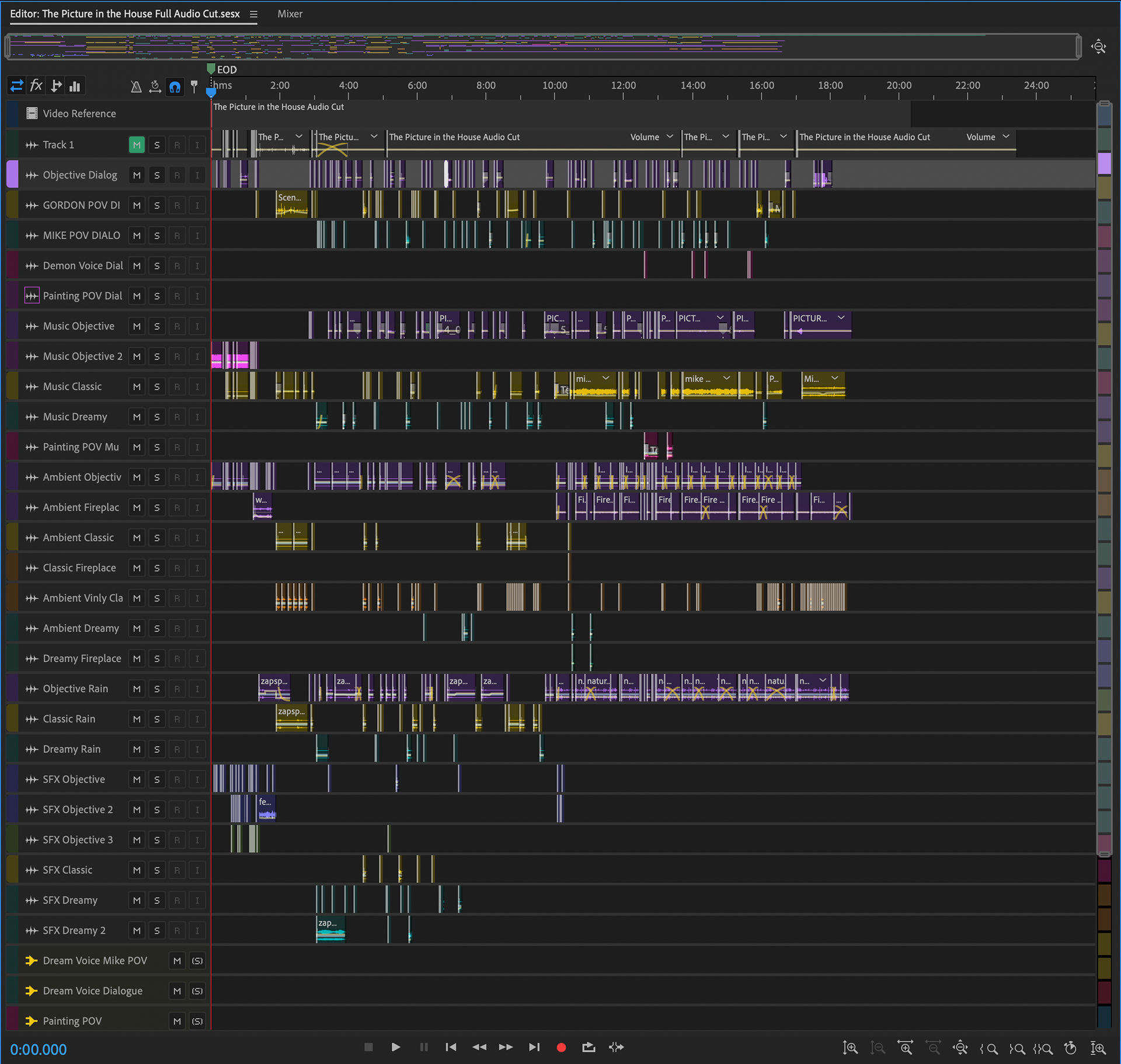
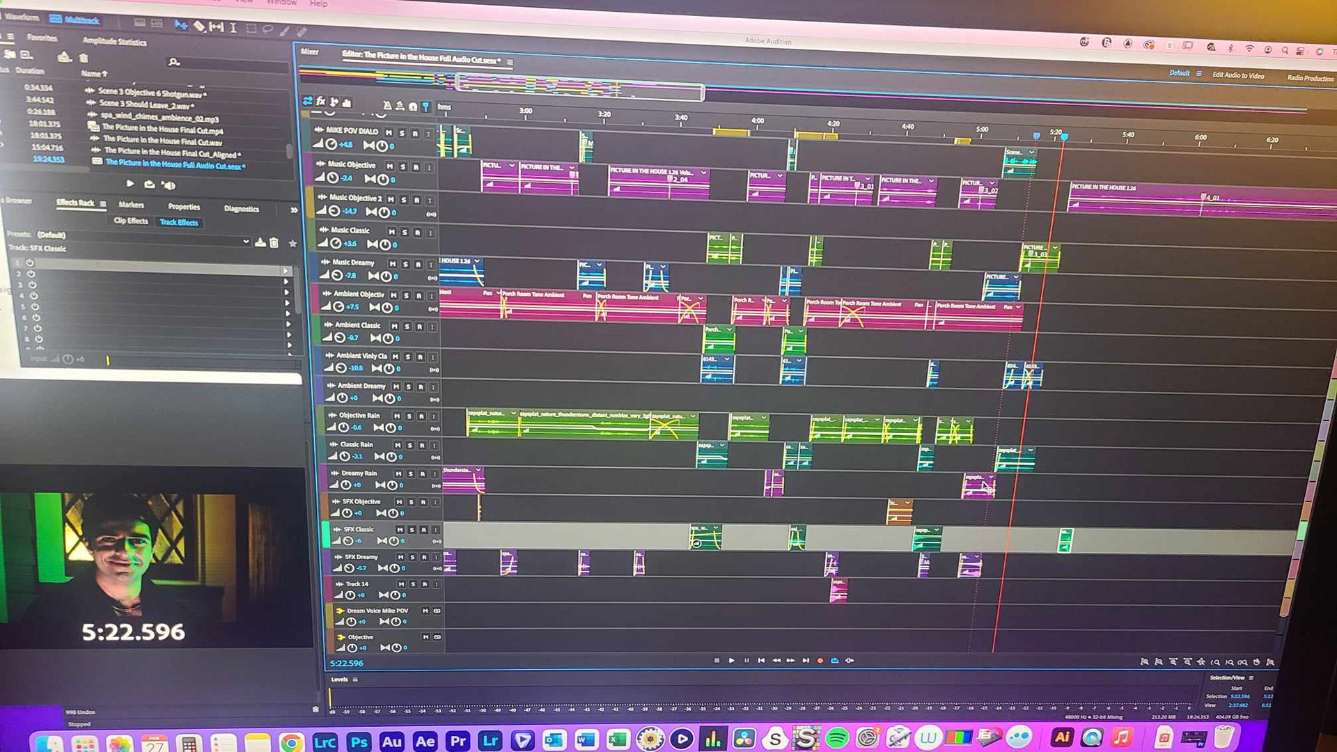
For this piece, I did the initial audio dialogue cut, sound design/effects, the ambeint sound, and the foley. Throughout the piece each perspective has a unique sound design, so I built audio buses to seamlessly apply the same effects to each element depending on what perspective each shot was in.
SPECIAL EFFECTS
RAIN MACHINE
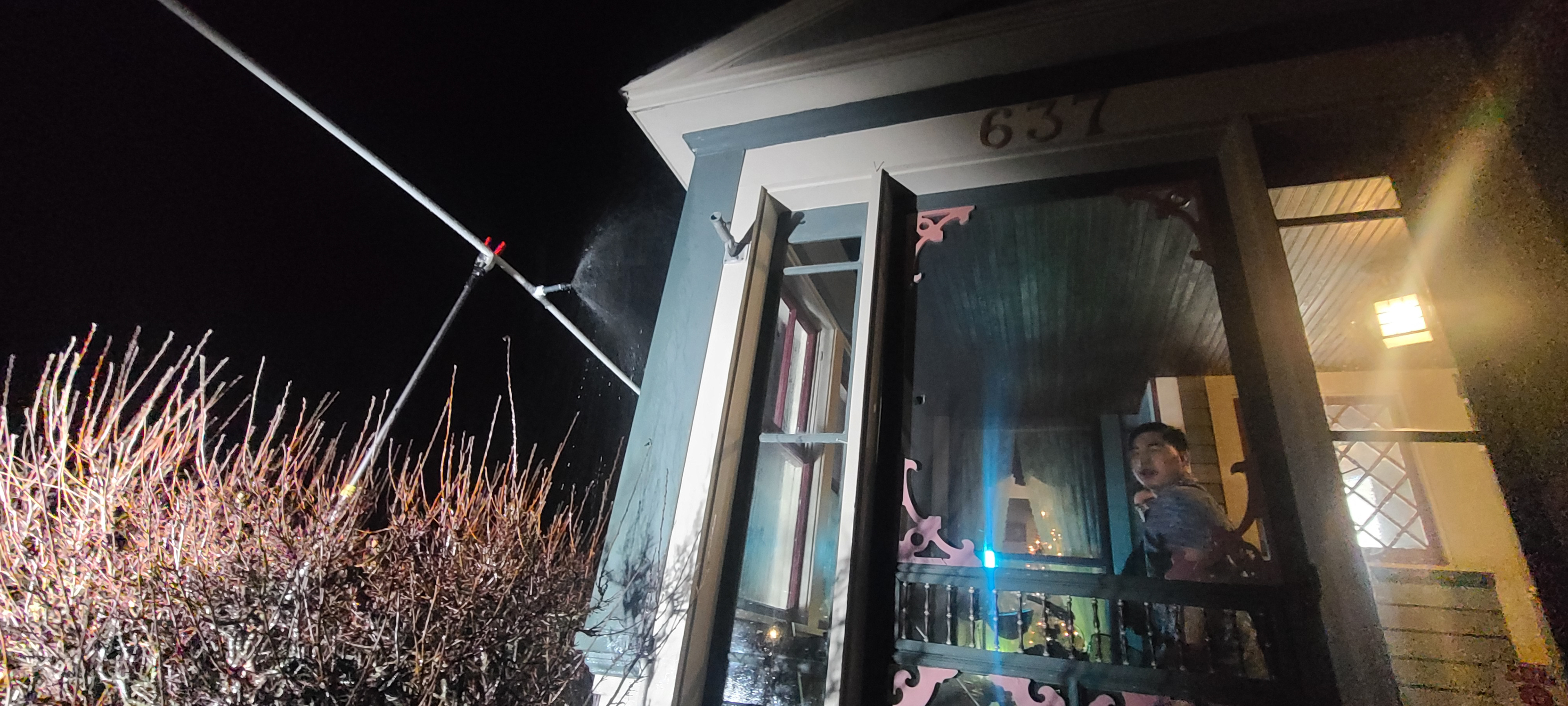
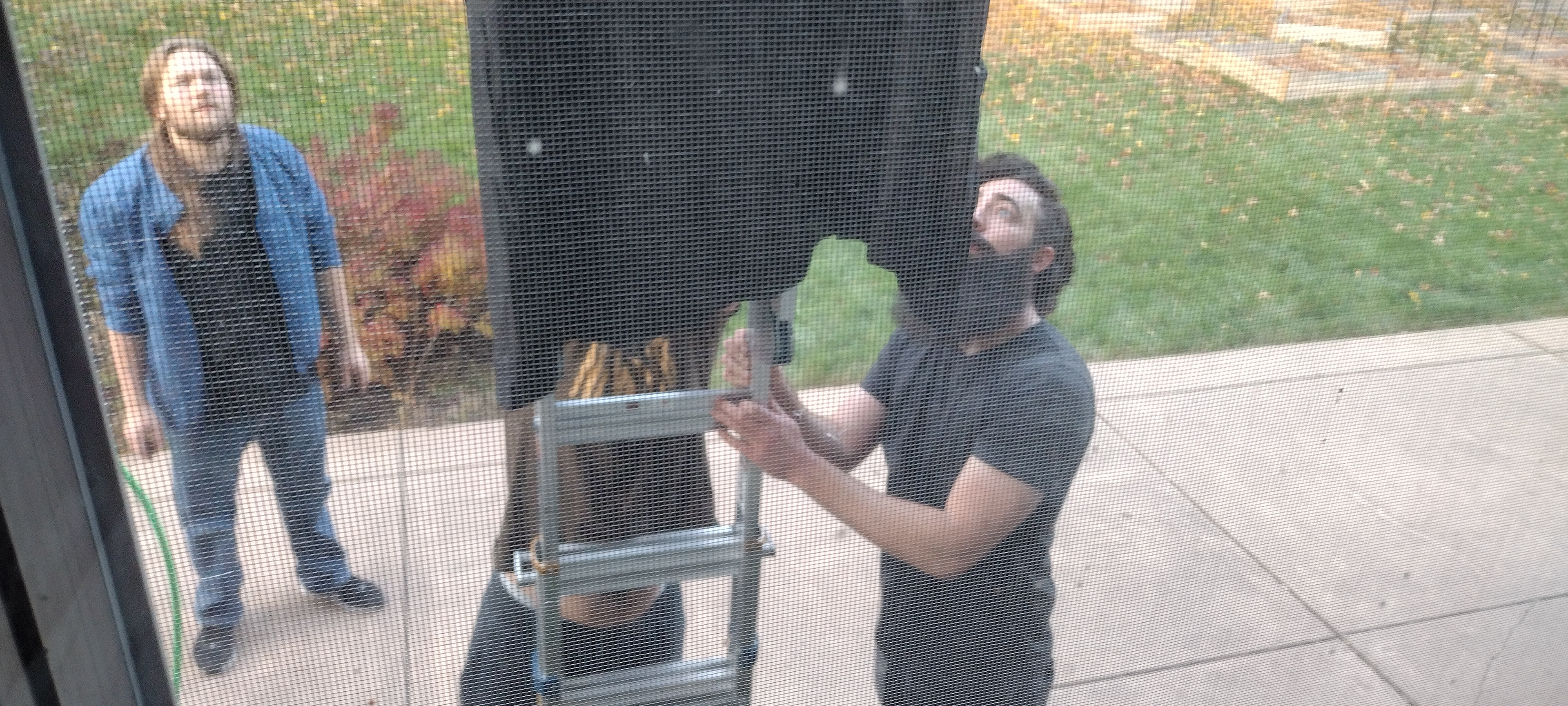
Throughout the film there is a storm - it was vital to the plot to have the storm present because it influences Mike's decision to stay in the house. To ensure we would have suitably rainy weather, we hand-crafted a rain machine that can hook up to a hose. It was used throughout the majority of the filming.

BURNING HOUSE
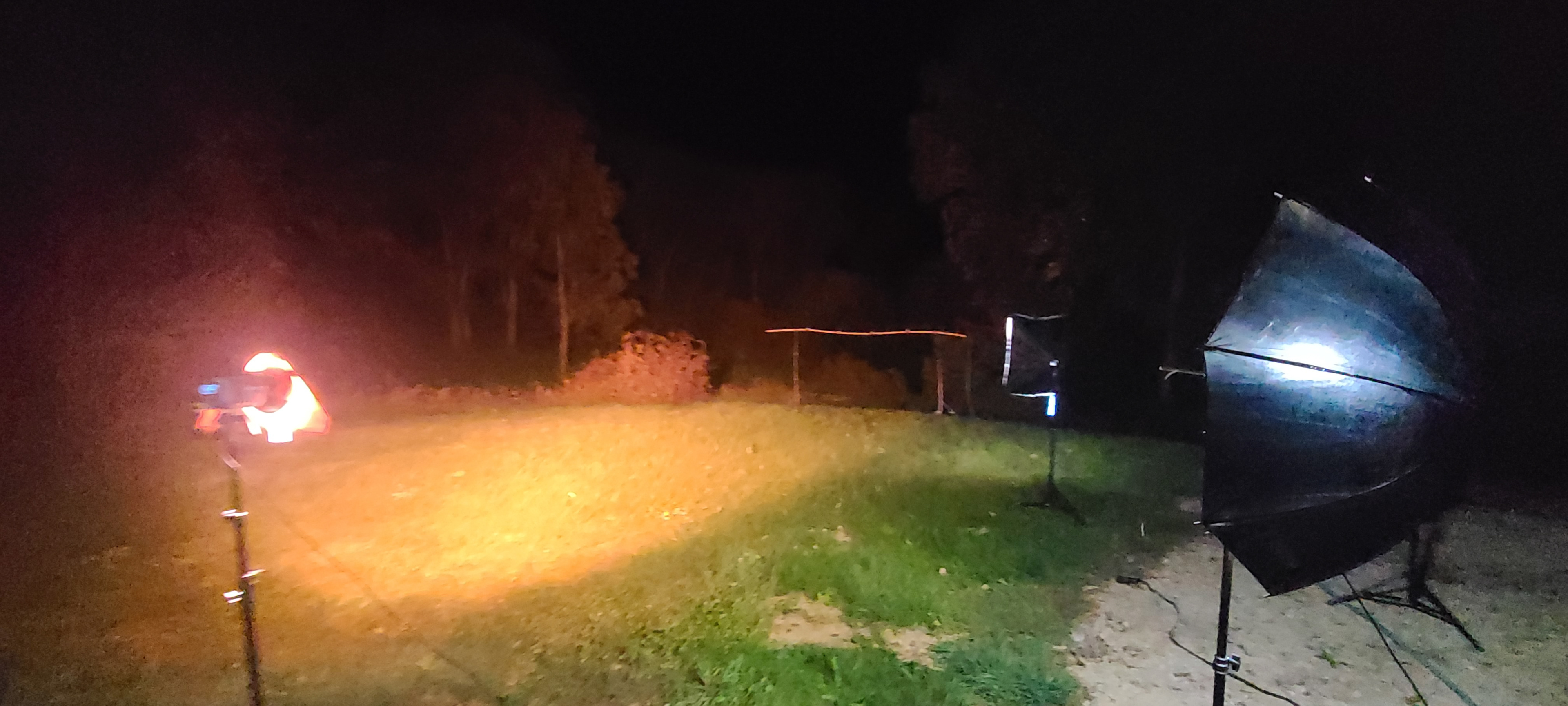
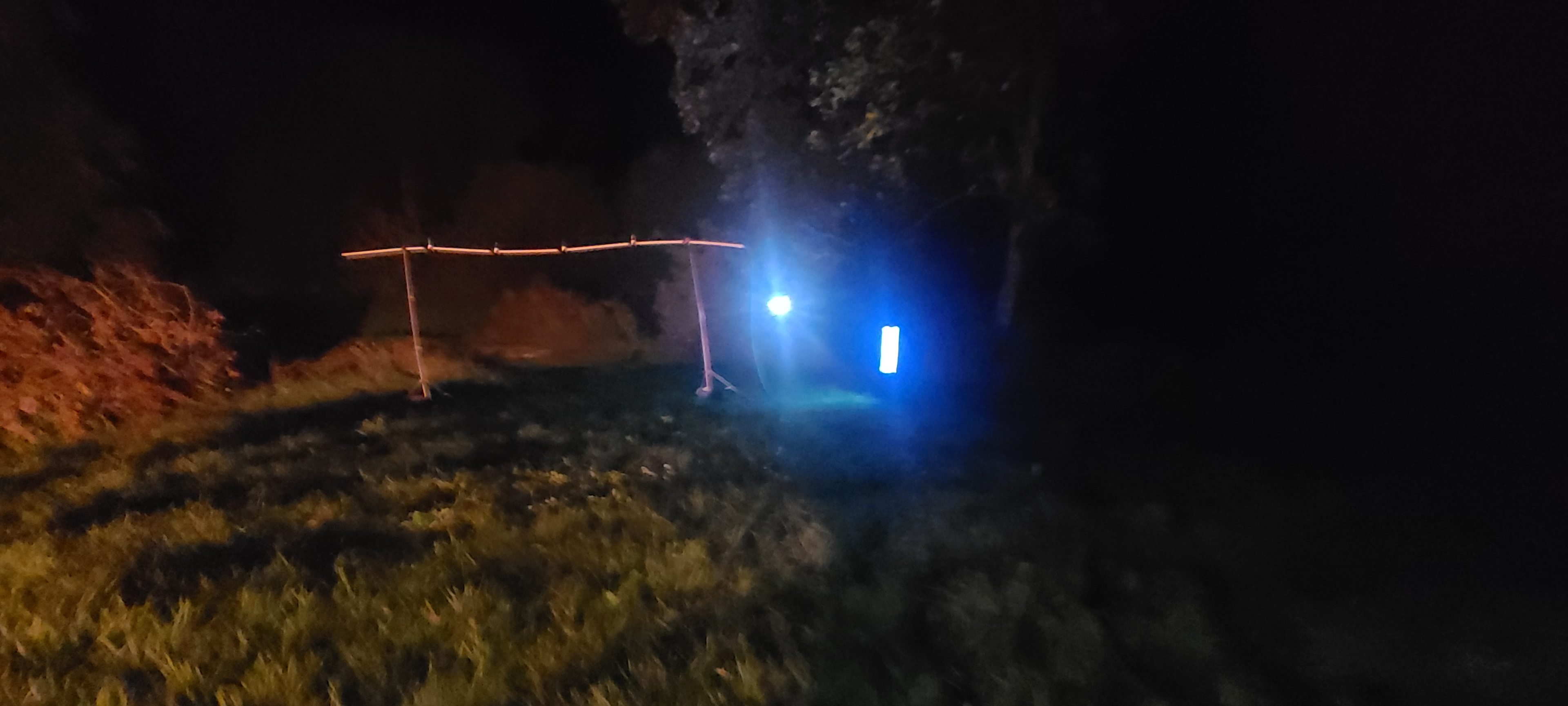
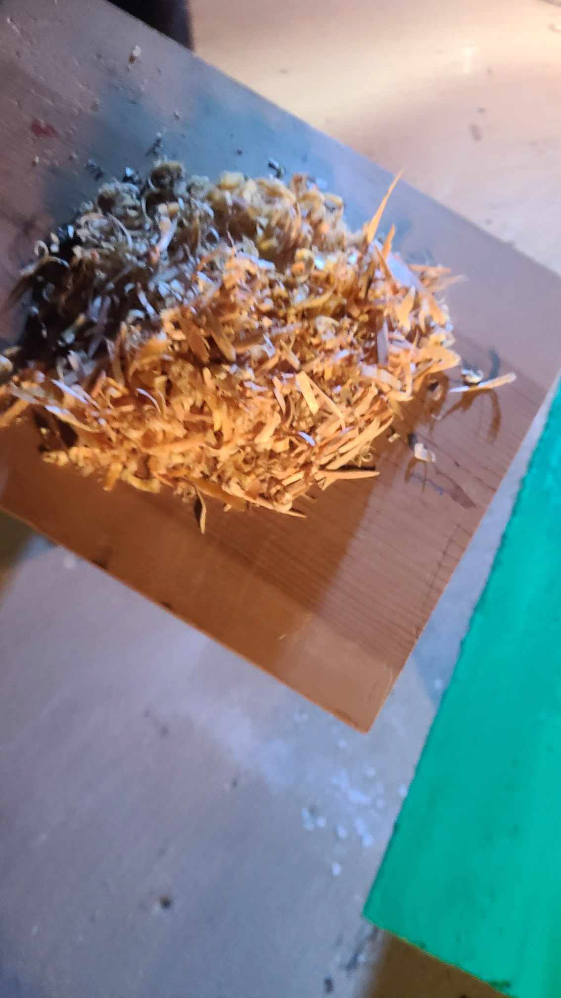
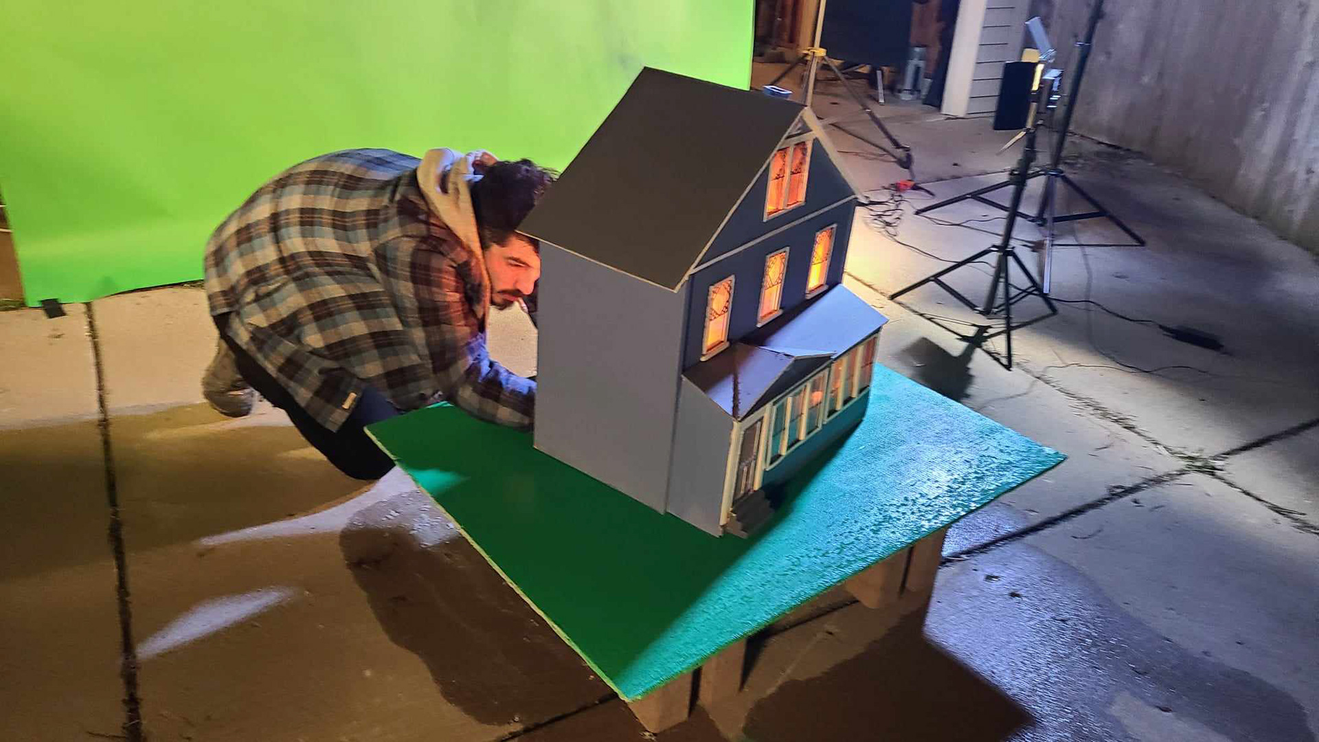
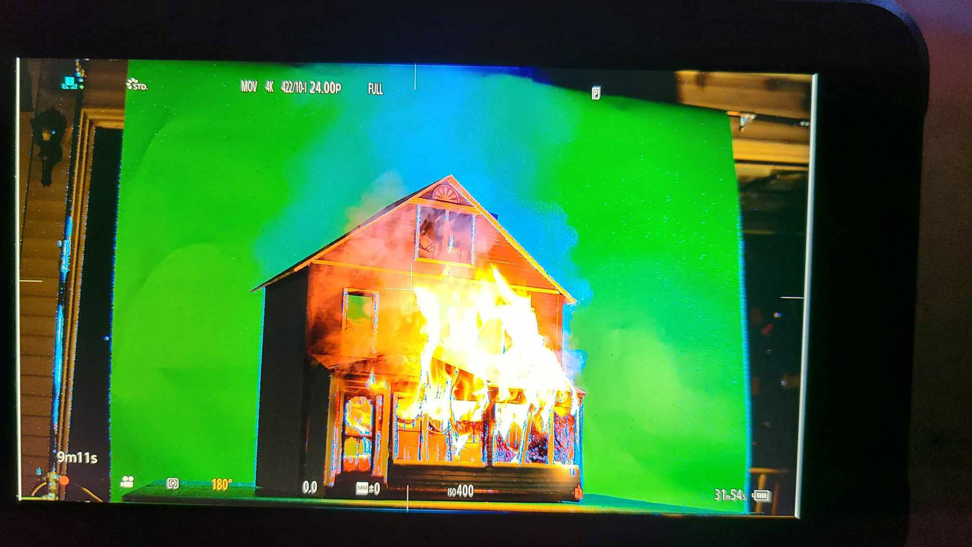
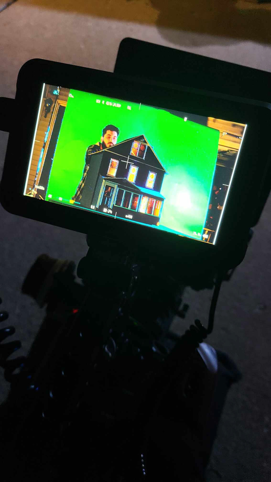
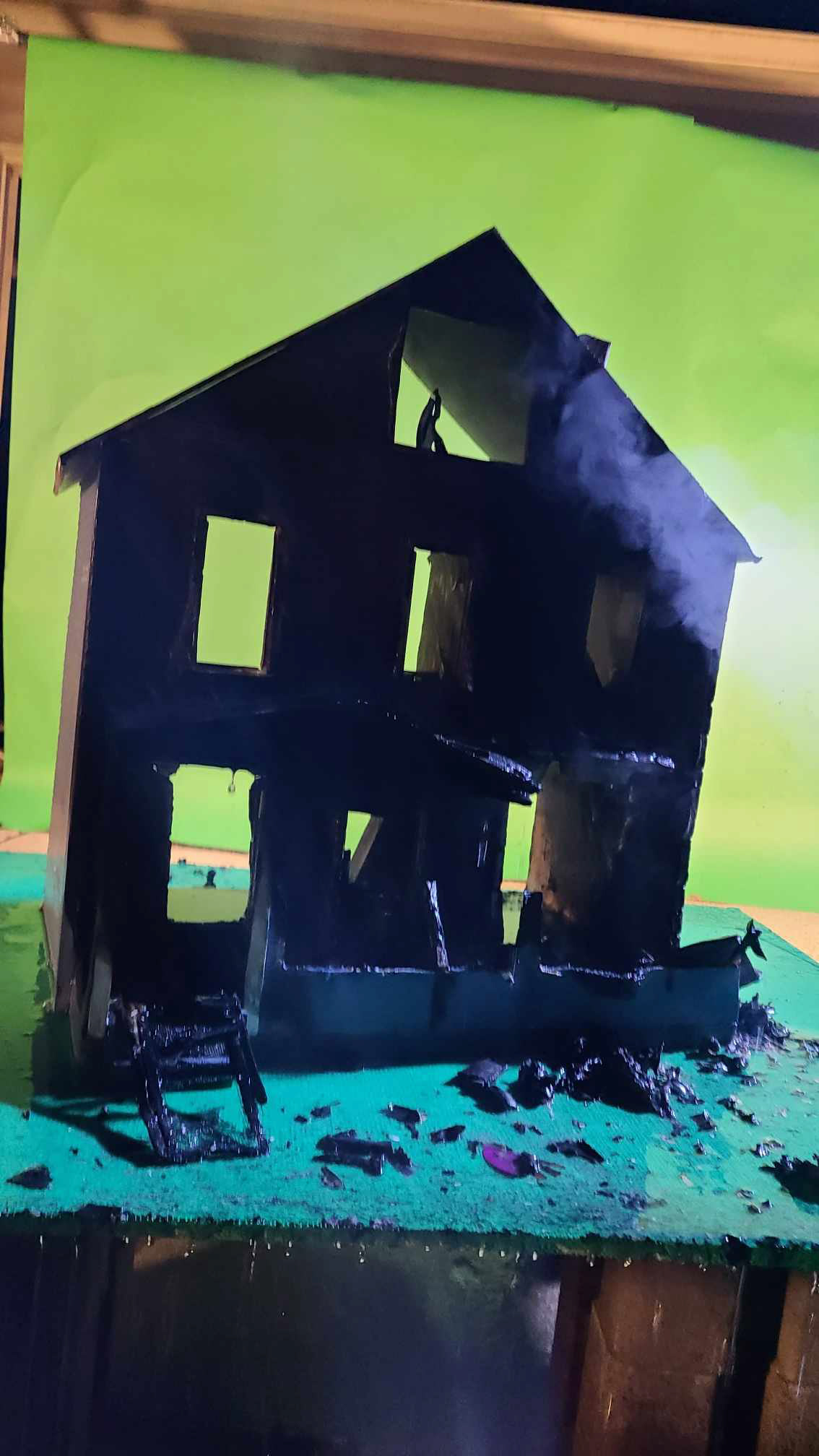
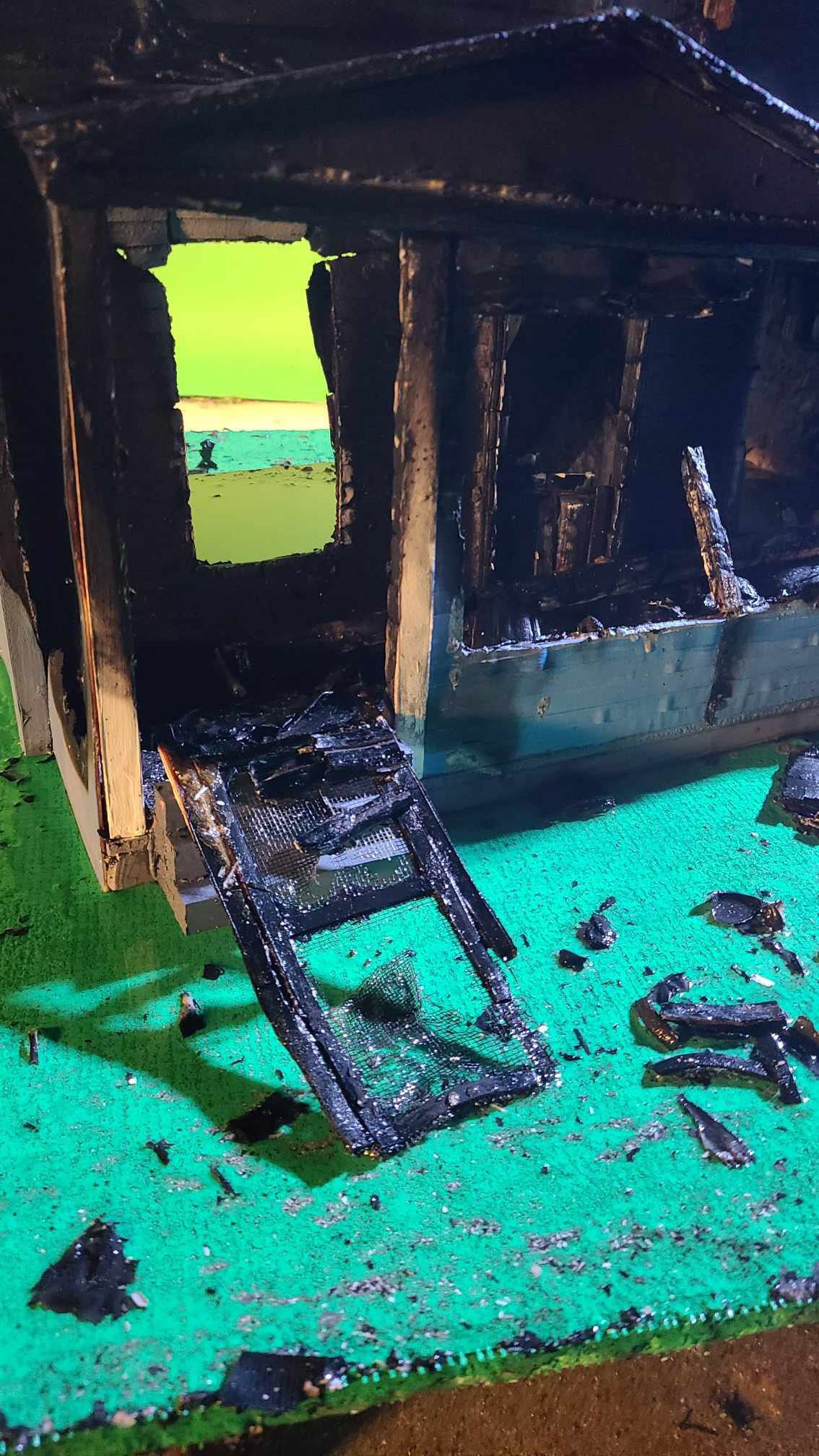
For the burning house effect, we constructed a miniature of the house to be composited into the background of the shot of Mike riding his bicycle away.
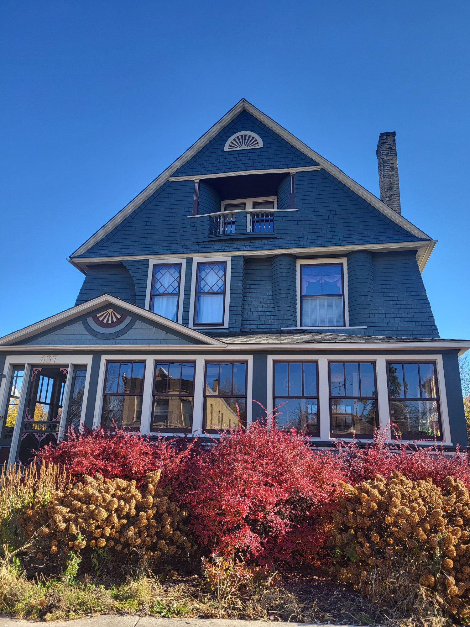
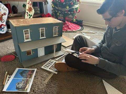

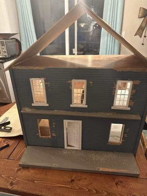
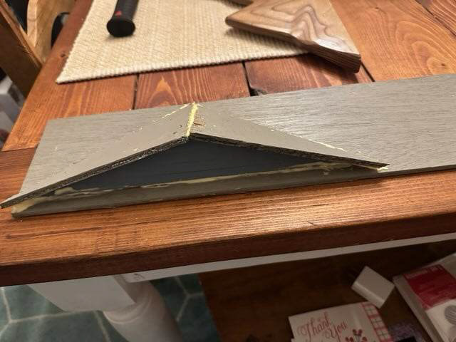
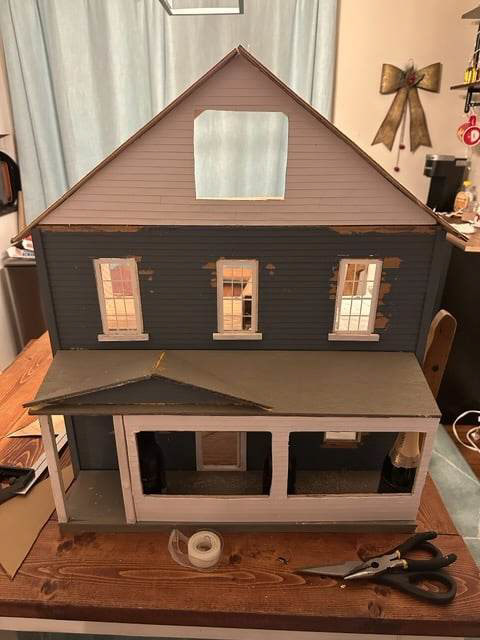
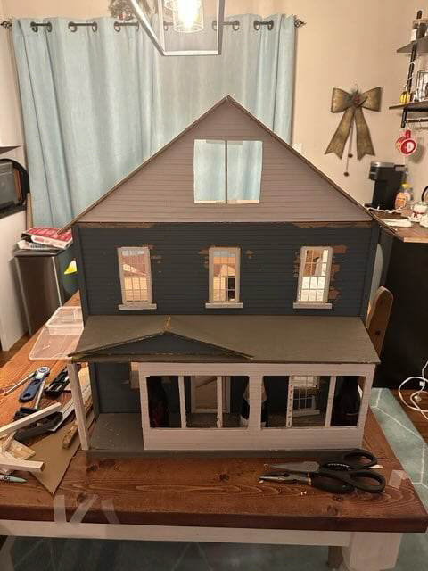
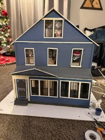
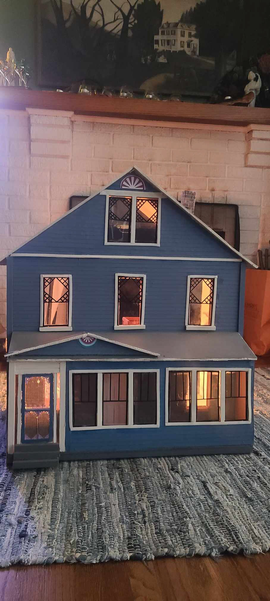
To achieve the composite, we captured the house burning against a Green Screen
BLOODY CEILING
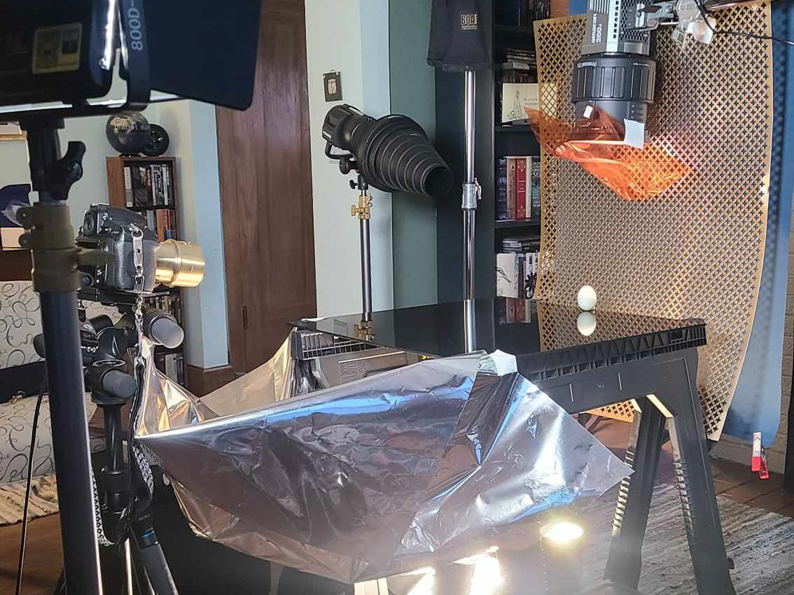
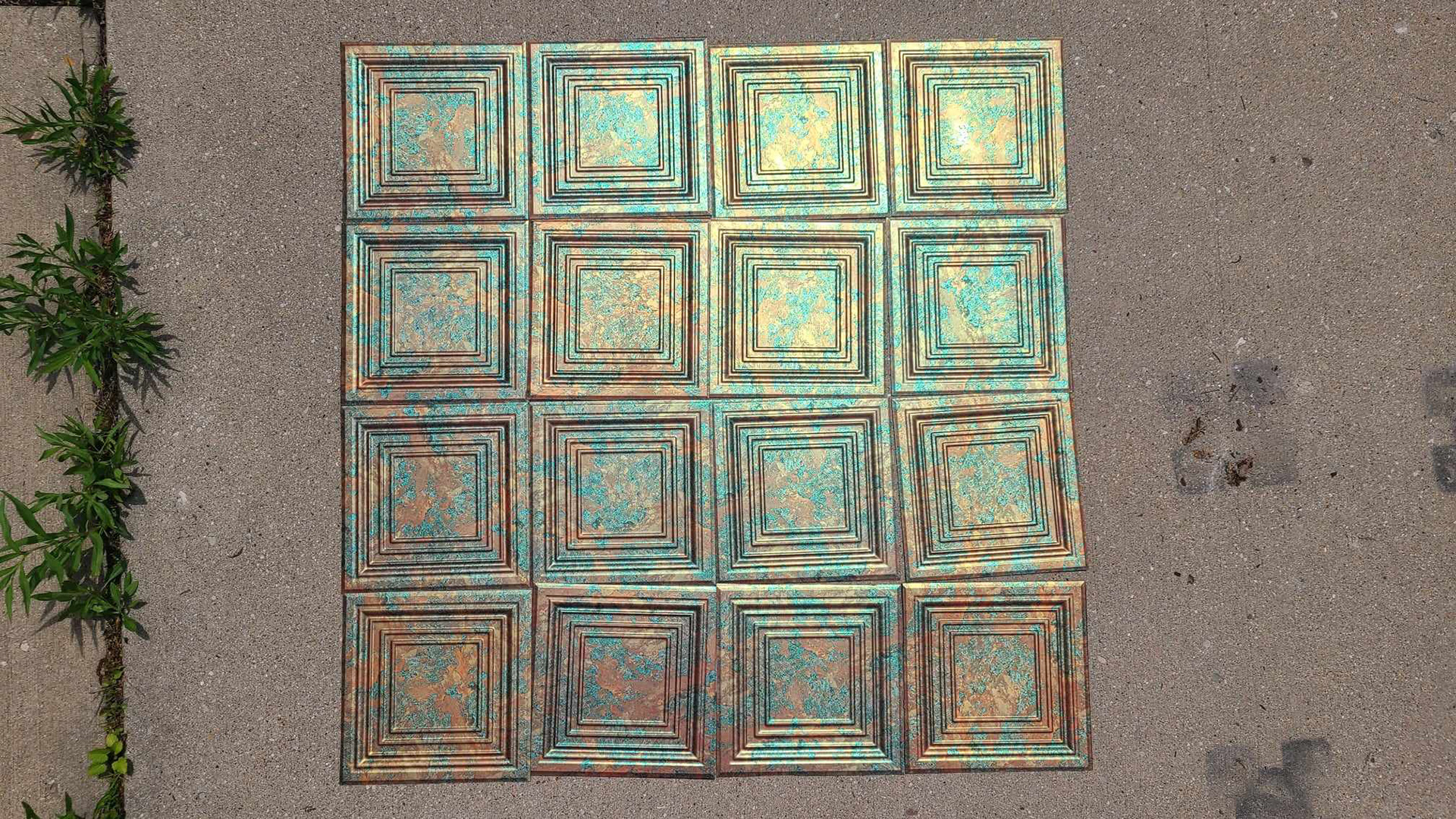
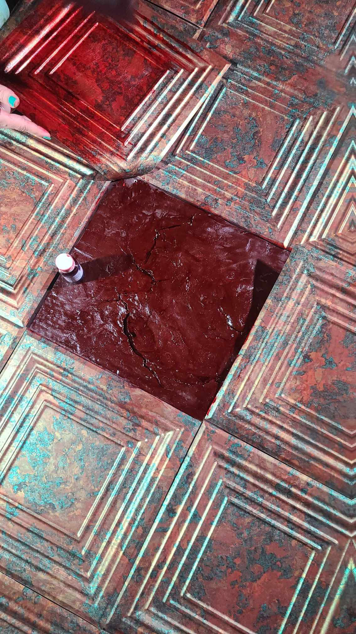
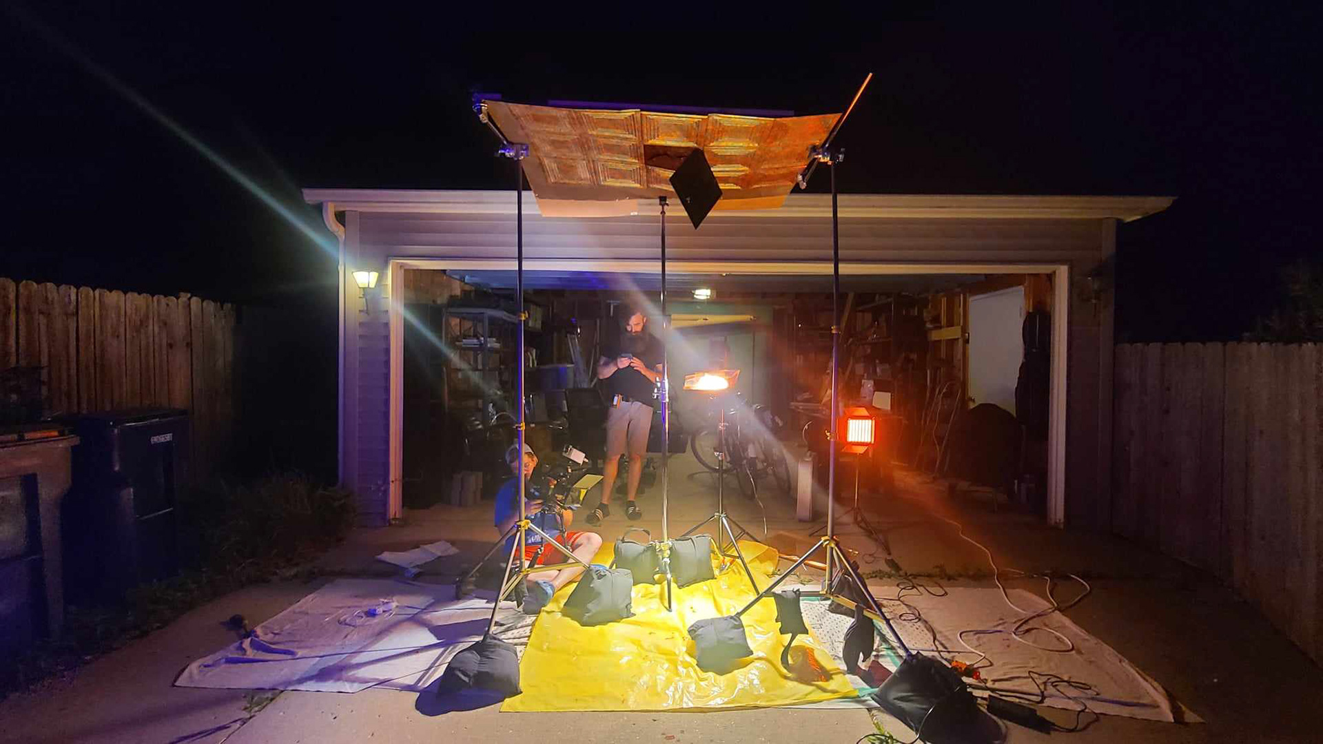
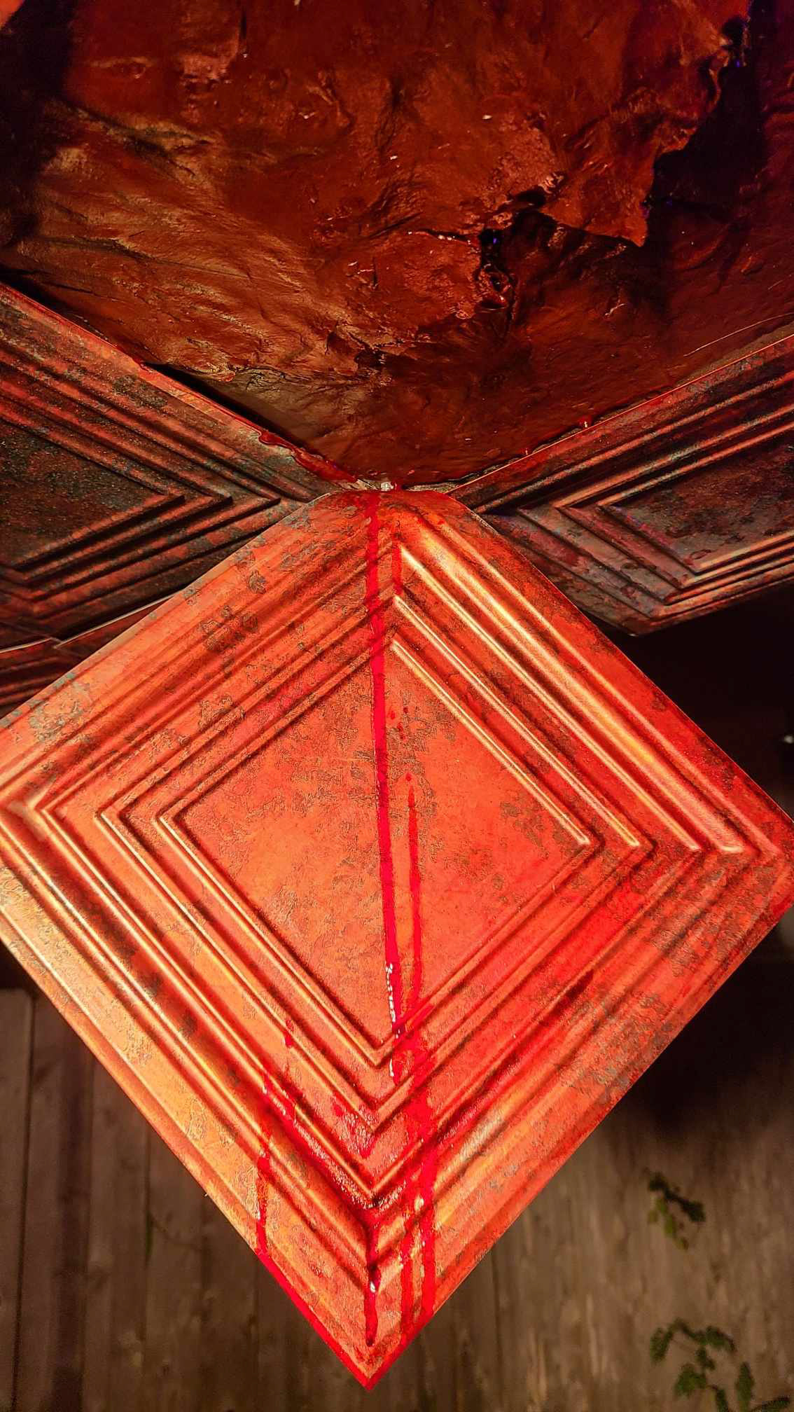
The other major effect we needed to fake was the bloody ceiling image at the end of the film. To achieve this we purchased sample fake copper tiles from amazon. We trimmed them, sprayed them with mattifying spray, and adhered them to a piece of cardboard on which we made a mound of air-dry clay. The clay dried, cracked and puckered the cardboard to create the effect of a ceiling that was warping and sagging. Then we painted the exposed portion of the ceiling to appear like it was sagging.
MOTION GRAPHICS
For the above-the-line credits, I created short motion graphics to highlight the title and some of the people who played a huge role in making the movie possible.
THE POSTER
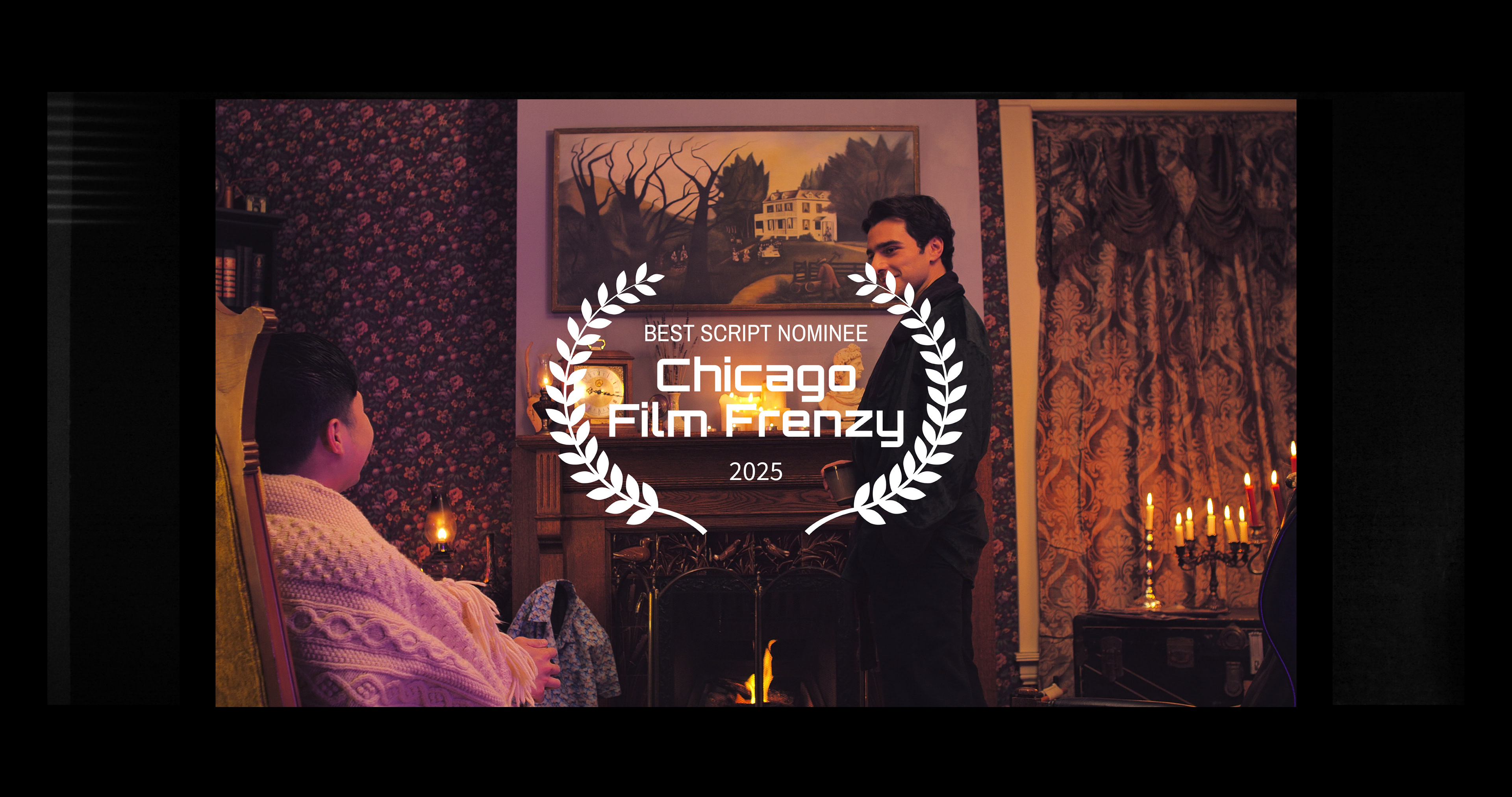
FILM FESTIVALS

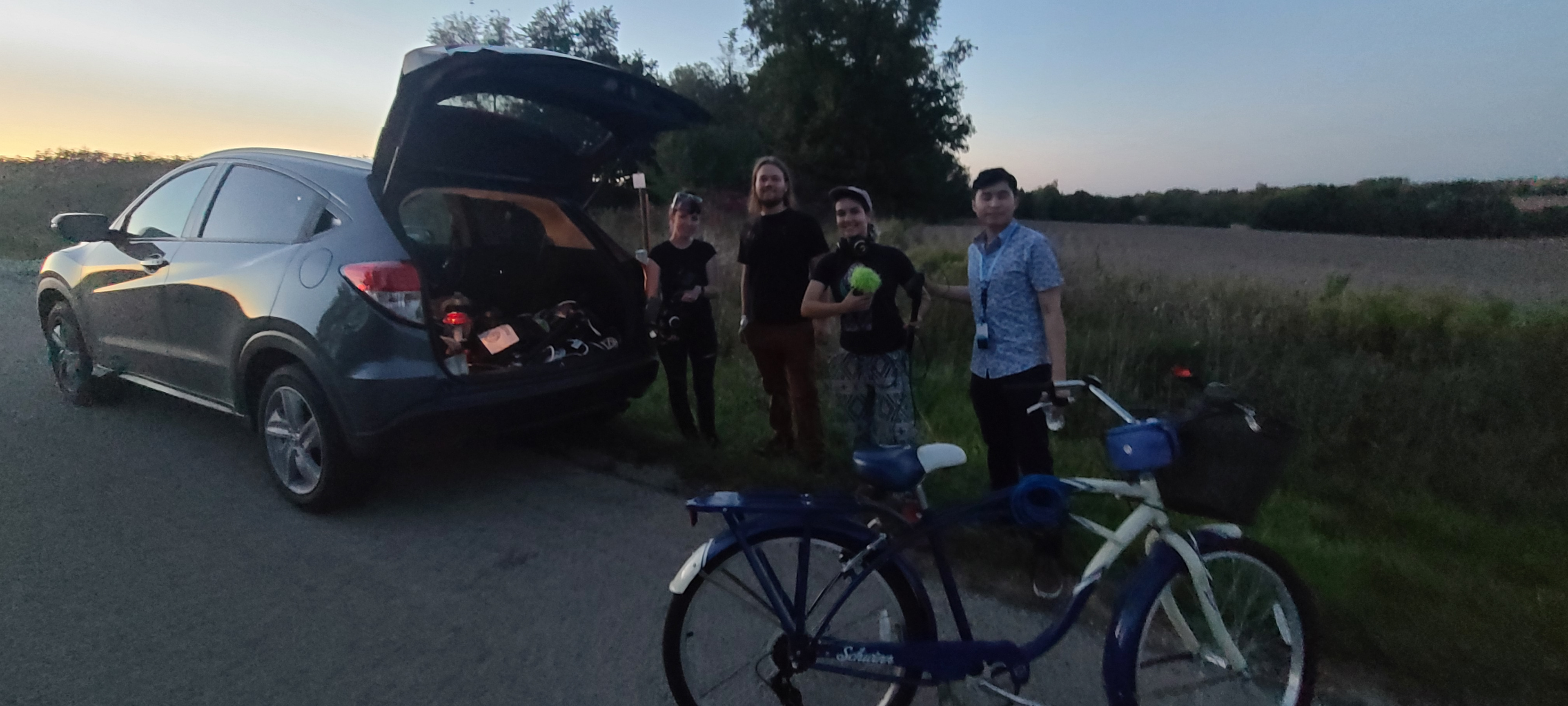
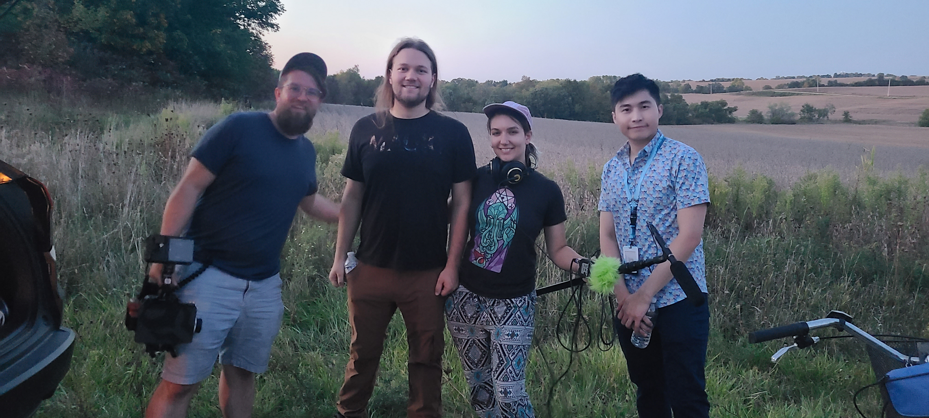
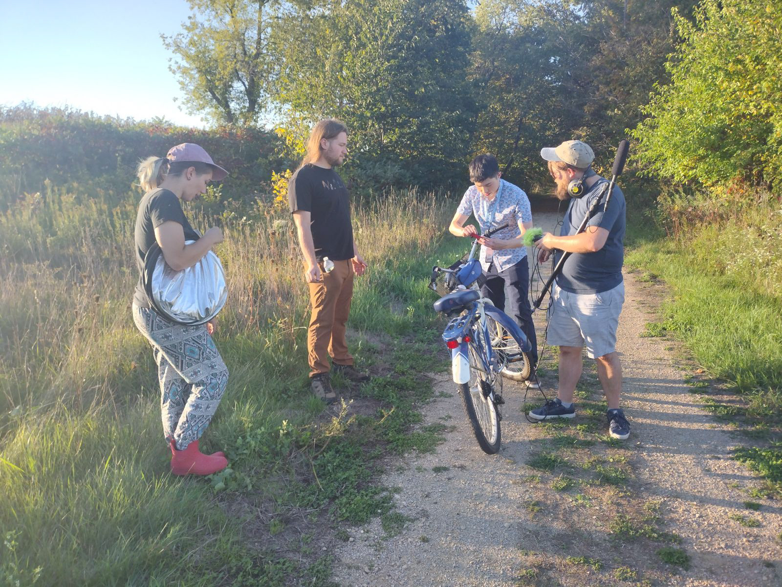
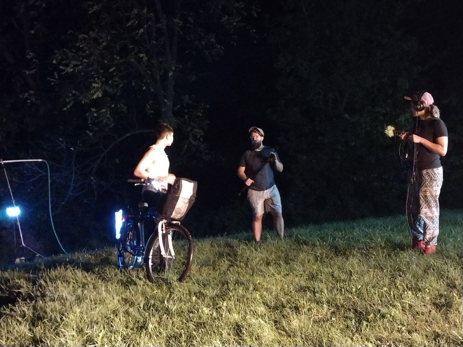
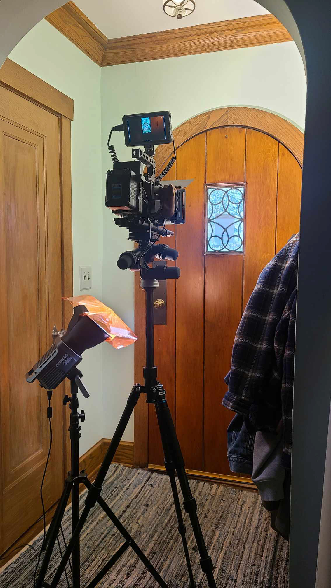
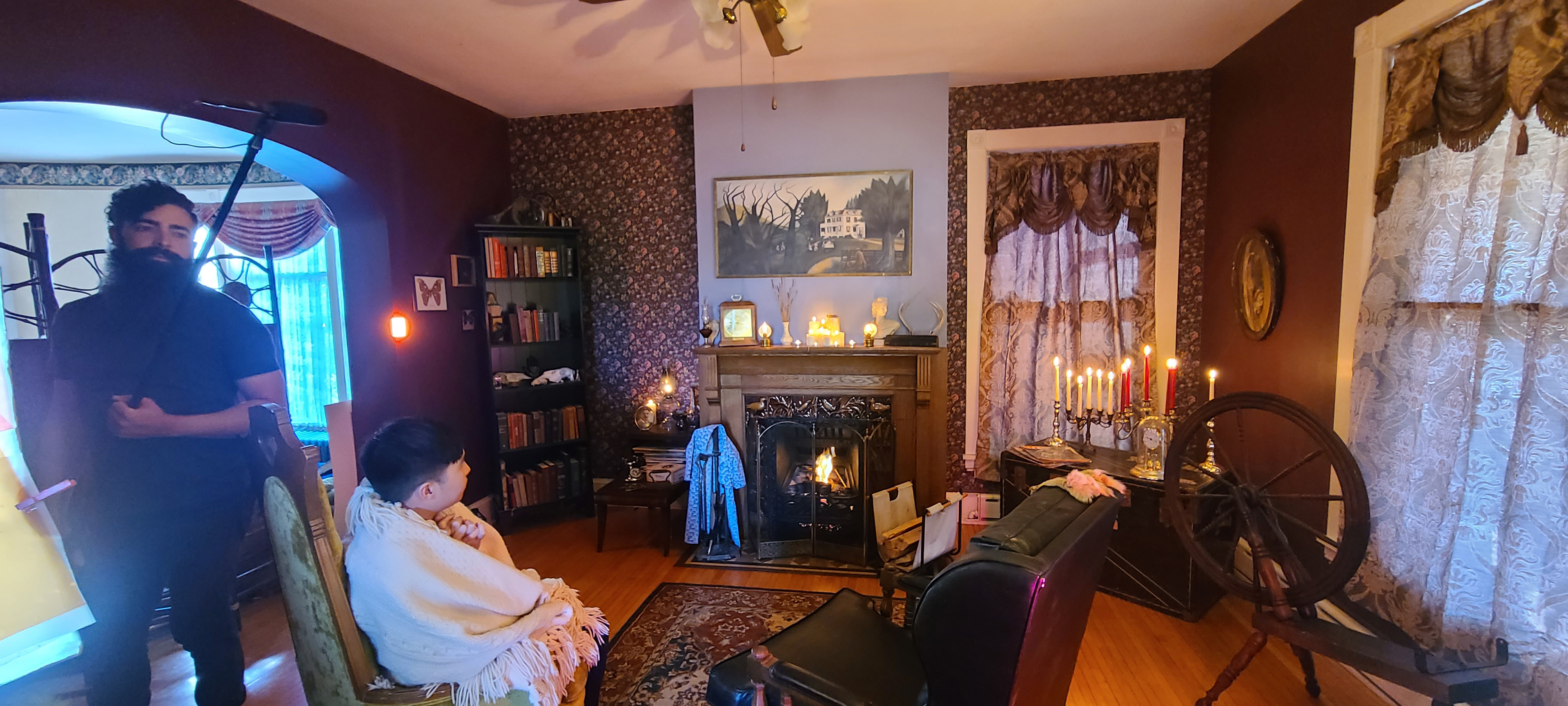
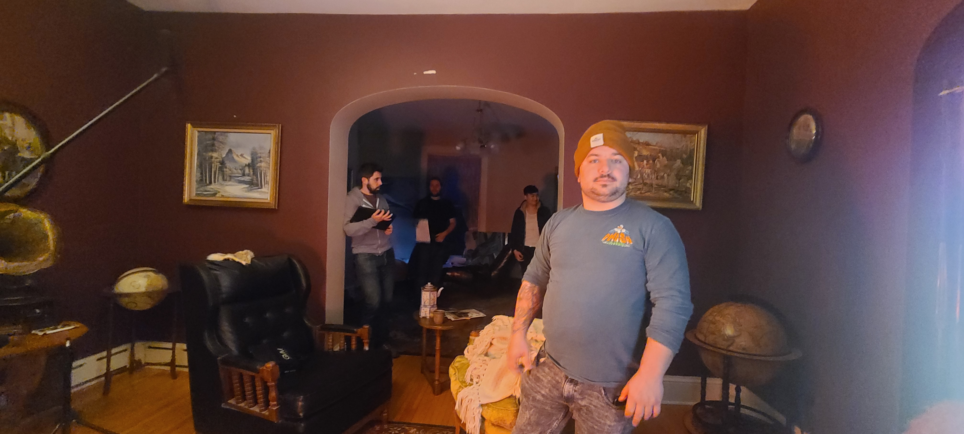
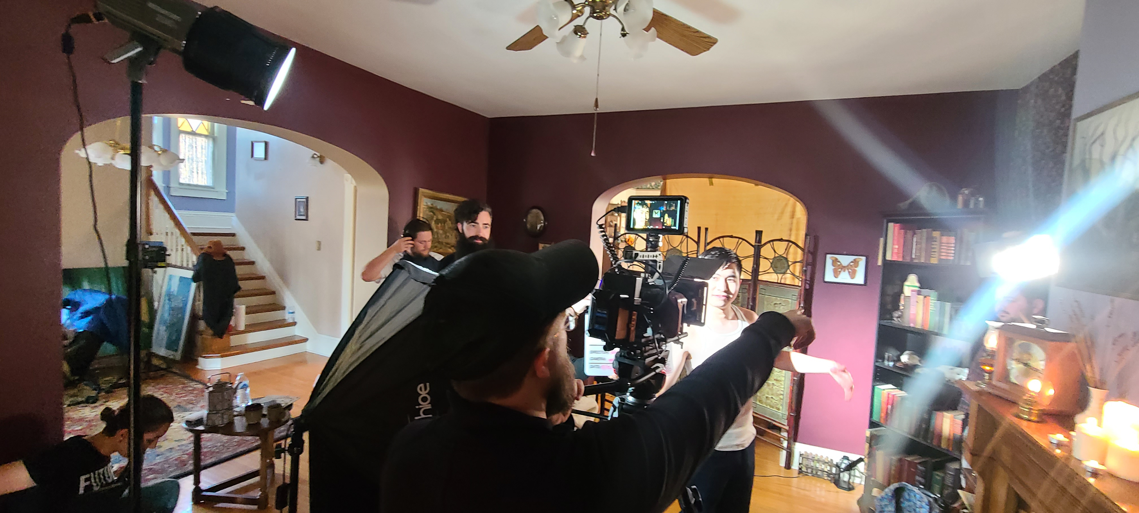
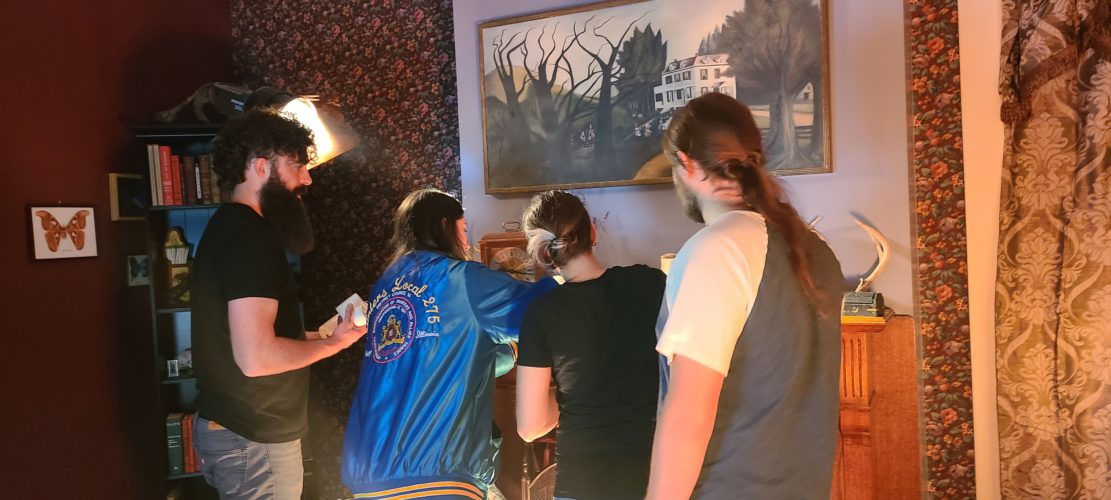
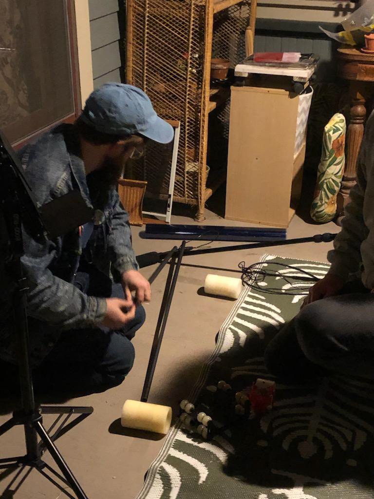
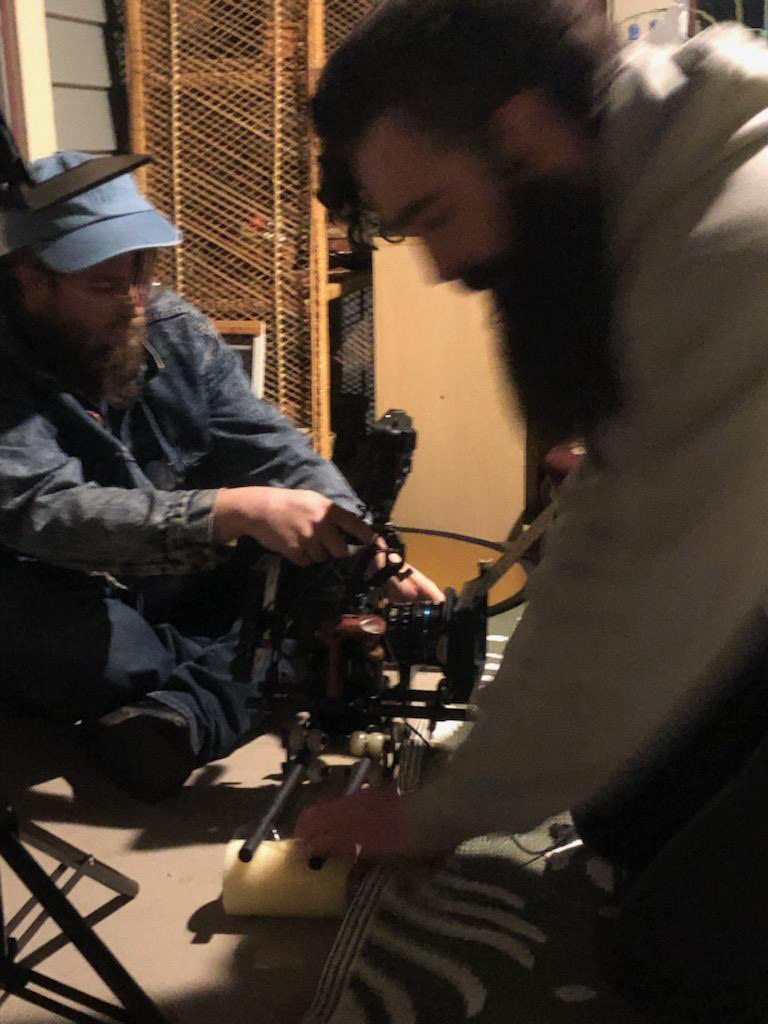
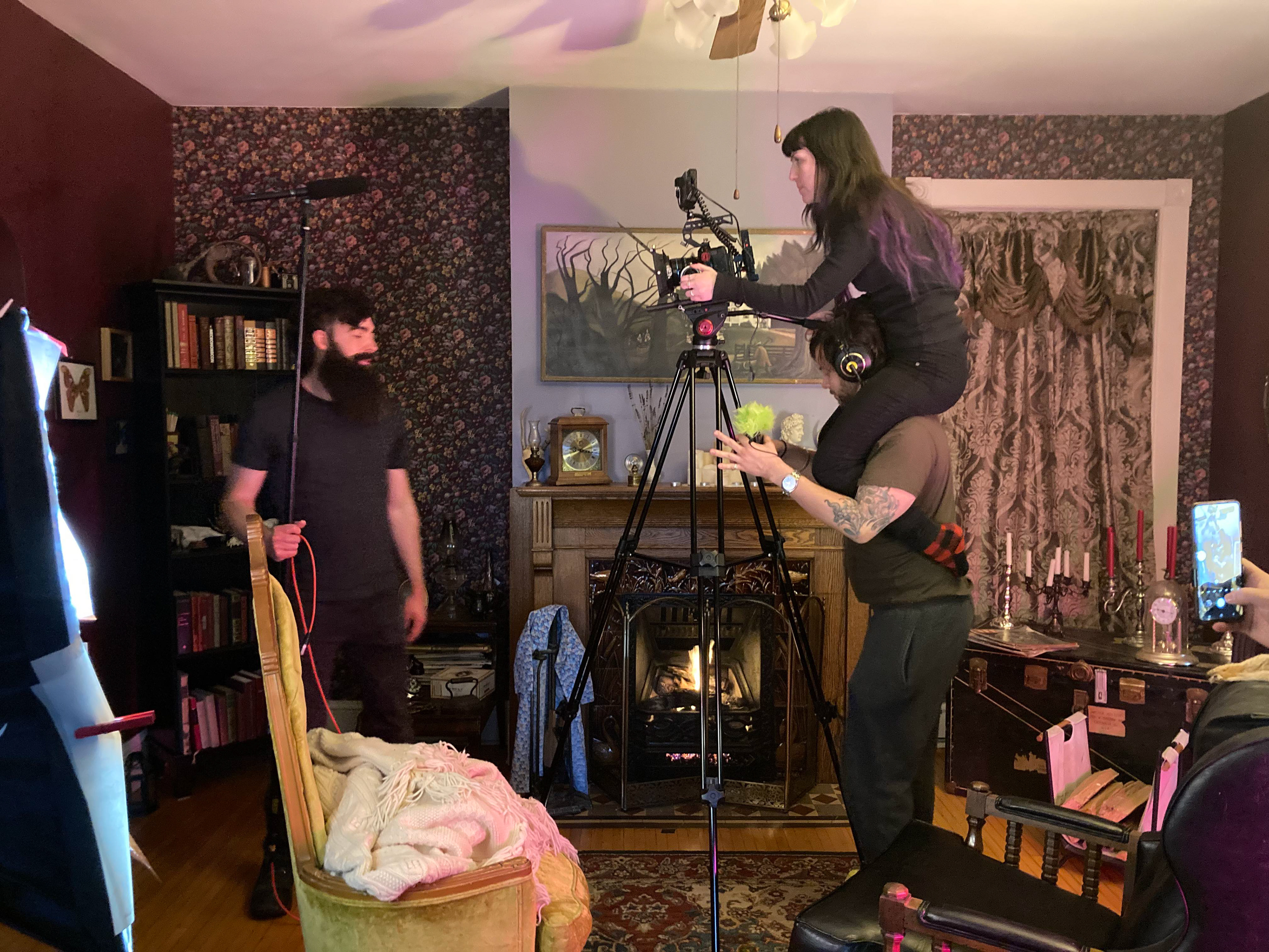
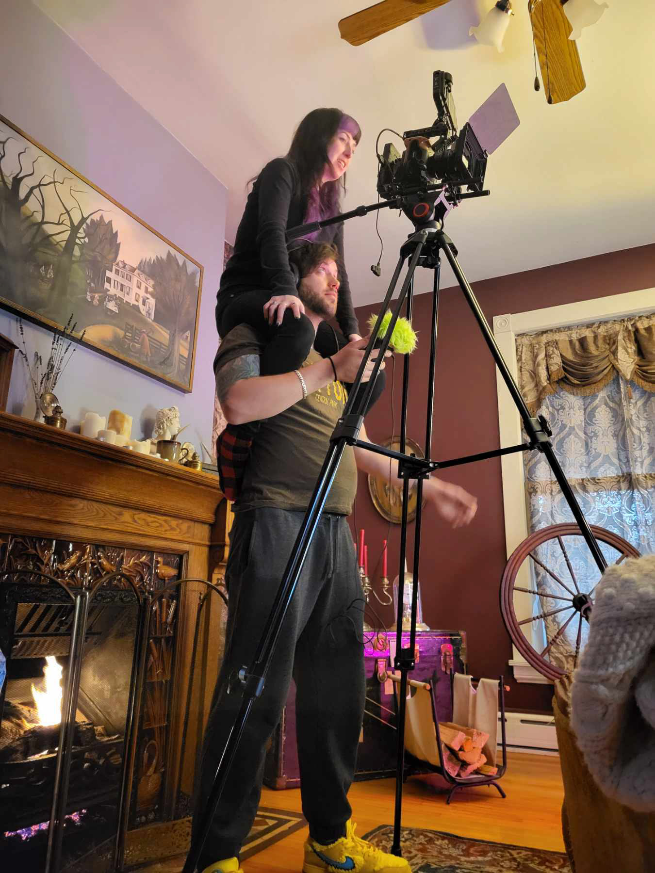
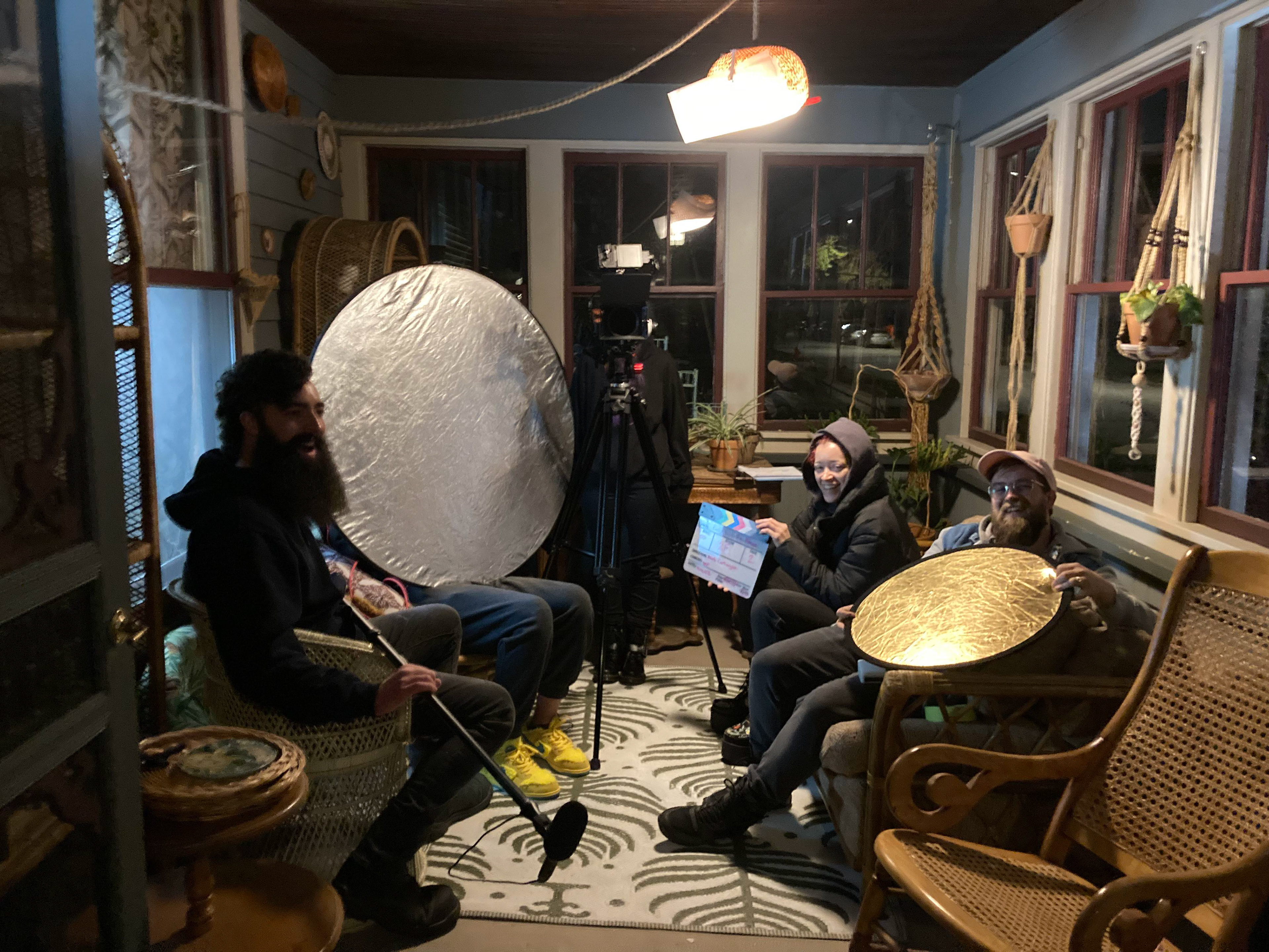
SET PHOTOS

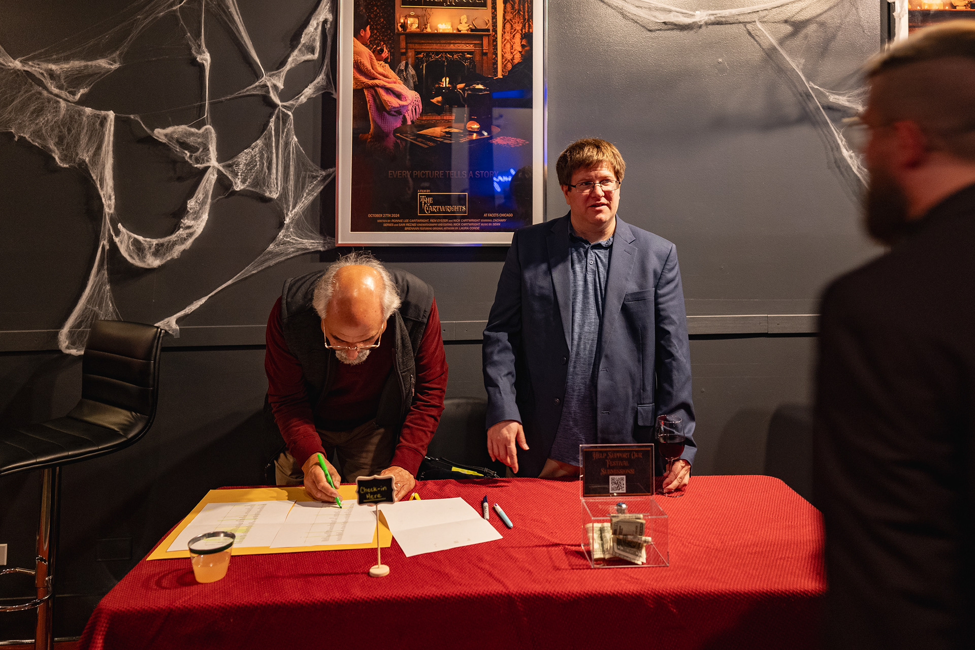
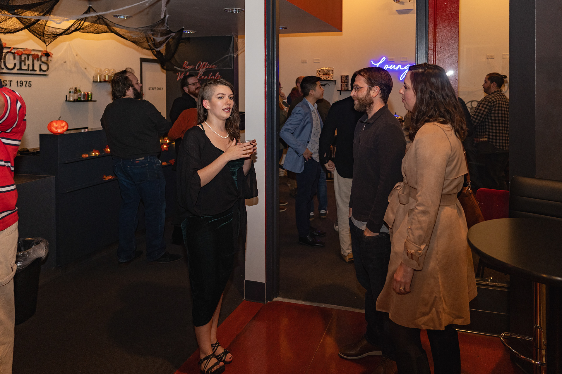
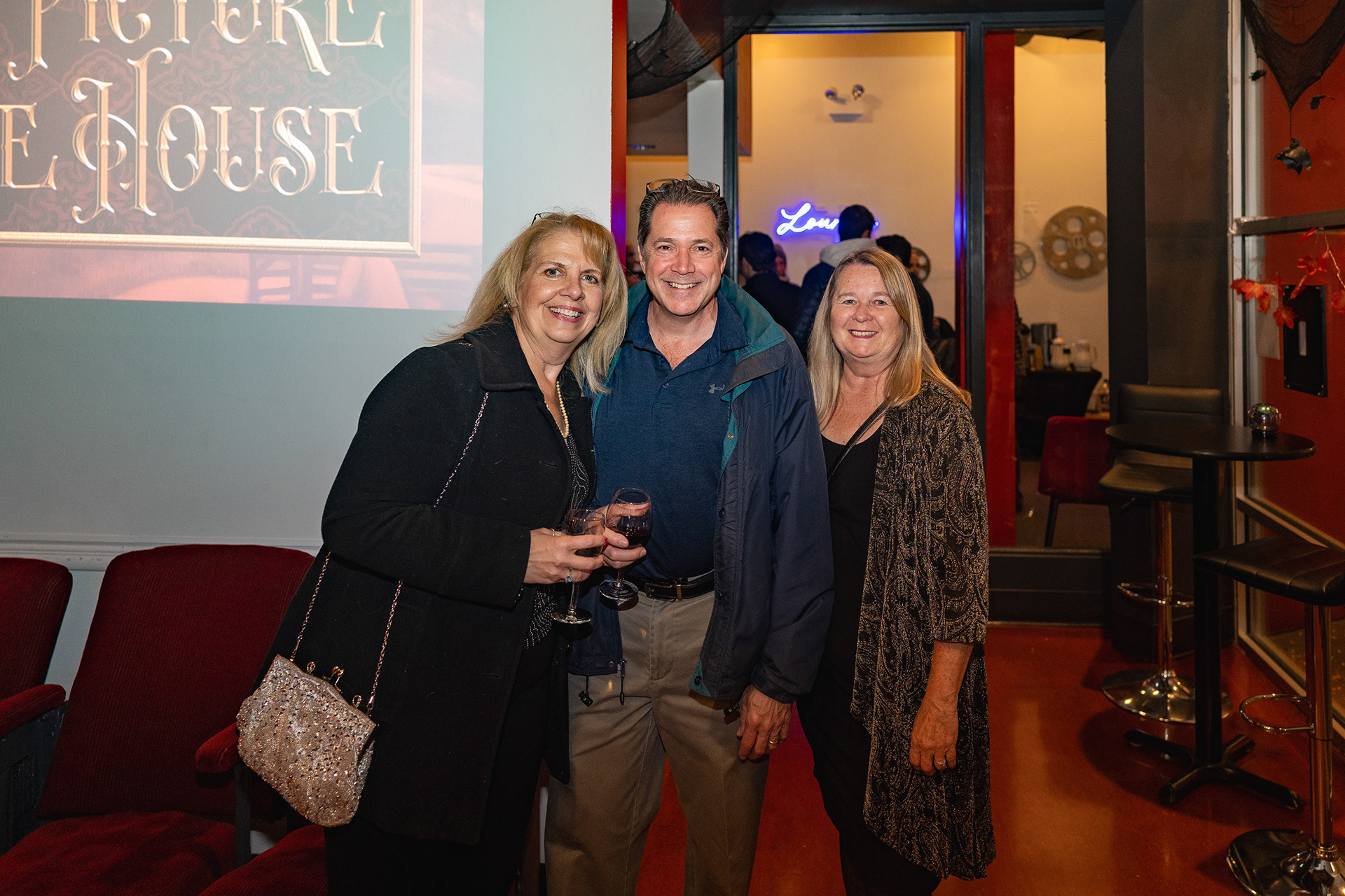
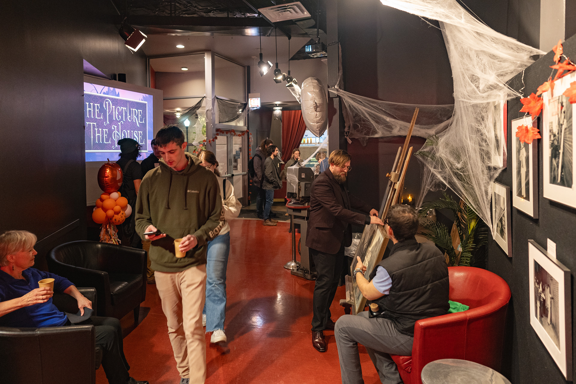
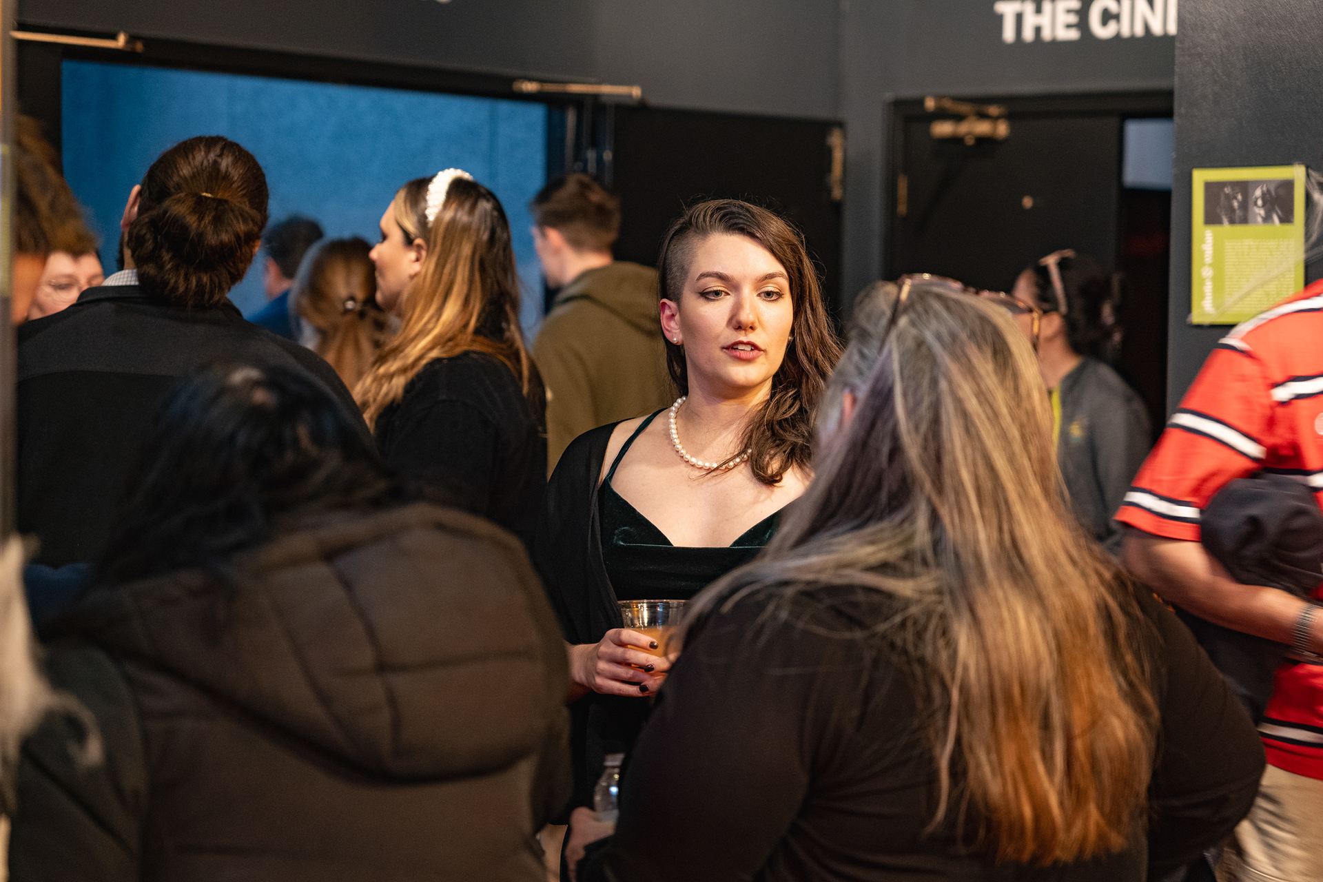
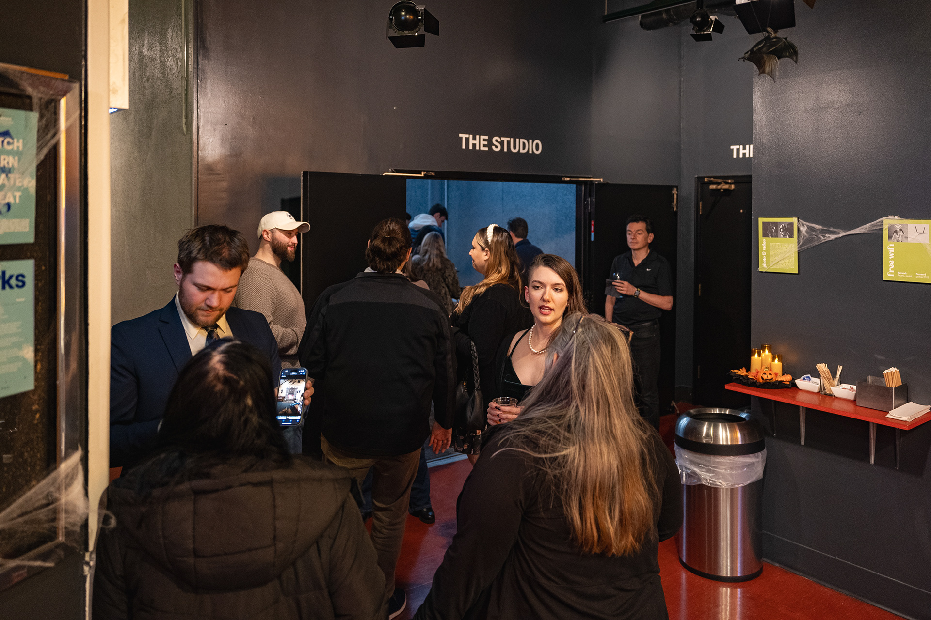
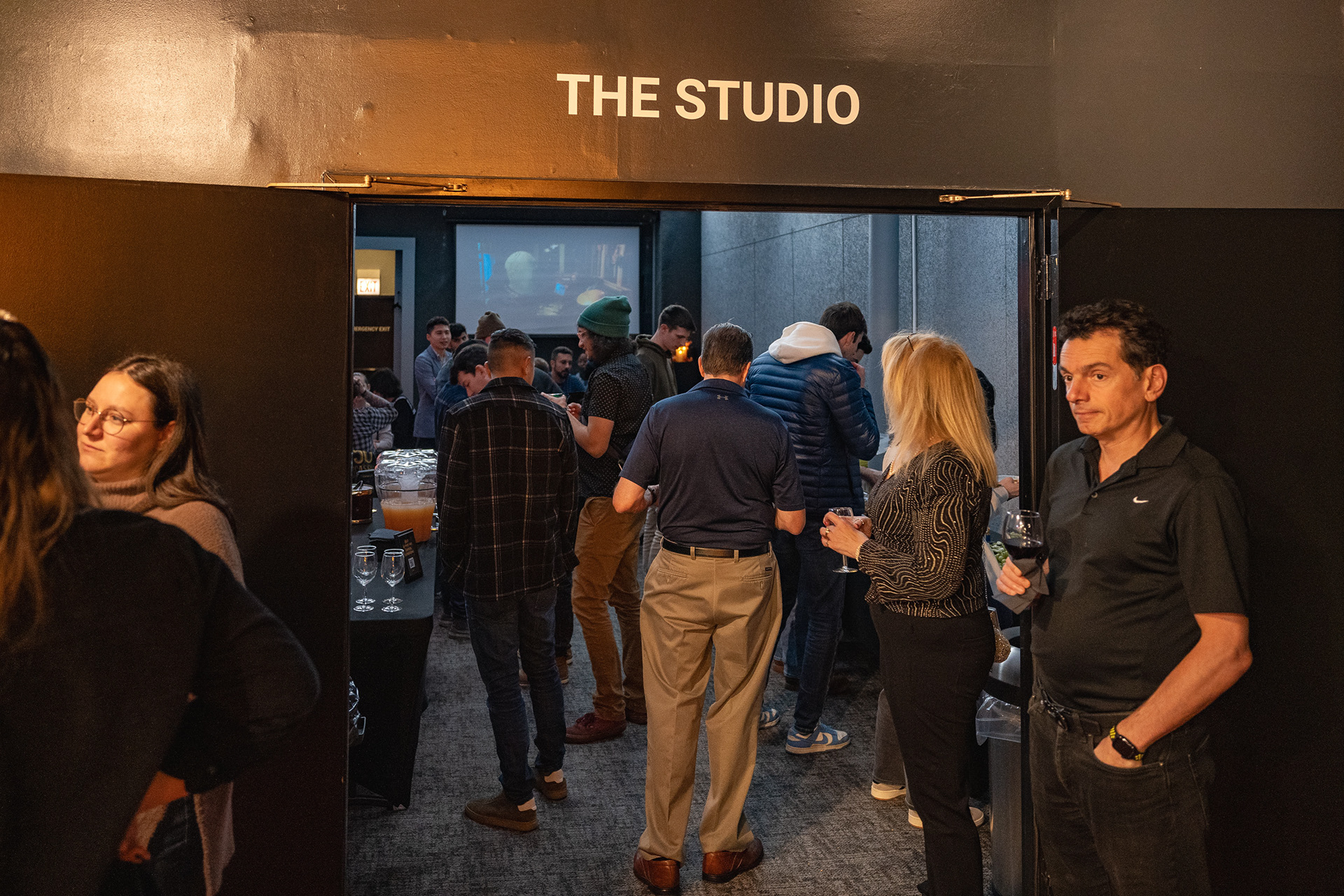
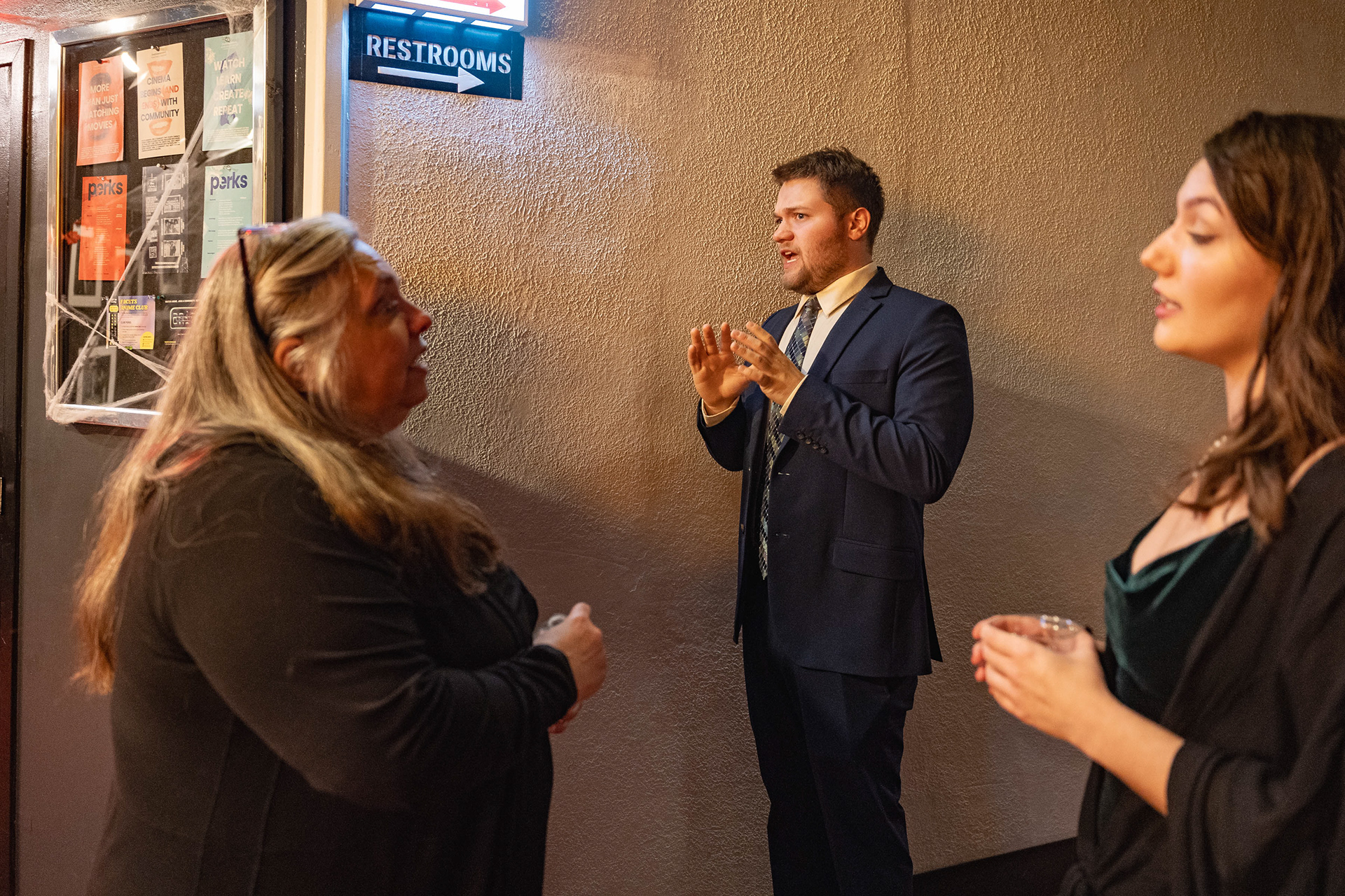
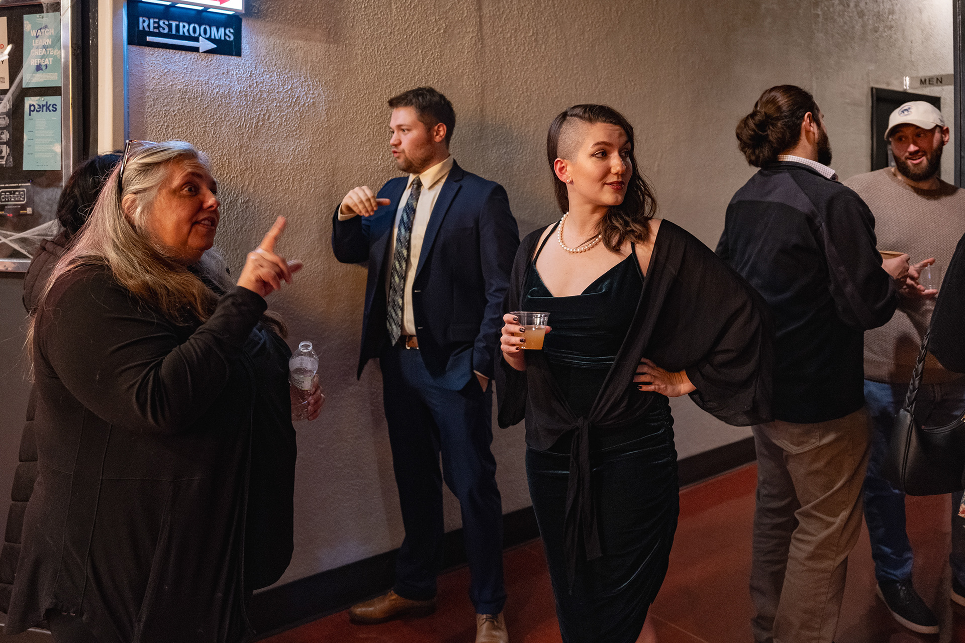
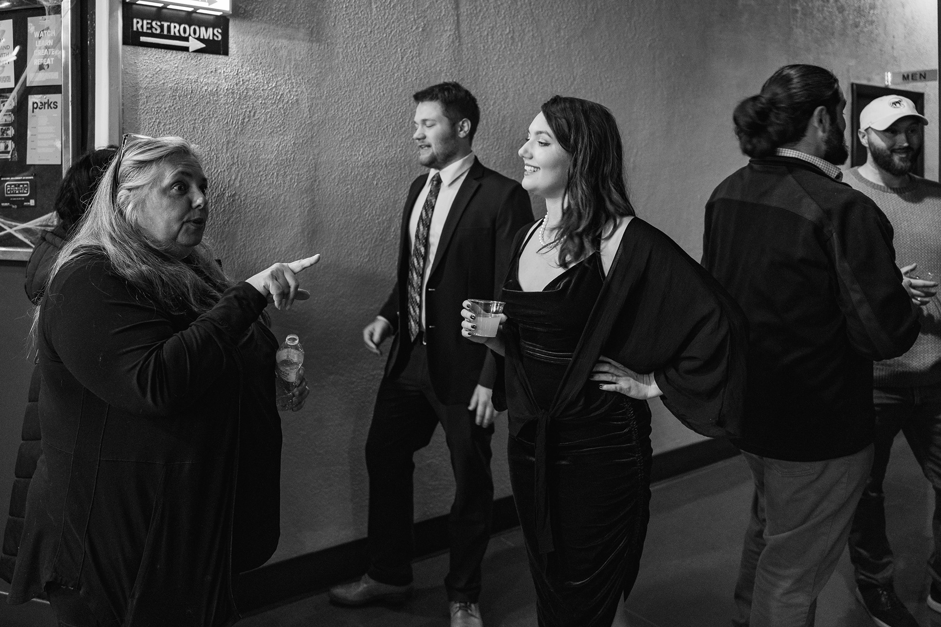
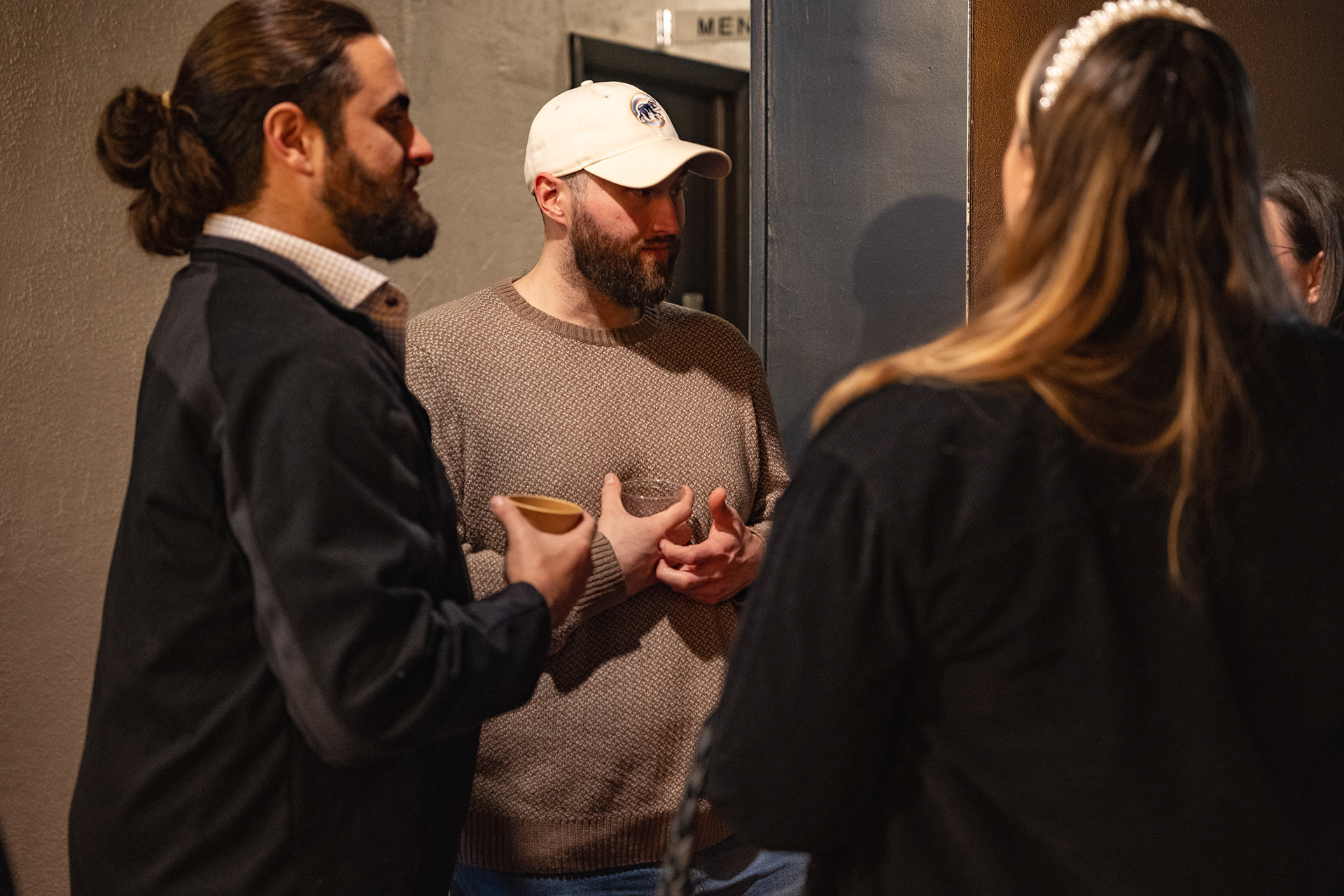
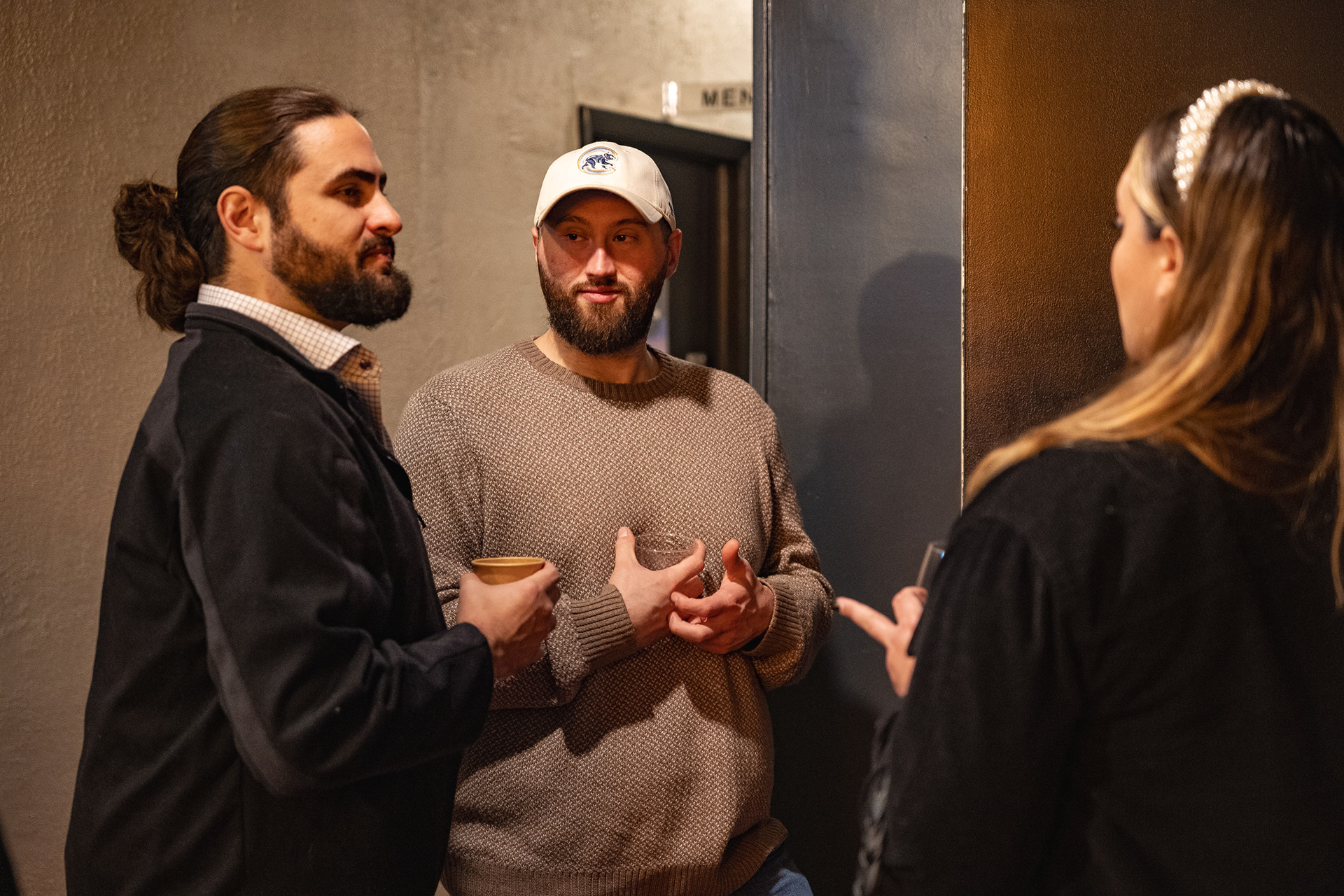
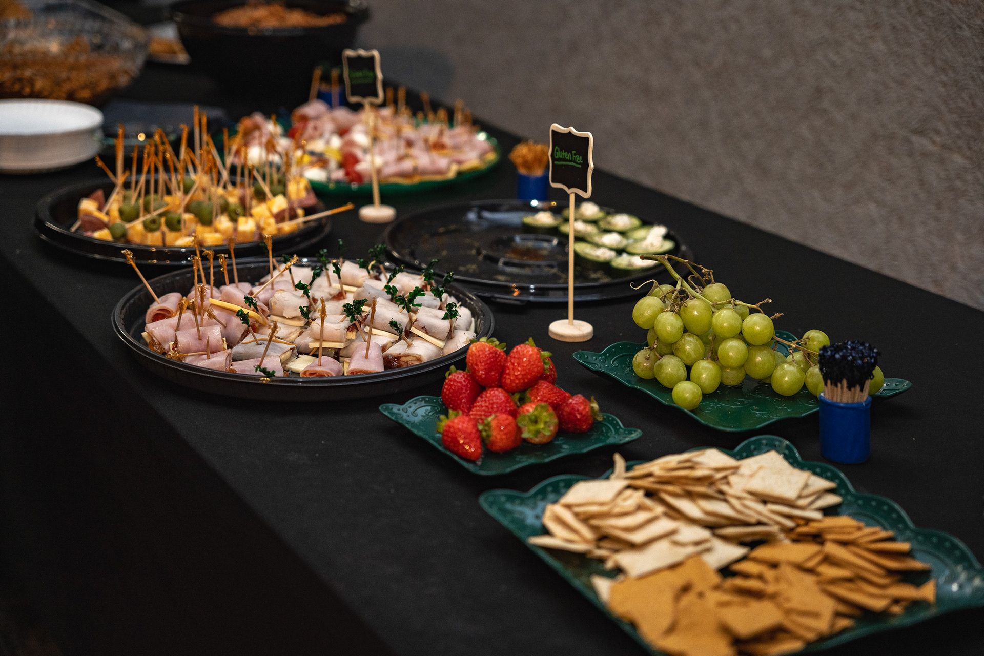
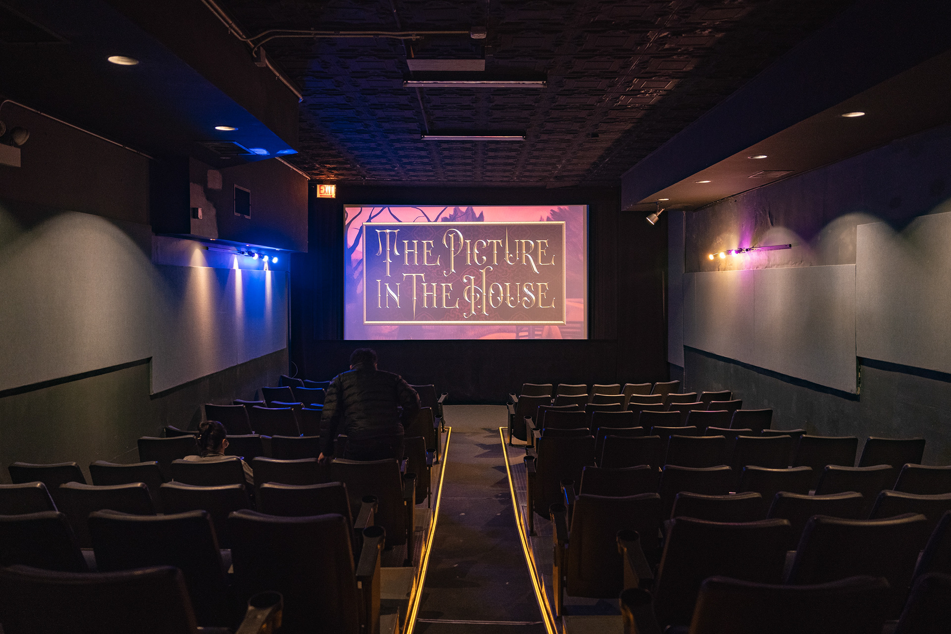
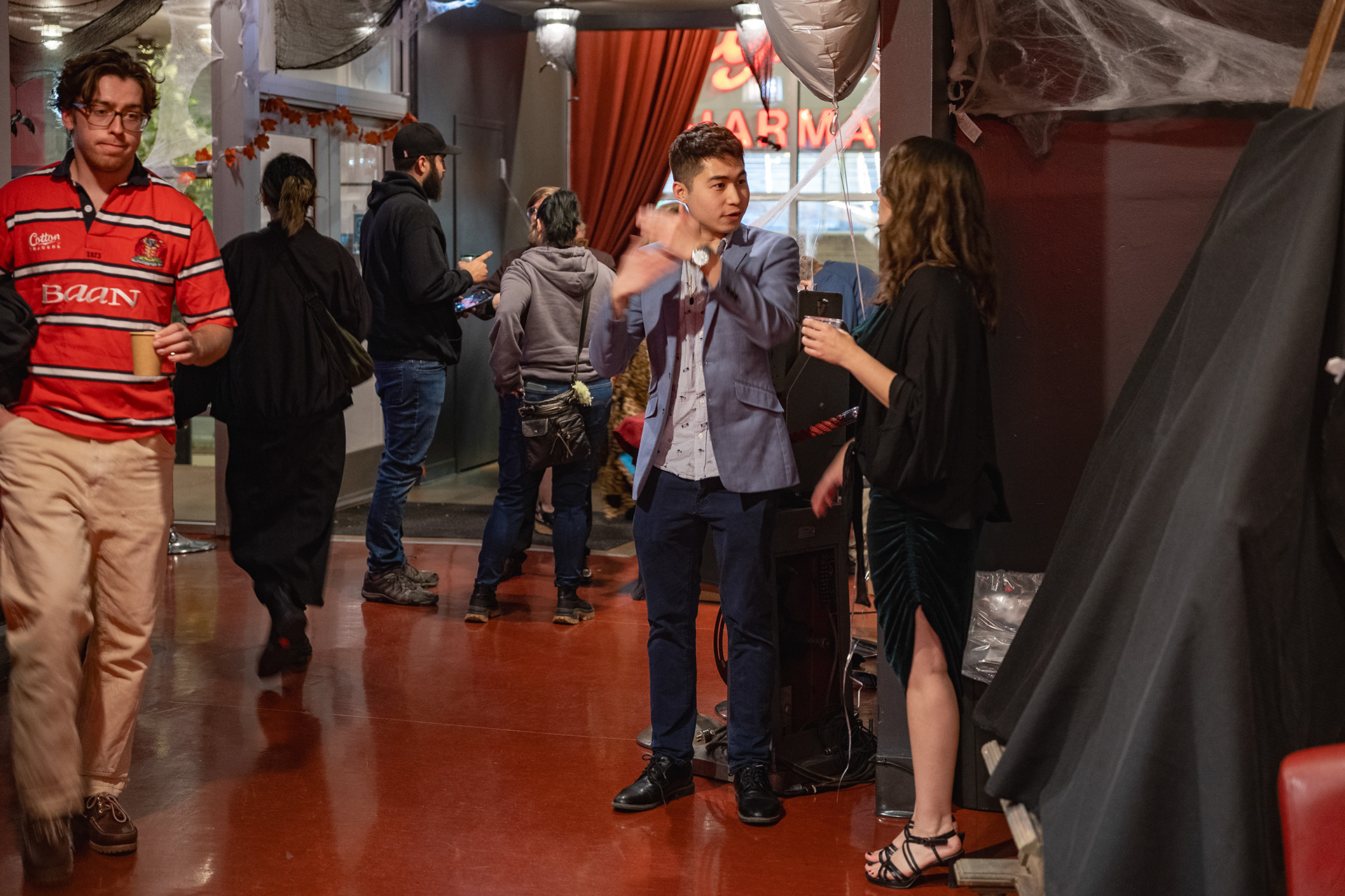
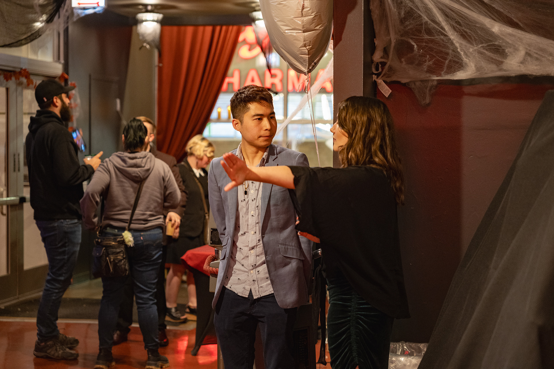
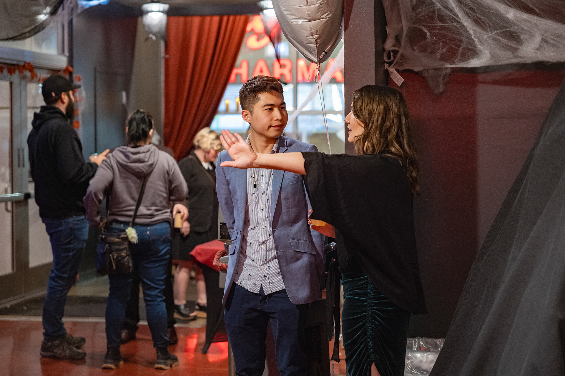
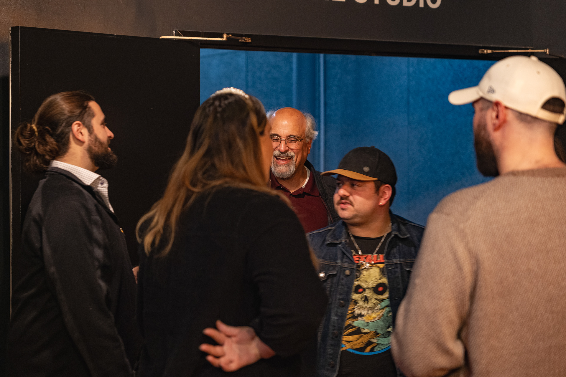
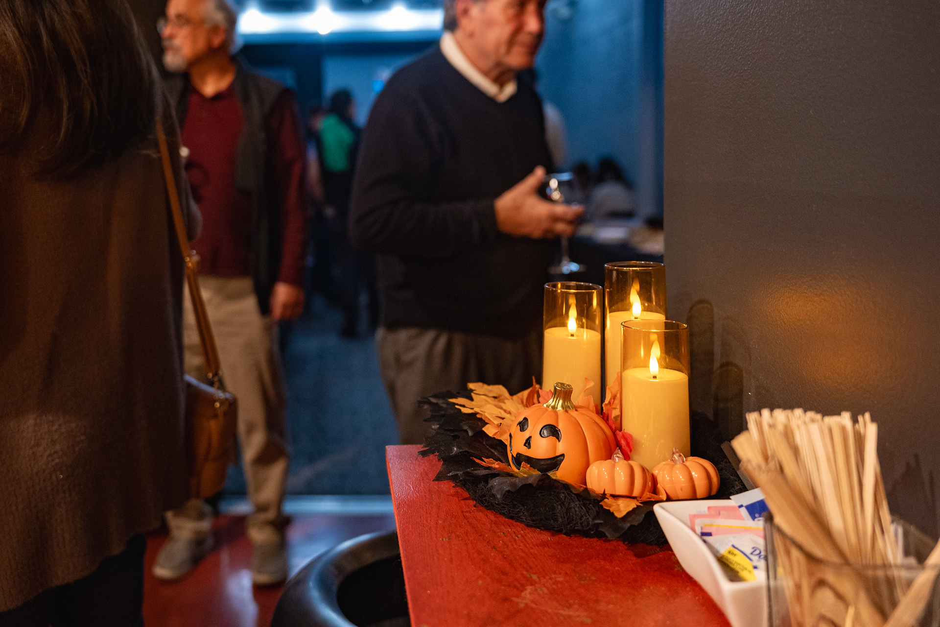
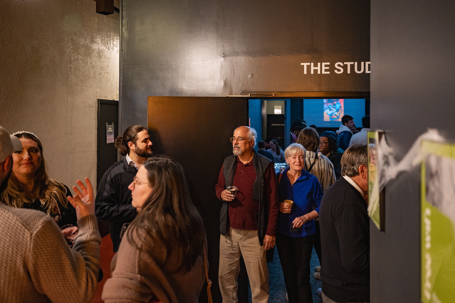
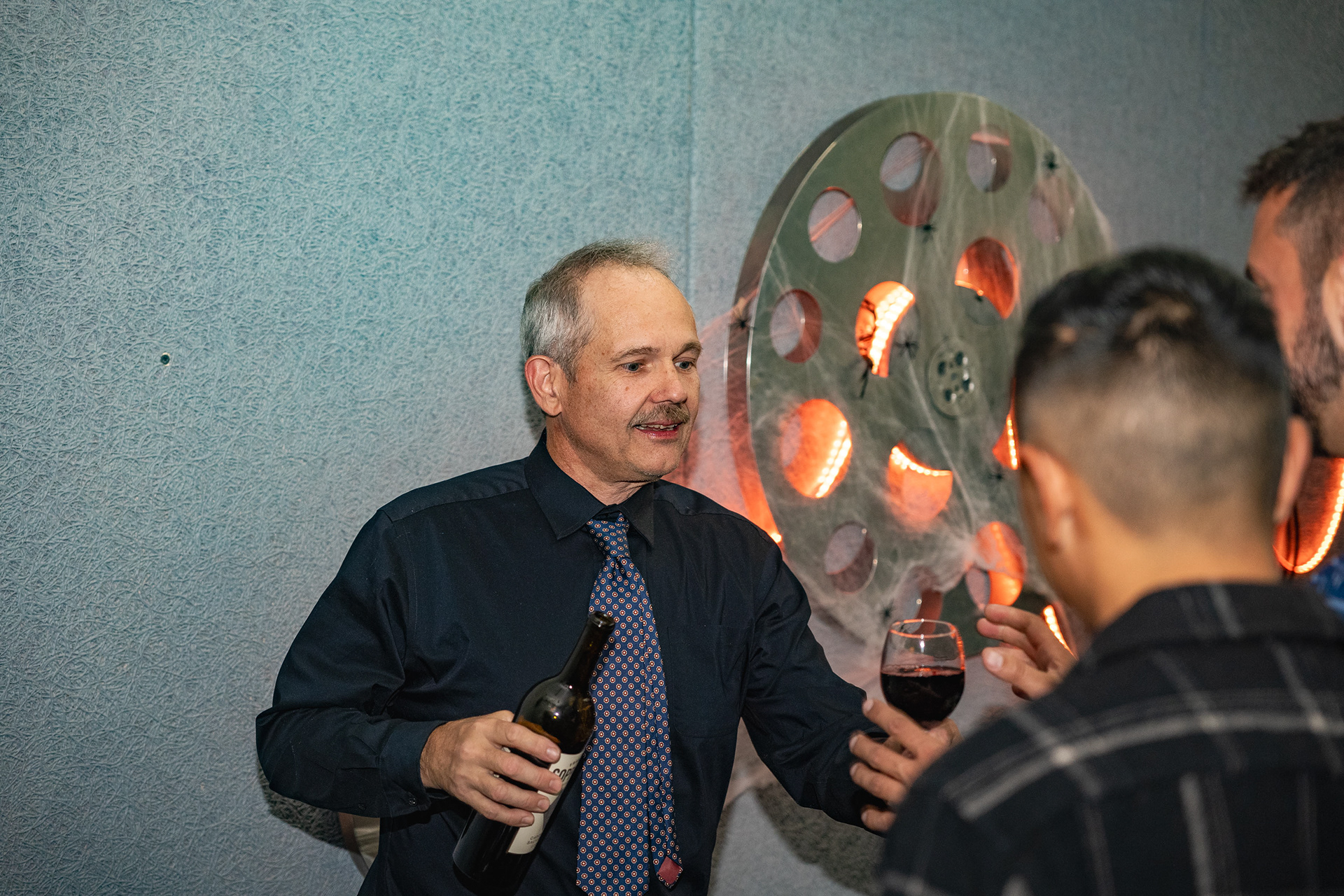
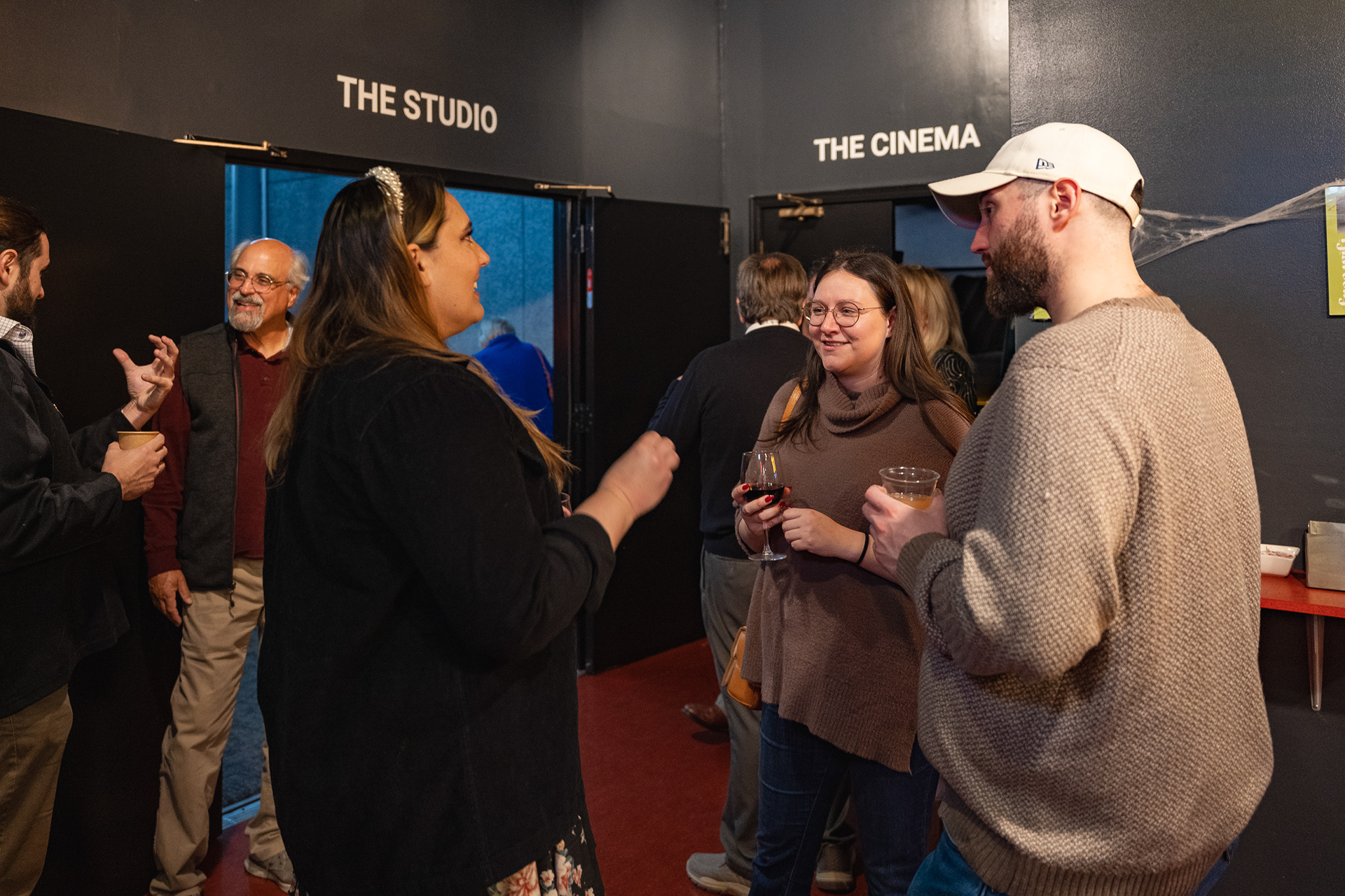
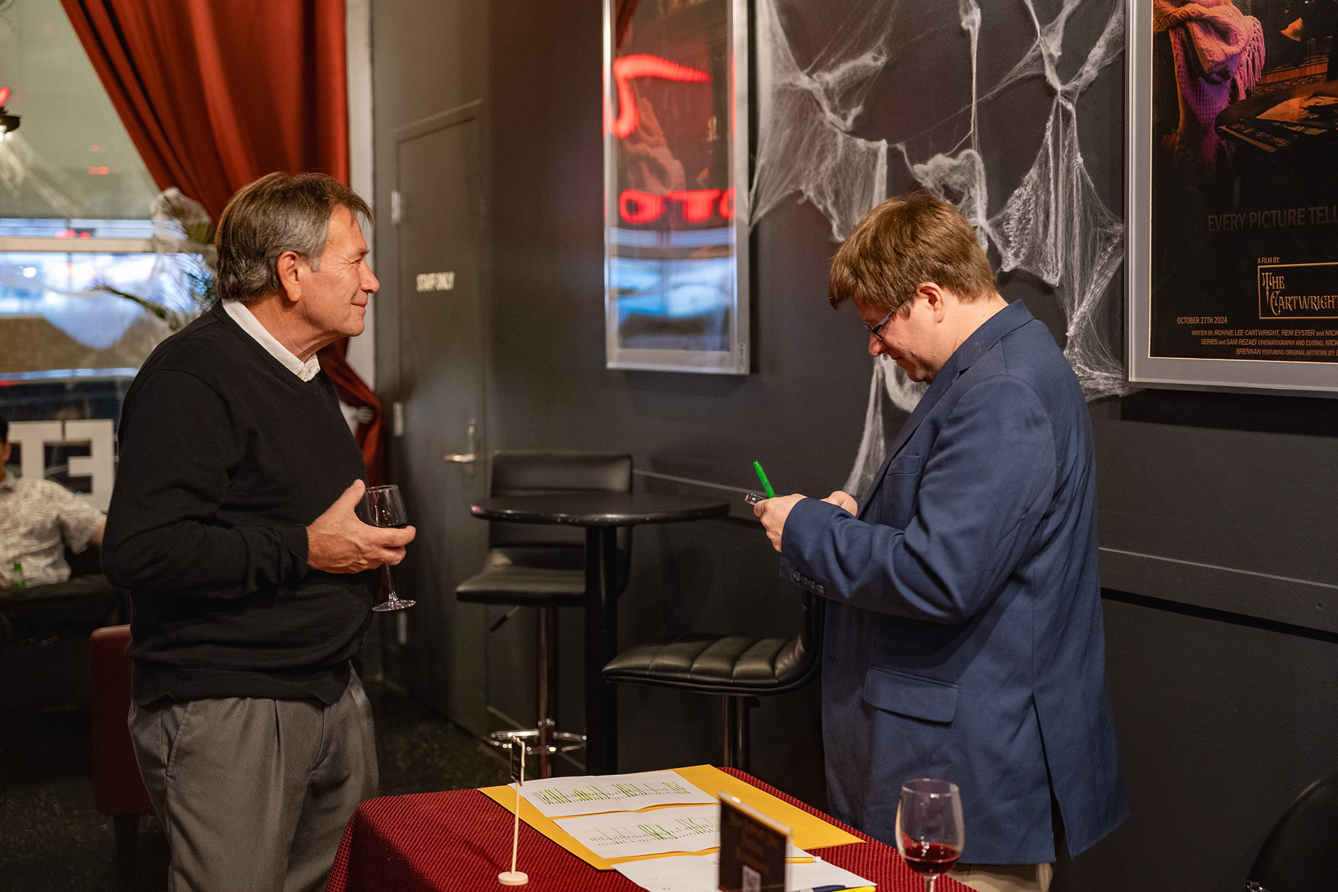
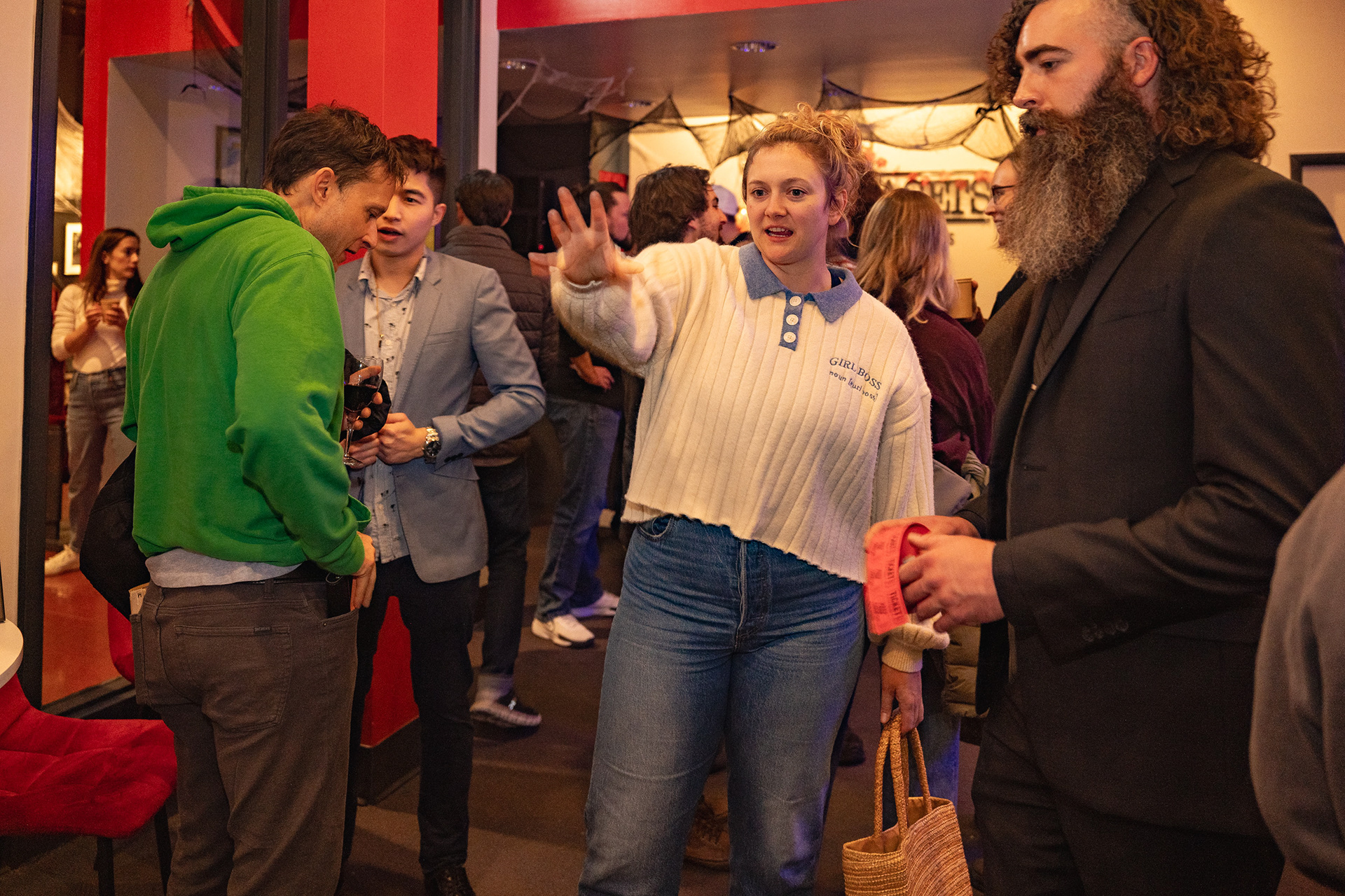
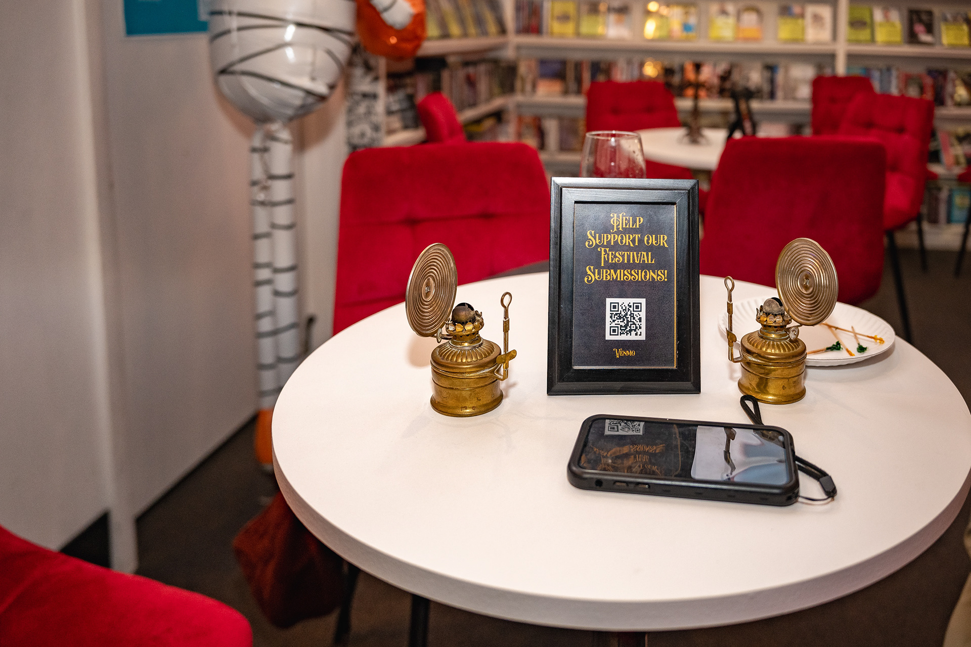
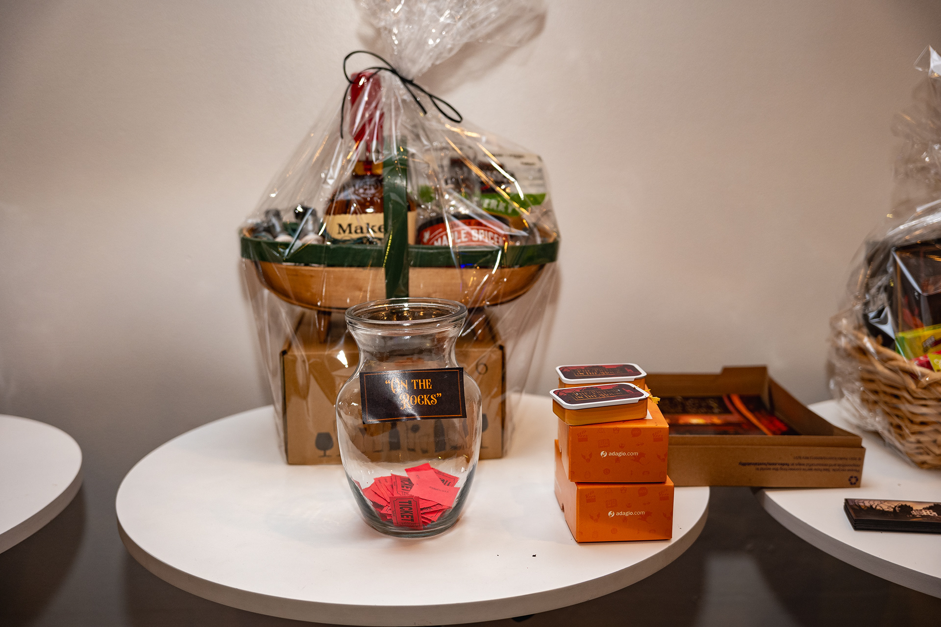
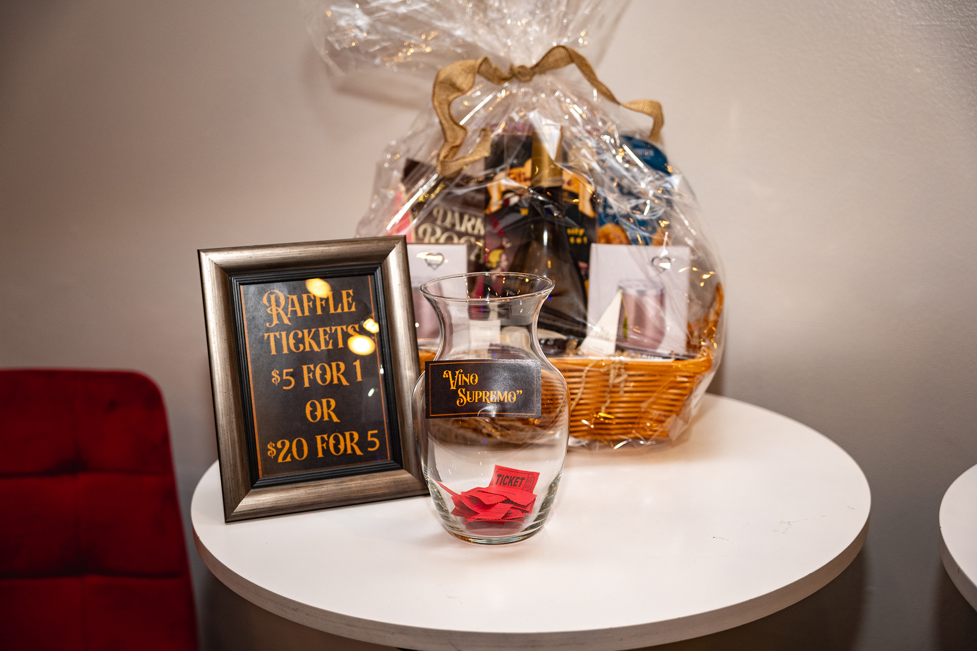
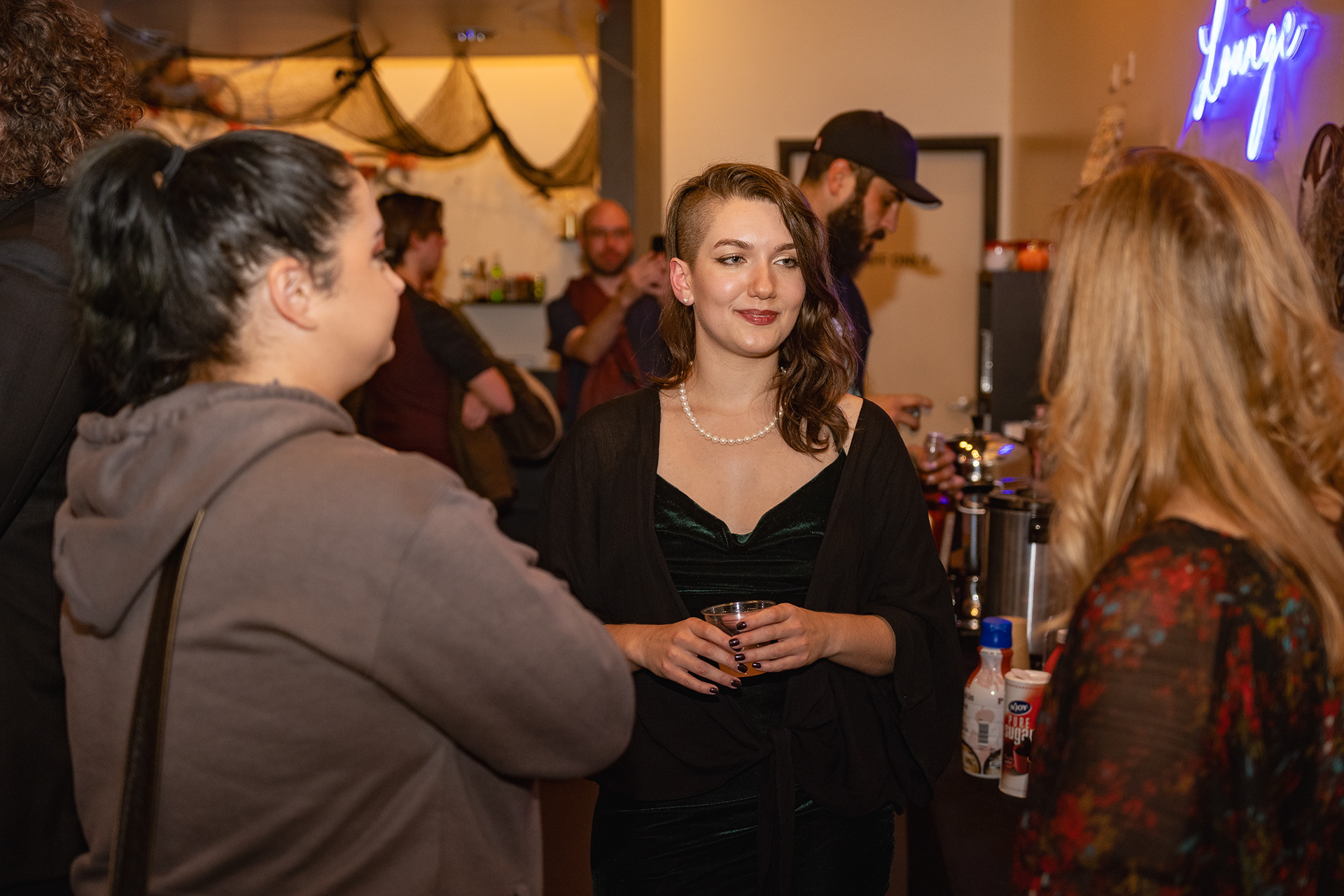
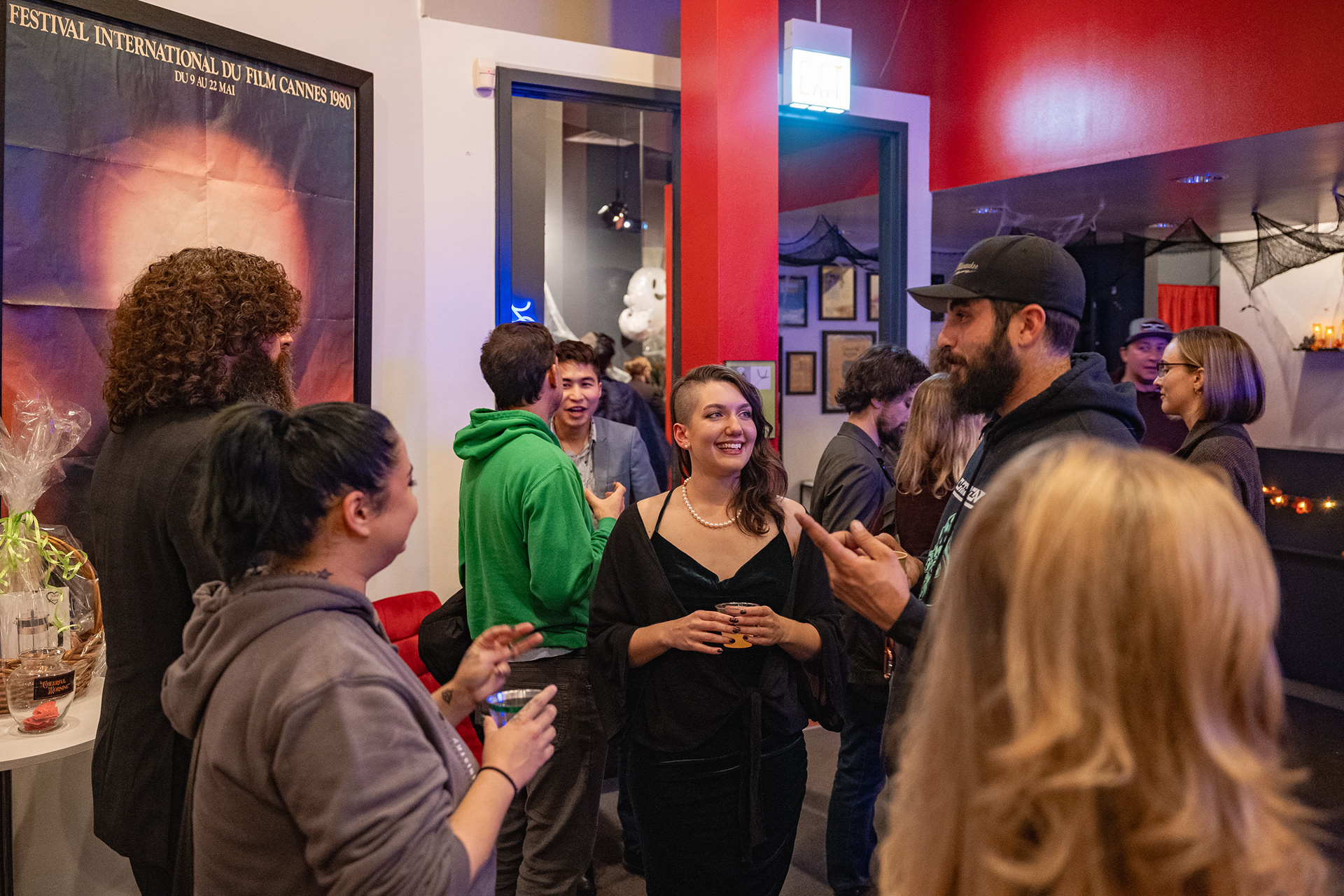
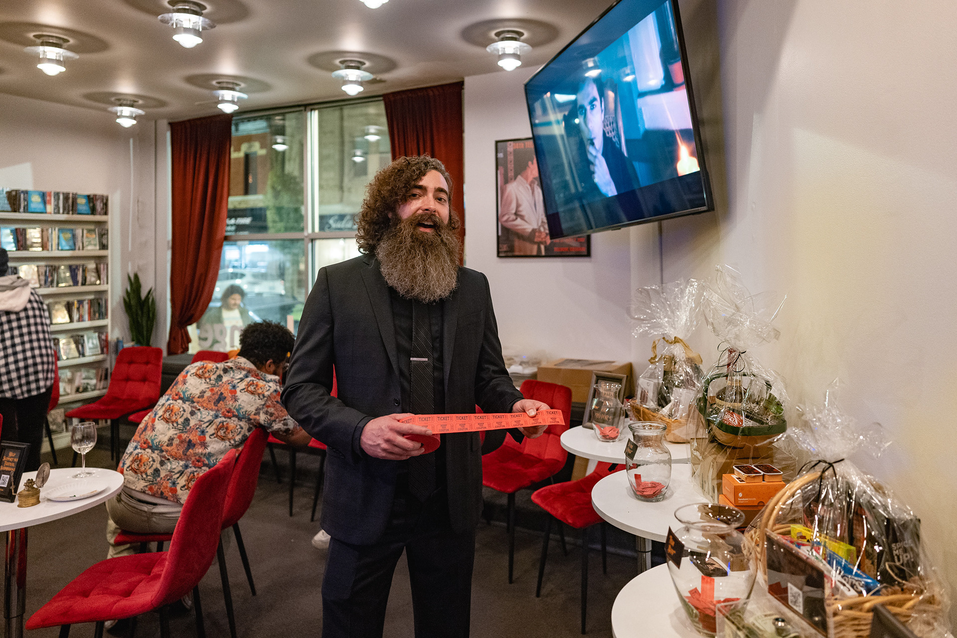
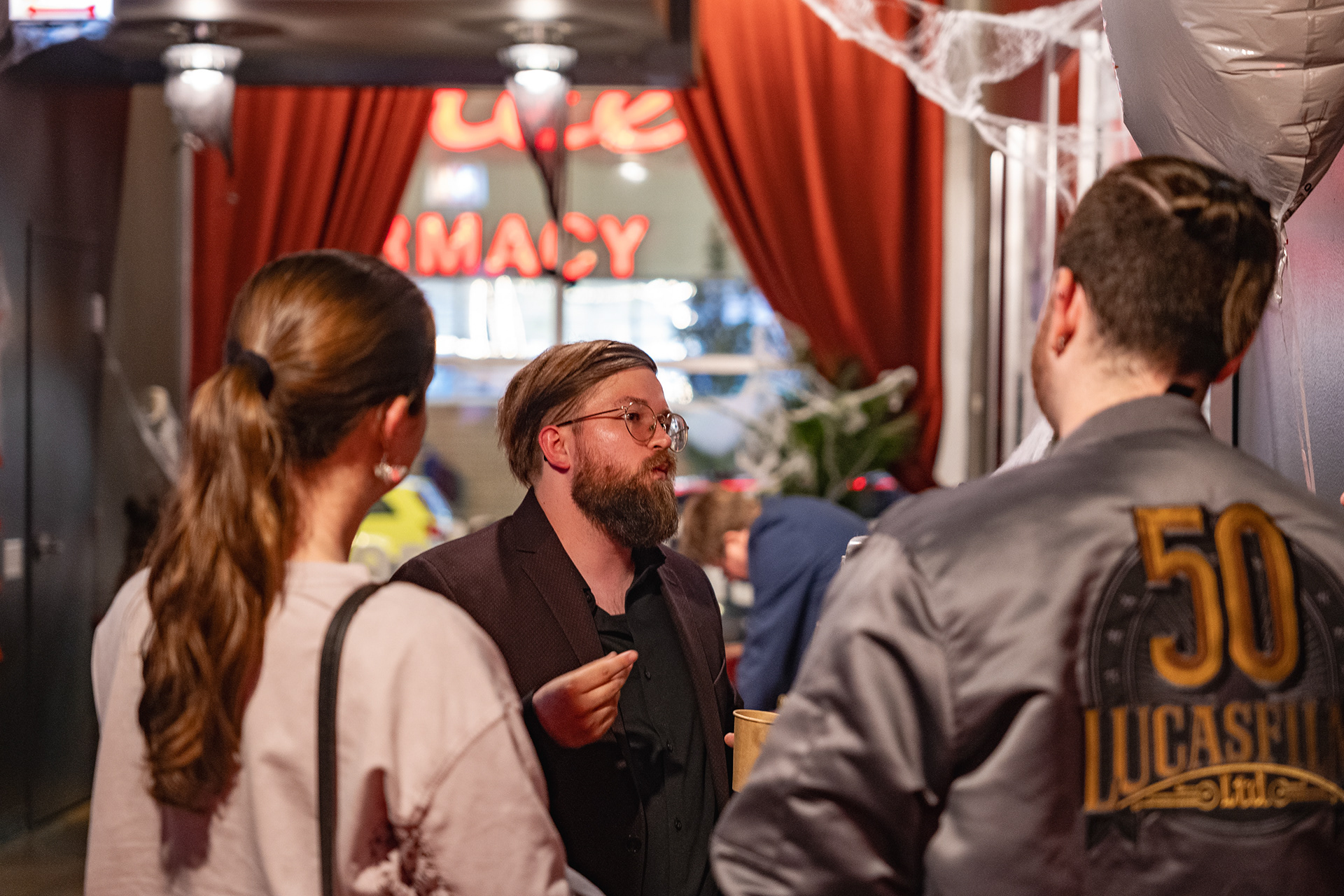
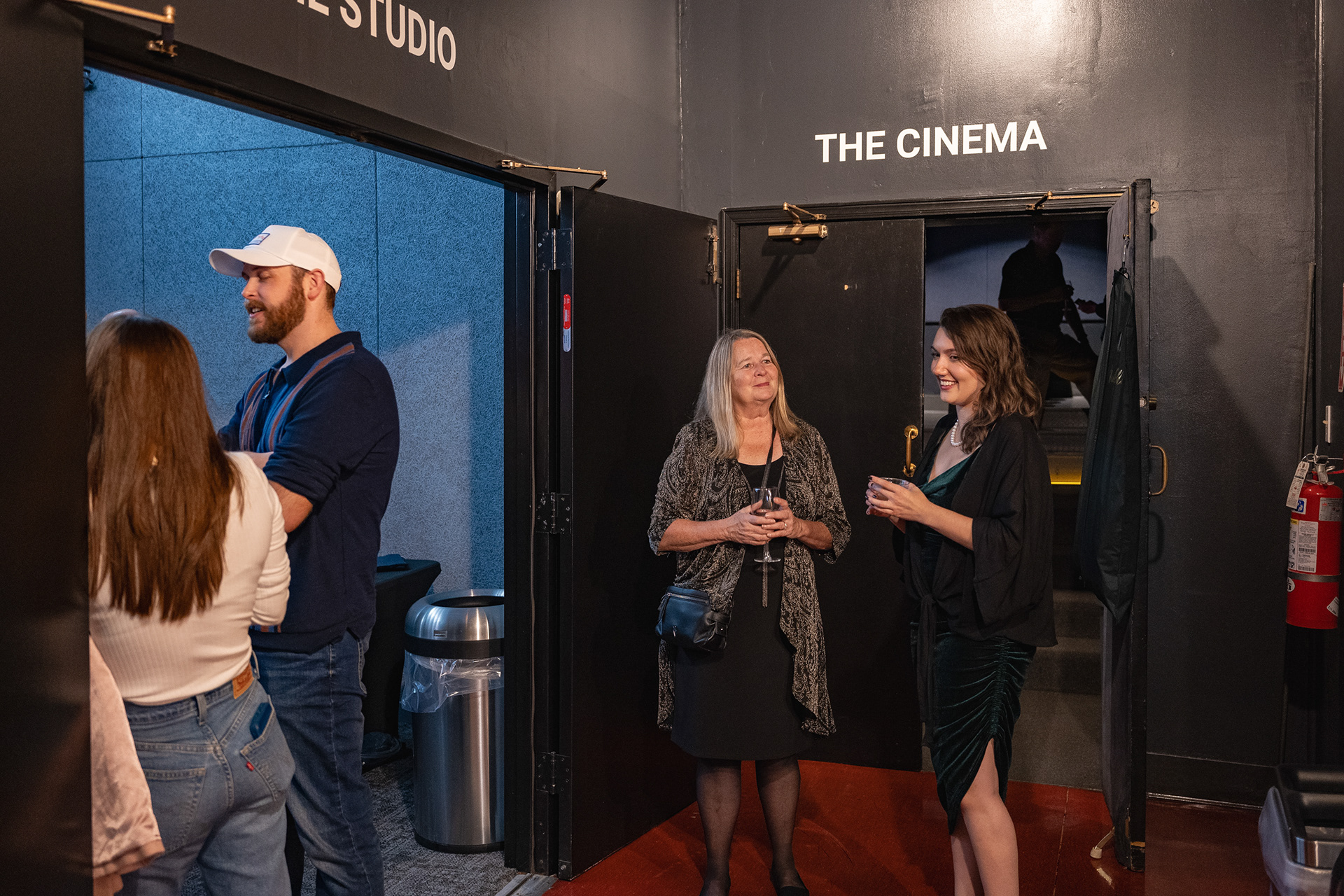
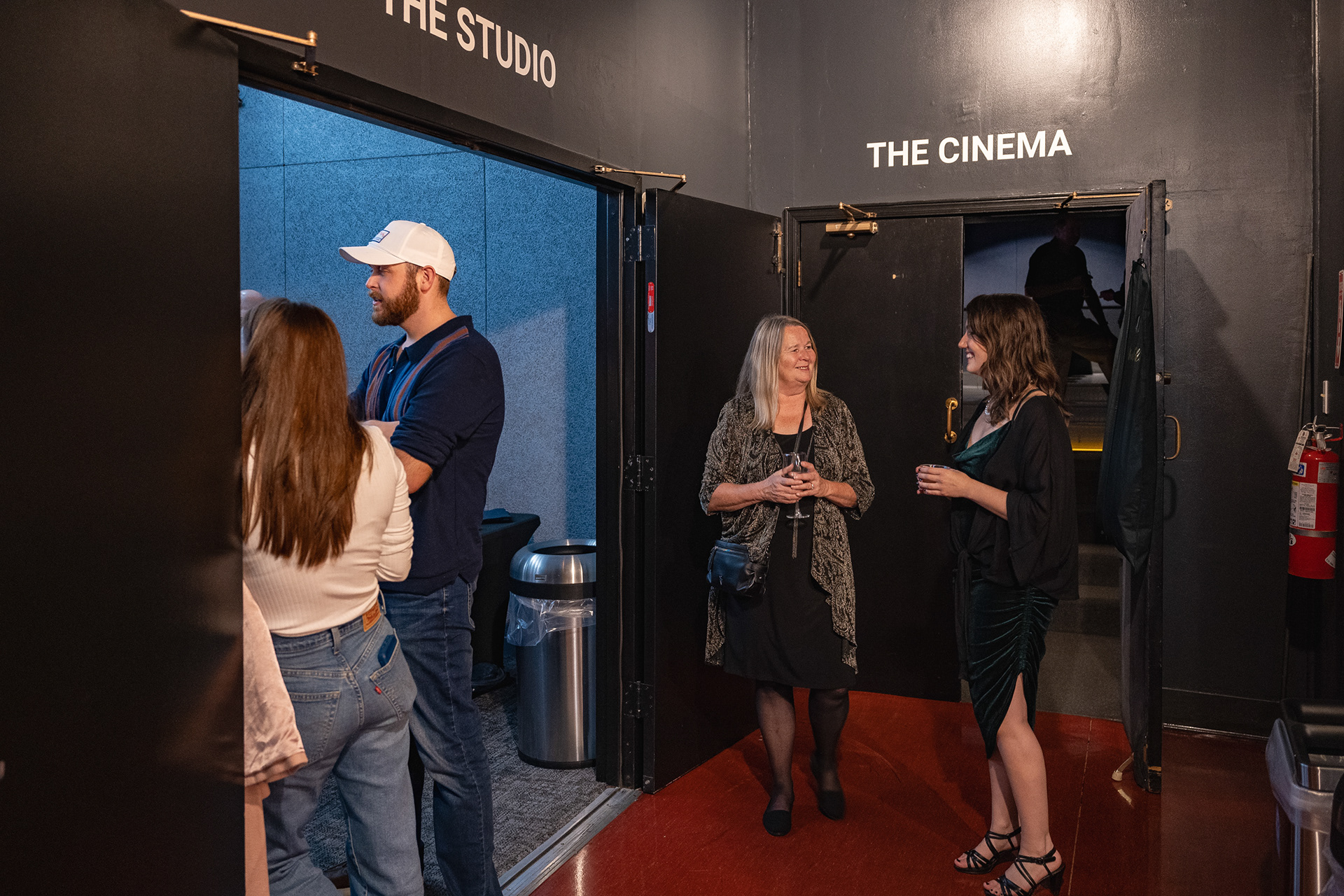
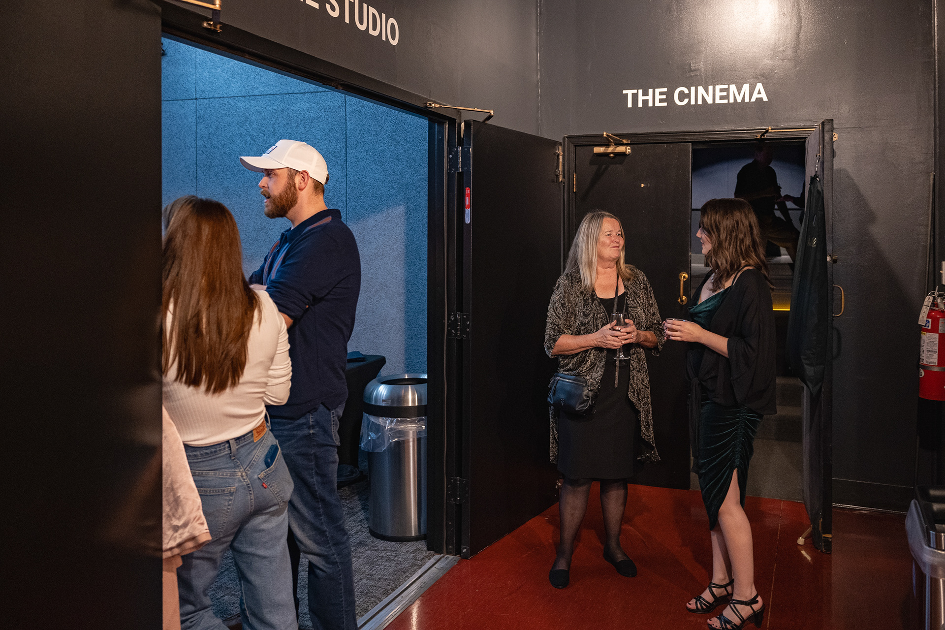
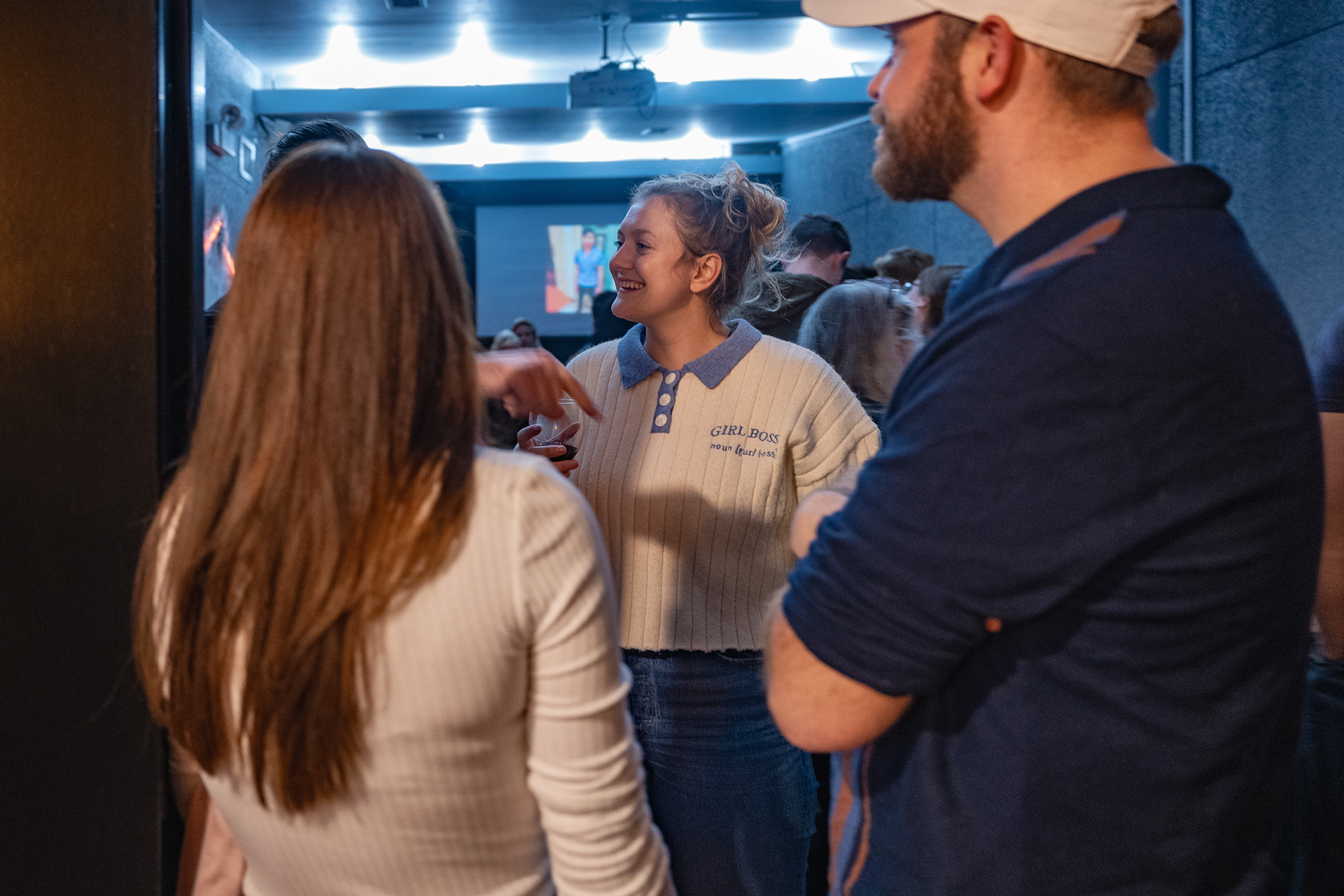
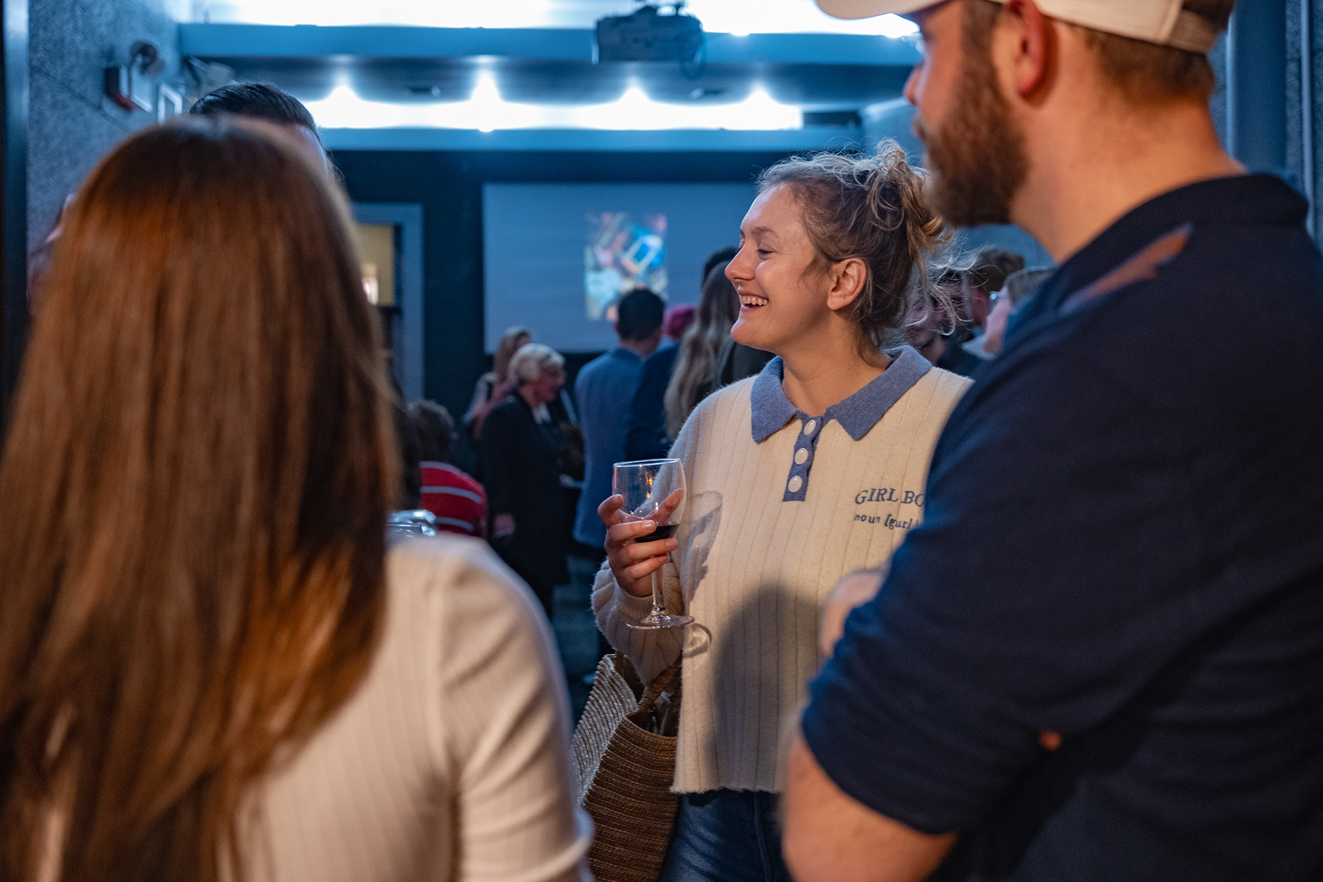
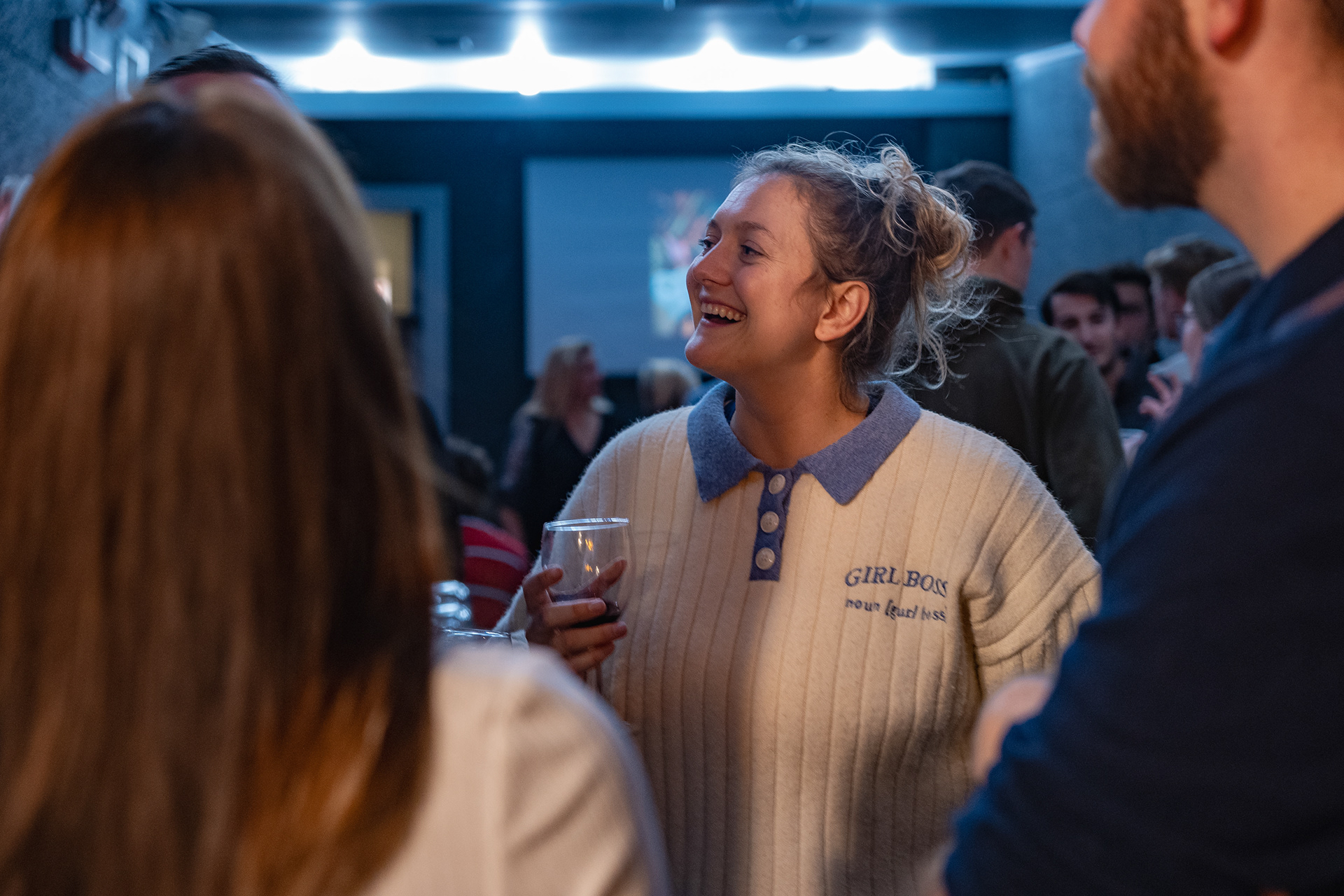
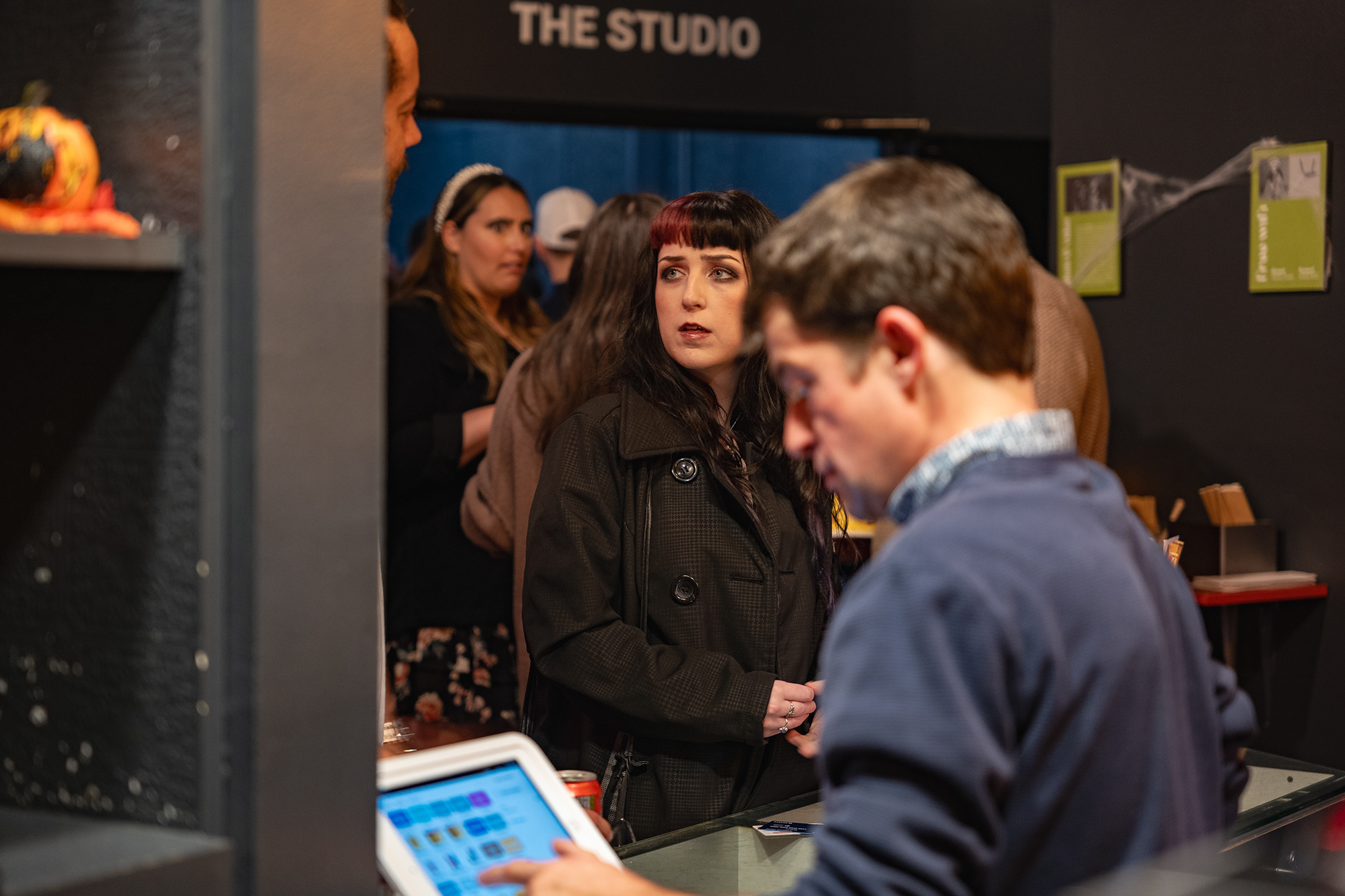
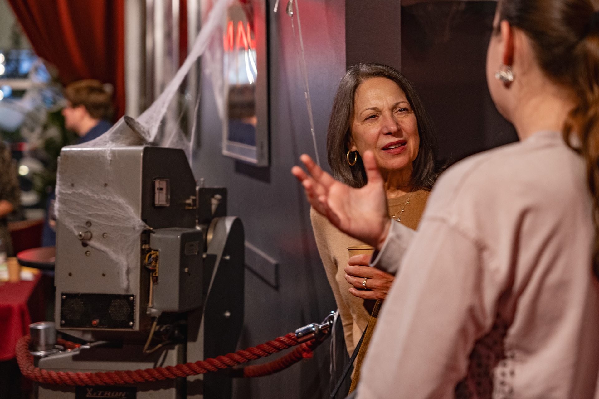
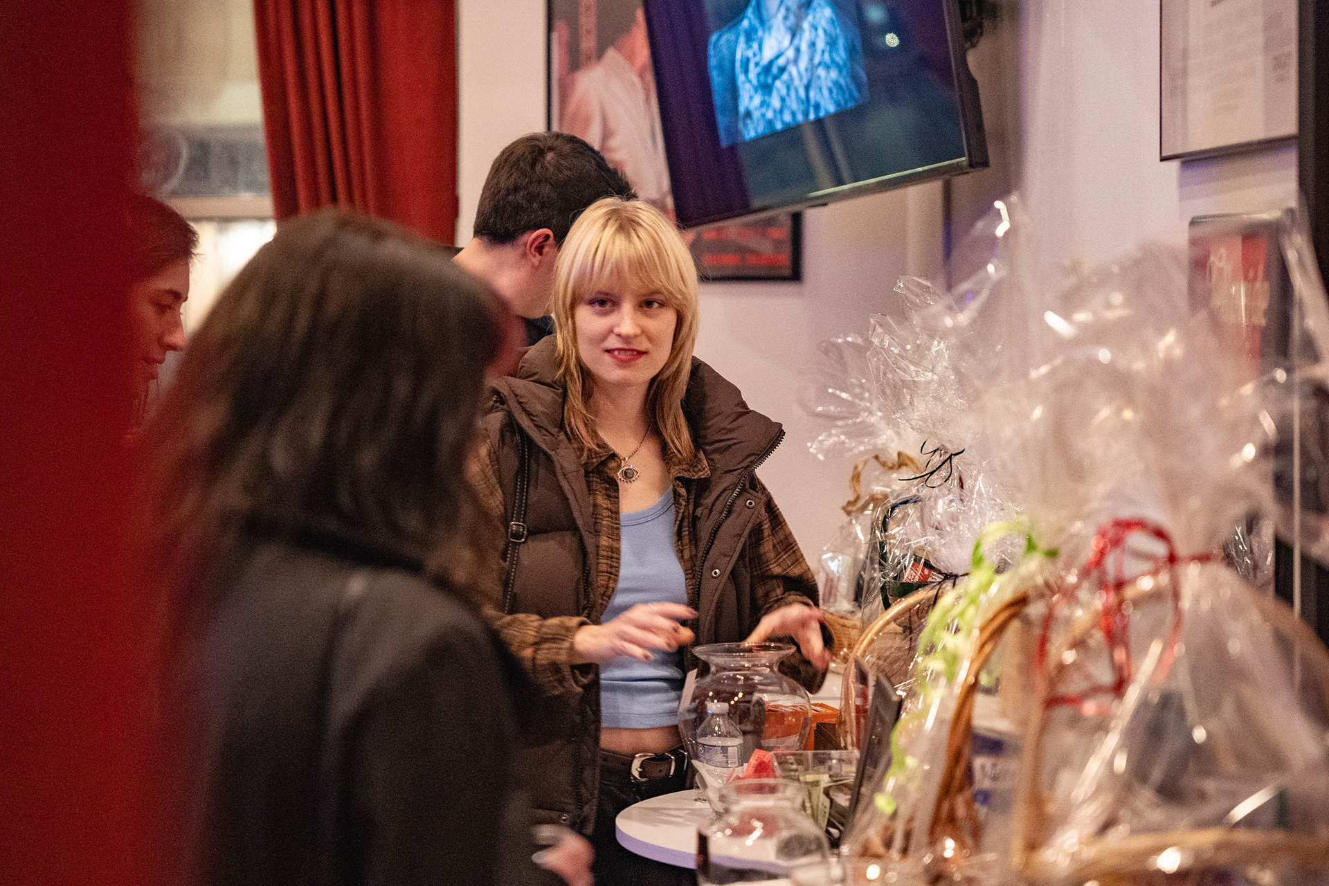
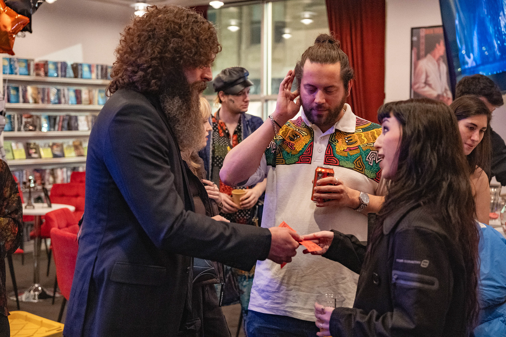
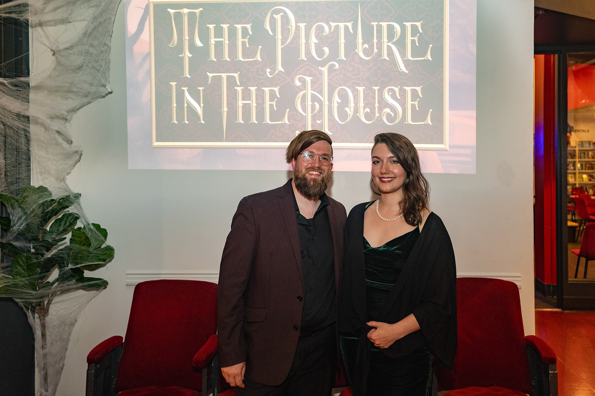
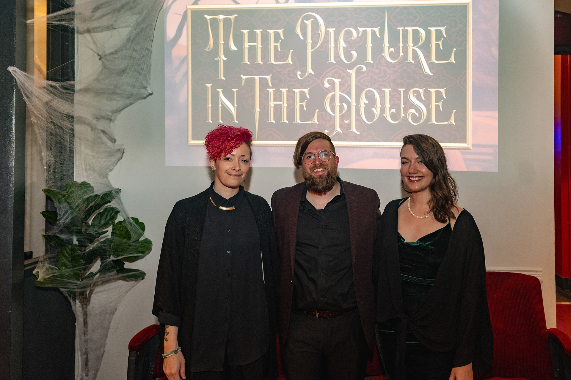
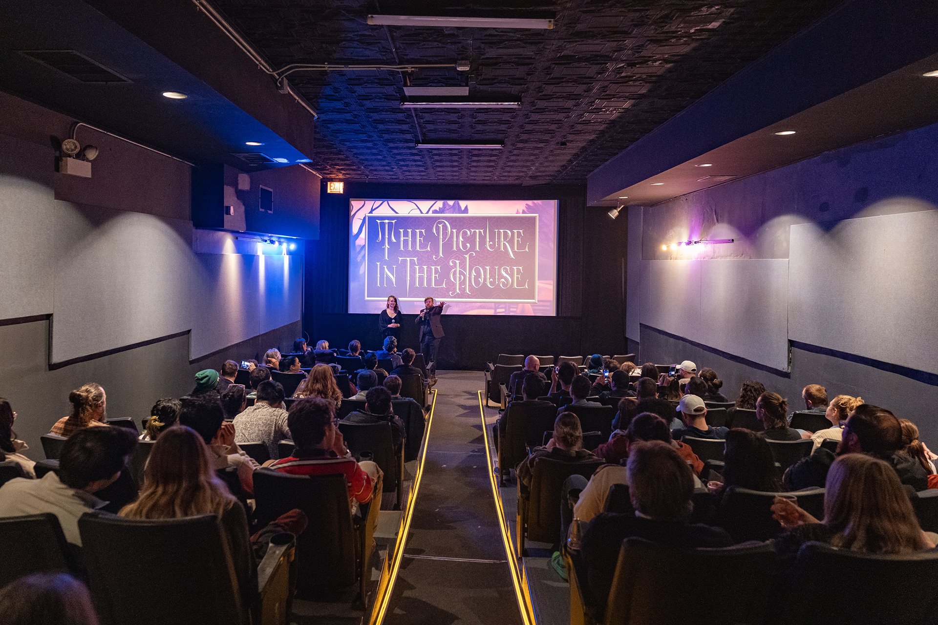
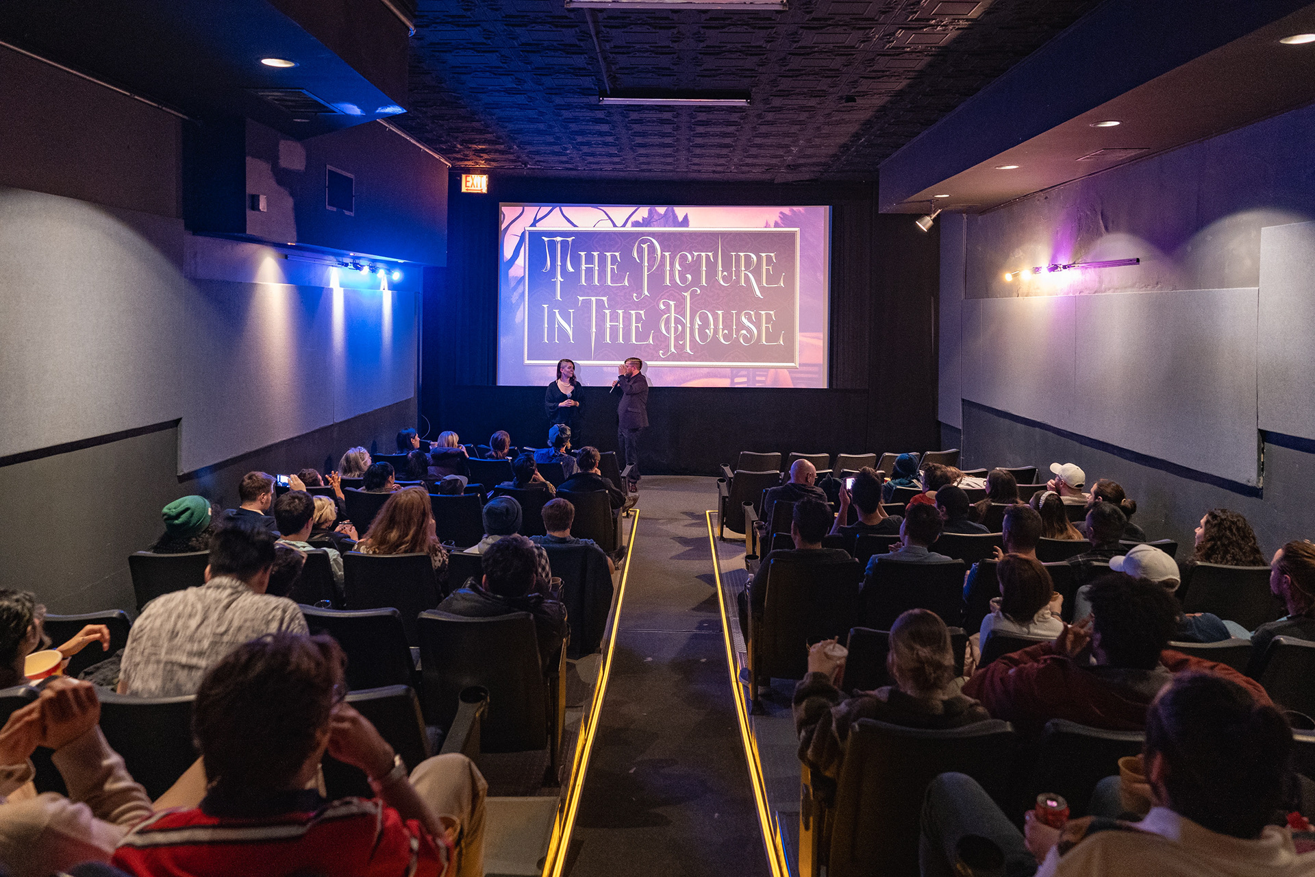
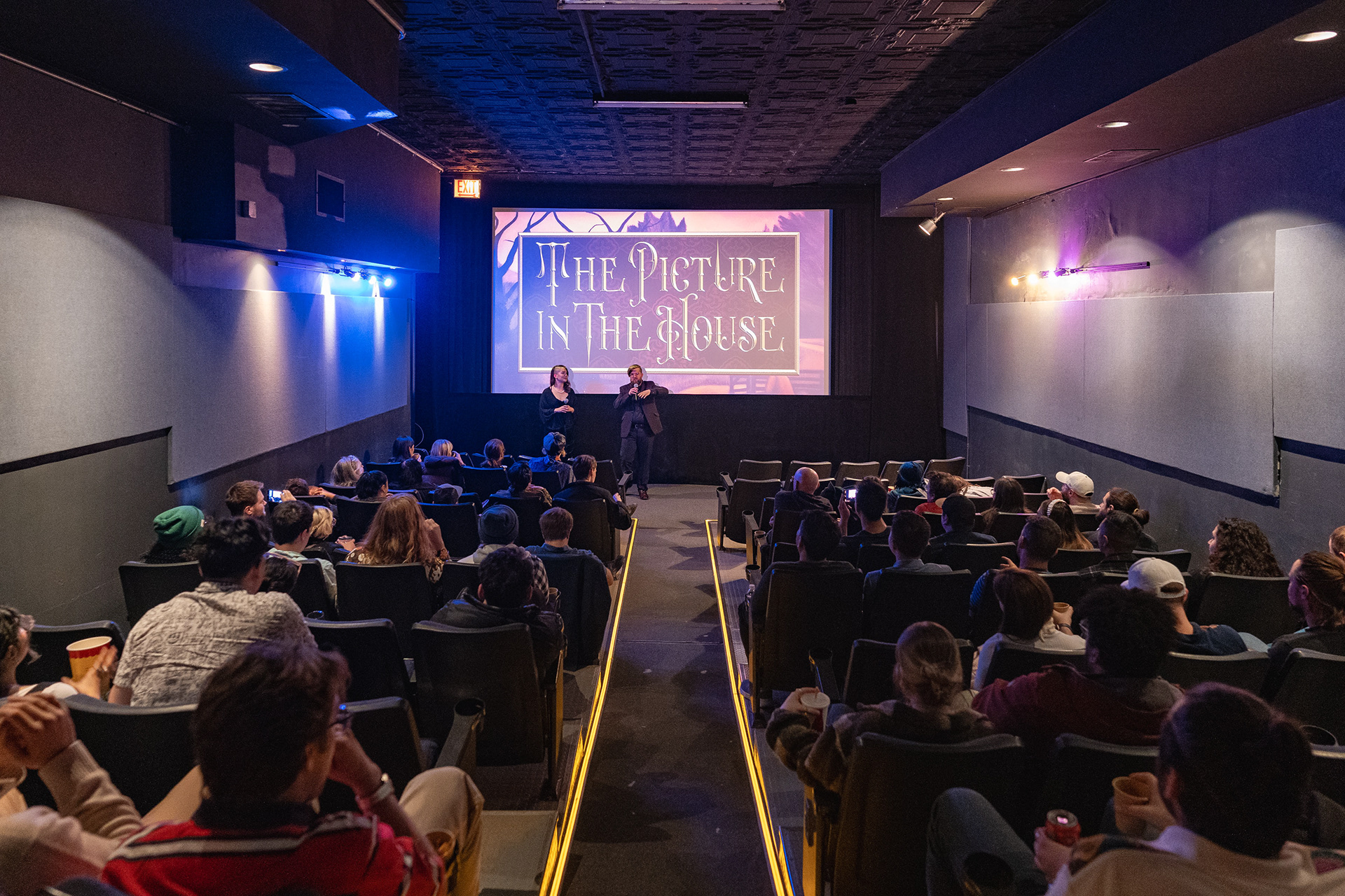
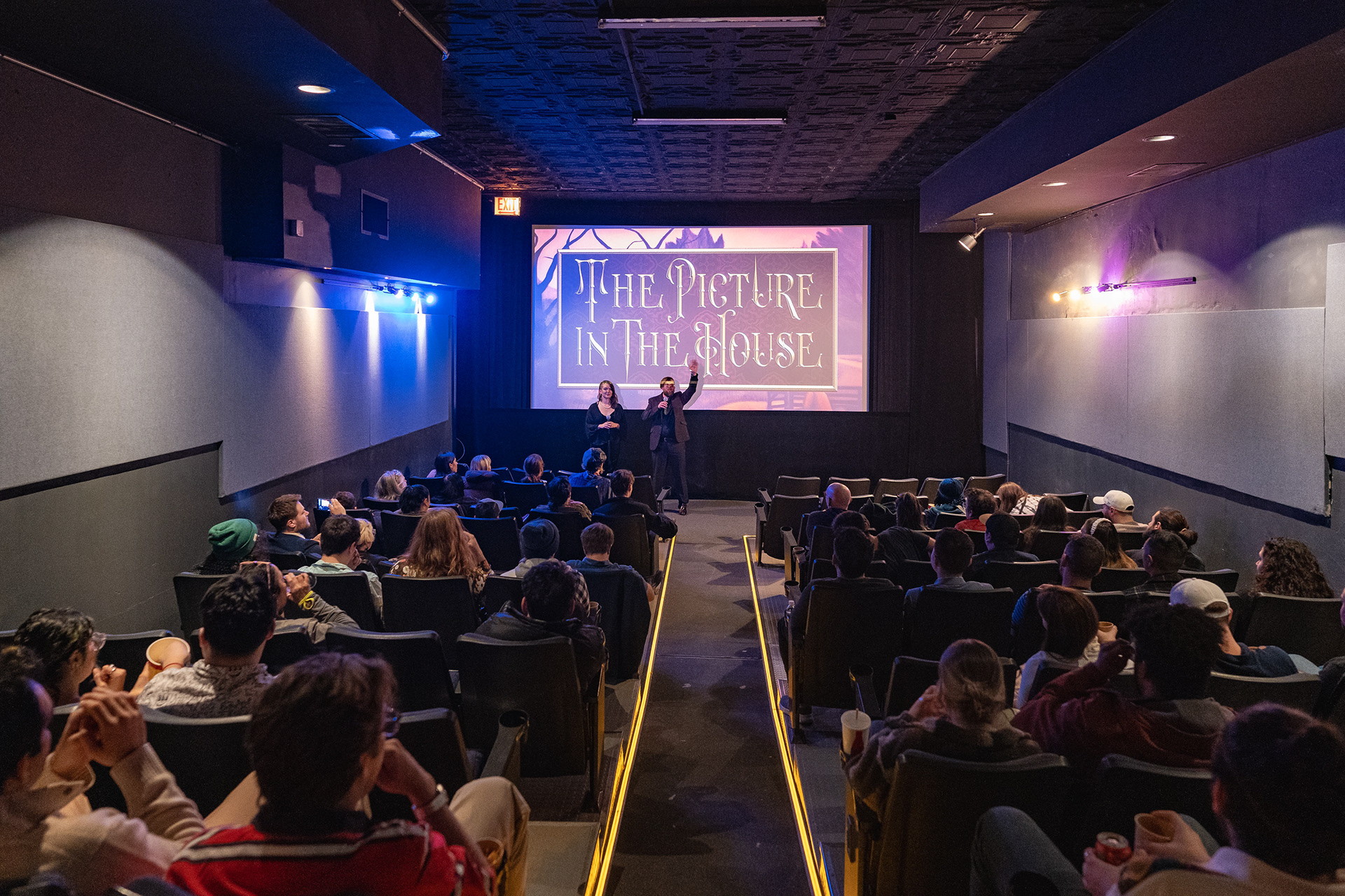
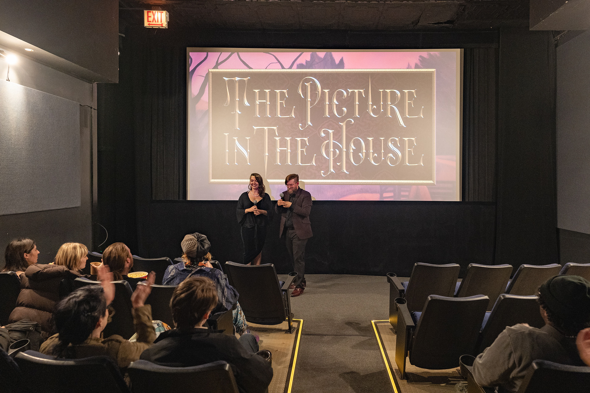
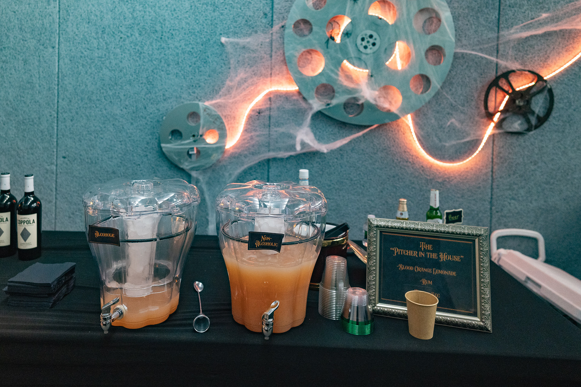
PRIVATE PREMIERE
